In the year since I came to Tencent, I have been exposed to font design in many projects, and thus formed my own set of font design methods in the design process. I would like to take this opportunity to share my design experience with you. If there are any deficiencies, please reply to the top post. Cut the nonsense and go straight to the point.
How to implement font transformation

How to achieve font deformation? I think it is the most concerned issue for designers who are new to typography. Here I just want to share a point of view, everyone's ideas and implementation methods are different. What I introduce here is a set of methods that I summed up in the design process for reference.
Back to the question just now, I will answer it in three steps.
what method to achieve
What is the process of realizing
What to avoid in the design process
1)>
My personal habit is to draw on the draft paper, and quickly finalize the structure and layout of the font. Find a more suitable solution from the listed solutions, and then take pictures and put them in illustrator>
2)>
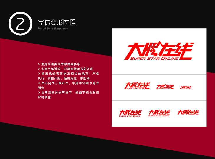
At this time, you can refer to the frame structure of similar excellent fonts to adjust the stroke distribution and center of gravity balance of each character.
After selecting the style trend of the font, make a corresponding visual arrangement for the font. For example, the distance between characters, the distance between strokes, the inclination angle of the overall glyph, rounded corners in special places, etc. Let the whole font have a consistent visual rule in it.
Example 1: The left ends of the vertical strokes are all rounded, and the following e is also rounded at the end of the strokes under the same rules.
Example 2: Using the smart guides in illustrator, pull vertical, horizontal and 45° guides to align strokes and adjust spacing. Use circular intersection and subtraction to achieve rounded corners of strokes.
Use different sizes for comparison, and fully consider whether the details of the fonts can be displayed in place under different sizes. In this part, it is recommended to make 3-5 actual application sizes as a reference.
Put the font in the actual application environment, and adjust the details and color matching. It is recommended to consider the style of the page to determine the texture and color type. Can be used as background color foil if necessary.
3)>
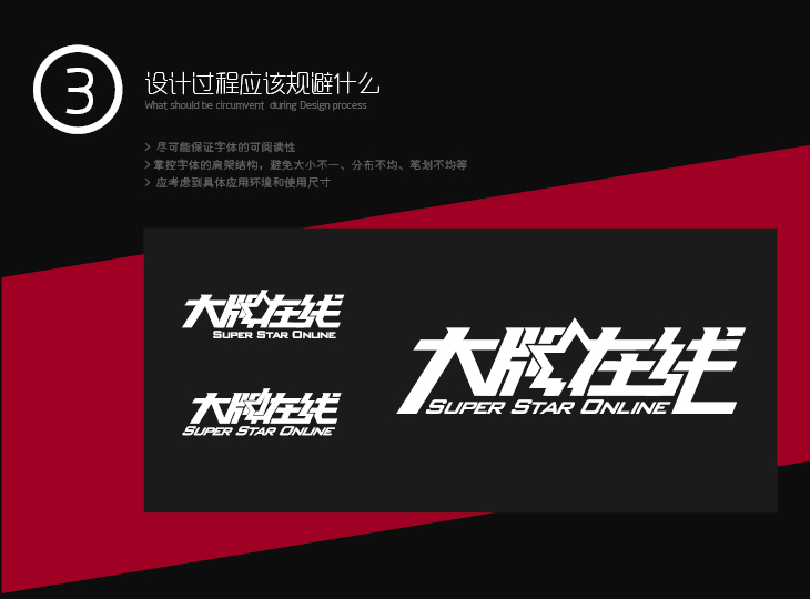
Make the text as readable as possible. After all, it is commercial design, which must take into account the cultural background and graphic recognition ability of most people.
Control the shoulder frame structure of the font to avoid problems such as uneven size, uneven distribution, and uneven strokes. In the example in the lower left corner of the example, although the shape of a star is used to accommodate the "brand" and "zai", it makes the font appear too dense and airtight in the central area. Looking at the example on the right again, the star shape is hollowed out and connected to the horizontal strokes of "in" to make the strokes of the font more compact and breathable.
The specific application environment and actual use size should be taken into consideration.
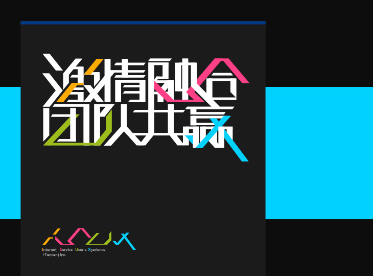
The following is an introduction to the font design works accumulated in this year. The above picture is the theme word design of the ISUX theme development activities in the winter of 2011. At that time, I felt my whole scalp tingle with these 8-character slogans. Because it's because the process is quite complicated. Later, when sketching the prototype of the font, I kept arranging the strokes, and found that the meaning of fusion can be better reflected after the spacing of the font is shortened. So I did the deletion and fusion of strokes. Properly straightening the strokes adjacent to the text makes the text look fluid. During the process, I saw the "little chrysanthemum" logo of ISUX, and I wondered if I could also integrate the colors into it. After trying a few drafts, I found that the four letters of ISUX can be embedded in the complex literal. So the final draft became a bunch of strokes with the letters ISUX embedded in them.
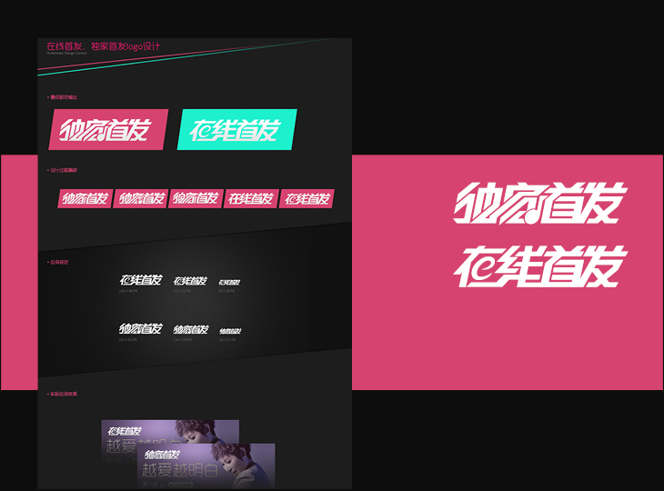
Sharing this case is to introduce a very fast and effective method. On the existing fonts, combined with theme elements for stroke deformation, it can also meet the design requirements to a certain extent, and save time and cost.
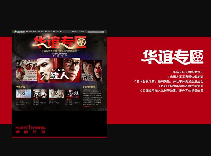
At that time, it was directly used in square, square, black and bold, because the event of this issue was named by Huayi Brothers, that is, to add film elements-film, and to make the strokes run through and deform, so that there is a literal connection. The second is to apply the red in the Huayi Brothers logo to continue the brand color of Huayi; the last is to put it on the page for light-sensitive processing to improve the visual effect of the font.
The font design of this part is designed for the title logo in the channel. Apply rules like thick strokes, slant, etc. uniformly. In view of the interesting shape of the font, graphic elements are added to enrich the font itself. At the same time, it has the display effect under different sizes, and can delete strokes and adjust the spacing.
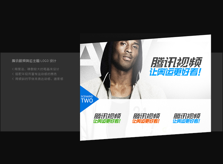
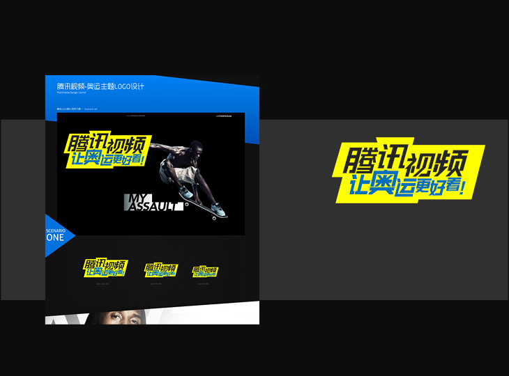
The design of this part is the logo design of the channel column before the Olympics. In order to make the final design draft have a sporty character, the strokes are all slanted and concise. In addition, through the horizontal typesetting of staggered characters, the whole text is more lively. Finally, yellow and blue are used to highlight the feeling of youthful vitality.
This article Tencent e-commerce user experience department
Articles are uploaded by users and are for non-commercial browsing only. Posted by: Lomu, please indicate the source: https://www.daogebangong.com/en/articles/detail/Font%20Design%20Getting%20Started%20for%20Experts.html
 支付宝扫一扫
评论列表(196条)
测试