Complement font library: Many fonts that everyone likes, such as some Japanese and Korean fonts, are not complete in Chinese, often only have more than 10,000 Chinese characters, and our Chinese characters must at least reach GB18030 -2000 standard requires 27533 Chinese characters ☜
Many people randomly find a font library with full characters to fill in, but the problem is that after adding, the size, thickness, and position of the font are messed up:
|
For example, the picture above:Enlarge it and look at it. The size and position of the font can be described as messy.
This article teaches you how to better supplement the font library from several aspects:Font weight adjustment, font size adjustment, font position adjustment, character width repair.
Font Weight Adjustment
Take the regular font of Japanese black body游ゴシック as an example , the regular English name of this font is YuGothicUI, and the original font has only 12721 Chinese characters:
|
If you put this little character on the phone, half of the Chinese characters on your phone will not be displayed. After comparison, I decided to use Pingfang font as the base to expand the font library.
Here we randomly find a font with a little more strokes. Compare the thickness of Youゴシック Regular and Pingfang Regular:
|
|
Pingfang Regular | 游ゴシックRegular① |
Compared and found that the Regular of 游ゴシック is obviously thinner than the Regular of the built-in font Pingfang.After several tests, the font of 游ゴシック is bolded, and the Bold parameters are vertical and horizontal If you fill in 8, it will become the same as Pingfang Regular(How to bold, I have a tutorial here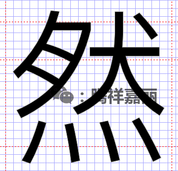 In-depth font tutorial - how to change a single-weight font into a multi-weight font ):
|
|
Pingfang Regular | 游ゴシックRegular② |
Font size adjustment
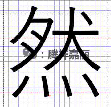
After the above adjustments, the thickness remains the same, but if you zoom in, you will find the processed 游ゴシック Regular font, which is better than Pingfang Regular A little smaller, obsessive-compulsive disorder and perfectionists, even if it is a font that is freely shared with everyone, they cannot tolerate such small problems, although the font is shrunk and everyone can't see it. After comparison, it is decided to enlarge the 游ゴシック Regular font to 101% horizontally and 102% vertically.Here we use the Scale parameter, where is the Scale, I have introduced in this article FontCreatorProv11.0.0.2388>, after processing, the size is also unified:
|
|
Pingfang Regular | 游ゴシックRegular③ |
Font Position Adjustment
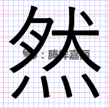
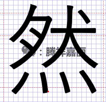
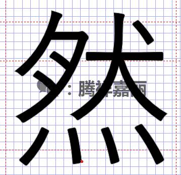
Through bolding and slightly larger font, the two fonts are basically the same, but you can find it through the reference line, 游ゴシックRegular It is still a bit higher than Apple's Regular font, so after the comparison, use the Move command to move the font down by 50 pixels. The Move command is introduced here FontCreatorProv11.0.0.2388>:
|
|
Pingfang Regular | 游ゴシックRegular④ |
Well, after some adjustments, the two fonts are basically the same in terms of thickness, size, and position, of course, the font is different, this font It is what we need, no need to adjust.
Compare the parameters by testing several characters with many strokes, and then use FontCreator to modify all the Chinese characters of 游ゴシックRegular in batches according to the above parameters.
Character Width Adjustment
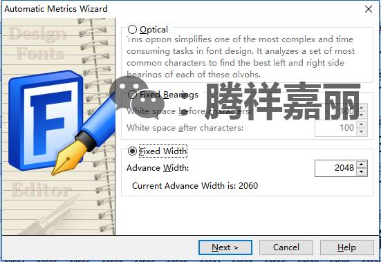
In the second step above, we enlarged the font. After the font is enlarged, the width of the grid on the side of the character will also be enlarged easily. For example, You ゴシック Regular, the default character width is 2048, after adjusting the size according to the above, you open a Chinese, look at the red dotted lines on both sides of the Chinese characters, the dotted line becomes about 2060< /strong>, if you put it in the phone, there will be problems.
①. Adjust the repaired character width to the original 2048
|
|
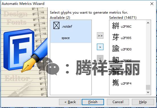
Set parameters | Select Chinese |
Open Autometrics in FontCreator, as shown in the first picture, fill in 2048, in the second picture, select all Chinese symbols, and then click Finish to complete the repair.
So far, this 游ゴシック Regular font has been adjusted, and Pingfang Regular can be used to supplement the font library. But before supplementing the font library, there is still a problem: Adjustment of the font layout size.
②. Header layout size adjustment
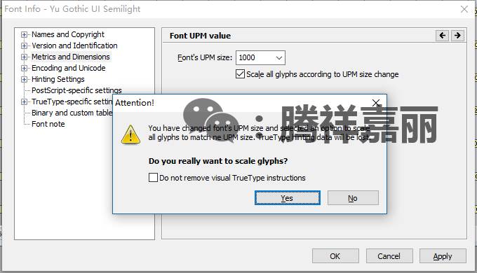
The new ゴゴシック Regular font saved after the processing just now is opened with Fontlab, and then press the shortcut key Ctrl+Alt+F to bring up the font layout Sizing:
|
As shown in the picture, adjust 2048 to 1000, then click OK, then click Yes in the pop-up prompt box, and then save it as a new TTF file. Apple is very particular about the size of this layout. Both iOS9 and iOS10 are 1000. For systems before iOS9, it can be solved by scaling up the parameters in the same proportion without modification, but iOS9 and iOS10 must be kept at 1000 like the fonts that come with the system.
At this point, one of the weights of this font has been repaired. After the repair, we can cover this repaired font into the Pingfang Regulr font, and the font library will be complete, and The size, weight, position, and width of the font are also uniform.
How to override? I will find time to tell you the next one.
In addition, this is just a word weight process. High-quality fonts generally have 5 or 6 weights, so it is still a bit complicated to make a good font.
Review of Past Typography Tutorials
Tool Download
Follow this official account, replyFontCreatorGet .
.
If you like it, remember to appreciate a little pocket money
For more resources, please click read the original text in the lower left corner!
Articles are uploaded by users and are for non-commercial browsing only. Posted by: Lomu, please indicate the source: https://www.daogebangong.com/en/articles/detail/Font%20Depth%20Tutorial%20%20Complementary%20Font%20Library%20Adjustment%20of%20font%20size%20position%20thickness%20and%20width.html



 支付宝扫一扫
评论列表(196条)
测试