Author: Liu Baikun
Qian Juntao (1906-1998) designed more than 4,000 kinds of books and periodicals in his lifetime, which is so large that his peers cannot be compared. His early works were similar to those of Tao Yuanqing, but he gradually absorbed Japanese pattern styles, borrowed from European futurism, cubism and constructivism, and then integrated the essence of Chinese painting, calligraphy, and seal cutting, and finally formed his own design language.
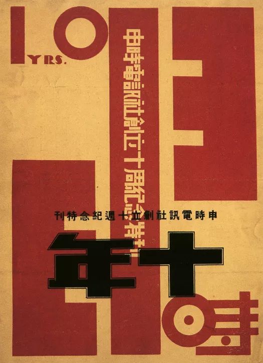
Special issue commemorating the 10th anniversary of the founding of Shenshi Telegraph Agency, 1930
His designs in the 1920s and 1930s present a surprisingly diverse appearance. On the one hand, they imply the blood of traditional Chinese visual culture, which are subtle, meaningful, concise and generous; It was also deeply nourished by the new culture of the May Fourth Movement, breathing with the latest international trends, unconventional in composition, color, and shape, and new ideas emerged endlessly.
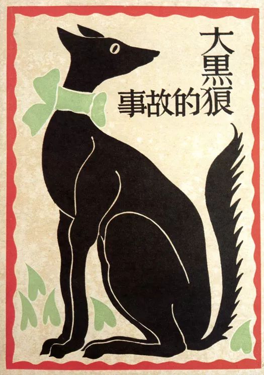
The Story of the Big Black Wolf, 1930
The fonts in the above books and periodicals are beautiful and sharp, and their shadows can also be found in modern fonts. Similar ones include Founder Yao Style and Founder Extraordinary.
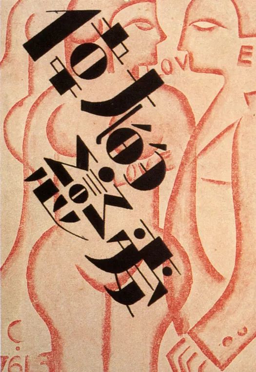
Great Love, 1930
I like the font in "The Great Love" very much. It uses a combination of dots, lines and planes, which is very design sense.
From these designs, people can feel the agitation and transformation of Chinese and Western cultures, the active information circulation in Shanghai, a modern city, and the surging passion of a designer in the great era. After liberation, Qian's designs tended to be clean and tidy in a minimalist style, with exquisite lines and elegant colors, achieving an old and firm, clear and cheerful realm.
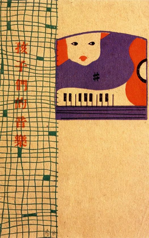
Music for Children, 1930
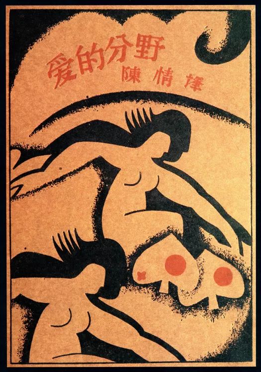
The lines of love, 1929.
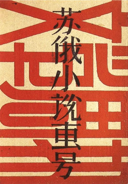
Soviet Russian Novels Special Issue
Modern Woman, 1933
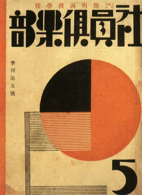
Members' Club, 1930
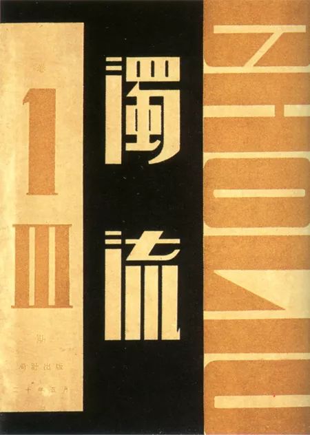
Turbid Current, 1931
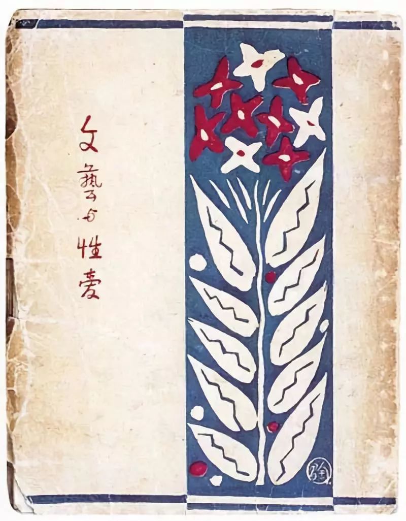
Art and Sex, 1927
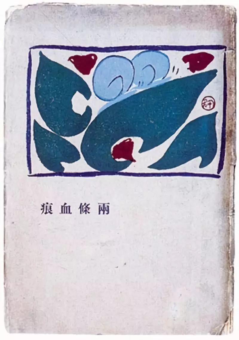
Two bloodstains, 1927
Bannong Pale Shadow, 1927
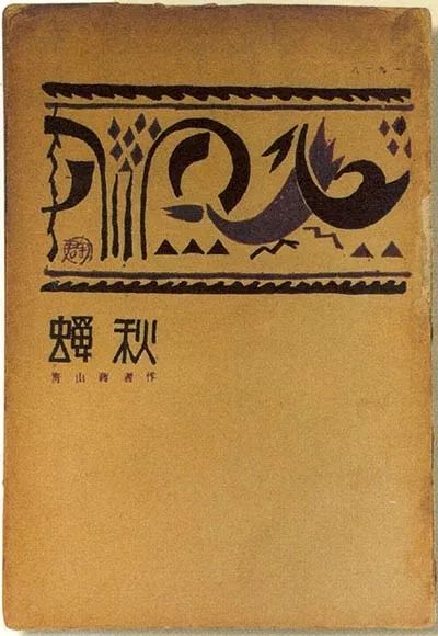
Cicada, 1927
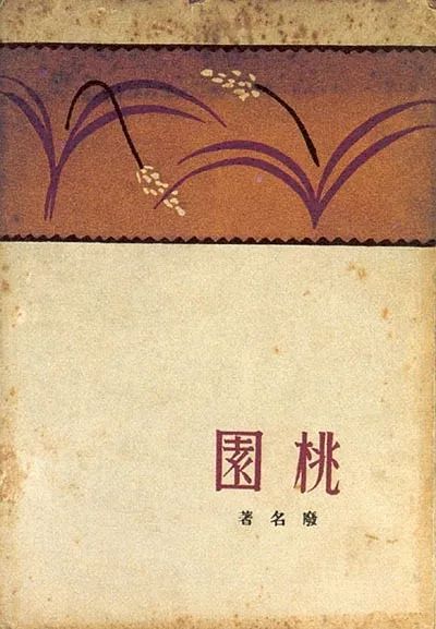
Taoyuan, 1928
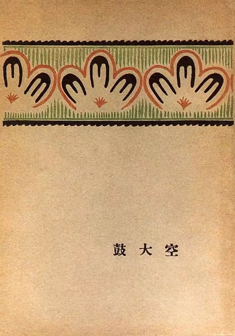
Empty drum, 1928
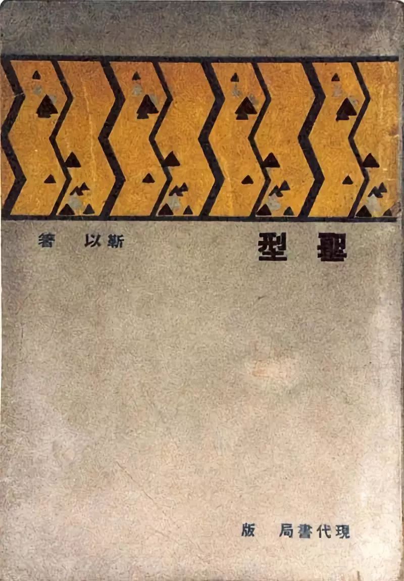
st Type, 1933
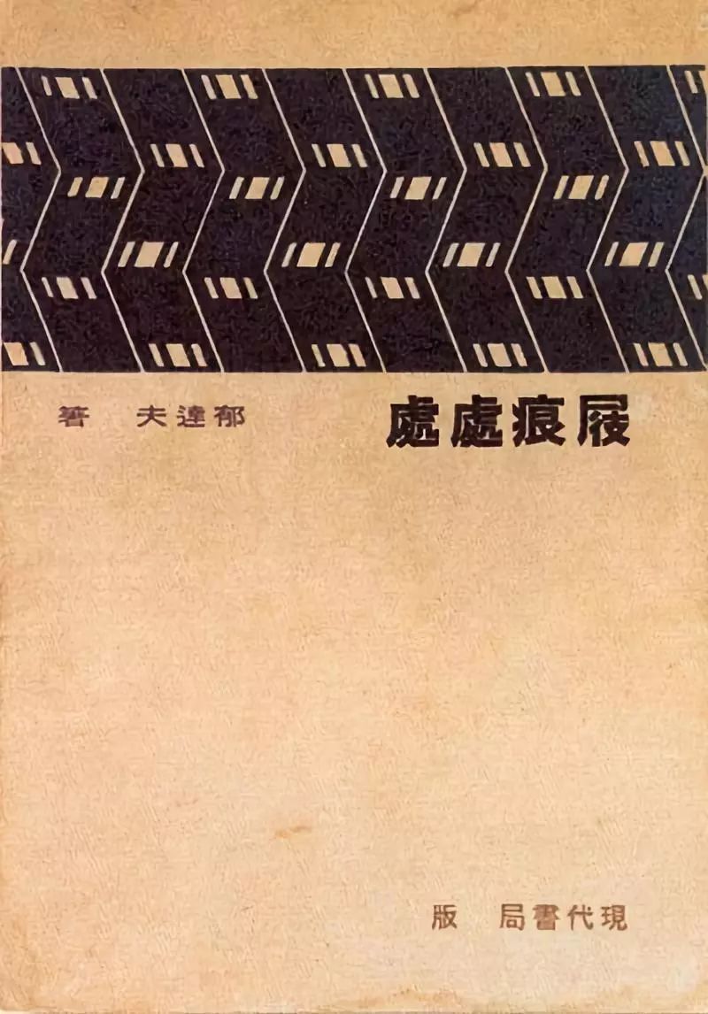
Clog marks everywhere, 1934
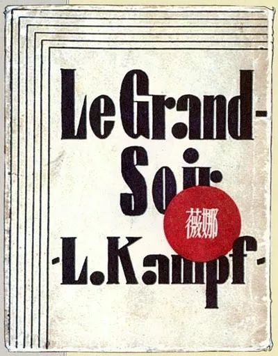
Vina, 1928
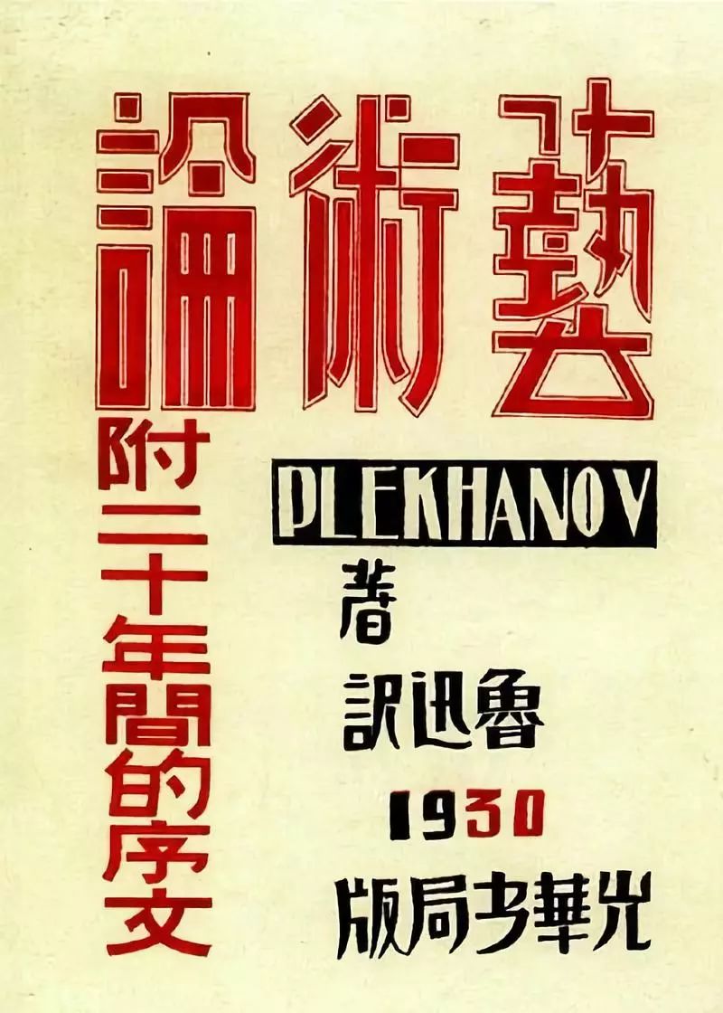
Art Theory, 1930
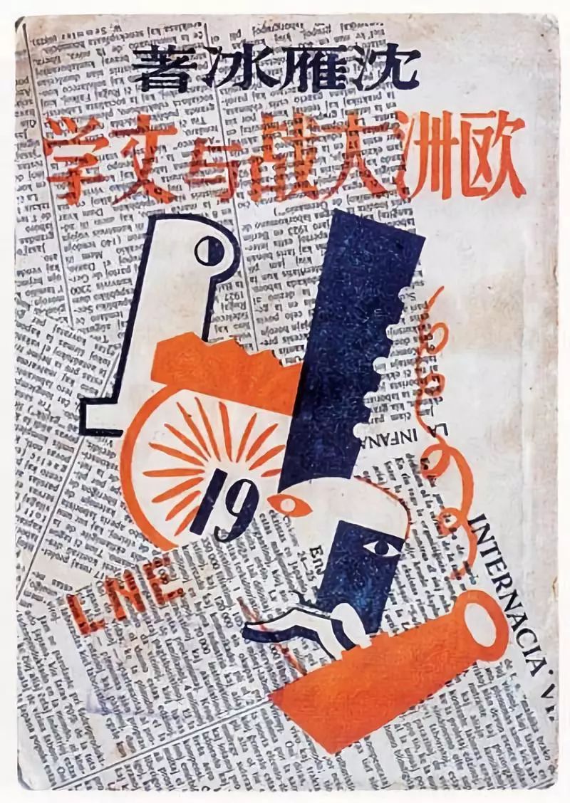
The Great War and Literature in Europe, 1928
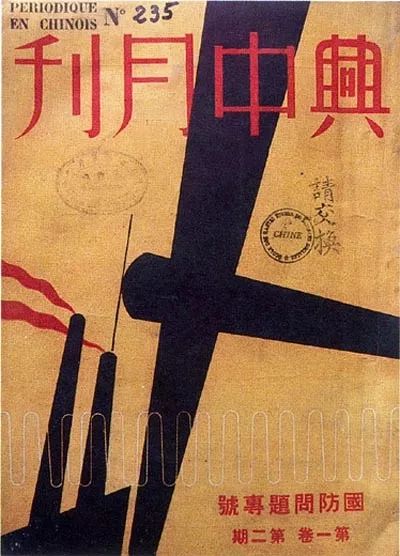
Xingzhong Monthly, 1937
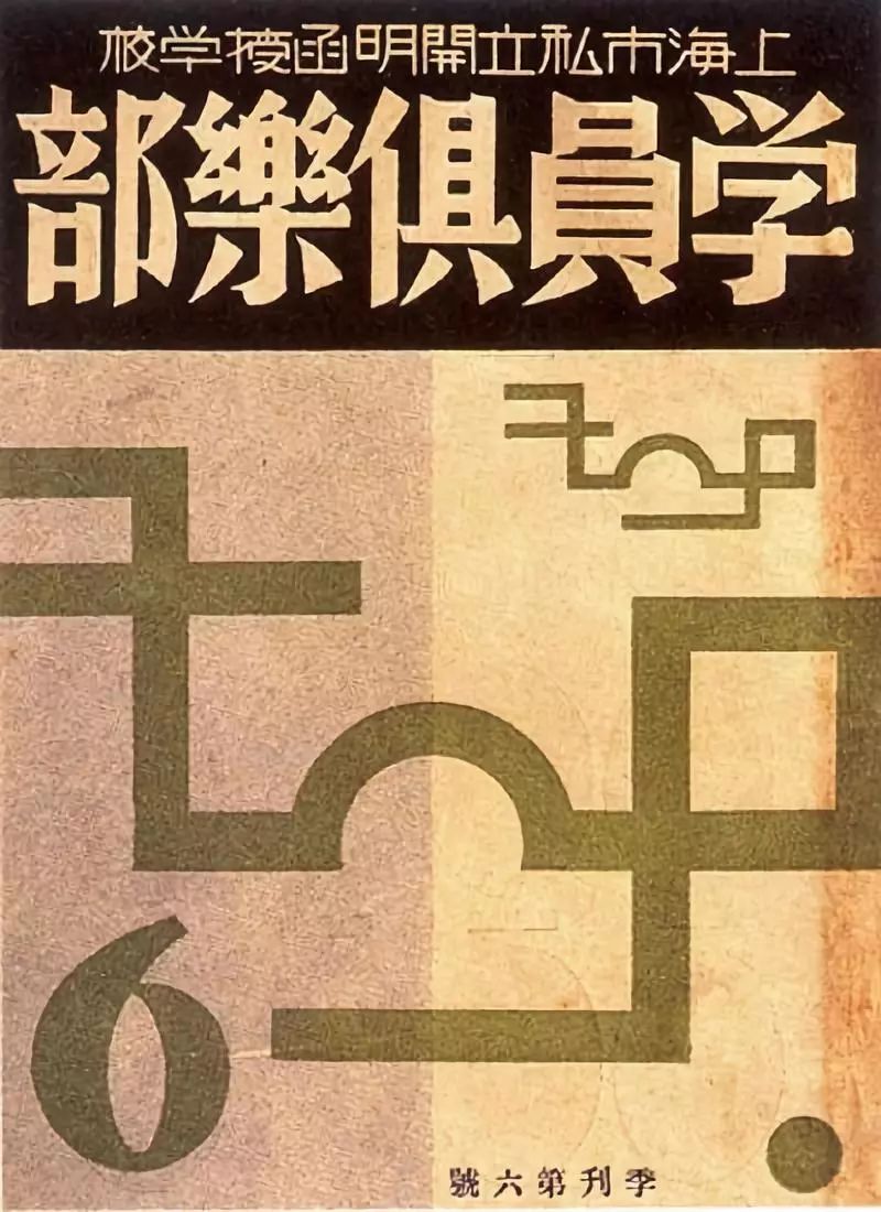
Shanghai Private Enlightened Correspondence School Student Club, 1930
Articles are uploaded by users and are for non-commercial browsing only. Posted by: Lomu, please indicate the source: https://www.daogebangong.com/en/articles/detail/Follow%20the%20master%20to%20learn%20font%20design%20%20book%20design%20master%20Qian%20Juntao.html
 支付宝扫一扫
评论列表(196条)
测试