-
This content, from Feilong, is divided into two parts:
Part 1: Tutorial on "Fatty" typeface design.
The second part is a summary of the fonts that Feilong posted on the Zaku homepage some time ago.
PART1
"Fat body" font design tutorial< /strong>
Preface
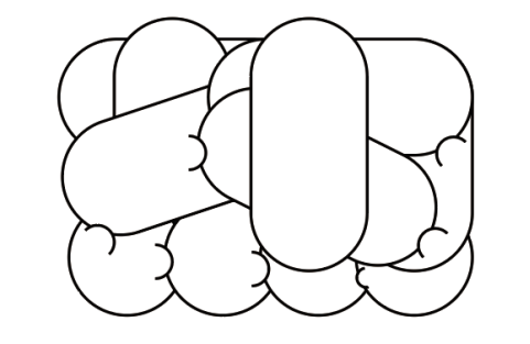
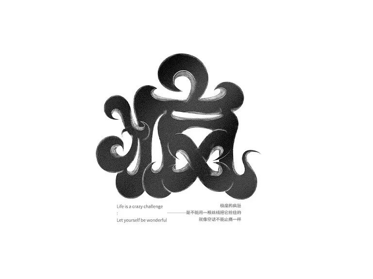
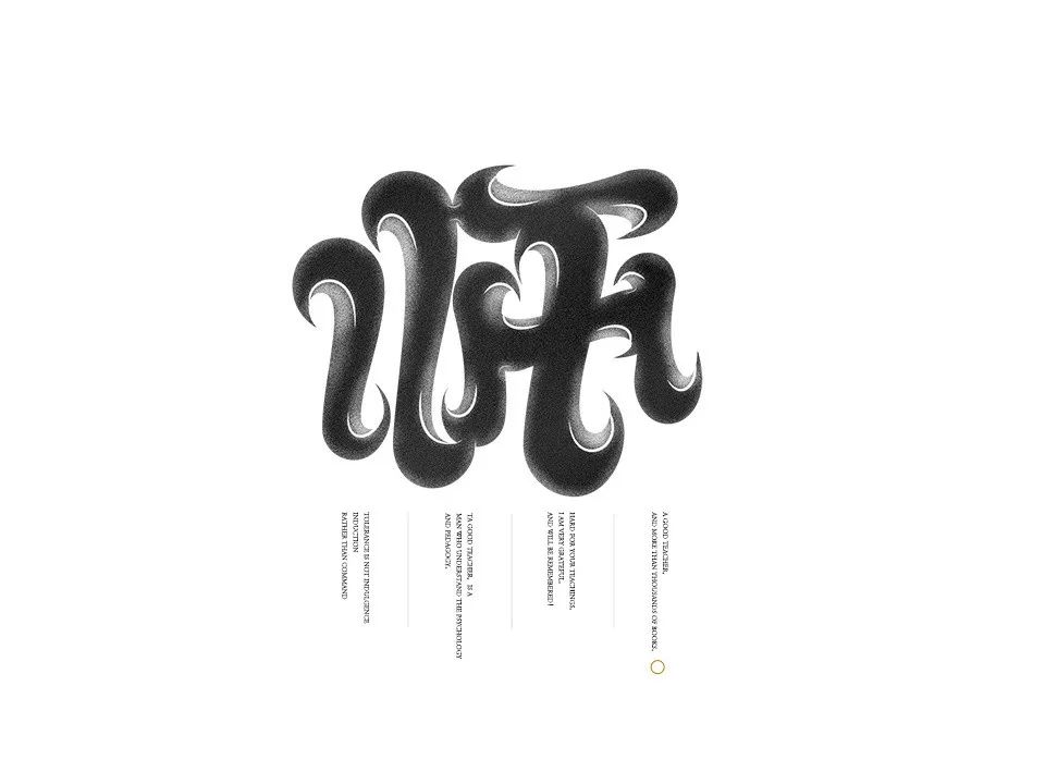
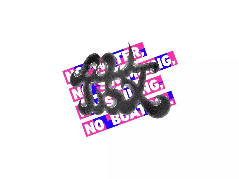
Today’s tutorial takes the group of characters “lively” as an example. The characters are formed by stacking, and the strokes are interlaced and extruded. glyph.

This type of font has evolved from the POP font (interested friends can go online to learn about the POP font).
(picture source Baidu, invaded and deleted)
1. Analyze this type of glyph, and besides studying the structure of this type of glyph, you also need to pay attention to the relationship between each stroke.
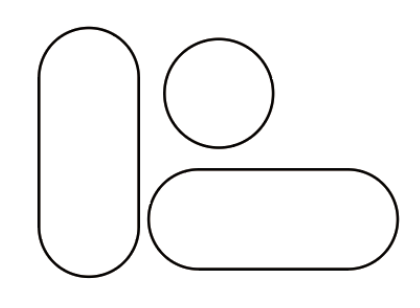
determines the thickness of the strokes. In this case, the horizontal and vertical strokes are rounded rectangles, and the point strokes are circles, filled with white, and stroked black with 1 pixel.
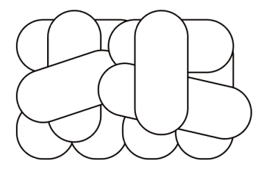
2. After confirming the strokes, stack the glyphs with the basic strokes. During the stacking process, you need to pay attention to the hierarchical relationship of the strokes and the overall recognition. (ctrl+[ and ] to adjust layer order)
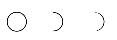
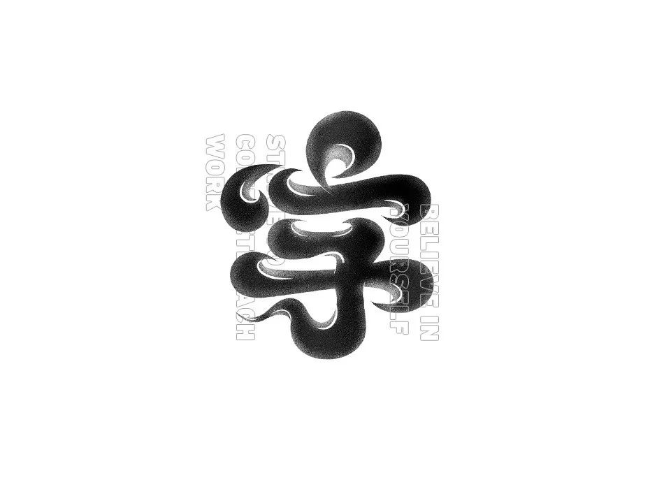
3. After confirming the general shape of the font, it is found that the font is too rigid, which needs to add fun and squeeze between the strokes.
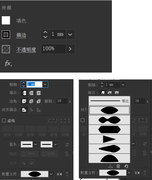
Draw a small circle with the same fill and stroke in the previous step, use the direct selection tool to directly remove the anchor point on one side, and then select the stroke in the property bar and select the configuration preset with two pointed ends to get the semicircle crease effect.
4. Place the finished semicircular creases flexibly at the stacked strokes (the effect is roughly that the strokes on the upper layer squeeze the strokes on the lower layer) pay attention to the hierarchical relationship (adjust the layer order)

5. After doing this, if the picture still looks dull, you need to sort out the relationship between the strokes of the characters clearly, and make the characters simple and lazy.
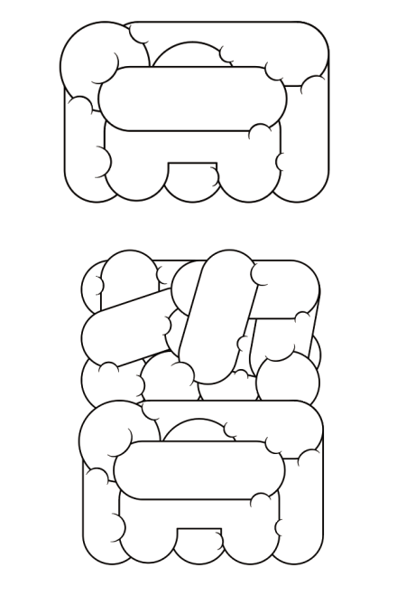
6. The same is true for the word Nao, and the two characters are stacked together to form a complete whole.
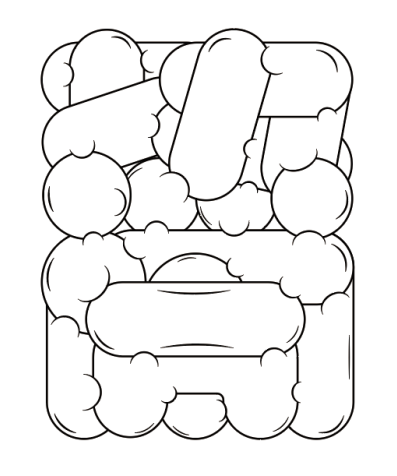
7. As in step 3, add other crease effects, add edges and strokes to create a sense of extrusion, and optimize the overall details.
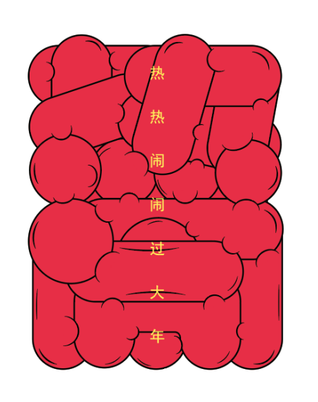
8. Finally, the color is toned, and the excitement should be booming, so I chose the noisy red, and then added decorative text to the middle of the overall text. forming.
This is the end of the tutorial, thank you for your support!
PART2
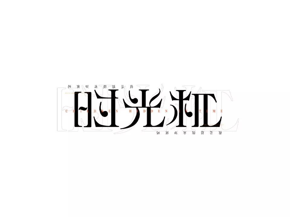
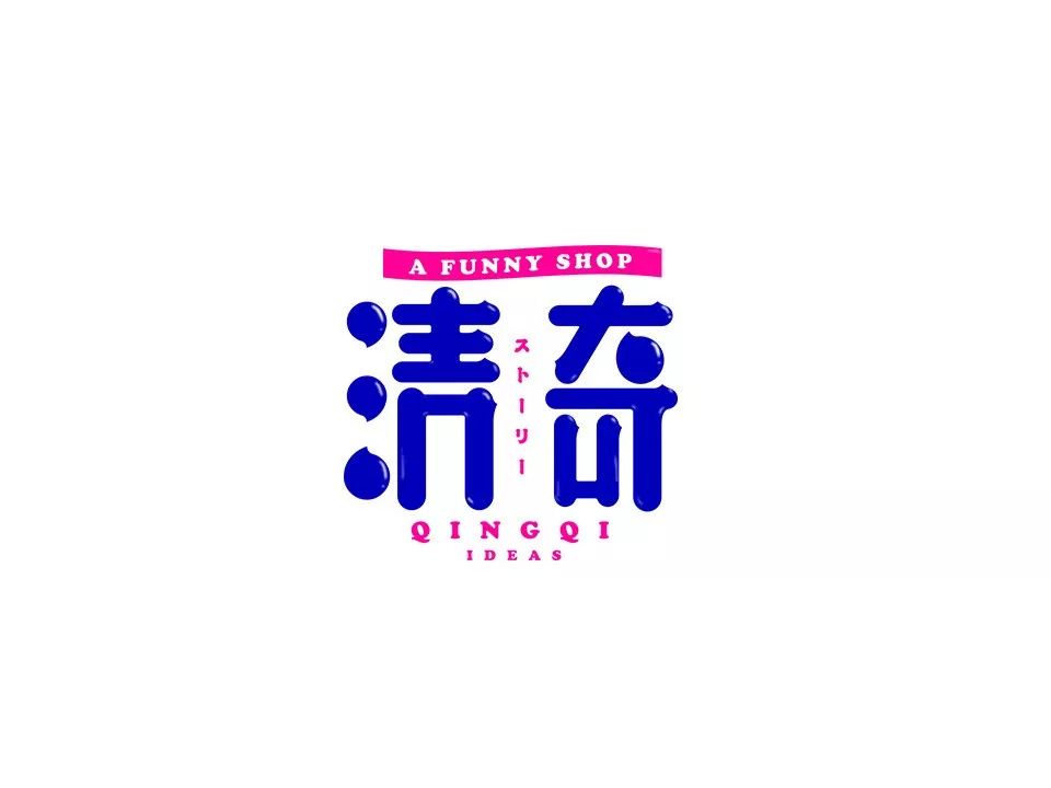
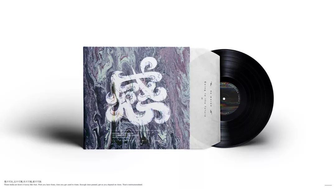
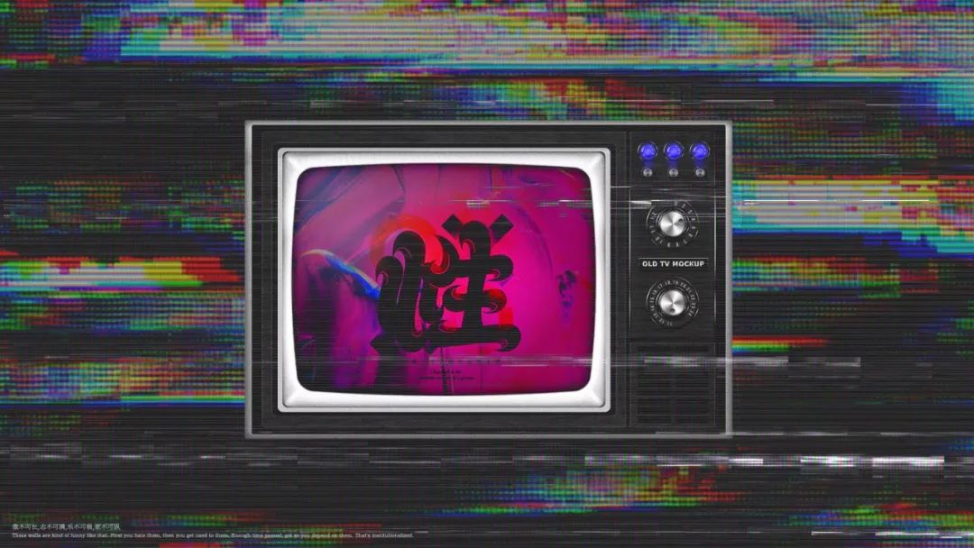
Dragon< span>Font Collection
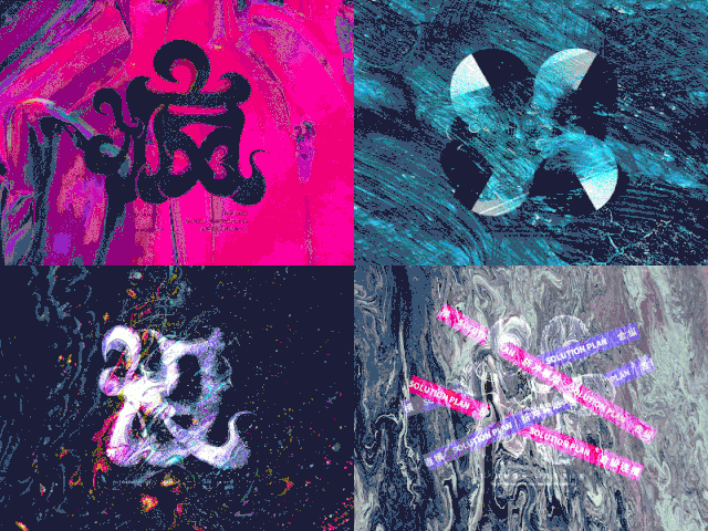
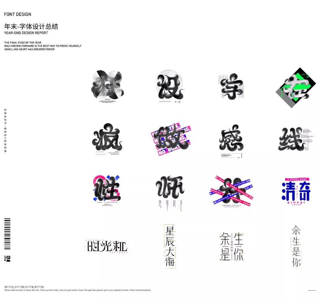

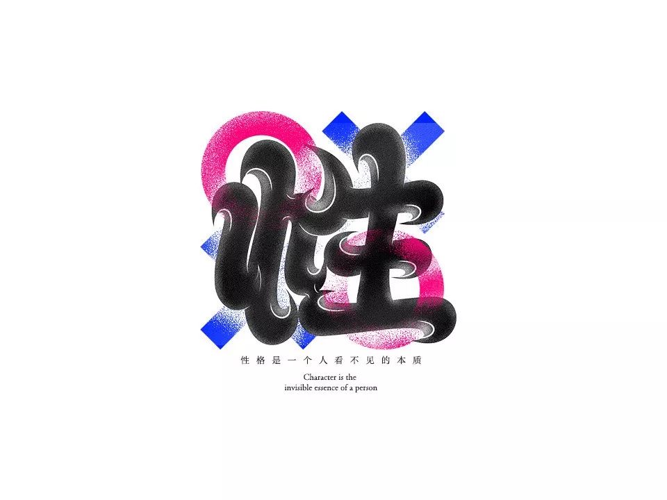
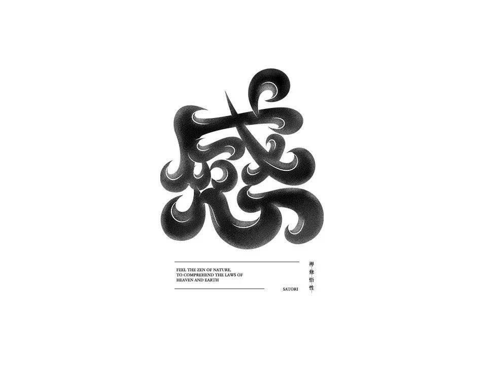
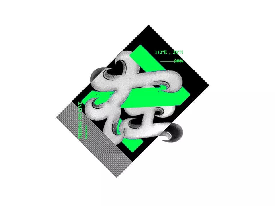
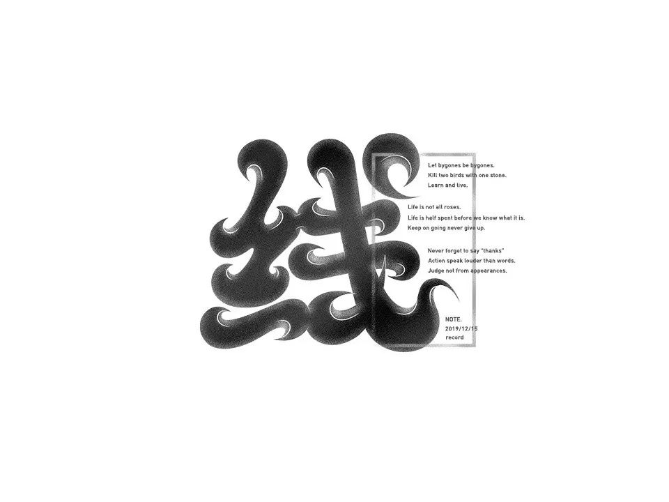
Crazy/Crazy/Design/Design/Teacher/Sex/Sense/On/Online/Do/Word
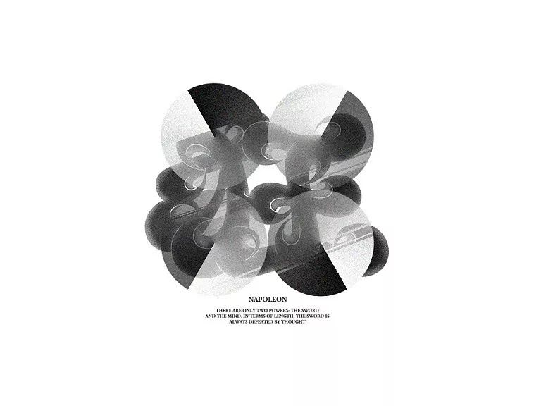
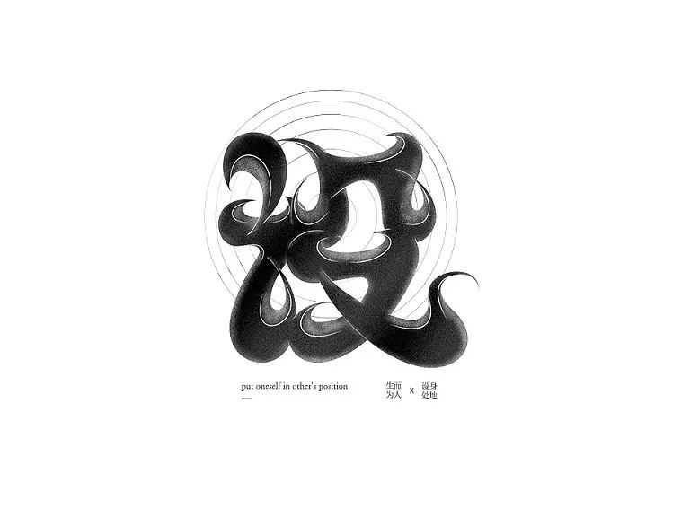
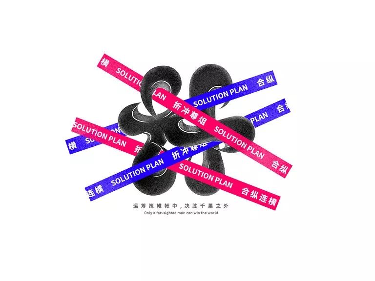


Well, there are also tutorials and works, which are nutritious and eye-catching, so delicious!
Recommended recent tutorials
▼


-
Click the lower left cornerRead the original text
EnterFlying DragonZhanku Homepage
Articles are uploaded by users and are for non-commercial browsing only. Posted by: Lomu, please indicate the source: https://www.daogebangong.com/en/articles/detail/Fat%20body%20font%20design%20tutorial.html
 支付宝扫一扫
评论列表(196条)
测试