Editor: Scallion Author: Liu Baikun
Every designer may want to create their own set of fonts, but there are many challenges in the conversion between artistic fonts and fonts. Are you ready? Let's take a look at the designer Wenxi, who has loved hand-painting since she was a child, and has inextricably communicated with pens. She is currently studying a master's class in the Department of Visual Communication Design, National Yunlin University of Science and Technology.
For Minxi, artistic calligraphy is not just words. They have emotions like people, and people of different ages and industries have different preferences for fonts. For example, "thick, thick, and large" are common characteristics of fonts in the food industry.
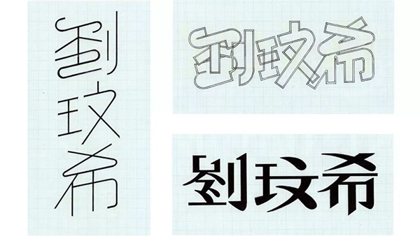
Fonts are not just a carrier of information, they can also reflect one's personality and self-expectations. Wenxi wanted to be harmonious, so she drew the characters on the left; she liked the sense of variety, so she designed the characters on the upper right; she hoped that she could become more stable, so what appeared in the pen was the more classical shape on the lower right. (The following figure)
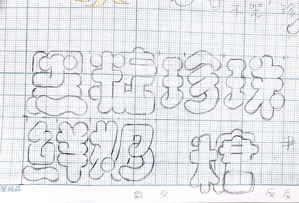
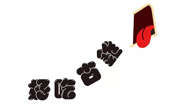
Her six-character hand-painted "Brown Sugar Pearl Fresh Milk" has strong characteristics and belongs to the category of artistic characters. There is a fundamental difference between the design logic of artistic characters and fonts. Artistic characters usually have more personal characteristics, while fonts are designed based on the concept of modularization.
A complete set of fonts will follow detailed design specifications. The designer will first define the basic stroke shapes, and then assemble them into individual characters. However, Minxi's "Brown Sugar Pearl Fresh Milk" involves a high degree of personal judgment in terms of shape design and stroke reduction. Is there really a way to turn this into a consistent font?

When artistic characters become typefaces: four challenges that even word-making software does not help
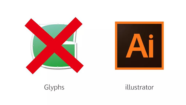
People who want to make characters, most of them know the character-making software "Glyphs", which can help you pre-set curves, and also has tools to help you adjust strokes. If you can make good use of Glyphs to make characters, your production efficiency will be greatly improved.
Minxi was also eager to try at the beginning, hoping to use Glyphs to complete the fat skin. But she soon discovered that the liveliness of casual thinking has become a dilemma in making fat skin.
Fat skin is difficult to pre-set modules with Glyphs, and pen types cannot be used. The key overlapping effect cannot be produced with Glyphs. Wenxi had no choice but to go back to find the designer’s best friend forever—illustrator, and started a journey of font design full of challenges.
Challenge 1: Every word has to be drawn again after entering illustrator
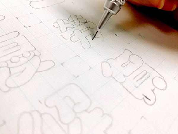
Facing the goal of 300 characters, Minxi had to draw and take pictures one by one on graph paper, and then uploaded to illustrator to draw out the desired shape again. It is conceivable that this process must be time-consuming and labor-intensive...
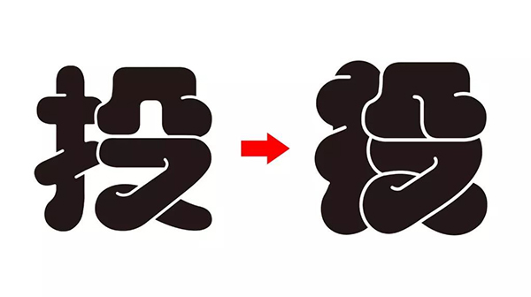
Challenge 2: The strokes are very different, but they look like they come from different fonts
Hand-painted is good and bad, with two sides, the advantage is high mobility, and the disadvantage is high variability. With the change of the current physical and mental state, the curvature of the lines and the shape of the strokes will be different. For example, if you look at the two characters "pay" and "eagle", you don't think there is a difference in one character, but when you juxtapose them, you will find that the curvature of the two characters is completely different. The corners of "Eagle" are relatively round, while the corners of "Reward" are relatively square.

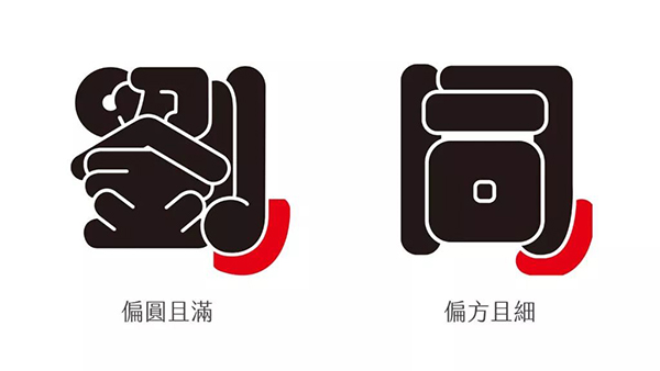
Therefore, Wenxi went back to correct the shape of the strokes, and changed the endpoints of the horizontal strokes into rounded corners with consistent radians. During the process, she also found other differences, such as the curvature of the strokes of "Liu" and "Tong", and "Liu" is closer to a circle than "Tong".
What is increasing day by day is not only the number of words, but also more and more difficult to control the differences in pen styles. This made Wenxi return to the original intention of making fat skin, and reflect on the fundamental difference between artistic characters and fonts.
In the world of hand-drawn artistic characters, random creation is full of flexibility, reflecting the most natural, sincere and straightforward self. But when it becomes a set of large-scale fonts for public use, the consistency of style must be the primary consideration, and creators have to gradually cut the fonts into independent entities that exist objectively and can be copied.
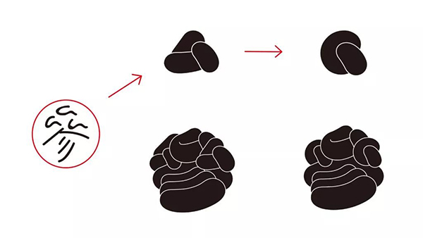
Considering that this depends on the definition of design specifications, Wenxi also began to draw up a perfect "basic pen shape". Her design ingenuity can be seen everywhere, like the strokes in the lower left corner, it looks like a wheel! That is the shape of the third stroke of "Zhen" in "Pearl".
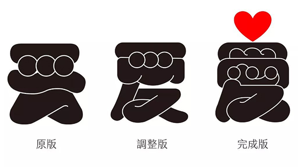
Challenge 3: The more words you do, the more obvious the balance problem
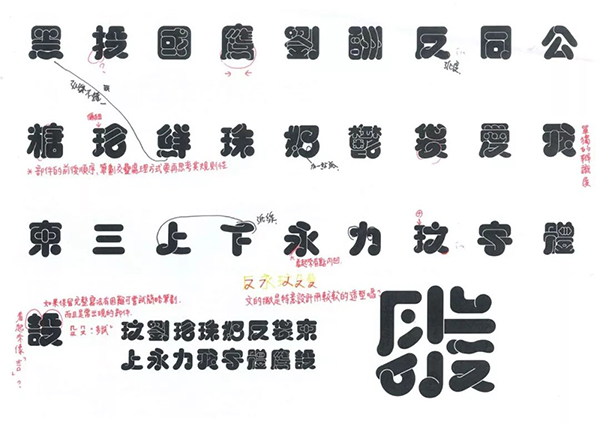
Although the basic pen type was standardized, as the number of words produced increased, Wenxi found that these words did not look like the same set. Their centers of gravity are different in height and strokes are also different in width. Words and sentences read high and low, thick or thin, and lack a neat and aesthetically pleasing stylistic consistency.
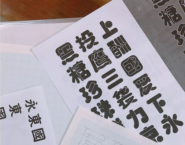
Wenxi simply increased the thickness of all characters uniformly, so that all strokes were promoted from bold to heavy. In addition, she also made the characters closer to the frame, and reduced the white space between the strokes (that is, the "character cavity" in a broad sense), so that each character has a full and rounded characteristic.
Min-hee even made the white line jump to the main position. She canceled the accent, and the white line became the key for readers to recognize the characters. Such a design is of course very bold, and it has become one of the most important features of Pangpi.
Challenge 4: In addition to the basic rules, how should special strokes be handled?
The most mysterious and intriguing part of font design is the process of keeping improving through repeated inspections. After adjusting the font size to heavy, Wenxi immediately found that the standard basic pen shape was invalid again! For example, the "ㄙ" of the word "虚" obviously has too many strokes after being thickened, so she adjusted the stroke order and streamline of the handwriting. Not only is two strokes reduced to one stroke, but the shape of the strokes is also changed to a circle.
In addition, like the word "love", it was originally shaped like a platypus, gingerbread man, and it looks a lot like the word "shou"! As the accent gradually shrinks until it becomes a white line, the word "love" finally has a full and rounded appearance, which is also the feeling that Wenxi wants to present.
Fat skin: a font that evokes the memory of Taiwan's traditional market
When Minxi designed Pangpi, she had Taiwan's traditional markets in mind. It is always shrouded in bright colors, with a large bright canvas covering the head, and hundreds of mothers-in-law carrying blue, green and red nylon bags shuttle through it. They were busy looking at the bold letters on the signboard, just to arrange meals for their families.
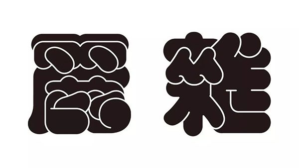
The fat skin is rounder than the round bodies currently available in Taiwan. It is so full that even if a lot of strokes are saved, it still feels super full. For example, "丽" in "beautiful", many strokes of "鹿" below are obviously overlapped, but it is still recognizable as "丽".
This kind of overlapping of strokes is not only a challenge for Wenxi, but also the fun of making characters. How to stack when there are many strokes? Just thinking about it while doing it.
For example, the "everyone" in the middle of the word "miscellaneous" is stacked together, and there is a cute feeling of being closely related; as for the word "xue", refer to the essence of learning, treat the strokes as information, and digest and absorb them all!
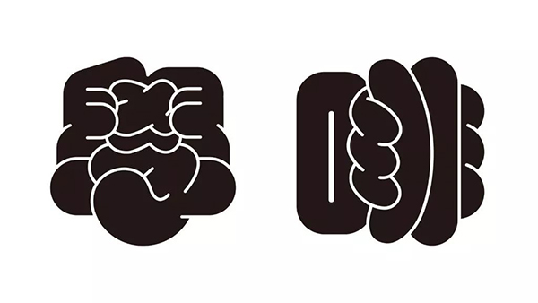
What about the "non" in the character "饭"? Don't write it as a flat three horizontal lines! Change to the image of the hand holding the object. These judgments seem random, but they also make the strokes made by the software full of vitality, so they are closer to Wenxi's original intention of creating characters—hand-painted fonts full of touch.
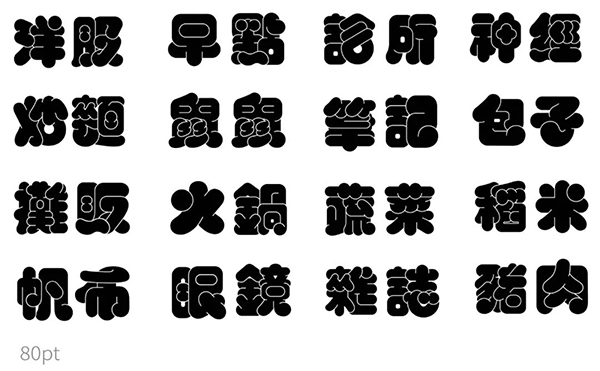
As for the ideal way to use the fat skin, since its strokes are more stacked, it is better to be bigger. Its features can be clearly seen only when the character level is above 36 pt. Of course, it can be enlarged to 80 pt, which will be even better!
Fonts that maintain the temperature of the hand
Each set of words has different advantages and difficulties. Pangpi's liveliness comes from the freedom of hand-painting. However, once he stepped into the category of fonts, accompanied by tool conversion and specification requirements, the lack of fixed guidelines for hand-painting also became the biggest shackle of Pangpi.
This is also the reason why Minxi still strives to leave a "hand feel" when she sets the benchmark for the fat skin. She was still the girl who loved hand-painting and curves deeply. When the lines must be assisted by software, she turned the overlapping strokes into warm stacks.
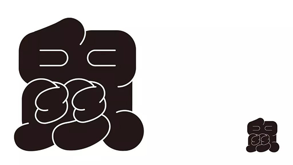
The upper half of "Mouse" is like Bi Zan's thumb, and the lower half is not only like clasped hands, but also like a partner who is hugging tightly. It is not for other reasons, but to be loyal to the original intention of creation.
Articles are uploaded by users and are for non-commercial browsing only. Posted by: Lomu, please indicate the source: https://www.daogebangong.com/en/articles/detail/Experience%20%20The%20challenge%20from%20artistic%20fonts%20to%20fonts.html
 支付宝扫一扫
评论列表(196条)
测试