@197DESIGN, hello everyone, I met you again. What I bring to my friends today are three simple and rough font design techniques that I commonly use in font design. Here is a summary (you didn’t come to the wrong set, it’s a summary, not a summary. Tutorial) for a detailed method.
Based on Xiaobai's point of view, having ideas but no skills is often a state of partial headache; then this article introduces three simple but not simple methods, which are:
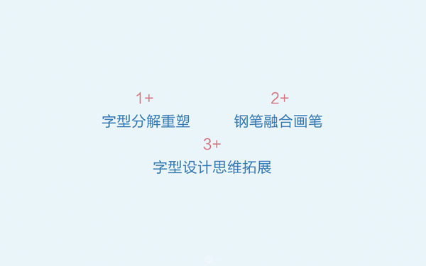
1. Font decomposition and reshaping
Do one thing with your heart, you have already broken away from the zero foundation
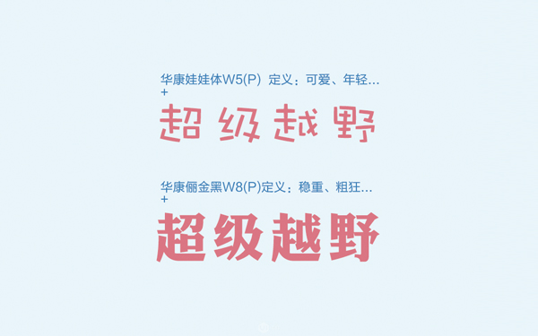
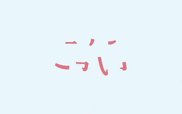
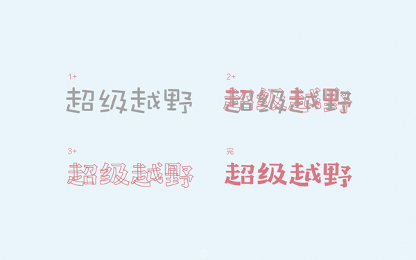
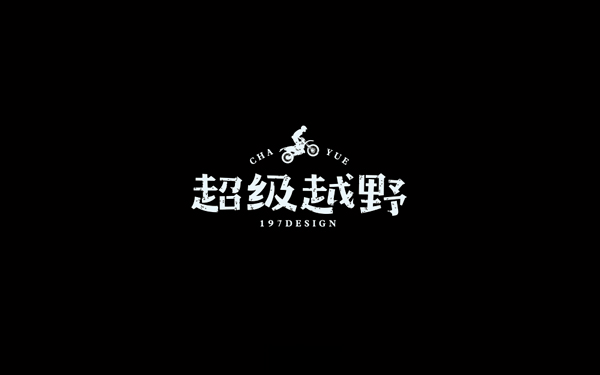
As far as the title is concerned, friends can know that the first method is to split it with font fonts, and then reshape fonts with different styles, so here we use a relatively complicated Analysis and explanation of the font "Super Off-Road".
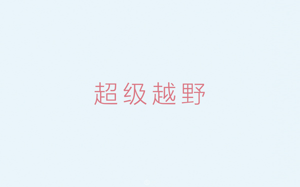
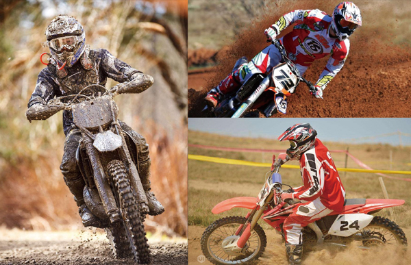
With the design title, what we need to do now is to find two suitable fonts to continue, instead of using a computer to operate from the beginning; for off-road, we can Search the web for visual references:
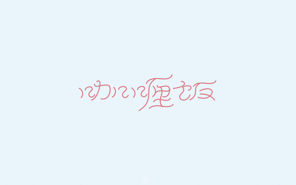
2. Pen fusion brush
The fast era of software
Pen and paintbrush are built-in tools in AI software, so how to use these two tools to increase our efficiency when designing fonts? So let's take a look below.
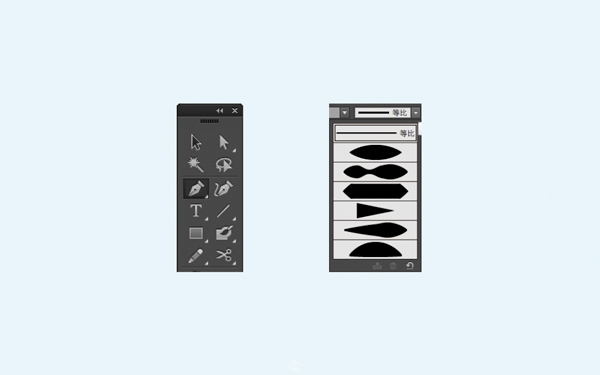
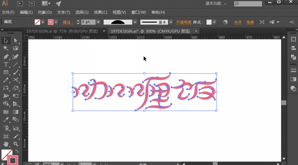
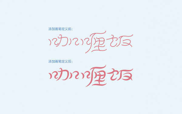
The pen tool (left picture) is mainly used to create paths, that is, to draw outlines and lines; the brush tool (right picture) is mainly to increase the effect of creating paths, reflecting the Various special brushes (the software defines the name as "Variable Width Configuration", which has the same effect as the brush definition tool, so we collectively call it the brush tool here).
When drawing a font with a pen, you need to pay attention to the recognition of the font itself and the space for evenly distributing the font; different styles of brushes, thickness, etc. will lead to a better final effect bad.
As you can see, we have outlined the shape of a group of characters here. At this time, we need to maintain the path shape for later adjustment and modification; there are too many styles of brushes, so we will not With examples one by one, let's use a form to see the effect achieved:
3. Font design thinking expansion
Inspiration will not come out of thin air
Where does the inspiration come from? The answer given by the seniors is to go out more, watch more photography and so on. This sentence is not unreasonable. Paying more attention to the details in life is of great help to our improvement.
Next, we will use the details we see in life to design fonts.
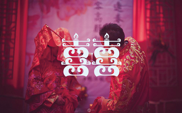
Hey, my first impression is festive, the visual sense of the wedding. Then let's look for references for this type of theme and see what it feels like to be festive; of course, those who have the conditions can also experience the best in person.

What we are looking for here are photos of Chinese-style wedding scenes and Chinese-style patterns (I want to get married as soon as possible after seeing them); these are our sources of inspiration, including fonts The color matching in the later stage has a lot to do with the preparation in the early stage. In other words, the color matching is not to match it after designing the font, but we should be ready how to match it from the beginning.
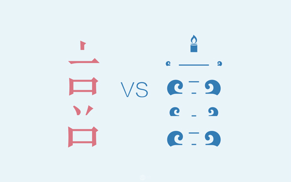
I have finished looking for references, but how to extract related elements? This is a very important issue. The extraction of elements is related to the quality of the font in the later stage, so we need to analyze the font first, make a definition and then extract the elements.
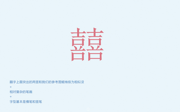
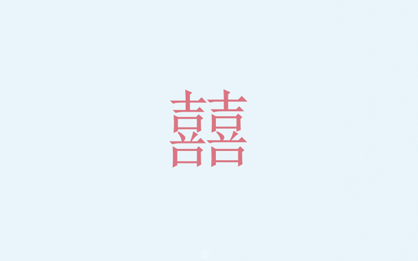
Analyze the font well, and you will know which elements are useful and which are useless for the next extracted elements; we can see here that the analyzed "candle" has become one of the elements. Then we can see that the font does not have relatively complicated strokes, but the basic elements that make up the character "囍" are horizontal and vertical; horizontal and vertical strokes are the most suitable strokes for decorative elements, and they are relatively easy to handle.
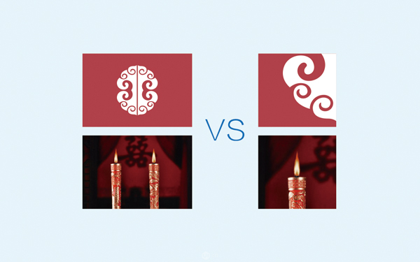
Let's extract the candles and add decorative elements:
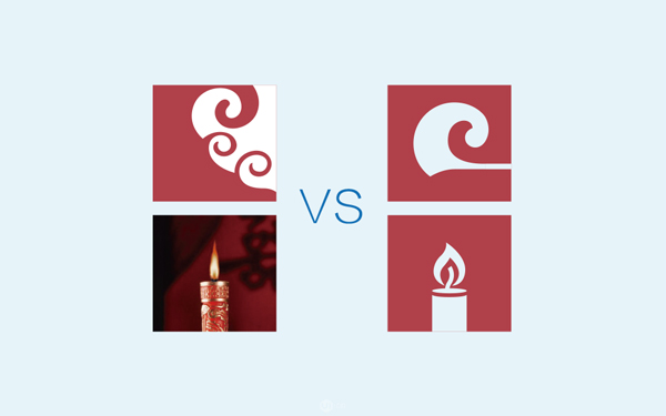
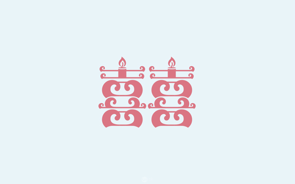
After the elements are extracted, we can split the strokes and compare the modification of the strokes with the fusion of the elements.
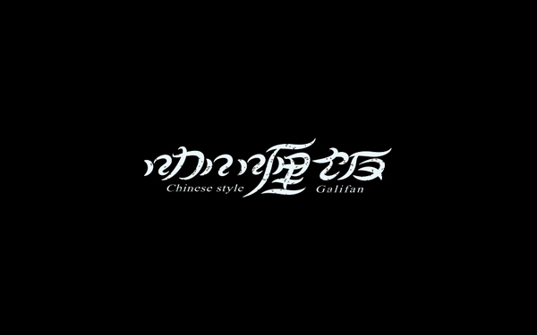
After all the elements are extracted, the font can be combined. The combination process is not to force the elements together, but to adjust the font according to the actual situation, so that The font has reached a relatively comfortable level, so let's take a look at the presentation of the final effect:
Articles are uploaded by users and are for non-commercial browsing only. Posted by: Lomu, please indicate the source: https://www.daogebangong.com/en/articles/detail/Experience%20%203%20strokes%20to%20try%20font%20design%20techniques.html
 支付宝扫一扫
评论列表(196条)
测试