Zhanku Dove Design
www.zcool.com.cn/u/13575288
Why Learn Typography
Font design is still relatively hot in recent years, and the scope of application and scenarios is also very wide. Not to mention planes and brands, it is said that our majority of UI designers will use it in many places, like many apps with many application icons. It is the font design of the brand name to complete, easy to identify and spread, and can carry a certain brand culture.

Or operate the title words in the banner.
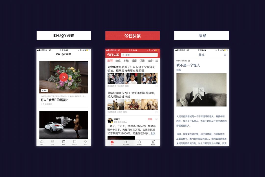
Another example is the font design of the UI page navigation bar.

Such a rough calculation, in fact, there are still many application frequencies and scenarios of font design in our UI field, so everyone can still understand and learn about font design.
General steps in this example font design
The first step: analyze and grasp the font character.
The second step: determine the font structure, this step is very important.
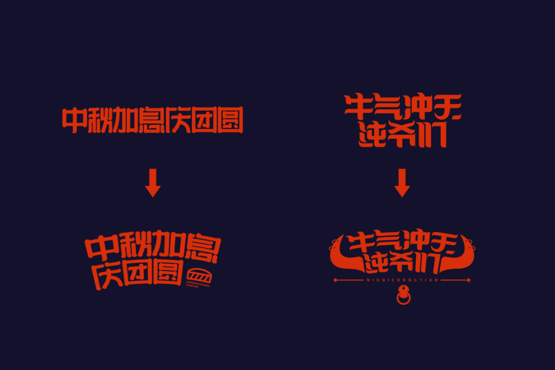
The third part: design appropriate stroke decoration according to the shape and meaning of the characters.
Part Four: Adjust and enrich the details according to the overall picture.
But no matter how you design and change, the most important point is recognition. The visual weight, size, and negative space of each word need to be consistent, but sometimes you have to make a choice according to the actual situation.
The character of the font
Characters of fonts such as Kai, Song, Hei, and Cartoon. Handwriting, etc. will have different personalities.
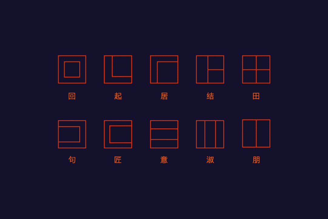
Structure of fonts
There are many types of Chinese characters, and the strokes of the fonts also vary. There is only one stroke at least, and more than 30 strokes at most. There are also relationships between strokes in size, height, length, and density. At the same time, according to the spatial structure There are also upper, middle, lower, left, middle, and right points.

Stroke design
Basically, after the common glyph, that is, the structure of the font is basically formed and correct, the font becomes rich, full and full of design by adding details and modifications that match the meaning and character of the font itself to the strokes. Design and modify the midpoint, horizontal, vertical, left, right, hook, fold, and pick of the font.

However, if the horizontal strokes in a group of characters use a certain form, then other horizontal strokes need to maintain this form to ensure the consistency of the characteristics. Of course, there are special cases, but in most cases, you must use Consistency comes first.
Overall font adjustment
For overall adjustment, you need to look at the effect of the font as a whole. It is possible that a certain word list looks fine, but some problems can be seen when combined together. At this time, it is necessary to adjust it subjectively based on vision, so that they It looks more natural and beautiful, and you can also do some other modifications and effects according to the font and meaning to make it richer and fuller.

I won’t talk too much about the theoretical things this time. If there are too many theories, it will be difficult for some students who are new to font design to understand. Let’s do it first and test the problem in practice.
STEP>
Select the pen tool to outline the strokes, use the pen tool to start sketching the strokes, the stroke trend follows the font itself, select the stroke, and change the thickness to 20, which you can adjust according to your own size, not a fixed value.
In some parts, we need to deform some strokes, such as the heart below. If we follow the strokes of the font library itself, it will appear more crowded or scattered. So we make some changes, and the connection and omission of strokes are used in many font designs. All can be applied, pay attention to the center of gravity of the word, it should be higher, the center of gravity of the two characters should be consistent, continue to draw, some places are relatively empty, you need to use strokes to fill, the lower part of the two characters is the heart character, if this is the case, The characters that will be displayed are relatively dull, but you can symmetrically check the heart below En's to see if it will affect the recognition. This is the premise. If it can be recognized, then we will continue.

STEP>
After the general font is finished, we will make a copy and start the second adjustment. Because gratitude is to express feelings, it is a beautiful and euphemistic attitude, so we can use rounder strokes for our fonts. We choose to directly select the tool and then select two There will be a small white dot at the intersection of the line segments. Press and hold and drag to create an arc effect. You can also double-click the pop-up box to enter the value. You can enter a fixed value and round all the strokes. The values of the same strokes should be as far as possible. Keep it consistent, and there are special cases for special treatment. The whole should be adjusted well, so that it looks comfortable and beautiful.
STEP>
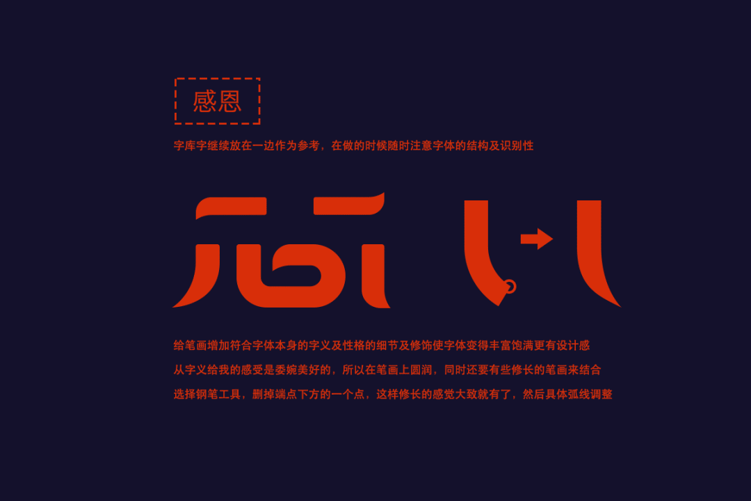
This step is mainly to add details and decorations to the strokes that conform to the meaning and character of the font itself, so that the font becomes richer and fuller with a sense of design.
Thanksgiving gives me the euphemistic and beautiful feeling from the meaning of the words, so the strokes should be rounded, and at the same time, some slender strokes should be combined, so we design the strokes.
You can watch my operation in the video, first select the pen tool, delete a point at the bottom right corner, so that the slender feeling is roughly revealed, and then use the pen tool to make specific adjustments to make the arc smoother and more natural.

STEP>
The overall strokes are basically kept horizontally thin and vertically thick. After the overall effect comes out, the font is a bit square and not very practical. Gratitude should be a more practical and sincere feeling, so press the font as a whole, so that the font will become more stable and practical .
STEP>
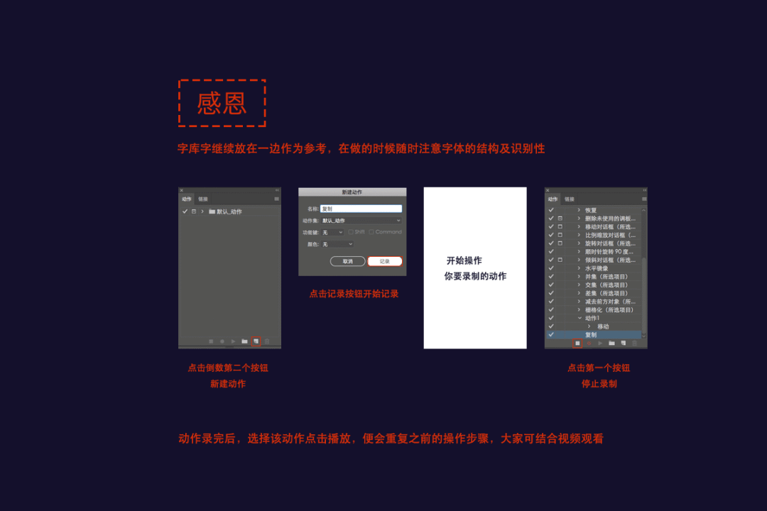
The last part is to add some text effects and enrich some small details. One knowledge point here is the use of the action function. Find and open the action panel in the window, and merge the two words into the path separately, because the three-dimensional effect we made is symmetrical. of.
Click on the word sense, Ctrl+c, and then Ctrl+f, so that a layer is copied on the original image, and there is another layer below. We can lock the top layer and use the bottom layer to create a three-dimensional effect. Everyone See the video operation for details.
Click the triangle in the action panel to create a new action, and then we start recording our action, we press the alt key, and then press the left arrow key and the down arrow key, in fact, this is the operation of copying left and down, Then we click the button to end the action in the action panel to end the recording.
Select the word just copied at the top, and at the same time select the action we just recorded, and click the triangle button on the action panel to get the desired thickness. Merge all the copied layers into a path and convert it into a stroke, so roughly The effect will come out, and the word en is the same.
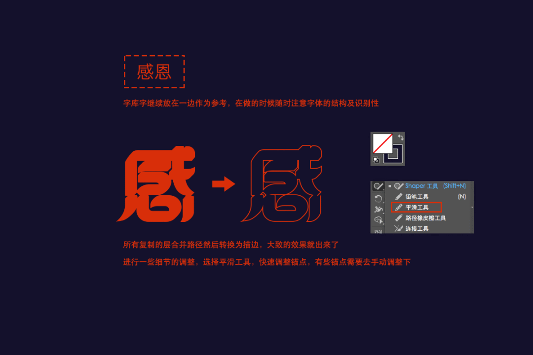
STEP>
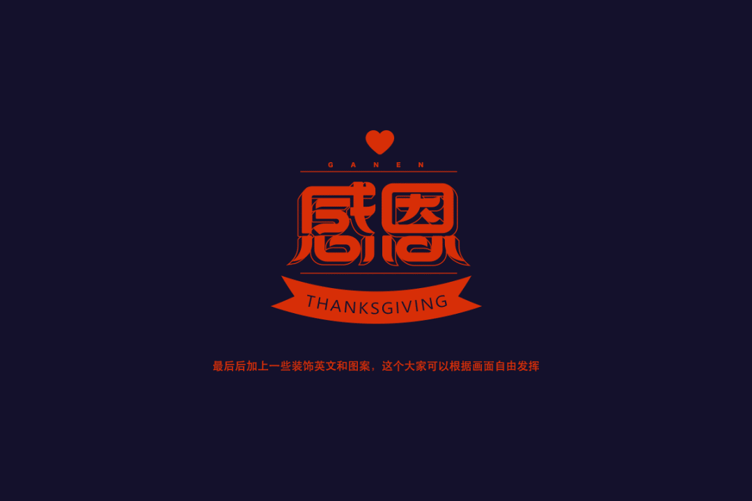
This step requires some detailed adjustments, select the smoothing tool, and quickly adjust the anchor points. Some anchor points need to be manually adjusted, and finally add some decorative English and patterns. You can freely play according to the picture.

Attention
When everyone gets a font design requirement, the first step is not to do it right away, but to consider the meaning of the character itself and the scene it needs to be used in, what kind of character it needs to show, rigid, cute , gentle, funny and so on. In the second part, you need to do the basic structure and stroke design of the font, that is, the design of the general font. This step is more important, because it is the skeleton of the font. If the skeleton is not set up properly, give him the best appearance (stroke modification) later. It will not have a particularly good effect. The third step is to combine the meaning and character of the font to make stroke modification and overall adjustment. The fourth part is to make overall adjustments or add some font effects to make the overall look richer.

After reading this Christmas tutorial, the boss wants to do the design himself!
Good to see no friends! Super handsome magazine style!

It turns out that this is how AI brushes are used! ?
Articles are uploaded by users and are for non-commercial browsing only. Posted by: Lomu, please indicate the source: https://www.daogebangong.com/en/articles/detail/Example%20analysis%20learn%20font%20design%20from%200.html
 支付宝扫一扫
评论列表(196条)
测试