@刘柏坤
1. Blue and white porcelain
When I saw this title, I immediately thought of Jay Chou's songs, and then I thought of Chinese porcelain. The meaning of the word itself is more Chinese-style, and what the original author wants to express is the elegant and ancient charm.
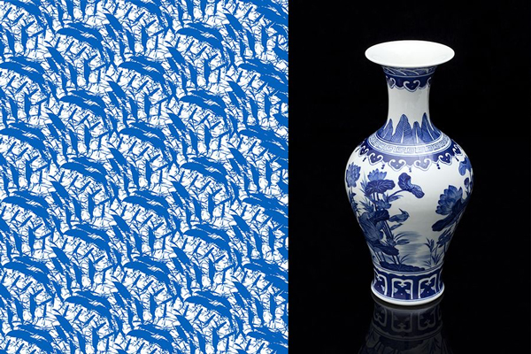
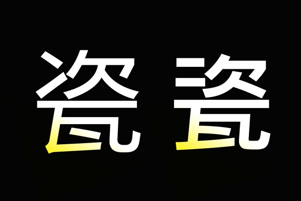
As shown in the picture above, I found some related patterns and porcelains of blue and white porcelain, let's feel it first. First of all, no matter what style of font you make, you must pay attention to the quality of the font. This requires many efforts. Let’s take a look at the original work.
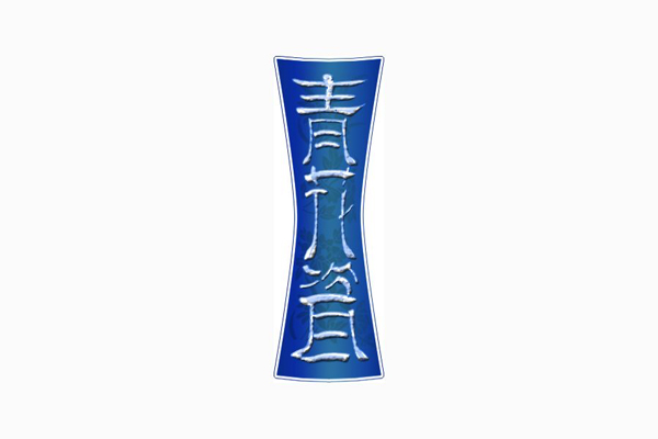
At first glance, it looks a bit like unearthed cultural relics. Let's analyze them one by one:
a. The structure is thin and tall, and some partial treatments of strokes are actually in line with the artistic conception of "Chinese style", but the details of the strokes are trivial, as if they were picked out from ancient inscriptions;
b. The background "waistline" at the bottom is a bit too concave, and the contour lines are not soft.
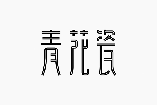
Use the pen tool in AI to outline the basic structure of the text. The strokes of equal lines are clean and neat, which is a bit more refined than the original text strokes, which is more in line with the aesthetics of modern people. In addition, the structure remains In the thin and tall style of the original characters, many friends think that the change of the font is just the deformation of the strokes. In fact, the change of the structural space can also reflect the characteristics of the font.
Refine adjustments. The green character is an axially symmetrical structure, so the structure is relatively easy to control; the two places marked by the flower character wanted to do complicated processing at first, but compared with the two characters next to it, it seemed a bit unsmooth; the place marked by the last character Completed in one stroke, some displacement and curves were added to the vertical pen, but it looks a bit muddy.
Knock out the text in the font, and pay attention to the stroke processing in the lower left corner. There are many different processing methods for the same stroke.
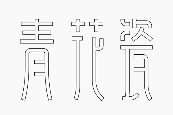
Adjusted as shown above. In fact, the strokes do not have much deformation. The main feature is that the lower part of the font is expanded, which is a bit like seal script.
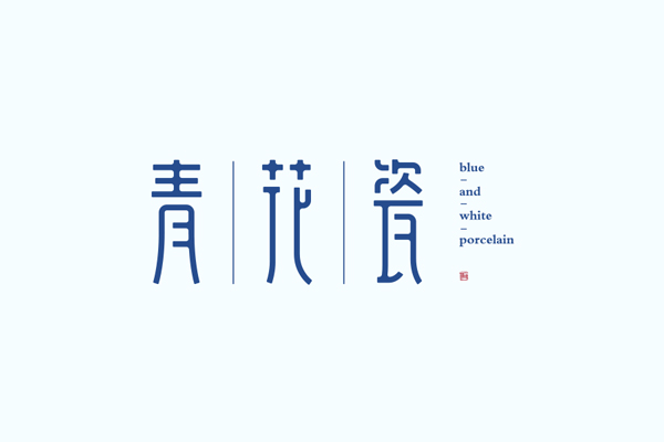
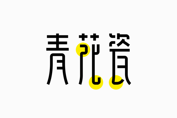
Fill in the color and make a little rounded corners to increase the roundness of the text and enrich the details.
2. Portfolio
In the strokes, it can be seen that the author wanted to find some changes. On the left, he found some common characteristics of strokes, but it was a bit far-fetched. On the right, the strokes were deleted, but the effect of these changes was not obvious. Why?
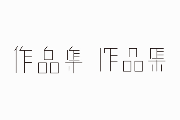
The two groups of characters are thin isolines. Too thin strokes will easily make the font look light and have no sense of existence. Thin strokes will have more negative space. In this case, it is even more necessary to allocate the font space more reasonably.
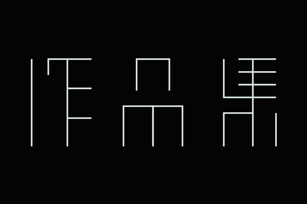
Adjust the spatial distribution of fonts on the basis of the second group of characters. The last character has changed a lot. The original connection method has been changed.

Creating characters in the form of connecting line segments can easily change the thickness of the strokes, so if you don’t know the exact thickness of the strokes, you can distribute a few more characters with different thicknesses for comparison and choose what you need.
No matter what type of font it is, the difference between right angles and rounded corners is quite obvious. Compared with the original corners in the previous step, the corners of the text in the above picture are rounded by right angles, and the whole set of characters has a temperament better.
Summary
The feature of the line segment connection method is that it is free and flexible. It can easily make a variety of fonts with completely different styles. Because it is composed of equal line strokes, everyone should pay more attention to the space allocation not to be too random, and some changes should be mastered. Strength, do more comparisons, I believe you will like this method ~
Articles are uploaded by users and are for non-commercial browsing only. Posted by: Lomu, please indicate the source: https://www.daogebangong.com/en/articles/detail/Example%20%20Up%20to%20three%20steps%20to%20change%20your%20font%20appearance.html
 支付宝扫一扫
评论列表(196条)
测试