Author: @刘柏坤
Let me share one of the word-making processes with you, hoping to receive some inspiration and skills from it.
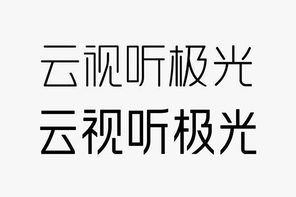
Cloud audio-visual aurora
Friends who like to watch TV must be familiar with this topic. I wonder if you have noticed the appearance of this font? Standard characters composed of equal lines are very common, especially in the Internet industry. I won’t help you find examples. Let’s take a look at the original characters.
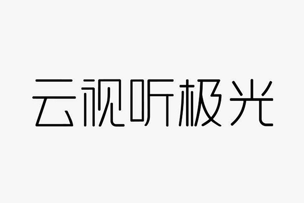
Obviously, the entire group of characters is composed of isolines, which can be directly outlined with the pen tool in AI. The basic method is very simple. The point is that with the same method, as long as the characteristics of the strokes are changed, standard characters with completely different temperaments can be designed.
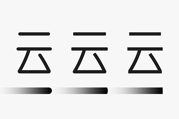
The thickness of the line segment can be changed, and of course the style of the endpoint can also be adjusted. For example, the structure and thickness of the above three characters are the same. The difference is that the endpoints are round, 35% flat and flat, right? From friendly to tougher?
In the eyes of others, such a change seems to be insignificant, but you need to know that a subtle change is enough to make the temperament and visual effect of the font very different.
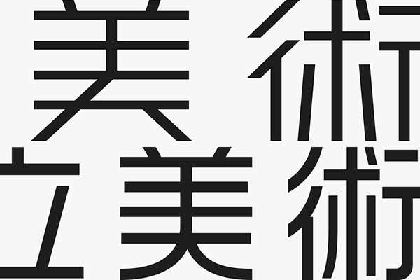
Another detail point that may be overlooked is the direction of the section. In the above picture, you can observe the closing strokes of the word "美" and the closing strokes next to the two characters of "Shu" to deal with horizontal cutting and vertical The feeling of cutting will be different, of course, there are the most common styles of oblique cutting, as shown in the figure below:
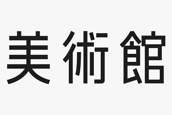
Then start writing, select the pen tool and roughly adjust the thickness of the line segment, and directly outline the font. If you can't control the font structure, you can choose a bold font and place it on the bottom surface for "drawing red".
I want to do some face-cut processing for this group of characters, so some strokes have to go out of the literal frame when outlining. If you think this will be ugly, you can use white first to keep the line segment adjustable. The color blocks are preprocessed.
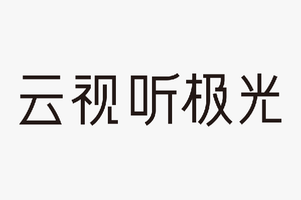
You have to know that the first step is often ugly and ashamed to show others, but you have to endure it anyway and don’t give up. Font design is not a one-step job.
Some parts of the original font have been simplified, the most obvious is the left side of the word "view". There is no right or wrong similar deformation, as long as it does not affect the recognition of the font, everything Start with your own needs.
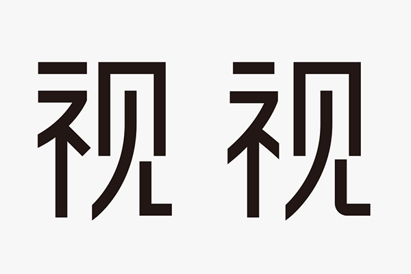
With the basic structure, the next step is to adjust a little bit. Generally, the overall adjustment is made first, and then the local adjustment. For example, the unity of the overall font size and the unity of the center of gravity, and then the structural proportions of individual characters, the position of strokes, the radians of some curves, and so on.
The words from left to right in the picture above are only initial adjustments, and many details need to be carefully considered, so I won’t explain them one by one here. Let’s directly see the effect of the adjustments.
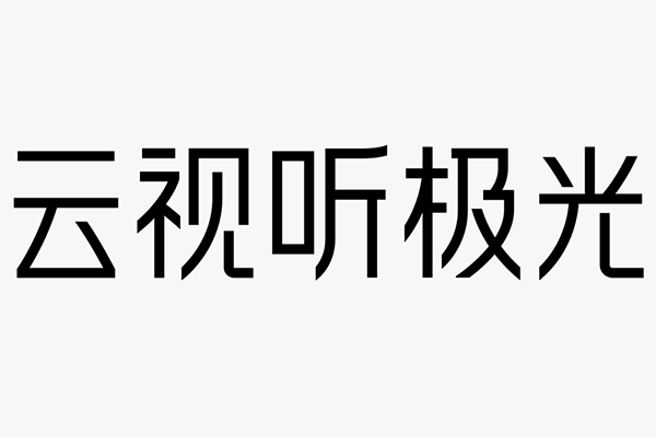
After the font is expanded from a line to a plane, the first is to cut out the endpoints, and further optimization is needed, or some small details can be changed, as follows:
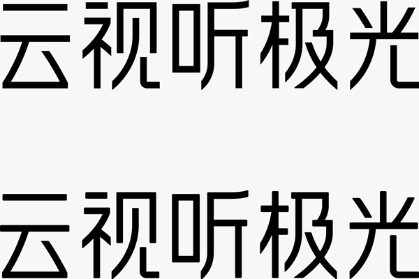
The words below have a little rounded corners, isn't it a little more friendly in an instant? Still the same sentence, the font design does not change more than anyone else, just right is the best.
Put a group photo at the end, the temperament and style are really different, but the method is the same. Well, that’s all for today, the time for writing in class is limited, please bear with me if there are any shortcomings~
Articles are uploaded by users and are for non-commercial browsing only. Posted by: Lomu, please indicate the source: https://www.daogebangong.com/en/articles/detail/Example%20%20The%20brand%20standard%20word%20composed%20of%20lines%20originally%20has%20these%20details.html

 支付宝扫一扫
评论列表(196条)
测试