I don’t know if you will choose appropriate fonts separately when Chinese and English are mixed. In China, the attention paid to Western fonts may not be as high as that of Chinese, but it is also necessary for designers to understand the usage trends of Western fonts. This article brought to you comes from Creative Boom’s forecast of the top 20 fonts that may be popular with designers in 2020. Let’s pay attention to it.
Creative Boom is an art, design and visual culture magazine for the creative industries, with a focus on visual communication. The magazine loves exploring the best ideas and giving tips, resources and advice to help designers succeed.
1. Helvetica Now

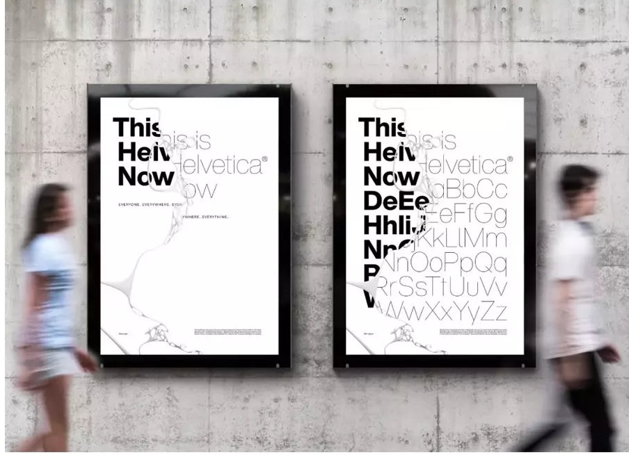
The design media Creative Booim recently released a list of the 20 most popular fonts for designers in 2020, and ranked first among the 20 fonts;:,
Launched by Monotype in April, Helvetica Now is the first redesign of HdvEtica in 35 years, with every letter redrawn and practical options suited to the needs of the modern designer. Helvetica Now has been very popular in the past 6 months, and I believe it will continue to be popular in the future.
Second, Aeonik
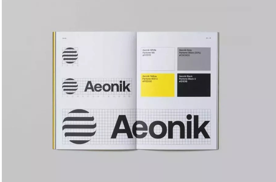
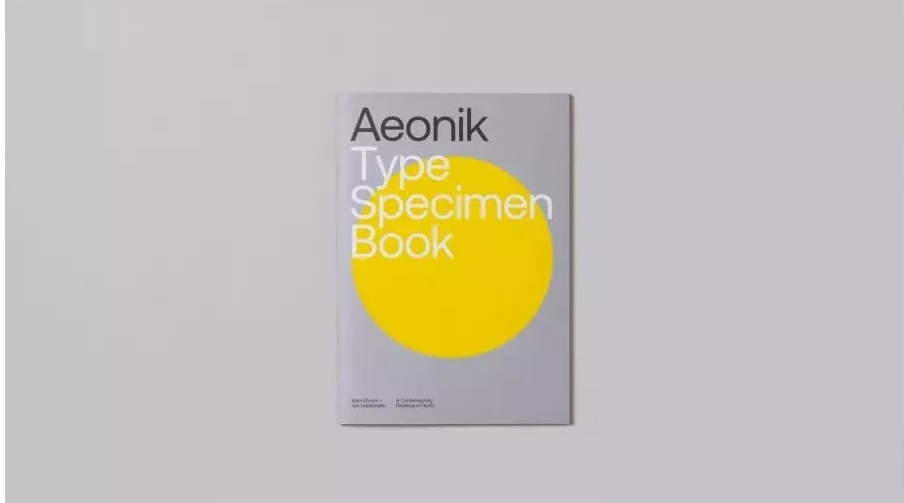
Aeonik is a font under the CoType brand launched by designer Mark Bloom this year. Aeonik has a strong structure and mechanical details. The designer positions it as a nio-grotEequu with a geometric skeleton. There are 7 fonts in total. Weight and italics are widely used.
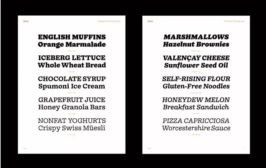
3. Beatrice Display
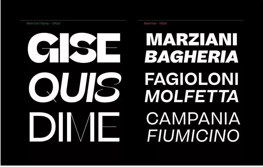
Beatrice is a new typeface released by New York font company S h a r p Type. Beatrice font is based on traditional American Gothic: with tight kerning, the Beatrice font family provides many font weight options, including Beatrice Display with high contrast and tight kerning (above left), and a standard low-contrast font.
Fourth, NewsSans NewsSans
NewsSans NewsSans can create a changeable vision, which can switch freely between noisy and high-spirited emotions, low-key and quiet. All the sharp corners have been changed to arcs, giving NewsSans a little more personality.
NewsSans NewsSans has a total of 9 weights and 5 widths to choose from, all of which are italic. If necessary, a free trial version of NewsSans can be downloaded from charactertype.com.
5. Untitled Sans Un Titled Sans
Un tit [ed Sans Un titled Sams is launched by Klim, a New Zealand typeface company, and belongs to Neo Grotesk sans serif. Klim also launched caliber fonts.
The design of Untitled San^ is drawn from traditional lead typefaces between the Casson and Times periods. The usage of this font is very high and can be seen in many works.
6. Gilroy Gilroy
Gilroy Gil「oy is a modern sans-serif font with a geo-metric style. It can be said to be a relative of the Qan^le^s font family. There are a total of 20 weights, including 10 upright versions, and related Corresponding italics are available for selection. Among them, Light and ExtraBoid are free fonts, you can try them.
7. DIN Next

The classic design of DIN is not a problem, but its font weight and width options are limited, which is another disadvantage that cannot be ignored. This century-old design has definitely stood the test of time, but it also needs a more modern redesign.
The flexible and timeless DIN NEXt was born. After the redesign, the classic DIN has transformed into the indispensable DIN Next of this era. There are 7 font weights from light to black, each with italic and narrow (conderi5Ecl) designs. din font brings users a series of font files with various styles, which can provide users with more complete font selection methods,
8. Recoleta Latinotype
The Latino type company has integrated the most popular and soft Cooper in the 1970s, and the slightly left-leaning, smooth Wmdso" into one, and it has become a familiar yet fresh and modern Rrcolete Latinotype. This kind of font weight choice, the thin type is suitable for the text, and the bold type is suitable for the title.
Nine, Fann Grotesque
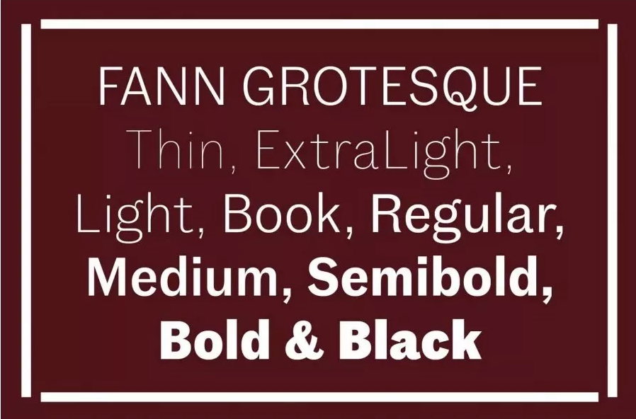
Design Fann Grotesque was inspired by British font houses such as Stephenson Blake, Day & CollinSx Miller & Richard. There are 9 font weights in total: Thin, ExtraLight, Light, Book, Regular, Medium, Semibold, Bold, Black, all of which are equipped with corresponding italics.
Fann Grotesque is the work of Colophon typeface company. Among them, the non-italic orthographic style captures the charm of British Grotesque in the 19th century and continues to explore its idiosyncrasies and imperfections.
Ten, Doyle
Doyle, like News Sans, comes from the Sharp Type company in New York. It has a sense of the times. Doyle combines Cooper Black and ITC American Typewriter to create a new result.
The Doyle font family has a strong structure, and it looks a little loose visually, hiding a kind of moist vitality when the pen and ink are not dry.
Eleven, Albertus
The original author Berthold Wolpe began to design Albertus in 1932. In the new version, the original 2 weights have been changed to 5 weights from thin to bold. Since the advent of Albertus, it has been widely used in book cover design, corporate identity system, signboards, and video games. Creative Boom predicts that Albertus Nova will be a frequent haunt in 2020.
Twelve, FF Mark
FF Mark was completed in 2013 by German font designers Hannes von Dohren, Christoph Koeberlin and the FontFont Type Department. FF Mark has a total of 10 font weights from Hairline to Black. It is very suitable for movies, TV, advertisements, packaging, publications, publications , logo and other designs are quite compatible with music, software, video games, sports and even web design.
Thirteen, TT Norms Pro
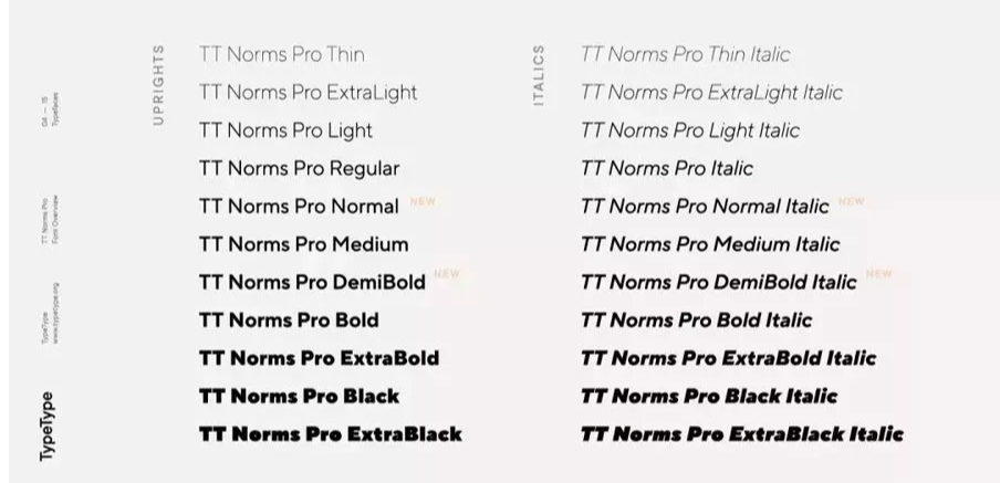
TT Norms Pro is one of the best-selling geometric sans serif fonts (geometric sans), very attractive and easy to use. The design team provided 11 weights and their italics.
TT Norms Pro font family series mainly provide Black Italic and other font styles. TT Norms Pro can be used in a very wide range, whether it is a large-sized text block or a small title, it is suitable for geometric grotesko in various situations
Fourteen, Coign
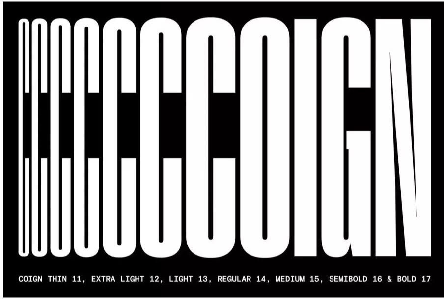
Coign challenged the limit of "narrow body". Generally speaking, narrow-body designs are limited by space, making it difficult to develop unique styles and features. However, Coign has a total of 7 font weights and 4 font widths. It is no wonder that Coign is becoming more and more popular.
Coign font family series mainly provide Regular and other font styles.
Fifteen, Harriet
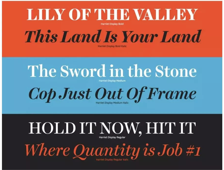
Harriet is a serif font owned by Okay Type. Harriet is like a modern Baskerville font with a touch of Scotch Roman. Extremely versatile, offering 2 optical sizes and multiple weights.
Sixteen, Neue Haas Grotesk
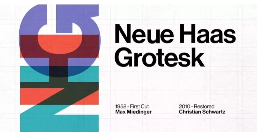
neue haas grotesk is a very creative sans serif typeface designed by Max Miedinger in the 1950s. The font structure is rigorous, concise and beautiful, with precise lines and no redundant stippling, and the visual effect is very clear and clear.
Designer Christian Schwartz, who completed the digital version of Neue Haas Grotesk in 2010, said that "the warm character of the Miedinger version has been erased in multiple revisions.
The focus of this reconstruction project is to bring back the original Neue Haas Grotesk by Miedinger, and to be faithful to the original shape and space configuration.
Seventeen, Avenir Next
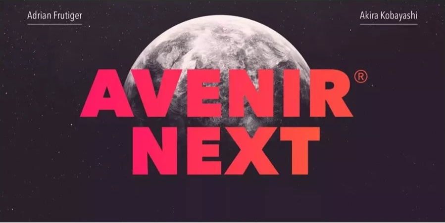
The new version of venir Next is created by the well-known font designer Akira Kobayashi and the inventor of the Avenir font
Made in collaboration with Adrian Frutiger. This is a reinterpretation of a classic, original concept
Eighteen, Silk Serif
Silk Serif is a high-contrast typeface with thin, sharp serifs. The highlight of this typeface is that the stems of the letters are separated from the bowls, but close together to create the illusion that they are connected, such as the P in the picture above. If you want to show texture, Silk Ser may be your best choice.
Nineteen, Nib
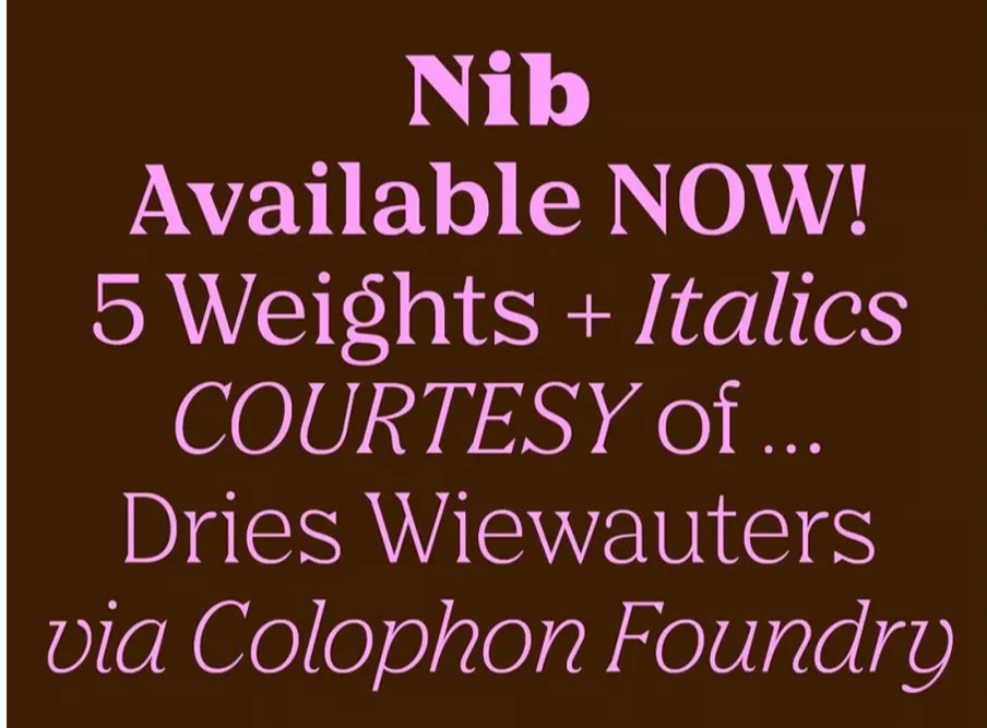
Nib’s serifs and f, j, y hooked up parts look elegant and funny. Some are inspired by calligraphy, while others come from paintings on ancient stones.
“Nibs are intimate and aggressive at the same time, so they can be used in a variety of situations,” said Colophon, the company behind the Nib.
Twenty, Vision
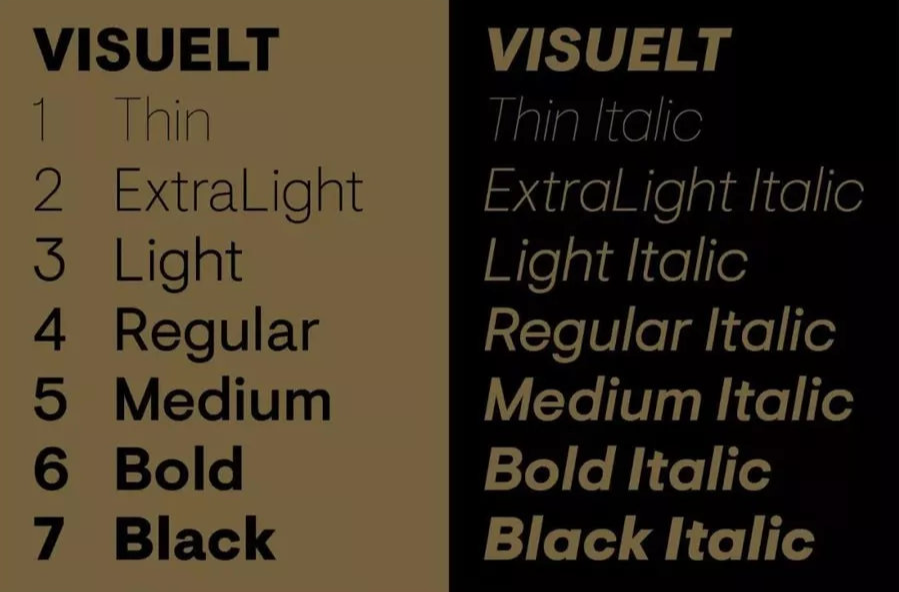
Visuelt is a work from the Colophon font company. The prototype of Visuelt is more conservative and somewhat similar to the Aper^u font. In the process of multiple revisions, adding new details and removing features belonging to Apergu, it is only then that Visuelt finds its own characteristics.
Articles are uploaded by users and are for non-commercial browsing only. Posted by: Lomu, please indicate the source: https://www.daogebangong.com/en/articles/detail/English%20fonts%20popular%20with%20designers%20in%202020.html
 支付宝扫一扫
评论列表(196条)
测试