English fonts are very diverse. A series of fonts may have dozens of different styles, thick and thin, long and flat, and oblique and straight. Therefore, some fonts recommended in this issue are very limited.
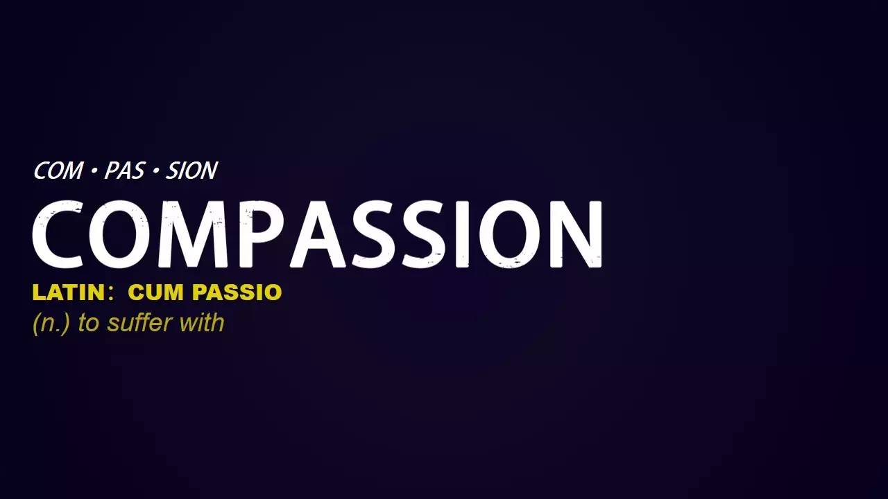
Font selection is a very serious matter. If you want to choose a PPT font and color like a boyfriend and a boyfriend, the difference is that you choose one for a boyfriend and a boyfriend, but there are often more fonts and colors. The principle of using fonts, how many to choose, how to choose, please look forward to the next article.
♫
At the beginning of the article, I recommend a website: Font Pocket (http://www.zitikoudai.com/), the main reason is that there are no advertisements, and the fonts are classified, so that you can find the fonts you want.
▌1. About Microsoft Yahei and more
Some people say that "Microsoft Yahei" is a "universal font". I used to think that in many cases, Microsoft Yahei is a relatively safe font, especially when the font in our PPT has always been the default Song typeface , For example, the courseware of many teachers is full of Song style, not to say that Song style cannot be used, but like courseware, using Song style is not very suitable. If you are in a large classroom, you will definitely experience it, and it will be more difficult to identify (no need to illustrate up).
Microsoft Yahei has three models, Microsoft Yahei Bold, Microsoft Yahei Regular, and Microsoft Yahei Light. So it can meet the needs of a PPT.

The picture above is the most comfortable PPT in the course I took. Of course, it has a lot to do with the design department of the teacher. Most of the PPT fonts are Microsoft Yahei and Microsoft Yahei Light.
Chinese fonts also have English parts, and some Chinese fonts are easier to use in English, such as the Fangzheng Lanting series:
 ♪Fangzheng Lanting quasi-black
In addition, some English fonts that come with the computer are also easier to use, such as:
CalibriLight (title), Arial, Adobe Series, Sans-Serif, TimesNewRoman, Georgia and more.
In addition, document fonts and cursive fonts are used less and are not highly recognizable. They generally appear in church programs, official announcements, wedding invitations, graduation certificates, and religious festivals such as Christmas and Easter.
♪It’s weird to use it in a large area on PPT, the recognition is too low,By the way, the title is GothicE, and the text is EdwardianScriptITC.
▌2, serif font
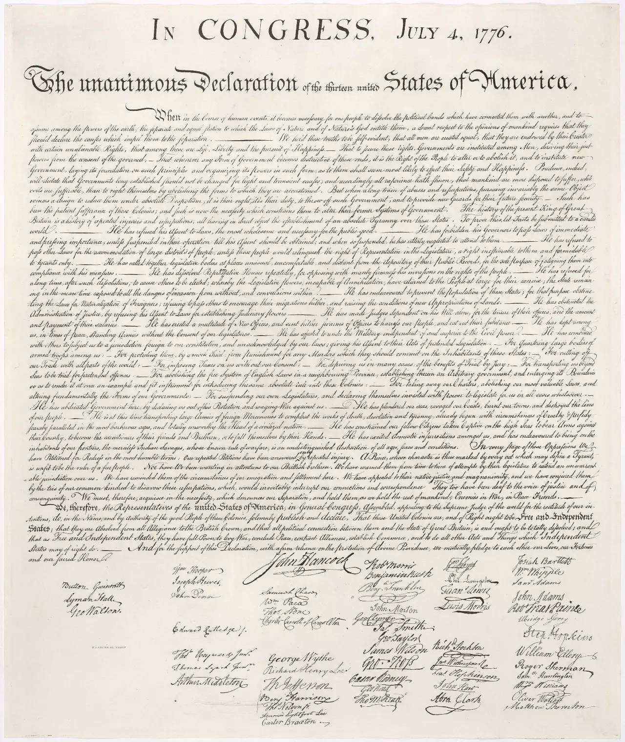
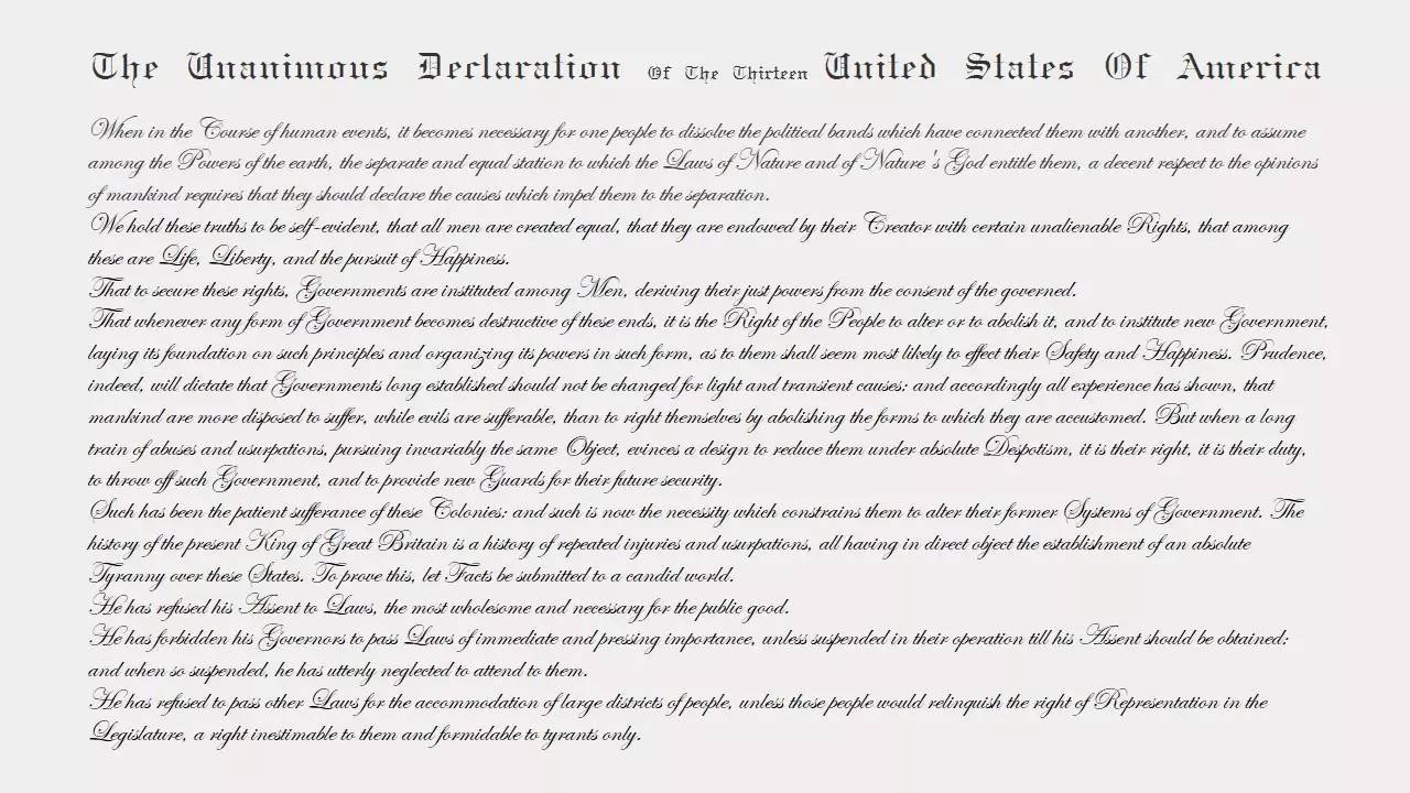
The distinction between serif fonts and sans serif fonts is the same. Roman fonts in serif fonts are more formal, and the system comes with TimesNewRoman. Roman script is widely used in books, newspapers and other reading materials.
Add a serif font:
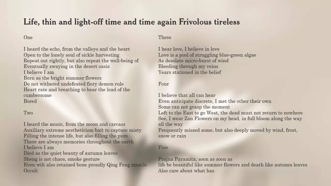
♪ The text of "Life is like a Summer Flower" isCentury>
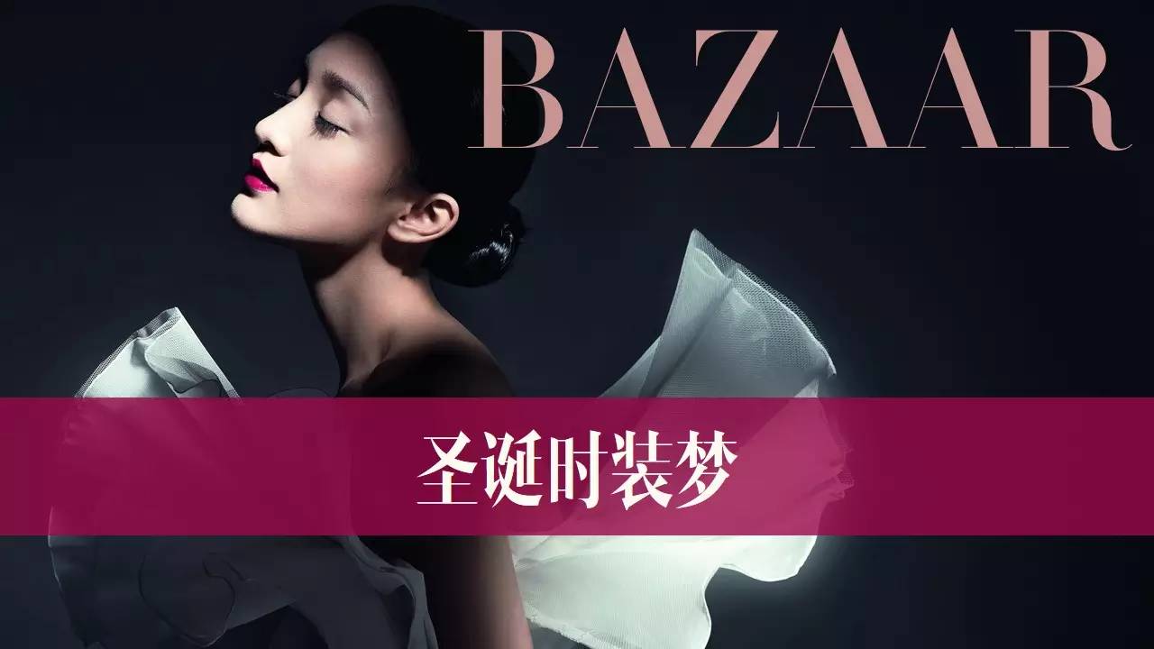
When it comes to serif fonts, fashion is naturally indispensable. For example, Didot series fonts are often the first choice for the covers of major fashion magazines. In fact, these fonts have some common characteristics that the contrast between thickness and thickness is very obvious. If you don’t believe me, look at the picture below:< /span>


▌3. Sans serif font
Actually, sans-serif fonts are more attractive to me. Especially Ultralight, which is extremely thin, and the small square text is very delicate, but then again, the general reading PPT will use small tofu block text, just like the following Slide:
Of course, this is not the only way to use it:
 ♪The font isMyriadSetPro-Ultralight
Myriad series fonts are very closely related to Adobe and Apple, giving people a feeling of being bigger. There is also a thicker font that is sometimes suitable for titles: Dense.
 ♪The font is Dense
▌4, there are many more
There are actually a lot of fonts recommended here, the most important thing is the understanding of the personality of the font, every time you see a font, you can understand what kind of occasion this font is suitable for. There are also many interesting fonts like the ones below that you can study slowly by yourself, and pay more attention to some good visual elements when browsing, not only fonts, but also typical movie posters:

In addition, if you use Google Chrome, you can consider a plug-in [WhatFont], which can tell you what font the English text on the webpage is, but the text on the picture is not acceptable.
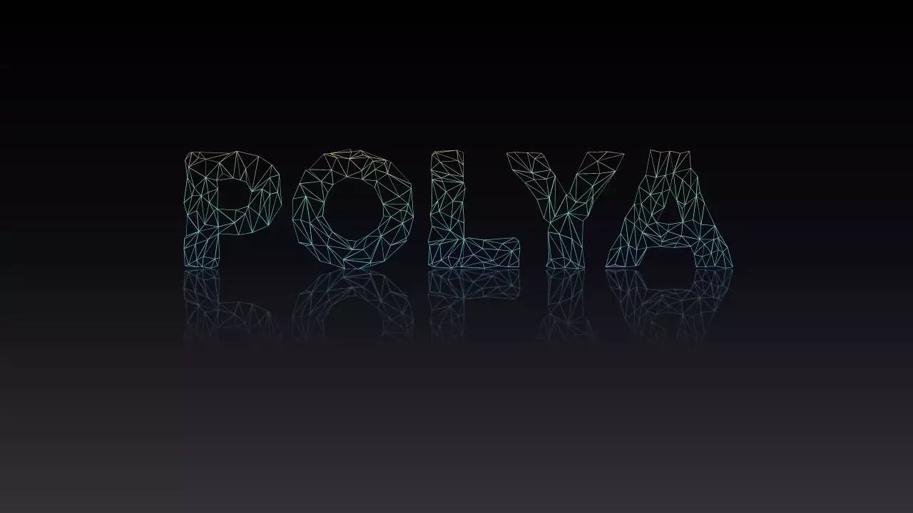
♪Wending thunder body and POLYA
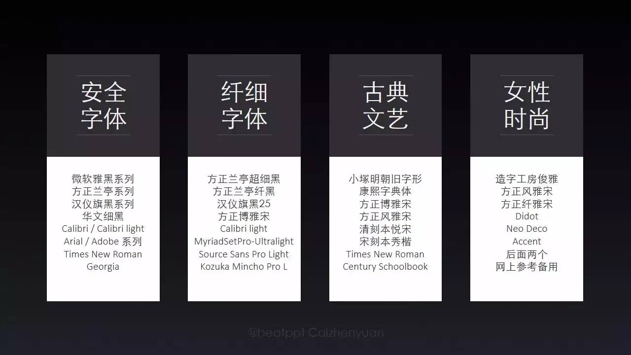
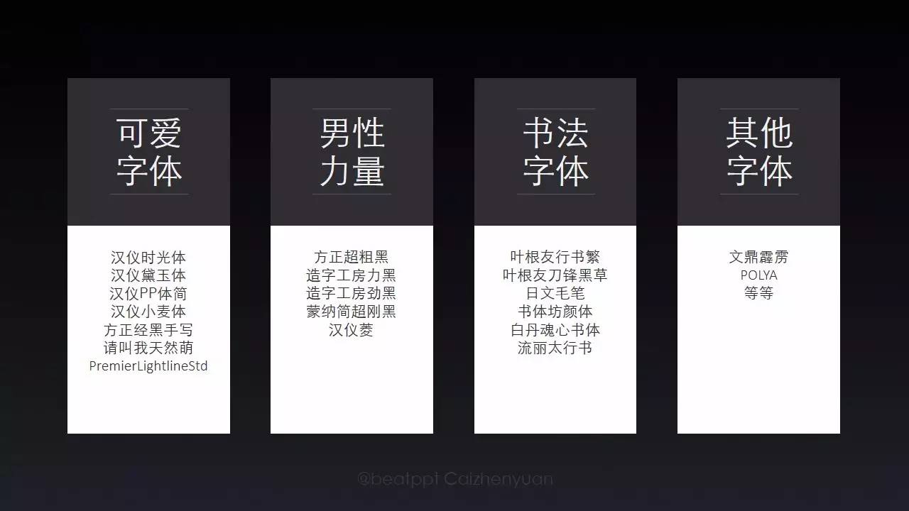
Final summary, but stillExplanation, the categories in the figure below are crossed, the specific use of fonts is not unique, only relative divisions are made for reference, and you can also supplement it appropriately, such as flat Hei, Xinhei, Siyuanhei, etc., these can also be regarded as safer fonts:
The font recommendation part is basically over. If you find a useful font in the future, you may mention it. If you find a useful font, you can also reply in the background. This issue will reply 【English font】 , to get the font pack link. Still emphasize Commercial use please pay attention to copyright.
The original text is an article with refreshed reading volume:
"Is English more beautiful than Chinese"
Articles are uploaded by users and are for non-commercial browsing only. Posted by: Lomu, please indicate the source: https://www.daogebangong.com/en/articles/detail/English%20fonts%20%20Font%20guide%20four.html
 支付宝扫一扫
评论列表(196条)
测试