Italian writing tutorialItalian originated in the 15th century AD and developed from Humanist. Because of its unprecedented almost one-stroke completion of a letter, the initial slope is produced, the letters tend to be elliptical, and the continuous strokes between letters are famous. Feeling that humanistic writing was too slow, Italian scholar Niccolo Niccoli created a new writing font in 1420, which laid the foundation for the later Italian style. 
The picture above is NiccoloNiccoli's handwriting. Compared with the humanistic style, it has four notable features: One is the tendency of the font to tilt to the right;Second, the circle becomes an ellipse; The third is that many letters can be written in one stroke;The fourth is to use a connecting stroke to connect the letters to each other. The most striking change is to change the lowercase letter a from double layer to single layer. 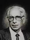
With the further development of the printing industry, in 1501, the Venetian printer Aldus Manutius commissioned the goldsmith Francesco Griffo to design a The small Italictype separates the letters. Most calligraphers followed suit. This caused Italic to lose cursive quality and writing speed, but brought the typeface to maturity.  AldusManutius
 Speaking of Italian font, everyone may think it is italic. In fact, this is not the case. The italics we usually see in word are simply slanting the letters, and the font has not changed. Refer to the three formats in the figure below, the first is Roman, the second is Italian, and the third is italic. Do you see the difference? 

There are also many types of Italian fonts, the most common BasicItalic, and FormalItalic, ChanceryItalic and CursiveItalic with serifs added on this basis. 
The next thing I will introduce to you is the writing method and tutorial of FormalItalic. FormalItalic has more serifs than BasicItalic (serif, which refers to the thin lines outside the main line of letters for decoration). When you write, you should refer to the tutorial and pay attention~ 
 Lowercase Letter Tutorial
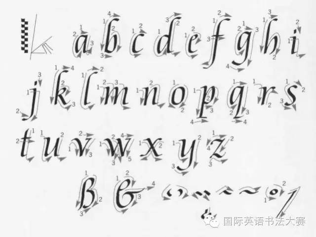

The writing of lowercase letters "a" and "n" provides the basis for writing all lowercase letters. The letters need to be inclined forward about 8 degrees, and the continuous strokes need to start from the bottom of the previous letter. to the top of the next letter. 

Capital Letters Tutorial 

Capital letters have the same stroke order and slant angle as lowercase letters. The starting pen height should be slightly lower than the upper part of some lowercase letters (such as "b", "q", etc.). 

The above content is translated from "Calligraphy Bible", the original work by DavidHarris. Students who like Italian font must practice a lot in order to write beautiful English characters! Public account ID: EnglishHandwriting Address : Room 403-404, Yicheng International Center, Haidian District, BeijingTel: 00861062890580 Website: www.strongfeeling. com.cn
AldusManutius Lowercase Letter TutorialCapital Letters TutorialArticles are uploaded by users and are for non-commercial browsing only. Posted by: Lomu, please indicate the source: https://www.daogebangong.com/en/articles/detail/English%20font%20practice%20%20Italian%20font.html
 支付宝扫一扫
评论列表(196条)
测试