Gothic Writing Tutorial< /section>In the past few days, some students have been asking me when I will publish a tutorial on Gothic. It seems that Gothic is indeed Very popular too! I also like it very much! The following is a Gothic tutorial for everyone~ But before that, let’s learn about the development history of Gothic and the little story behind it with the editor. And font classification! 
1 Font Development History< /section>BlackLetter, also known as GothicScript (Gothic script) or OldEnglishScript (Old English script). The Chinese translation name is various in China, some are called black body, some are called decorative body, some are called Gothic body and so on. Here, we collectively call it Gothic. ” At the beginning of the 9th century AD, Charlemagne, King of the Frankish Kingdom believed in Christianity. In an illiterate or semi-illiterate state, except for priests, almost no one can read and write. In order to better promote Christianity and change the illiteracy situation, Charlemagne ordered people to collect a large number of ancient Latin texts and Greek manuscripts, and they were reformed to uniformly use Carolingian miniscule. The literary and scientific movement promoted by the successors was called the Carolingian Renaissance in history, also known as the "European Renaissance". The First Awakening". 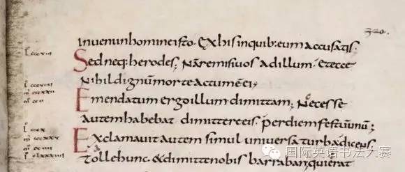
Charlemagne Carolingian small cursive script is a milestone in the history of Western fonts. It clearly distinguishes between uppercase and lowercase letters, which greatly improves the speed of reading and copying; distinguishes the X-height of the font and the ascending and descending parts, laying a foundation The basic method of today's font design. The word Carolin comes from the Latin Carolus, which means Charles. In 843 AD, shortly after the death of Charlemagne, his three grandsons divided up the empire, and on this basis formed the prototypes of the three countries of Germany, France and Italy. 
Carolingian small cursive script In the 12th century, cultural demands surged. Many new universities were established, and there was an urgent need to print books of all kinds of knowledge. Books carrying all kinds of new knowledge need to be printed quickly to meet the growing demand. Although Carolingian small cursive script has good legibility, it takes too long to write or engrave a lot. At that time, the paper was expensive, the fonts were too large, and it was not economical enough. By the middle of the 12th century, a typeface for quick writing and mass printing had become popular in the Northeast of France and the Low Countries. This is the BlackLetter font. 
Latin Manuscript Bible in AD 1407 It can be seen that the loose and random letters of Carolingian cursive script have become neat and compact BlackLetter, with a strong rhythm and beauty. Early styles of Black Letter began to take shape around the turn of the 11th and 12th centuries. At the same time, the Gothic style was also on the rise in the field of architecture. Perhaps due to the coincidence of time, Black Letter was satirized as GothicScript (Gothic script) by the Italian scholar Valla in the 14th century. 2 Font classificationFrom the 13th to the 14th century, European countries were constantly at war, and countries were divided and united. The development of BlackLetter tends to be chaotic and diverse. There are two main branches: the regions north of the Alps use the Textura variant; the areas south of the Alps use the Rotunda variant. 
Textura, Rotunda, and variants after Textura Schwabacher and Fraktur.< /section> 3 GothicTexturaQuardrataIn the 15th century In the middle period, the development of Textura reached its peak. It became the common script for all church documents. At the same time, while retaining the basic form of handwritten strokes, Textura became the first typeface to be printed with lead type (printed on parchment). This is a very classic font, what we are going to learn today is it! 


Tutorial< /section> Gothic should be used Flat tip pen. For specific pen introduction, please pay attention to the small calligraphy update every Friday~ 

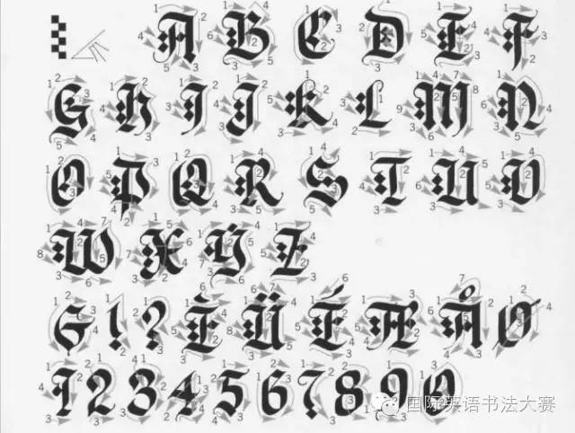
Next, look at the writing of capital letters. This uppercase font first appeared on woodcuts, showing the difference from printed and handwritten. 


In the next issue, we will still update the Gothic font~ it is the variant in Germany - Schwabacher. Remember to watch it on time next Monday~(^U^ )ノ~ Part of the content is translated from "Calligraphy Bible", the original work by DavidHarris Part of the content comes from the Black Letter story in TypeIsBeautiful. 
Public account ID: EnglishHandwriting Address: Room 403-404, Yicheng International Center, Haidian District, BeijingTel: 00861062890580 < span>URL: www.strongfeeling.com.cn
As the name suggests, TexturaQuardrata demonstrates that text is as beautiful as rows of fabric. Textura means a neat effect like a fabric.
Articles are uploaded by users and are for non-commercial browsing only. Posted by: Lomu, please indicate the source: https://www.daogebangong.com/en/articles/detail/English%20font%20practice%20%20Gothic.html
 支付宝扫一扫
评论列表(196条)
测试