Editor's recommendation:
English font selection popularizes knowledge
The following article comes from the way of beauty, the author has two articles

Share cases, knowledge, tutorials, etc. related to font design.
Why do we like to use English when making design proposals, especially when making some aircraft drafts or making style proposals for customers?We always like to design in English? The works produced in this way really look very "high-end" (high-end, grand, high-grade), which is very in line with the psychological needs of customers. So, is it enough to only use English? How to apply is correct? What classic fonts are there in English, and what kind of temperament are they? Where is it suitable for application? These are all things we need to learn and understand; in real life, we often see many ridiculous and error-ridden English application cases, many of which are government and official international activities, which will damage our national image. Therefore, as a designer, it is very necessary to understand the basics of English fonts and know how to apply them accurately.
Do not use the English that comes with boldface!
There is such a wonderful English, using it not only will not appear "tall", but will appear "LOW burst"! It is a representative of no culture, but it is a pity that it often appears in many official promotional videos and public transportation systems. We often see it in our daily life. Wherever it appears, it will destroy the people within a radius of two kilometers. The beauty and harmony of ... well, let's see what it looks like.

Heiti comes with English fonts, and the typesetting effect is like this
See? Isn’t it weird, in the same word, some letters are crowded together, and some letters are thousands of miles apart. Why does this happen? It is because this font is completely designed according to the logic of square characters. No matter whether the letters themselves are wide or narrow, they all occupy the same width, so there will be wide letters such as "m" squeezed together, and narrow letters For example, the distance between "i" is too large. The real English design is not only finished after designing 26 letters, but also punctuation marks, numbers, etc., and the most important thing is to design the combination of each letter and other letters. Spacing, the spacing between each letter and another is carefully designed to fit comfortably and uniformly together.

Comparison of the typesetting effect between the English font of the black body and Univers
Looking at the picture above, you will know the difference between authentic products and counterfeit products. Yes, if you study English fonts well, you will be able to sharpen your eyes. You can spot counterfeit brands at a glance, because many counterfeit brands are In this way, the imitation is very similar on the surface, but it is full of loopholes when you look closely. my country's government departments and many official activities often express this feeling vividly and delicately. It can be seen from the "China Space Day Propaganda Poster" issued by the National Space Administration some time ago. In addition, there are many other examples.

The English subtitles of the promotional video of the Shanghai World Expo use bold fonts
People all over the world are watching the promotional video of the World Expo, so the English subtitle part is very important. With such an unprofessional font, I don’t know what foreigners will think when they see it. Design can be more and more important, more and more professional.
Next, I will recommend several classic English fonts and their suitable usage scenarios:
The darling of fashion: Didot

Didot is the purest expression of the serif body, representing the pinnacle of the fusion of classical and modern. It not only conforms to the modern simple geometric shape, but also inherits the characteristics of the classical serif body. It looks very elegant and modern. It is precisely because of its temperament that those big fashion brands have chosen Didot as the standard font. The famous fashion magazines: BAZAAR (Fashion Bazaar) and VOGUE have chosen Didot as the standard font. The standard font of the famous French fashion brand ELLE It is also modified on the basis of Didot.

International major fashion magazines use Didot font as brand standard font
A font that conveys a classic sense: Trajian

The reason why this font can reflect the classic feeling is that it inherits the font characteristics and proportion characteristics of ancient Rome, and conveys a very classic temperament to people. Trajian is used as the title on the cover of many classic literary works. Even the classic movie "Titanic" also used this font to design posters, and many high-end brands have used this font. In short, when people see it, they can feel a classic and eternal history breath.

Ancient Roman inscriptions, the shape and proportion of Trajian follow this style

Trajian is used in the titles of the classic movies "Titanic" and "The Pianist on the Sea"
A font that conveys a sense of luxury: Optima

Optima is a sans-serif font that not only retains the classical temperament, but also has a modern sense, because its skeleton and proportion inherit the proportion structure of the Roman inscription. Although the font has no serif, the vertical line part is designed Subtle thickness changes appear very elegant, giving people a refreshing, modern but not lacking in historical heritage. This font conveys a high-end feeling. Let's take a look at an example of its application.
Premium chocolate brand Godiva uses Optima as a standard font
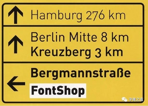
Fonts that convey an industrial feel: DIN

The full name of DIN is "Deutsches Institut für Normung" (German), which translates to "German Industrial Standard". The paper unit A0-A5 we use is formulated by German Industrial Standard. This font looks a bit Cold, very rigorous, embodies a rigorous spirit of the Germans, often used in road signs, German highway signs use this font, in addition, this font is also often used in warning signs, giving people a powerful warning effect.

German road signs use DIN fonts with different weights according to the distance
The spiritual connotation of DIN: preciseness, industry, geometry, standard
There are many other classic English fonts, with different styles and suitable for different fields. Their stories are very exciting, so let’s introduce them here in this issue.
Recommended reading
Designers publish a powerful illustration library for free, for free commercial use by anyone or business in the world
Design, Reflective Work Li Yongquan
tenfive exclusive Beijing designer recruitment groups
Enterprise Recruitment, Designer Looking for a Job, Design Exchange
Please note to add Beijing group
Zhao Liandong Design Studio
Design CooperationWeChat: zhao_design
Studio Packaging Works Click the link
Articles are uploaded by users and are for non-commercial browsing only. Posted by: Lomu, please indicate the source: https://www.daogebangong.com/en/articles/detail/English%20font%20how%20should%20you%20choose.html
 支付宝扫一扫
评论列表(196条)
测试