The following article comes from the way of beauty, the author has two articles

Share cases, knowledge, tutorials, etc. related to font design.
In the previous article, we introduced Didot, the darling of the fashion industry, Trajan, which conveys a classic sense, Optima, which conveys a sense of luxury, and DIN, which conveys an industrial sense. In this issue, we will continue to introduce some characteristics of classic English fonts And usage, I hope everyone can gain something.
A font that conveys a sense of trust: Helvetica

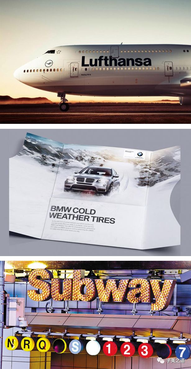
This font can be called the most dazzling star in the Western font industry. It has been used for a long time and is widely used in official institutions and enterprises all over the world, including: 3M, Epson, Lufthansa, BMW, Jeep, Kawasaki Heavy Industries , Intel, Muji, Panasonic, Microsoft, Mitsubishi Electric, Motorola, Toyota, Samsung, Standard Chartered Bank and hundreds of other companies and government agencies. Helvetica does not seem to have any distinctive features and strong personality. Because of this, its purpose is to make people pay attention to the information itself. When people see it, a sense of trust arises spontaneously. The reason for the decline.
2007 marks the 50th anniversary of the birth of helvetica. As a very popular and successful typeface in graphic design and business, British director Gary Hustwit filmed a documentary "Helvetica" for her. Finally, I want to say: when you don't know what font to choose, you can use Helevitica.
Friendly and elegant handwriting: Zapfino

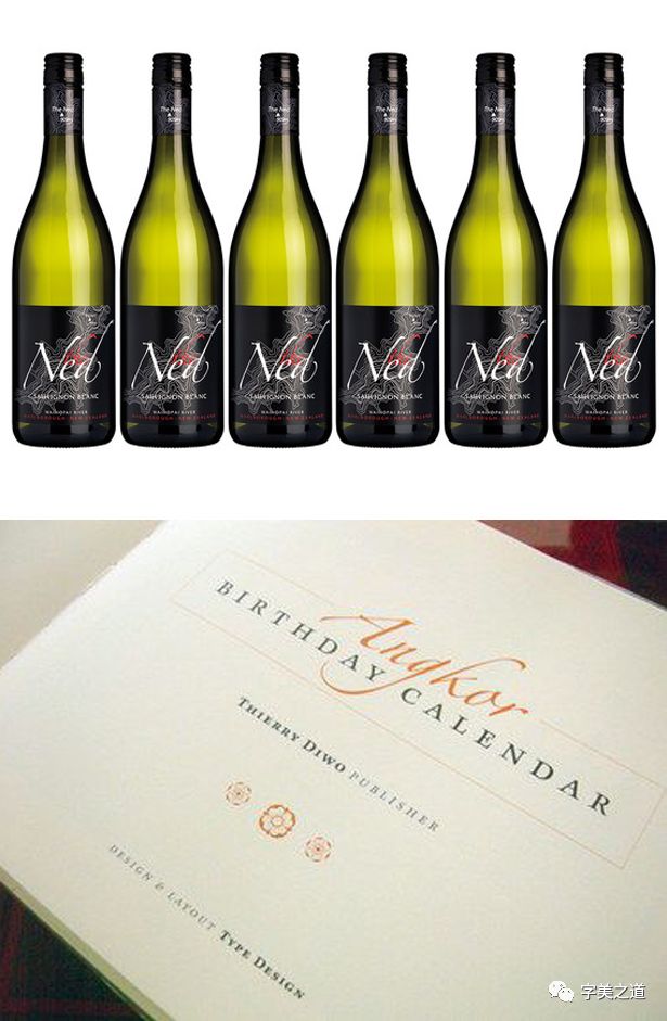
When I saw this font for the first time, I was fascinated by its elegant temperament, like a dancer dancing, exuding affinity and elegant taste, very suitable for application in western restaurants , high-end red wine and chocolate packaging, its author is the world-renowned calligrapher Hermann Zapf (Hermann Zapf), and Hermann Zapf is also the author of Optima introduced in the previous article.

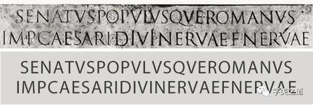
A font that conveys a classic sense: Trajian

The reason why this font can reflect the classic feeling is that it inherits the font characteristics and proportion characteristics of ancient Rome, and conveys a very classic temperament to people. Trajian is used as the title on the cover of many classic literary works. Even the classic movie "Titanic" also used this font to design posters, and many high-end brands have used this font. In short, when people see it, they can feel a classic and eternal history breath.
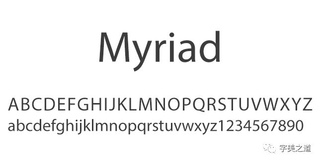
The font favored by Jobs: Myriad
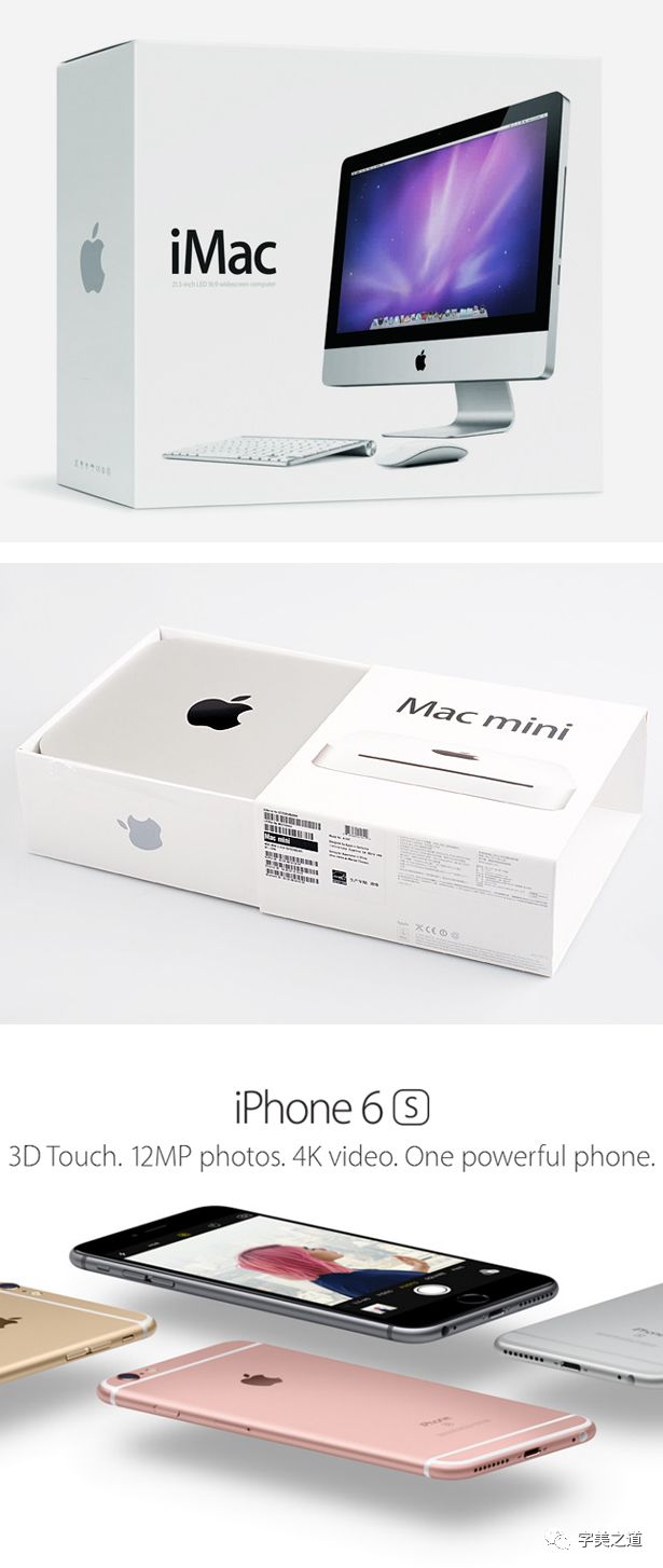
Humanistic features, a sense of technology and a sense of design are the reasons why Myriad is favored by many digital brand companies that value design. This design is designed by Robert Slimbach and Carol Twombly The font, originally designed for Adobe based on the Frutiger font. Myriad's glyph characteristics and skeleton structure inherit the characteristics of the Roman font, so it seems to have strong humanistic characteristics, followed by its technological sense attributes. It is one of the earliest fonts designed for screen display. It uses MultipleMaster technology. Displays well on computer screens that are well below the print resolution.

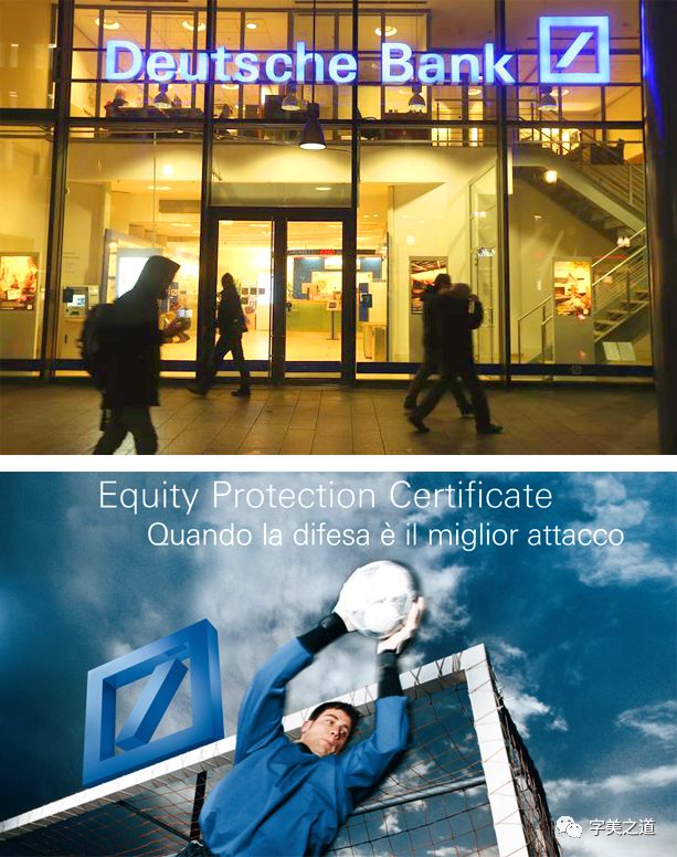
Elegant and quieter than Helvetica: Univers
Univers and Helvetica were born at the same time. They were the first sans-serif fonts to refer to the font family concept. From the initial design stage of the total font, the development plan of the entire font family was systematically considered, including narrow body and wide body. And other changes, its designer is Adrian Frutiger, a recognized font design master in the West. After the launch of this font, it has been widely welcomed by the market, including Swiss Airlines, Deutsche Bank, General Electric, HSBC Bank, Japan's Sanyo Electric, etc. Adopt Univers as the standard font of the enterprise.
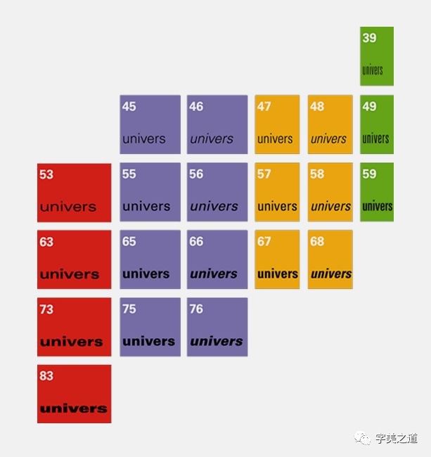
Univers is a complete font family,Many font developments followed this model
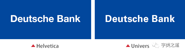
From the perspective of fonts, Helvetica and Univers are very similar, but from the perspective of the overall temperament, Univers gives people a sense of stability and elegance, with a sense of tranquility and temperament in the elegance.
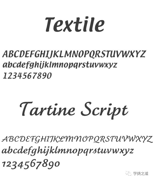
Fonts suitable for food: Textile and TartineScript
These two fonts seem to have a good appetite-stimulating effect, and the glyphs look very round, coherent, and have a strong sense of rhythm. Delicate, soft, rich, stretching, smooth... These words to describe the taste of food are very suitable for describing these two fonts, so these two fonts are very suitable for food.

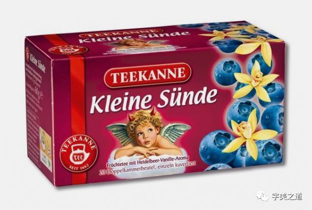
Textile is used in a blueberry fruit tea in Germany
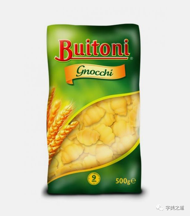
A pasta package uses TartineScript
After reading the introduction of English fonts in these two issues, you should have a certain understanding of the selection and application of English fonts. In fact, Chinese and English are interlinked in many places. The important thing is to be able to accurately judge the temperament conveyed by the words, so that you can use the words accurately. How to say that sentence: Yes, "mainly depends on the temperament "!"
Recommended reading
Designers publish a powerful illustration library for free, for free commercial use by anyone or business in the world
Design, Reflective Work Li Yongquan
tenfive exclusive Beijing designer recruitment groups
Enterprise Recruitment, Designer Looking for a Job, Design Exchange
Please note to add Beijing group
Zhao Liandong Design Studio
Design CooperationWeChat: zhao_design
Studio Packaging Works Click the link
Articles are uploaded by users and are for non-commercial browsing only. Posted by: Lomu, please indicate the source: https://www.daogebangong.com/en/articles/detail/English%20font%20how%20should%20you%20choose%20two.html
 支付宝扫一扫
评论列表(196条)
测试