On September 1, 2015, Google announced the launch of a new LOGO, which uses a sans-serif font design, which makes it perform better on small screens, and also declares that Google has more diverse platforms for interacting with users change.
Google's new LOGO
In most cases, a company's LOGO cannot be composed of a simple font, especially for companies like Google, most of them will make personalized fonts Modify to make it suitable for various application scenarios. This article will focus on comparing several very similar fonts.
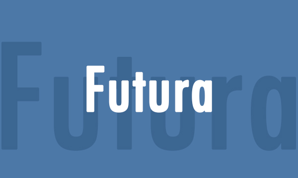
Old Futura
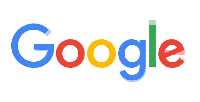
Futura is a sans-serif geometric font designed by the famous designer Paul Renner in 1927. This typeface uses a geometric design to give a very precise look, which makes it great for small text. We tried to make a comparison chart to see the difference between this font and Google LOGO:
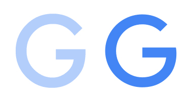
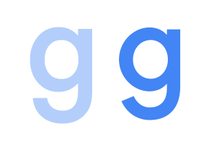
The most important thing in Google's entire LOGO is the letter G, because on many occasions this specially designed G represents Google. As can be seen from the picture below, Google’s G pen is taller and has a larger opening, which looks like a smiling face. This design makes it perform better on small screens.
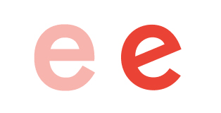
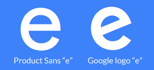
The same treatment is also shown on the lowercase letter E. The design of this letter has a strong humanistic color, and it looks more friendly than Futura's E. Of course, this design is also inherited from the old LOGO design.
In addition, the lowercase letter G is not as long as Futura, which makes the whole LOGO look more balanced. At the same time, the opening of the descending strokes is beveled. This design is also For better legibility on small screens. The same design technique is also applied to the lowercase letter L.
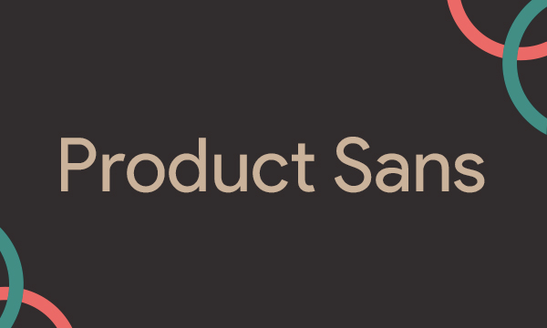
Google’s own Product Sans
Product Sans is very similar to Futura, the only obvious difference between them is on the letter A of the message, Futura uses The letter A with a double stroke is a typical feature of the humanist style. This change of Product Sans is also for legibility considerations. After all, Futura is too old, so old that it was born in an era without digital devices.
As Google's own font, Product Sans is still different from Google's LOGO, yes, it is the slanted lowercase letter e.
Other fonts
There are also several very similar fonts, so I won't compare and analyze them one by one here. Interested students can download and compare by themselves. Below we have given the download links of all similar fonts, and those who are interested can download them directly.
Futura font download
Product Sans font download
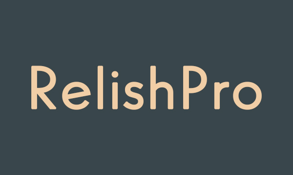
Relish Pro font download
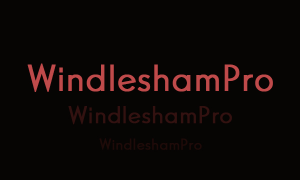
Windlesham Pro font download
Articles are uploaded by users and are for non-commercial browsing only. Posted by: Lomu, please indicate the source: https://www.daogebangong.com/en/articles/detail/English%20Typeface%20Special%20Issue%20Typeface%20Design%20on%20Google%20LOGO.html
 支付宝扫一扫
评论列表(196条)
测试