Starting with iOS 9, Apple replaced the previous Helvetica Neue font with the new San Francisco font. At present, this new font has become the default font of Apple's various product platforms.
New San Francisco font
Helvetica
The Helvetica typeface was designed by a Swiss company in 1957 and digitized afterwards. It has a long history, even going back to a time before electronic devices. Since the first generation of iPhone, it has been the default font of the iOS system, and since "Yosemite", Apple has also used this font as the default font of the MacOS system, replacing the previous Lucida Grande. But what exactly made Apple decide to phase it out?
IOS interface using Helvetica font
In fact, a fatal flaw of the Helvetica font is that it does not support small fonts well, especially after it is used on MacOS, this problem becomes even more serious. Many users, especially designers, reported that they could not bear the poor performance of this font.
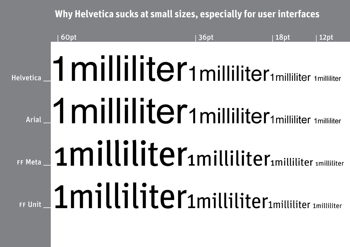
Someone made a picture to compare the difference between Helvetica font and several other fonts
It is not difficult to see from the picture that Helvetica does not perform well in small-size text, and the letters are mixed together, making the legibility very poor. This is undoubtedly a fatal problem for Apple, which is about to release smart watches, so they decided to design a new font for smart watches, and San Francisco came into being. But why is Apple bringing this new typeface to iPhone and MacOS? Just know they're not like the Apple Watch, where the text is always that small.
San Francisco
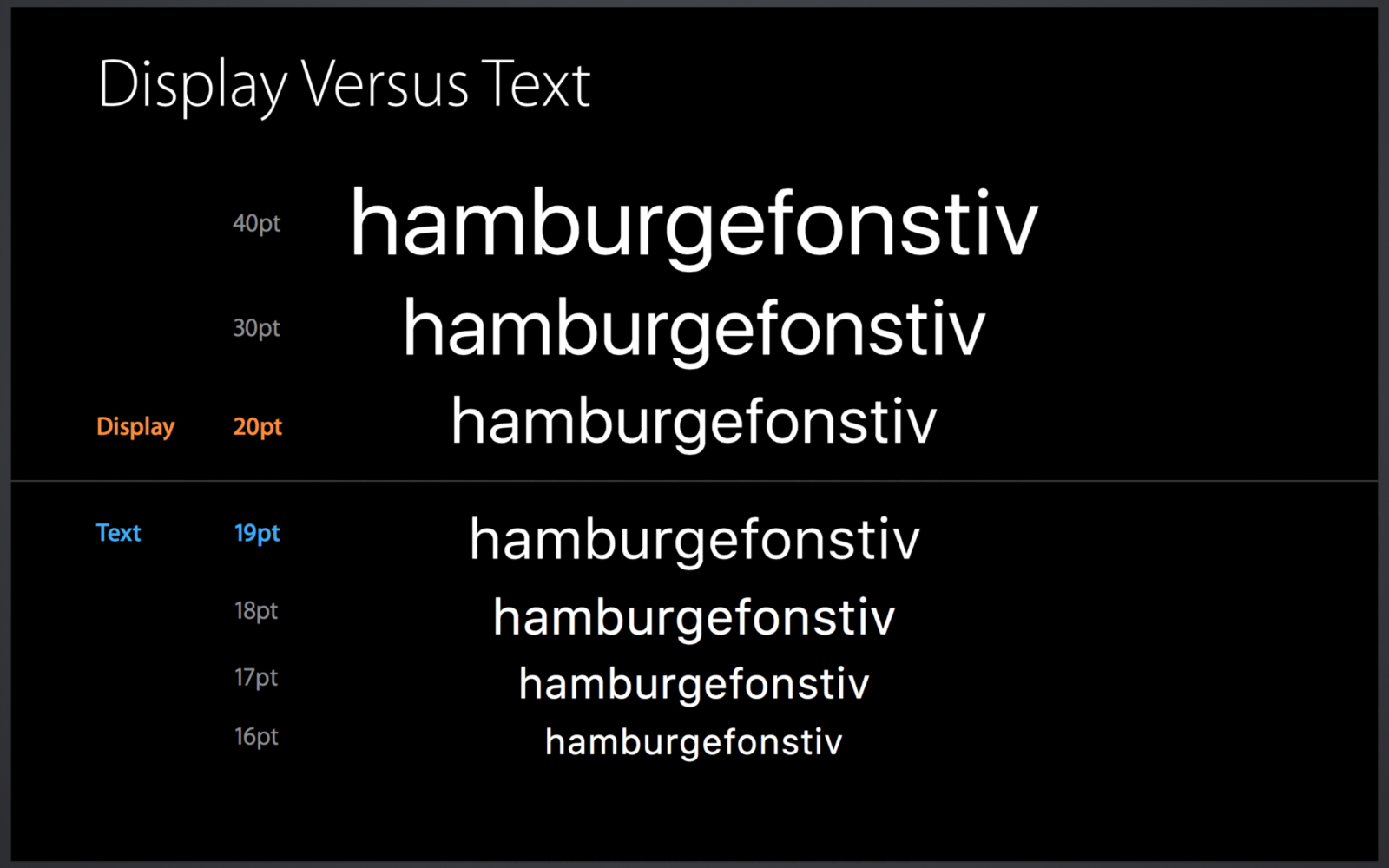
In fact, it is not the same font used on iPhone/Apple Watch/Mac, but they have a unified name: San Francisco. A font family called SF is used on the iPhone and Mac, but the SF Compact family is used on the Apple Watch. In the comparison chart below you can see the difference between these two font families:
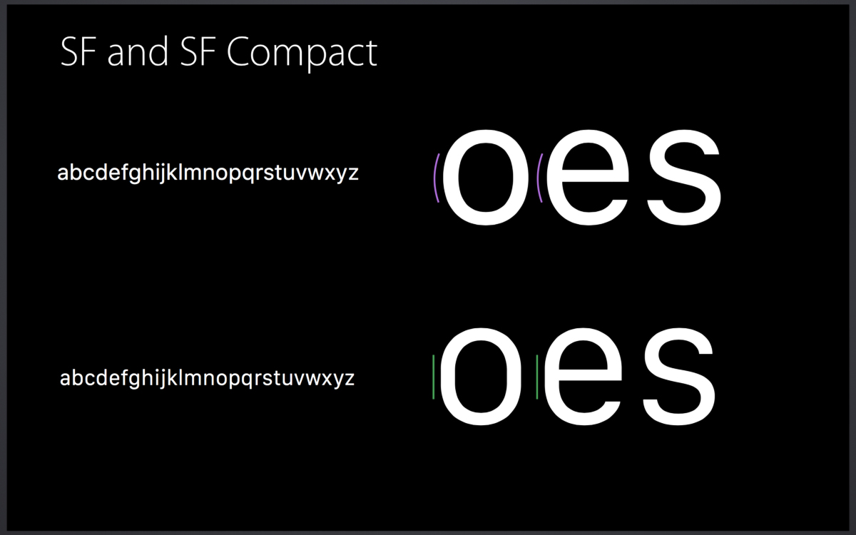
It can be clearly seen in the image above that the SF Compact family of fonts has larger gaps between letters, which makes it highly readable even on a small screen like the Apple Watch. Moreover, these fonts all contain two different sub-versions: Text version and Display version. The Text version is used for smaller font sizes, while the Display version is used for larger font sizes, which is what Apple calls the "optical size" of a font. Text version fonts have larger spacing and apertures at smaller font sizes to improve text legibility.
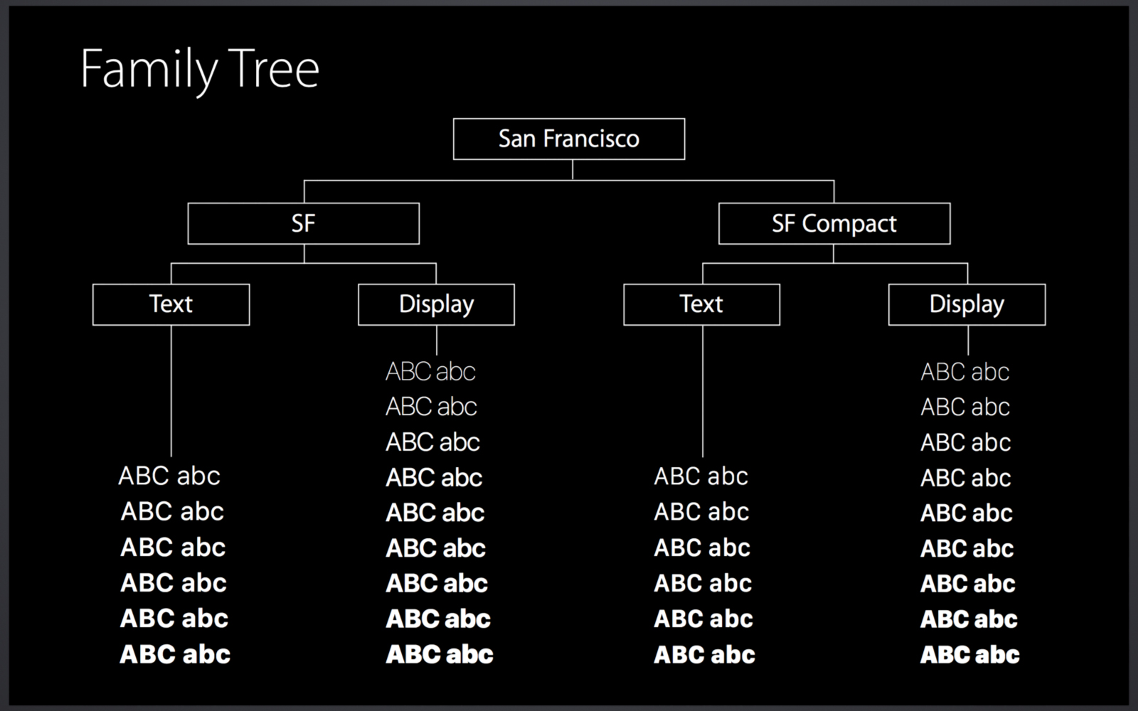
It is also worth mentioning that the operating system will dynamically switch between different font versions according to different usage scenarios, using the Text version for small text, and the Display version for others. Users don't need to pay attention to what font to use, and everything is automatically determined by the system. Apple's focus and dedication to user experience can also be seen from this.
San Francisco font family download
Normal version download
Compact version download for AppleWatch
Exclusive monospace version download for coders
Articles are uploaded by users and are for non-commercial browsing only. Posted by: Lomu, please indicate the source: https://www.daogebangong.com/en/articles/detail/English%20Typeface%20Special%20Issue%20Apples%20San%20Francisco%20Typeface%20Design%20Exploration.html
 支付宝扫一扫
评论列表(196条)
测试