A good cover design requires proper typography. The following are eight font design tips to make your cover no longer monotonous: 1. Basic principles: choose more than two fonts A good cover design requires the use of two or more fonts. One font for headi
As we all know, fonts are the design soul of the entire PPT, and good fonts can catch the audience at first sight. After choosing a font, how to apply it to the cover design?
Today, let’s talk about: When designing the cover, how to layout the fonts is not monotonous.
Really called Chen Long
Demo Home PPT (ID: PPTYSZJ)
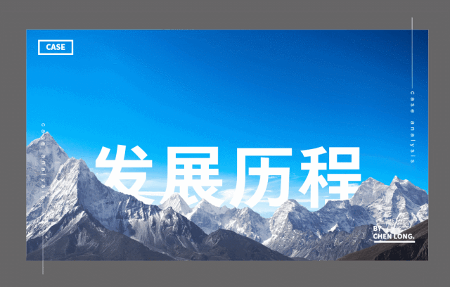
01
TypesettingEight techniques
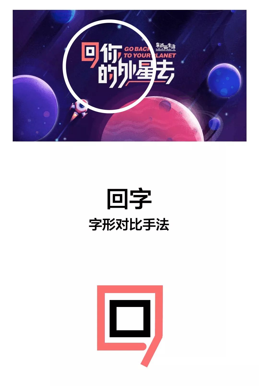
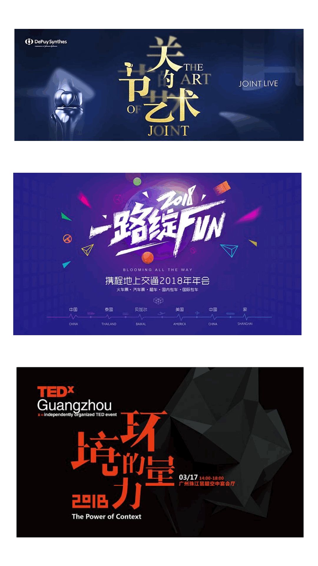
In the application of PPT, there are 8 commonly seen methods of typography, such as size, thickness, font shape, color, and space , interlacing, direction, reality and reality. < section> In various PPT tutorials, the concept of comparison is mentioned. In fact, size comparison is often used in cover design. This is the most basic typesetting method and the most intuitive effect.
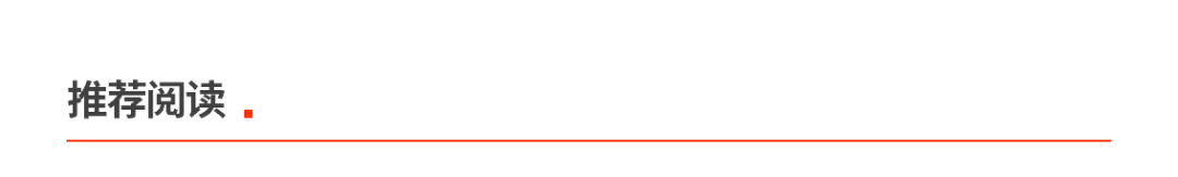
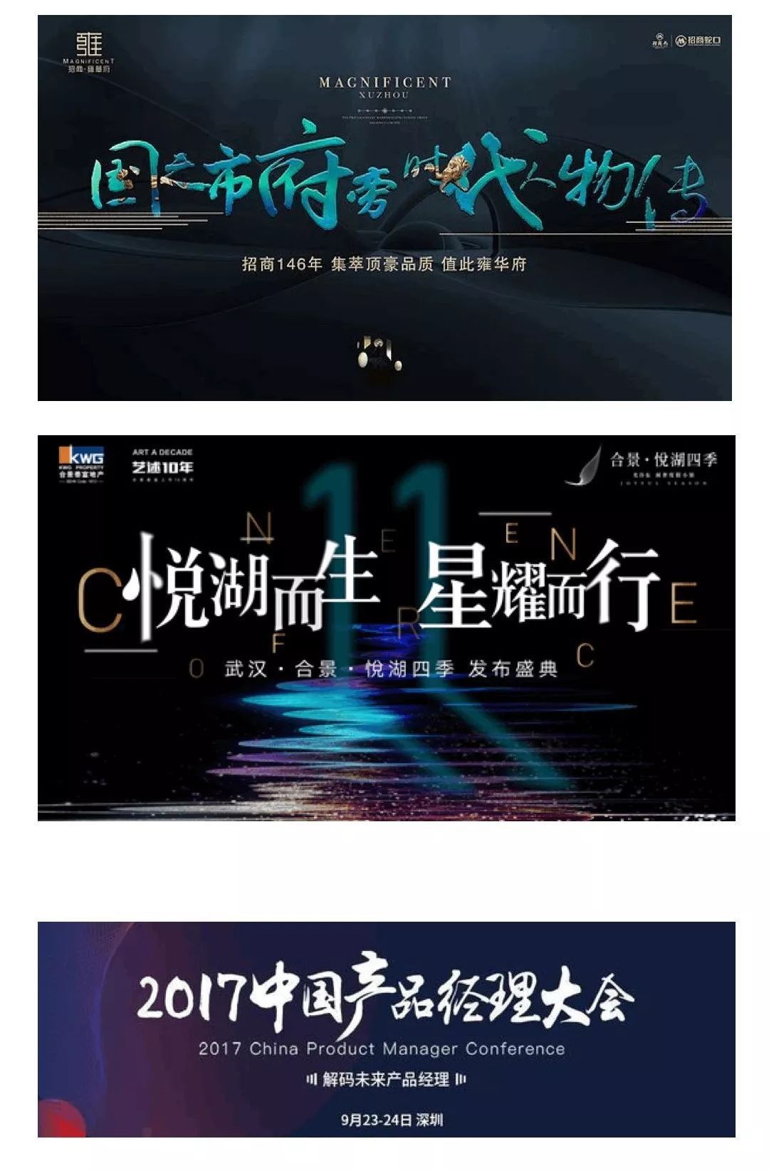
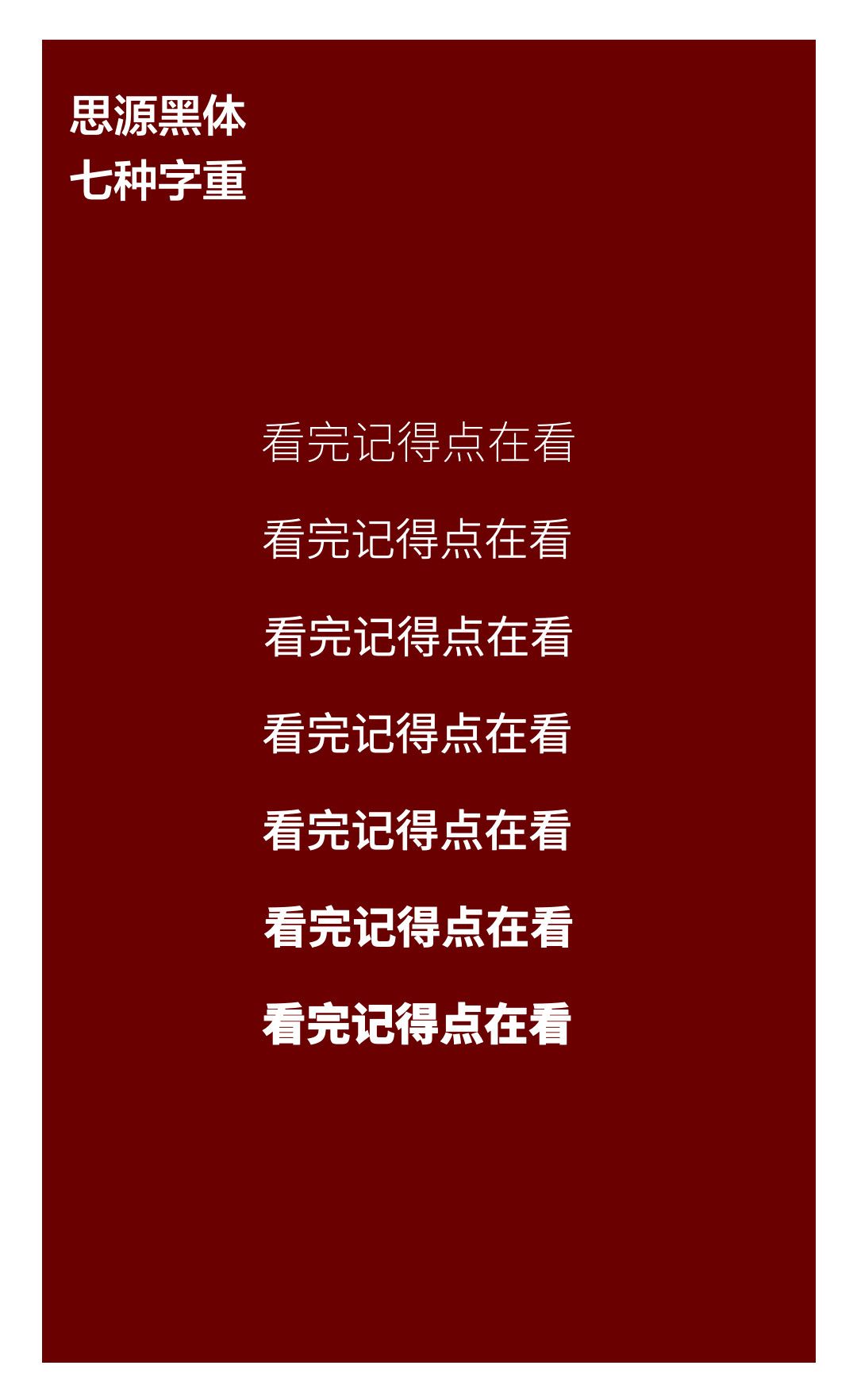
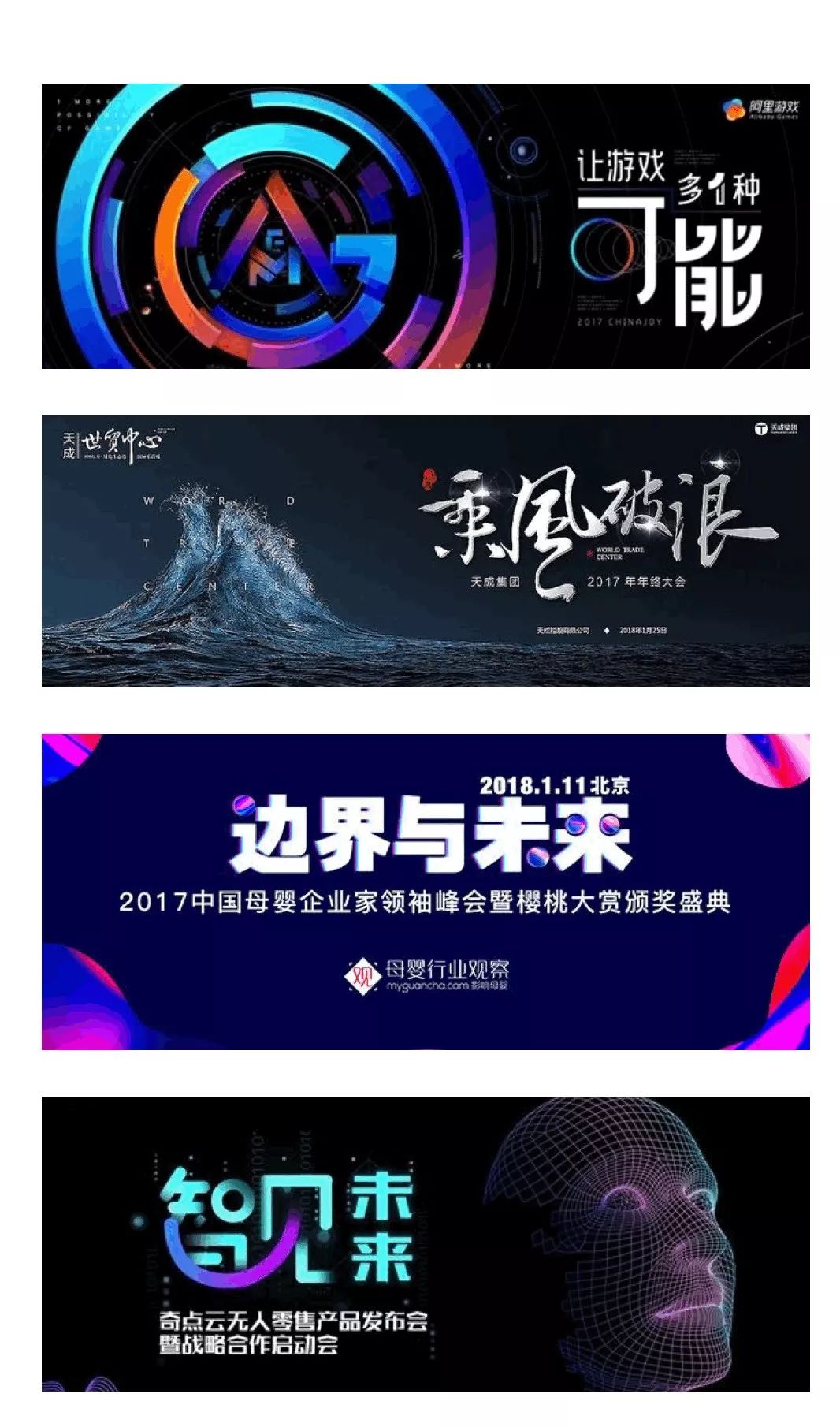
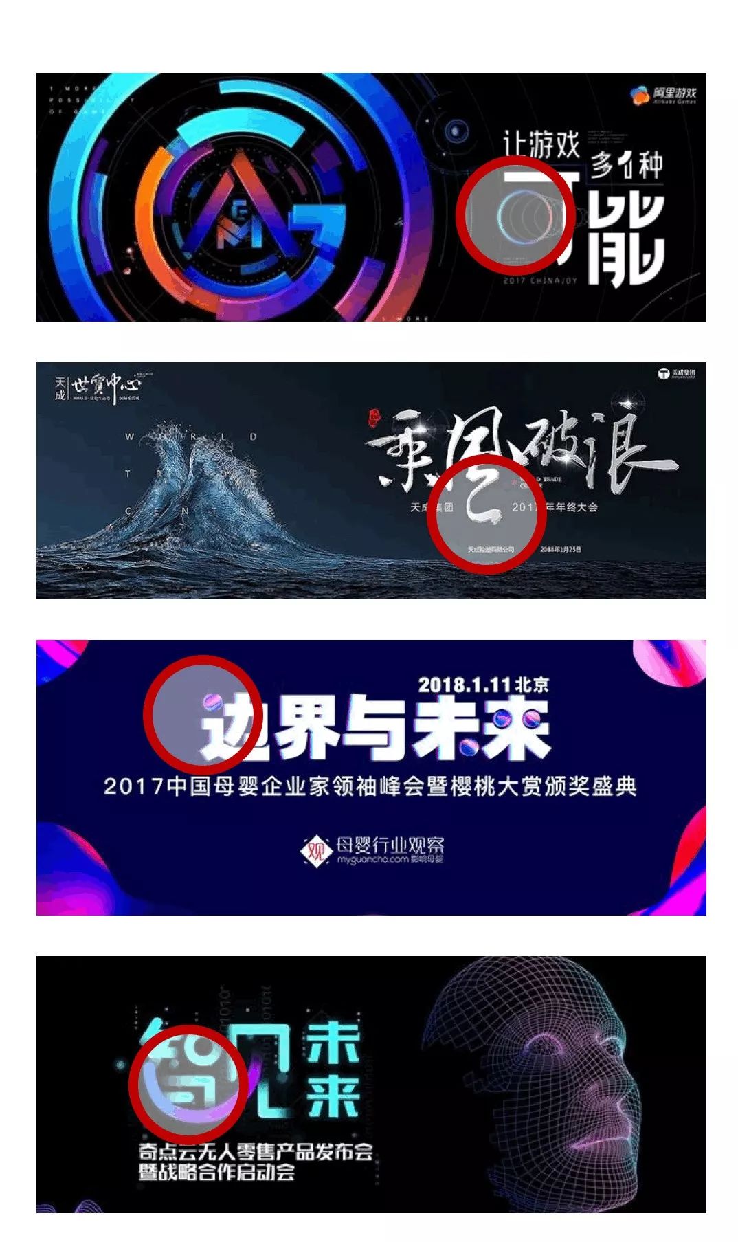
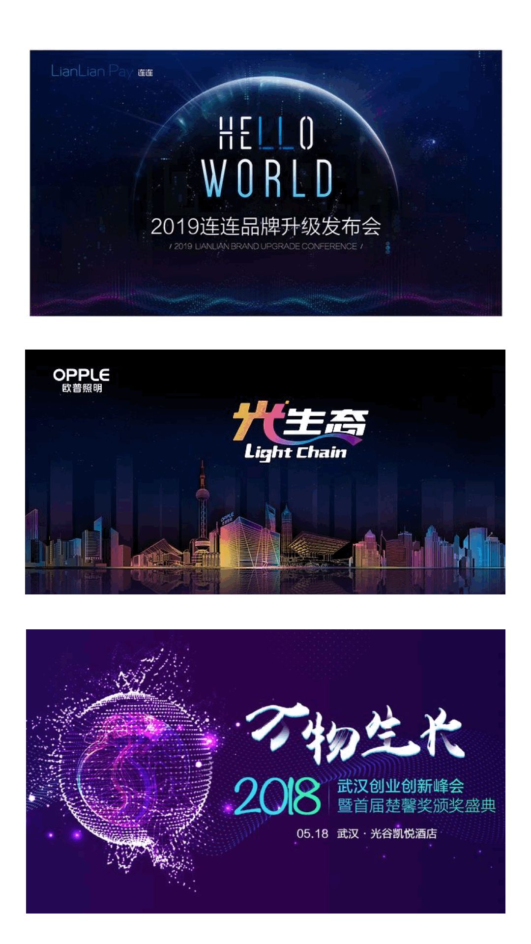
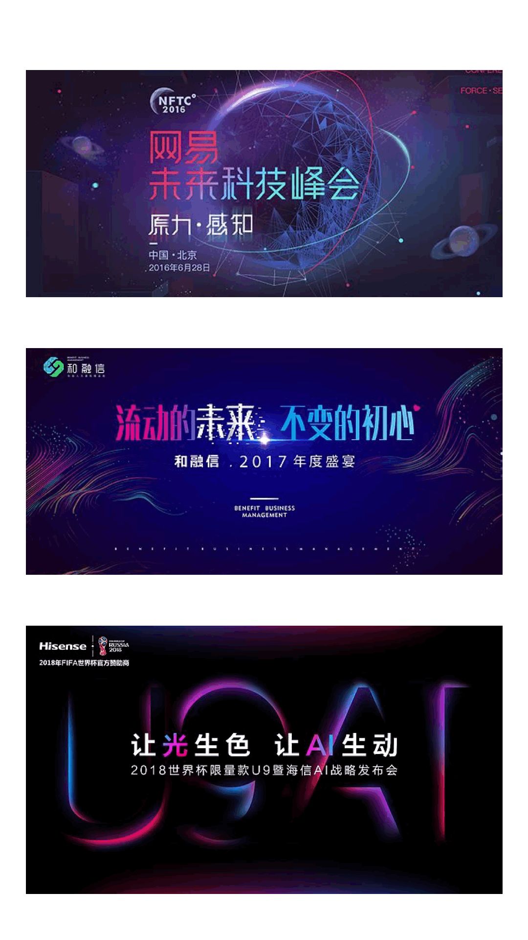
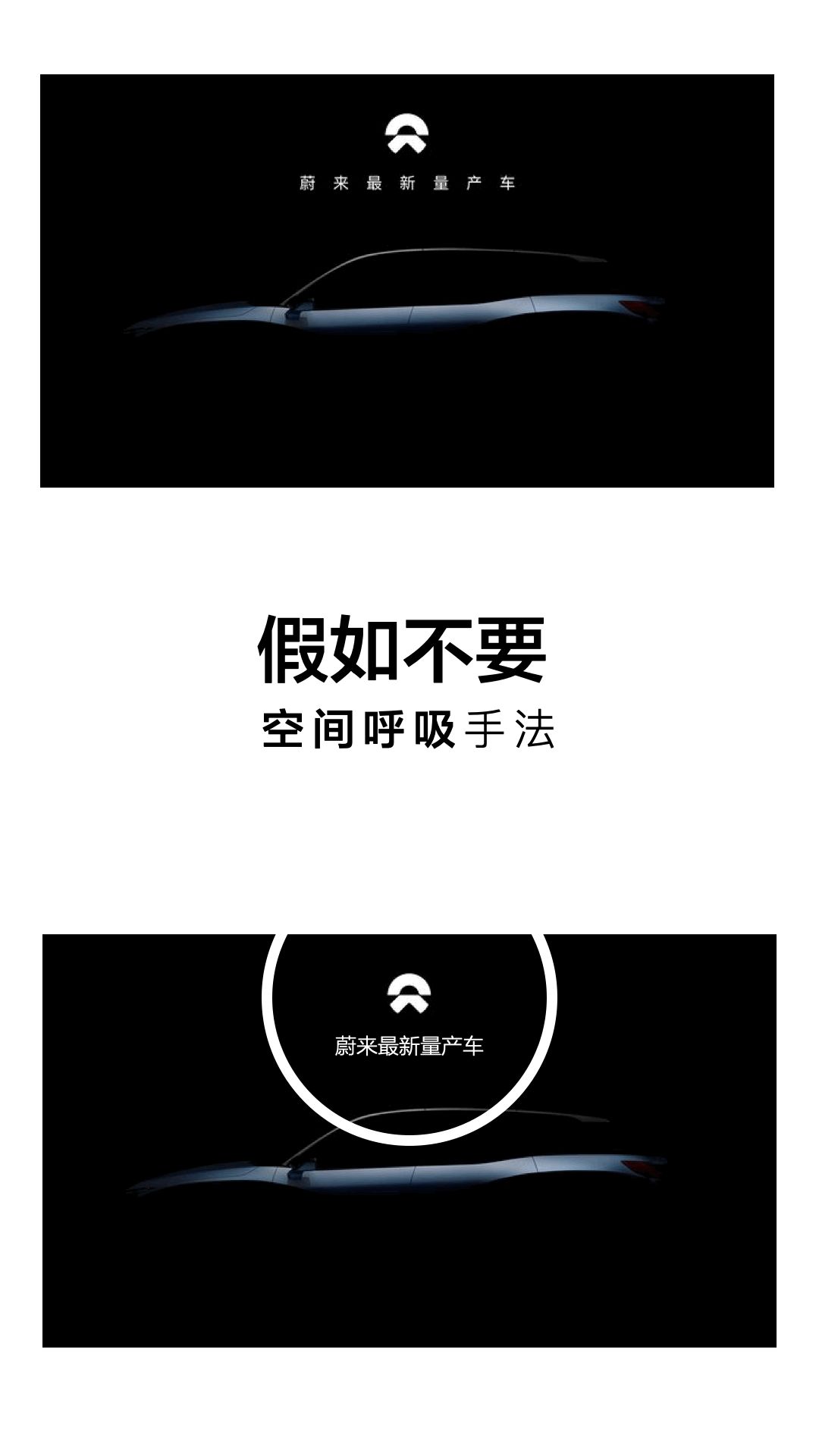
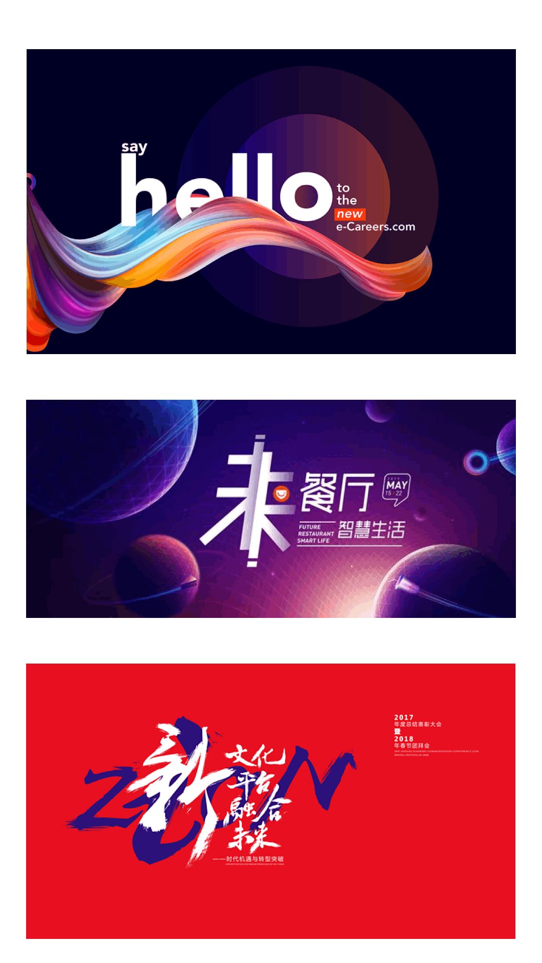
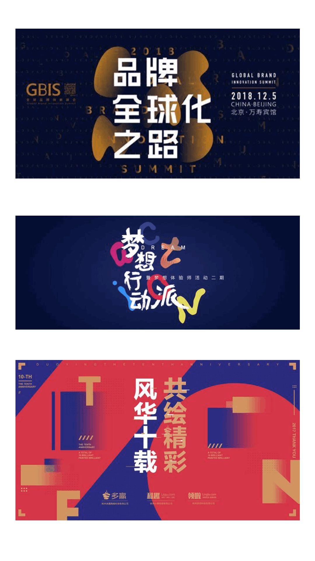
For example, in the following cover designs, the font size comparison method is used. This type of comparison method is the most basic and intuitive method. The font size comparison balances the entire layout, and the strong visual effect of the font size contrast also makes the page more Focus on jumping. Word weight comparison can be understood as font thickness comparison. This kind of comparison method is similar to the first size comparison, which is separated by the concept of size, but it is different from changing the font size comparison The most important thing is that the weight of the font makes the whole vision more hierarchical through the appropriate thickness and depth contrast of the font. For example, the case on the following page. Pay attention to the press conference at the bottom. The three characters of the press conference are smaller than the new future above. If it is not bold, it will be difficult to be noticed. The form of font weight comparison is adopted. Although the font size of the three characters of the press conference is small, it can still capture the visual focus. This is the form of weight comparison, and here is a little knowledge. Usually a font has extra thin, thin, regular, bold, and extra thick. Our commonly used Siyuan black body has reached 7 weights, namely ExtraLight, Light, Normal, Regular, Medium, Bold, and Heavy. The corresponding word weight forms are as follows. That is to say, we can use these 7 weights to identify Siyuan bold, choose different weights, and let the same type of font be used in titles, subscripts title, text. There may be a question here, is it possible to achieve the word weight effect by directly bolding it? The rough and direct bolding method can make the font thicker, and it will also affect the structure and aesthetics of the font, making the entire paragraph There is a deviation in the layout and typesetting, which affects the visual effect. < /section>Simply speaking, glyph comparison is to change the font shape to distinguish it from other conventional fonts. The fonts in the above layout designs all use the glyph processing method, and the parts I circled are all glyph expression methods. In PPT design, this method can break the font through the Boolean operation in PPT, and edit vertices, add shapes, etc. The technique makes the font more vivid. For example, for the back characters on the following page, PPT can use Boolean operations to evolve and design the glyphs. < section>Color contrast is the easiest to understand in typography, and it is indeed the most test of color matching skills. Because once the color embellishment distinction is used incorrectly, the entire layout will become messy, without a sense of advanced and design. The usual suggestion is to use gradient colors, similar color systems, and contrasting colors. For example, in the following cases, gradient colors, similar colors, and contrasting colors are used for embellishment contrast. In the above pages, colors are used to separate other text information. In addition, we can also use this method to focus on the content to be expressed in the PPT content page design copywriting. ❺Spatial Contrast
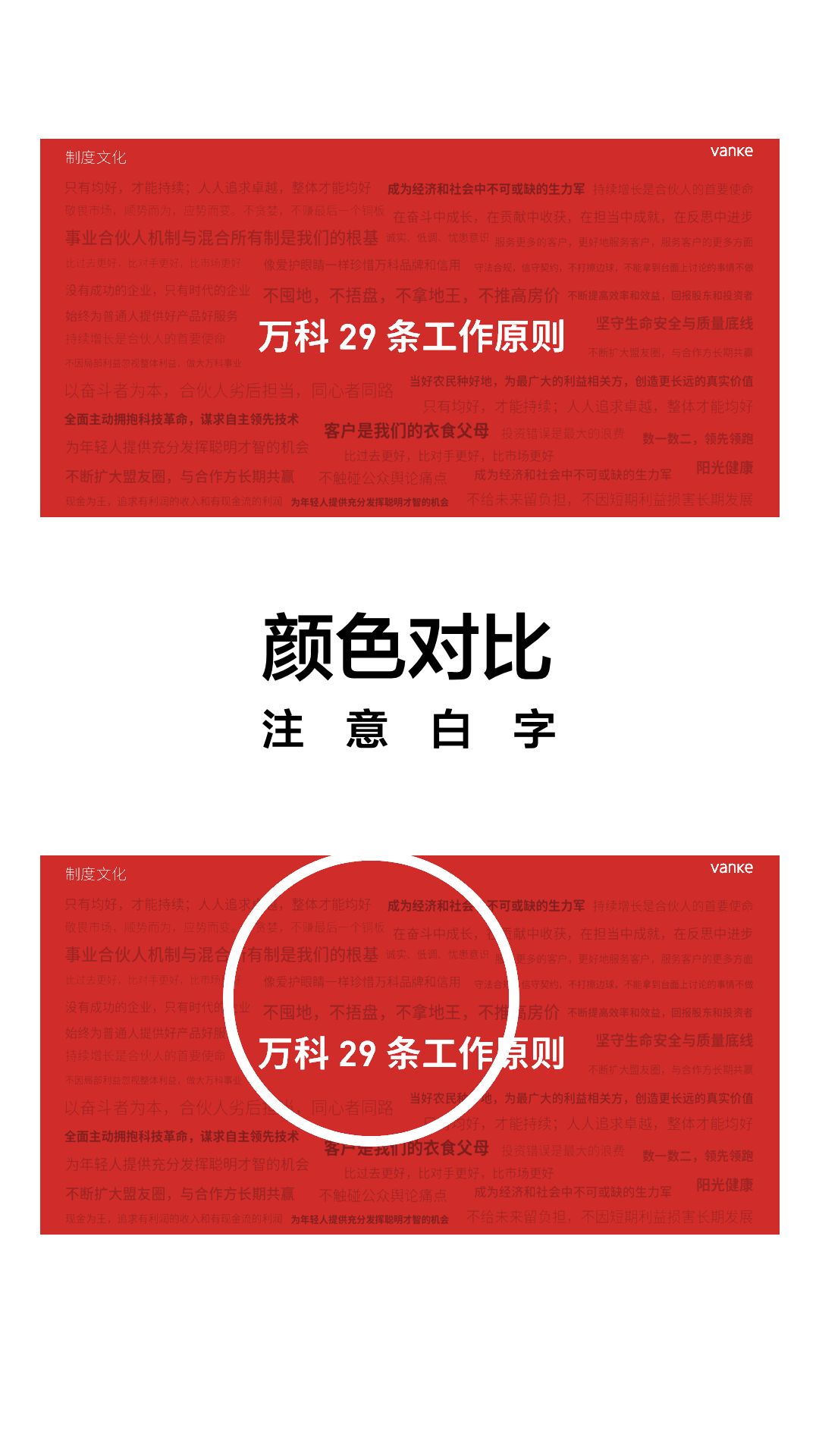
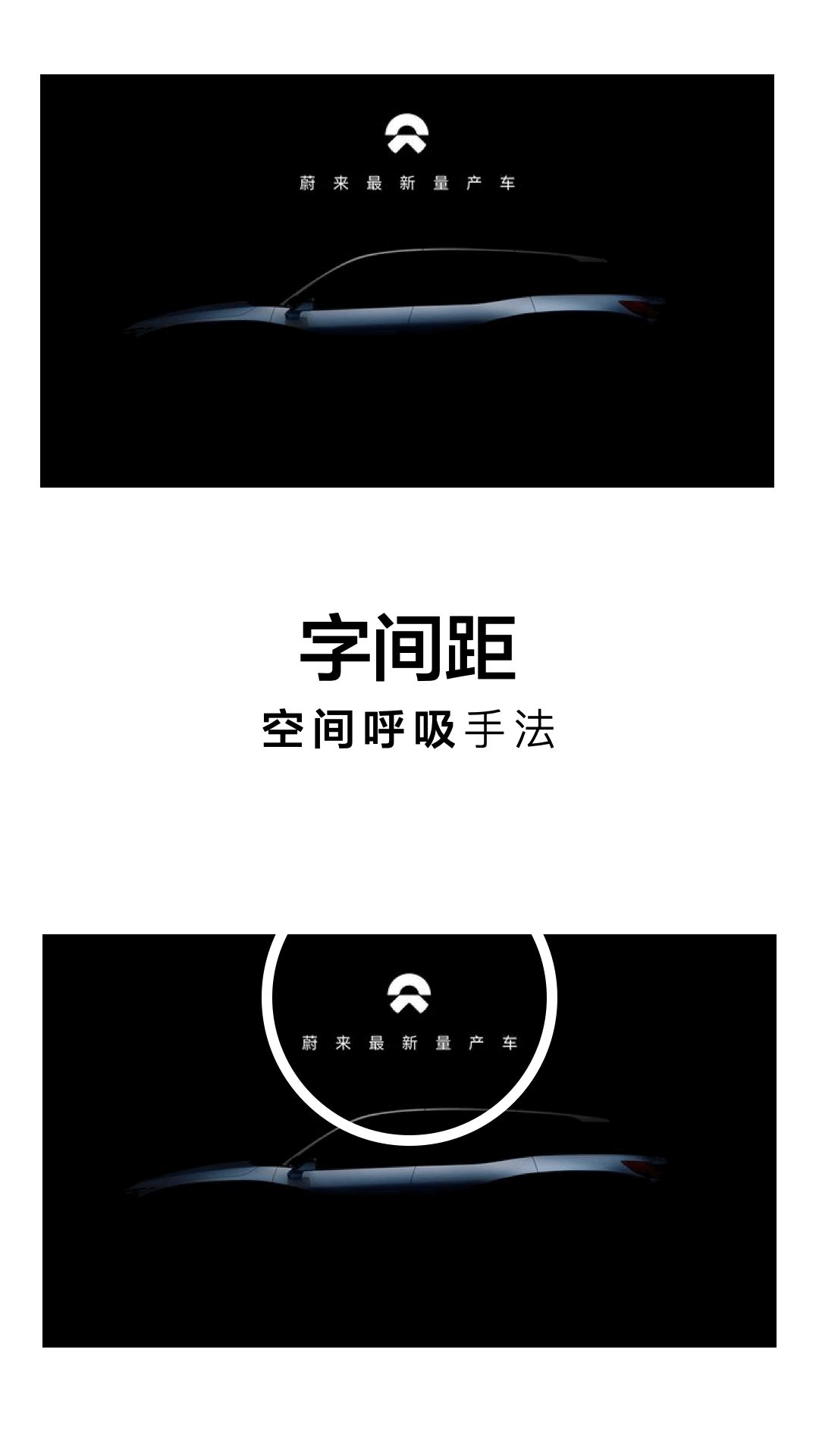
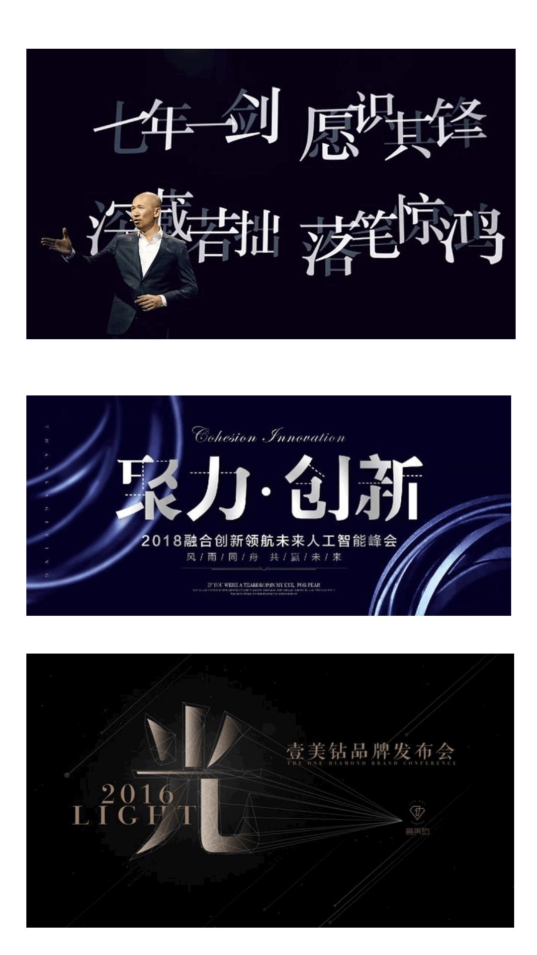
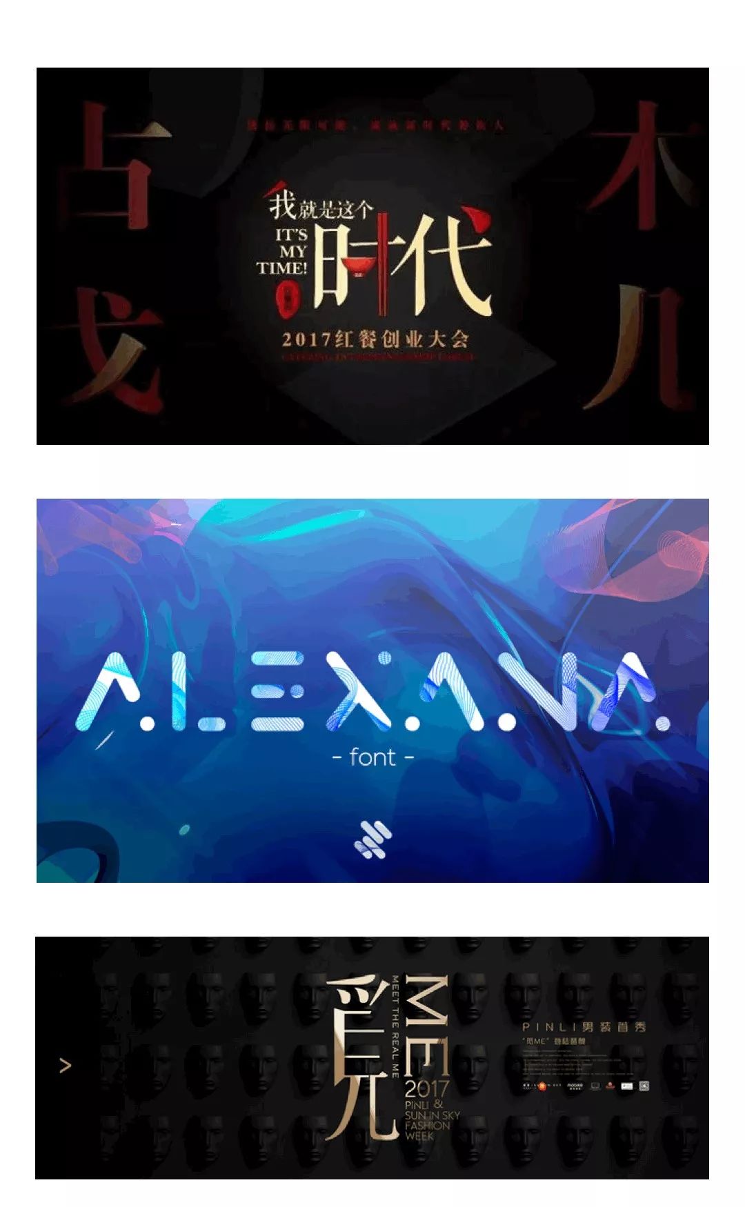
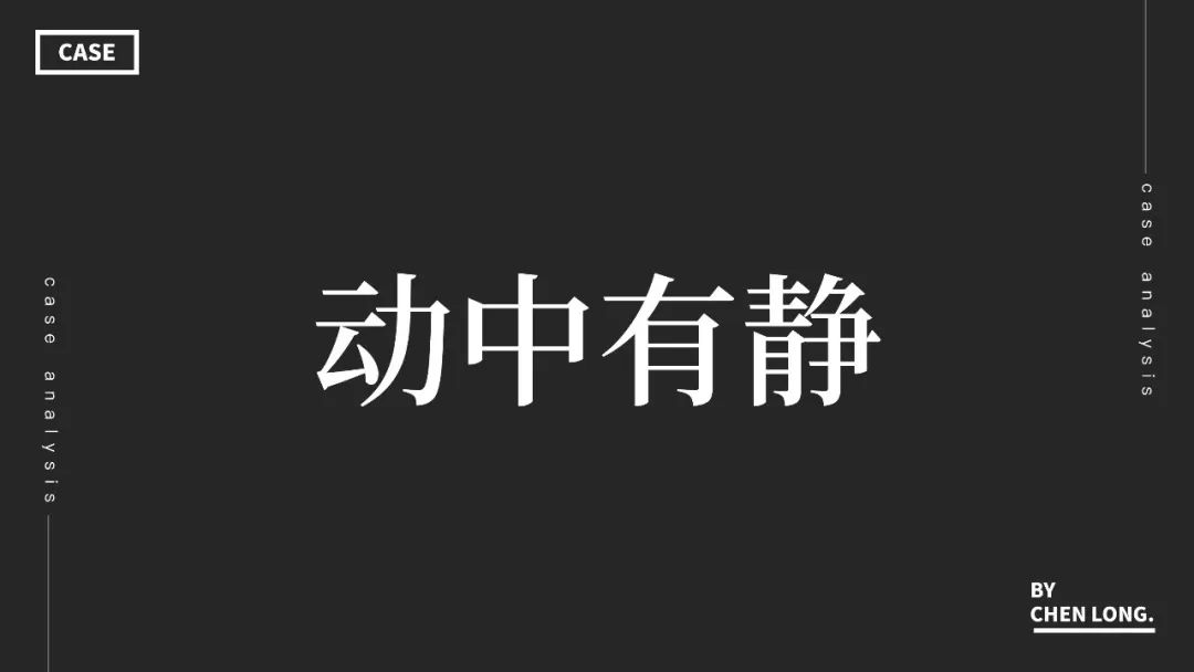
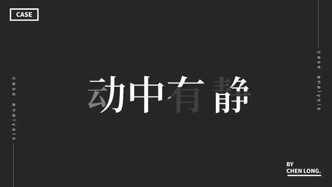
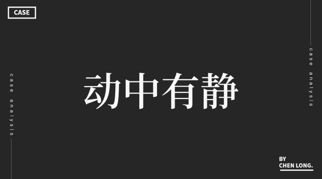
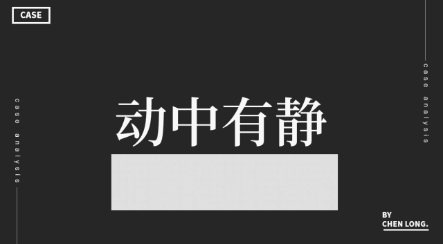
In the PPT cover design, there are not too many texts. At this time, we need to consider the contrast between the entire space and the text. The usual method is to use The text spacing is set differently, so that the entire text has a sense of breathing. For example, in the above page design, the main title text and subtitles are typeset by using font spacing contrast method, and the balanced visual processing method makes the whole page more hierarchical and reasonable. On the same page, if we adjust the text spacing to be regular, the contrast between the breath of the overall page and the design space will reduce the refinement. Similarly, there is another kind of design technique, which is to use the contrast between space and text to generate a sense of design. This kind of technique is usually called blank space. Let’s take a look at the following These are examples of space versus text contrasting. Here can be summed up in one sentence, as long as the space contrast is used well, there will be a sense of exquisite design. < /section>Cross contrast is also the design form used in PPT cover design. In the same spatial vision, the tension and sense of space in text expression can be achieved through front and back staggered typography. For example, our common use of faded characters, which hides the lower part of the text in the overall background, belongs to this category Class approach. < section>When designing PPT, we habitually format the text according to the horizontal baseline. Changing the conventional typesetting method of the text is also another typesetting method for the cover. For example, vertical guidelines can be used to typesetting design, so that the visual center of the entire layout falls on the text. It can also be typeset diagonally upwards, which will make the overall page more focused, and the design feeling conveyed by the page will also have more dynamic and jumping elements. ❽ Comparison of truth and reality< section>
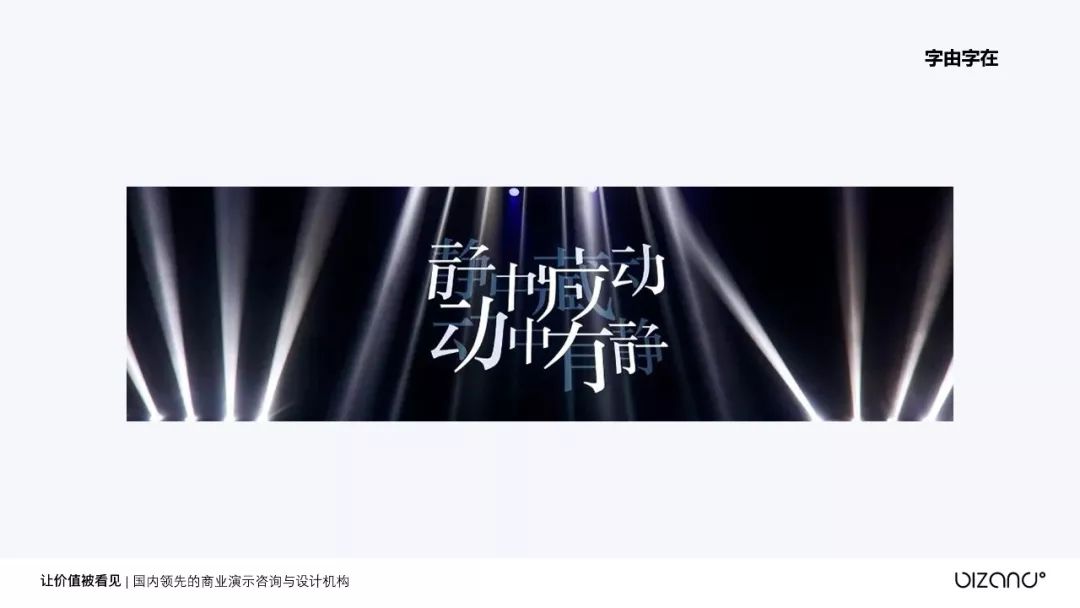
In more and more PPT presentation occasions, this type of design is adopted.In simple terms, it is the combination of virtual and real and the distinction between foreground and background , The staggered light and shade make the text more grippy and grab the visual focus. The contrast between fuzzy and clear is the contrast between the foreground and the background. Through the difference between the foreground and the foreground, the core text content is highlighted. This type of font technique In PPT, it can also be realized with basic PPT operation skills. 02
Font recommendation,Skills
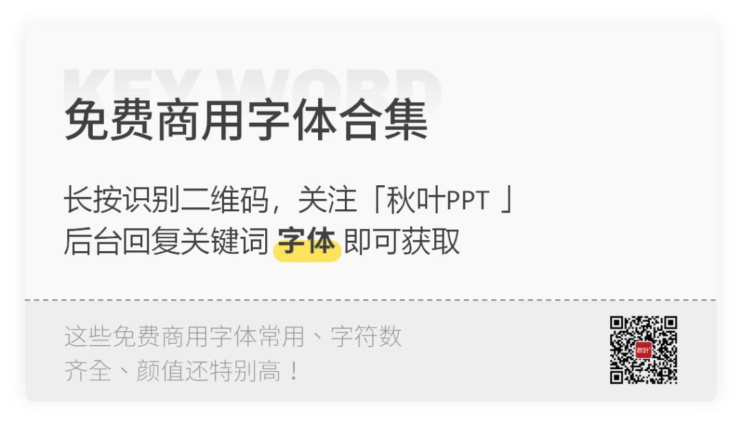
Above we mentioned the eight methods of fonts in cover layout, may be Ask, how are these related techniques implemented? The specific production method can refer to this article: "Inventory of PPT with a sense of design and easy-to-learn text skills" span>In addition to these techniques, “Free commercial font collection” is obtained here, reply to keywords, 30 +The fonts are all packaged and brought home:
This is the sharing content of this article! If you gain something, remember to click Looking:)Have seen so many font designs, have you opened your eyes? ! ! You should know that font is just an element in PPT, want to see more interesting things? More unexpected operations? Strongly recommend“Autumn Leaf PPT Design Advanced Class”! In the PPT design advanced class, poster design, template making, color animation, plug-in AI, visual expression and customization are all in one go! The seventh PPT design advanced classLet you improve design aesthetics Realization skills Realization is not a dream 6cFqFOlDZMleLl4pw/640"data-w= "64"style="max-height:20px!important;width:20px!important;height:20px!important;"_width="20px"src="data:image/gif;base64,iVBORw0KGgoAAAANSUhEUgAAAAEAAAABCAYAAAAfFcSJAAAADUlEQVQImWNgYGBgAA AABQABh6FO1AAAAABJRU5ErkJggg=="cross origin=" anonymous">Scan the QR code to add duck friends, and give you dry goods benefits! 

Articles are uploaded by users and are for non-commercial browsing only. Posted by: Lomu, please indicate the source: https://www.daogebangong.com/en/articles/detail/Eight%20font%20design%20skills%20to%20make%20your%20cover%20no%20longer%20monotonous.html


 支付宝扫一扫
评论列表(196条)
测试