
LOGO master editor (ID: logods)
ArticleAdobeDesignTeam
Translation: Hiiibrand (ID: hiiibrand_com)
Your Majesty looked back
A few recent LOGO upgrade tweets
I found that recently when brands change their logos, they seem to be playing with "fonts"
▼
Lenovo quietly changed the Chinese LOGO, but I didn't notice it!
It turns out that OPPO's new LOGO interprets "circle circle circle circle circle" in terms of strength...
Avon's new LOGO, playing retro?
Consulting giant McKinsey changed the LOGO, just "press the enter key"?
Of course, except for LOGO
There are too many places where fonts are used in design
As designers, we increasingly rely on
Using fonts for organized narrative in design
So, what new trends will there be in font design this year?
According to Adobe’s 2019 font design trend
Combined with some practical examples, let’s take a look~
▼

"It's about teaching people how to 'see' fonts,
is becoming more important than ever. "
Eight Trends
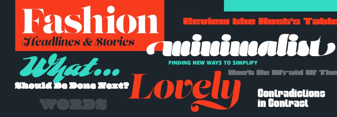
The simplest sans serif
High Contrast
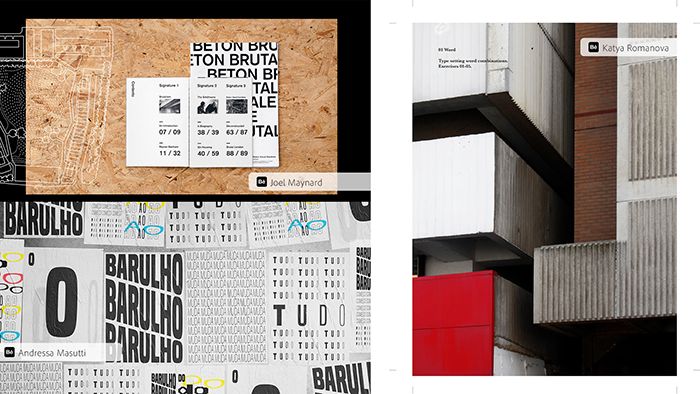
Brutalism
Variable font + dynamic display
Bold + border
Handwritten font
Retro Font
3D+AR font
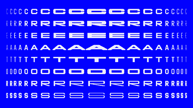
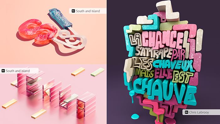
01Simplest Sans Serif
Minimal>
"Boldface never goes out of style."
"Sansserifswillneverdie."

Sans-serif fonts work very well in graphic design. Their slightly sophisticated modern mystique gives designers room to express and convey emotion.
Meanwhile, sans-serif became the new standard for "clean, uncluttered" design.
"Modern sans-serif fonts have become such as Helvetica (a widely used Western script typeface, created in 1957 by Swiss type designers Eduard Hoffmann and Max Miedinger (MaxMiedinger). It is the default font of Apple Computer, and the Arial font commonly used by Microsoft also comes from it.) Such a mainstream spokesperson.”
Similarly, the sans-serif font corresponds to the Chinese font, so that brand LOGO, visual system design, and web design generally use boldface as the font of choice. It seems that after the mass reading medium has shifted from paper to electronic screens, it is becoming more and more difficult for Song typefaces to survive.
via Tencent
02High Contrast
High>
"More extreme customization and operability."
“Moreextremecustomization
and manipulation.”
Spontaneous design experimentation is no longer a thing in the design world. In fact, experimental works are increasingly being admired. So how do you keep up with the huge trend of graphic design?
High contrast is your tool.
Many font tools now allow designers to change font thickness, overlap, spacing at will... There are too many places for us to change and adjust.
Fill some gaps. Maybe in your next UX or brand identity design, you can try to use high contrast to complete it.
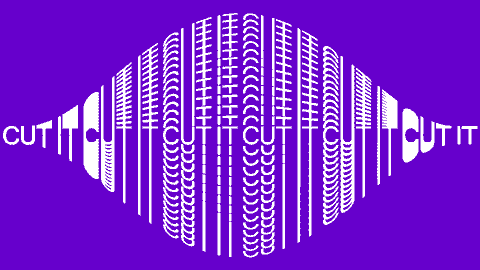
Brutalism
Brutalism
"Knowing that there are tigers on the mountain, why not go to the mountain?"
“WhatcanIdowiththisthat
I’mnotsupposedto?”
Brutalism likes to push type straight to the edge of the page—a lot of designers are jumping in and doing things they shouldn't be doing.
"It's a whole new kind of postmodernism. It's a real shock to rules and standards."
The font company Panagram Panagram Foundry said in a related share: "Such brutalism is an excellent way to create tension in the design." When a raw and polished design jumps directly in front of your eyes, it immediately It caught people's attention.
via Stefan Huerlemann
Brutalist fonts can also create a manic, rebellious vibe, which is why this brutal style is so common on posters and experimental projects.
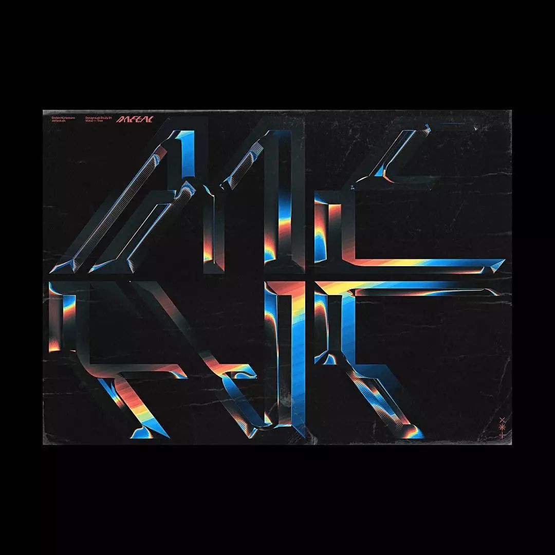
Variable font + dynamic display
Variable>
"This is quite possibly one of the greatest discoveries in typography ever made."
“Possibly, one of the greatest
type discoveries, yet.”
With the reform and innovation of open fonts, the previously unimaginable handling of fonts and graphicsEntered a new era of customization and openness that can be zoomed in and out endlessly.
With variable fonts, you can arbitrarily enlarge, shrink, stretch or bend the font within a given range...you can adjust it to the proportion you want, the symmetrical effect suitable for the work, or even continuous animation.
Now, the technology is starting to take design in an increasingly interesting direction.
"If you want to break out of static design, try variable fonts. It can give you more creative freedom and make fonts more interactive with designs. Do the same design as others? You can No need."
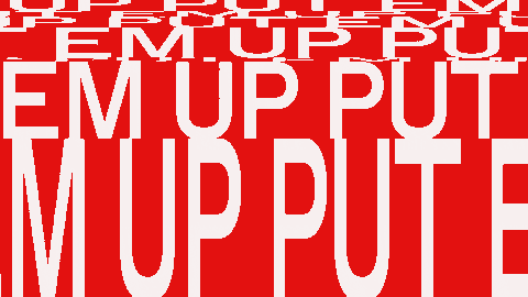
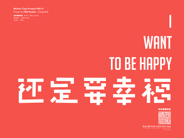
This trend has long been used by domestic designers in the design of brands and posters. Due to the complexity of Chinese font strokes, the derived dynamic effects are richer and have more possibilities.
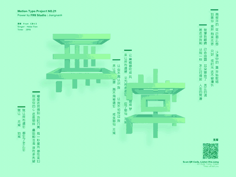
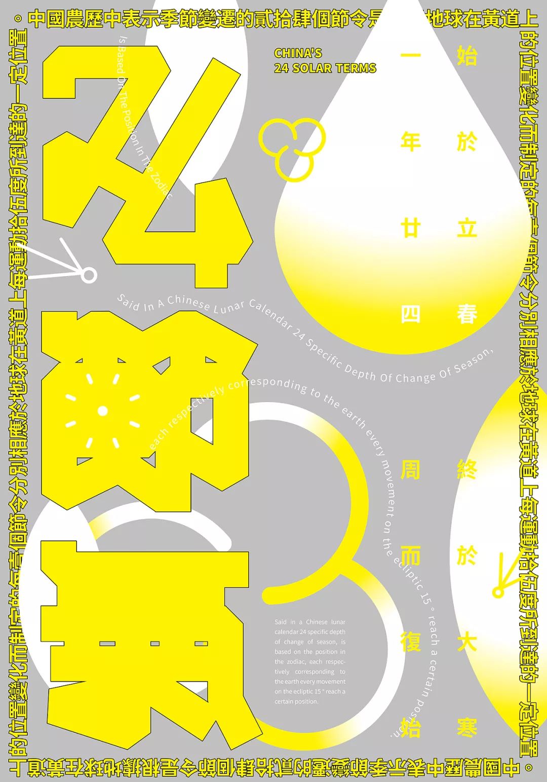
via Jiangnan Li
05bold + frame
BOLD>
"Beautiful art stronger than words themselves."
“Show-stoppingartthat’s
louderthanwords.”
The thicker the better.
Among fonts, there is no strongest, only stronger. All caps, interlaced case and more will make people stop.
Fonts with outline borders make fonts a more interesting transition into graphic design. Especially in fashion, newspapers, magazines, etc., such outline fonts are very common, and it can be said that they perform perfectly in open compositions.
via Fxckdown
Furthermore, the colorful fonts are never separated from the design. Then use this year's visual trend palette, you will be the focus of the audience.
Give it a try in your next magazine, article, or a branding project.
The combination of "bold font + frame line" was used by many designers as a tool to reflect "brand rejuvenation and personalization" when domestic street style prevailed, and it was also an important element in 2018-19 .
via Fxckdown
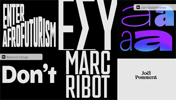
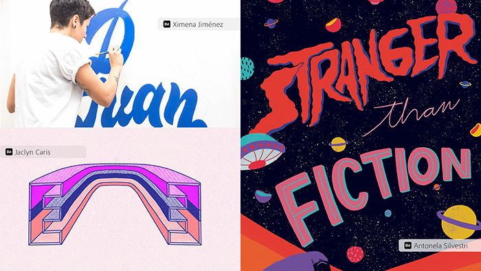
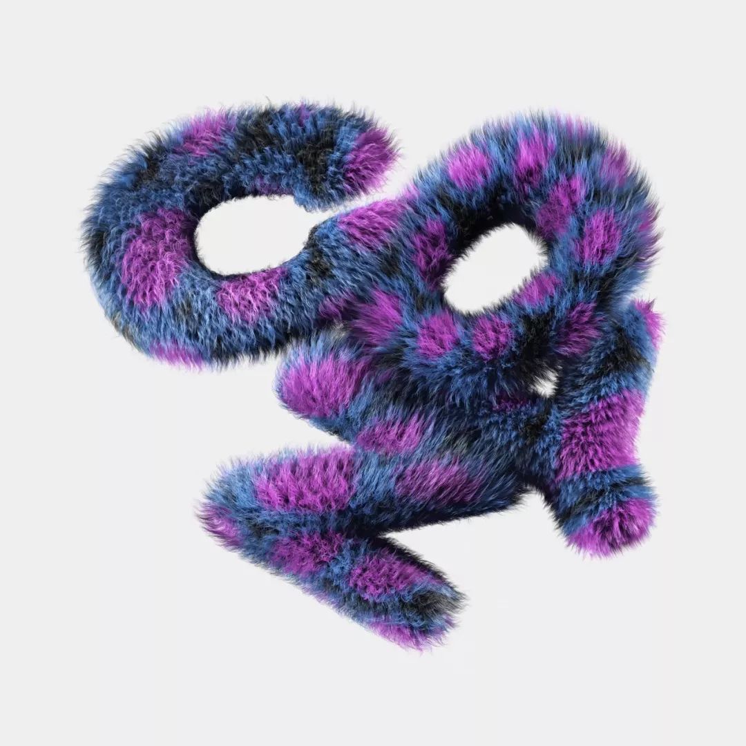
06Handwriting
Hand-Lettered>
"'Personality' is being valued more than ever."
“Individuality is more important than ever.”
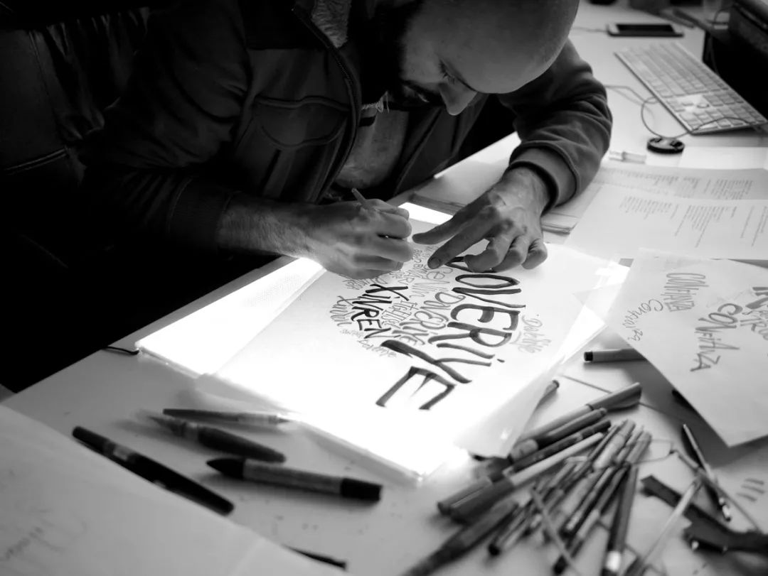
Yes, handwriting is everywhere, as we all know. But is handwriting overused?
No. Especially when it comes to "personality".
"Handwriting is almost a wonderful first taste of a typeface. Typefaces that mimic handwriting have long existed in Western culture, especially in feminine aesthetics."
In recent years, handwritten fonts have become more and more powerful, and there is a trend ofemphasizing more and more stylization. They are no longer limited to soft or preppy, but can be bolder and more avant-garde.
A thousand handwritings, a thousand differences. The subtle differences between handwritten fonts also bring more uniqueness and non-reproducibility to the design.
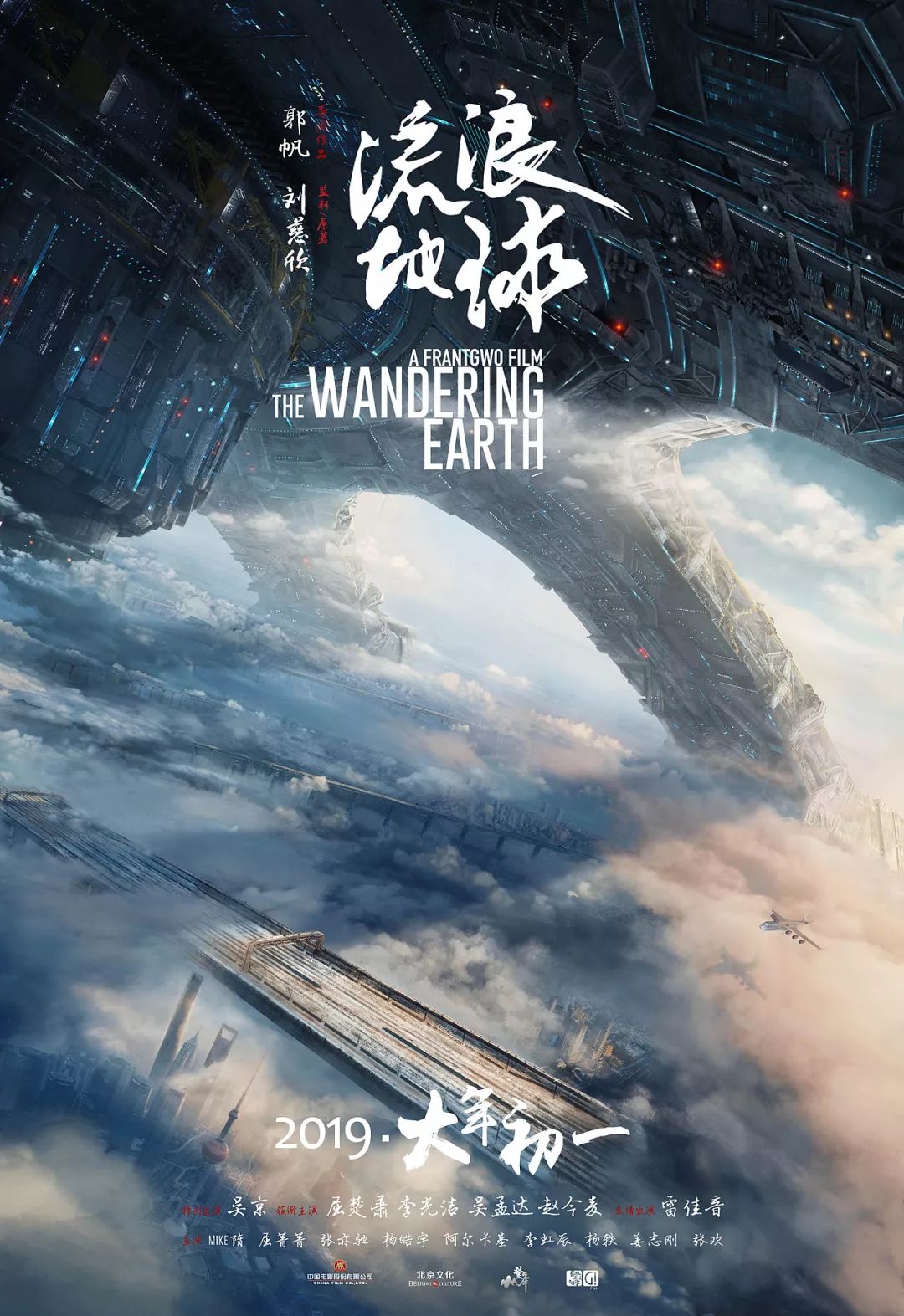
In China, handwriting is more reflected in the use of calligraphy and calligraphy. We can see it on many commercial posters and web pages.

via "The Wandering Earth" movie poster
via "The End of the World" poster
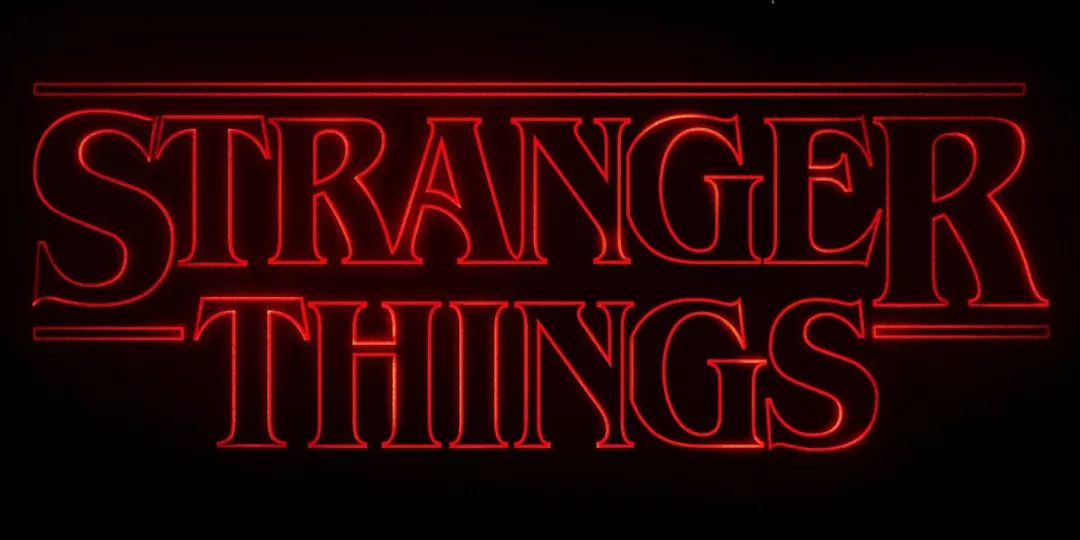
07Vintage Fonts
Nostalgic>
"The essence of human beings is a repeater."
"When generation keepspeating itself."
Everyone is obsessed with designing the typeface that most reminisces about the 80s. In it, we can discover how reading typography connects with the reader's emotions.
For example, designer Ed Benguiat created the Stranger Things font—a typeface that evokes many classic horror stories and 80s pop culture.
Yes, round and round,nostalgia, retro always appear in the design again and again.
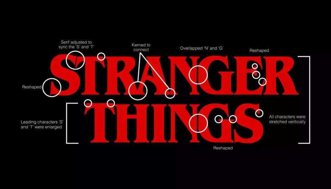
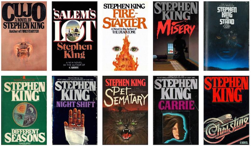

This font was inspired by the cover of Stephen King's novel
These nostalgic fonts are often used in projects such as movie posters, music flyers, and event promotions. Here are some more 90s-inspired font designs. ↓↓↓


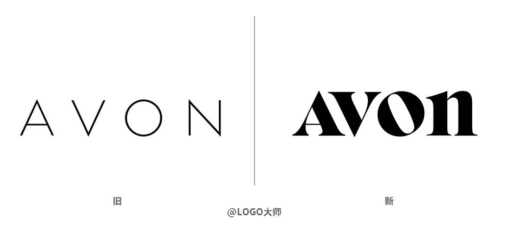
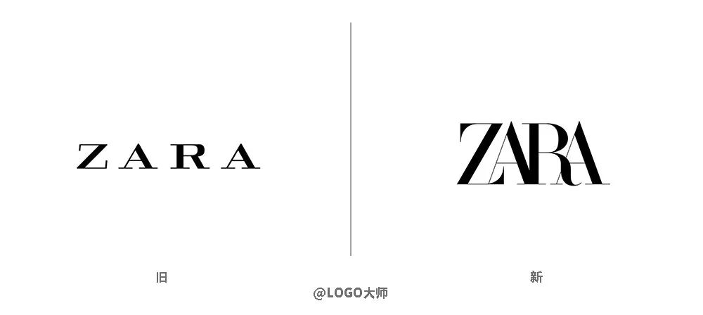
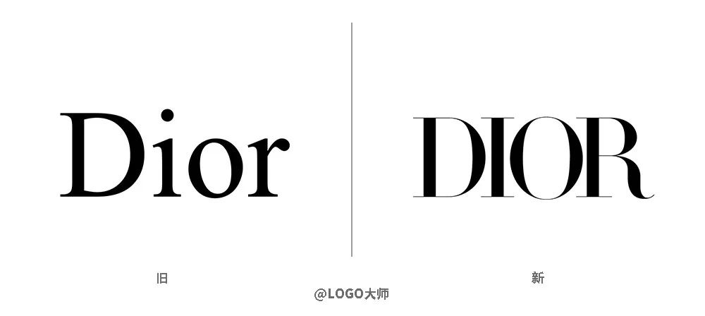
Avon, ZARA, and DIOR, which recently upgraded their LOGOs, all adopted nostalgic and retro-style fonts. Among them, Avon's new LOGO has been interpreted as "a retrospective of the LOGO in the 1970s".
3D+AR font
3D>
"A new level of design, a new level of font."
“Nextleveltype,fornextleveldesign.”
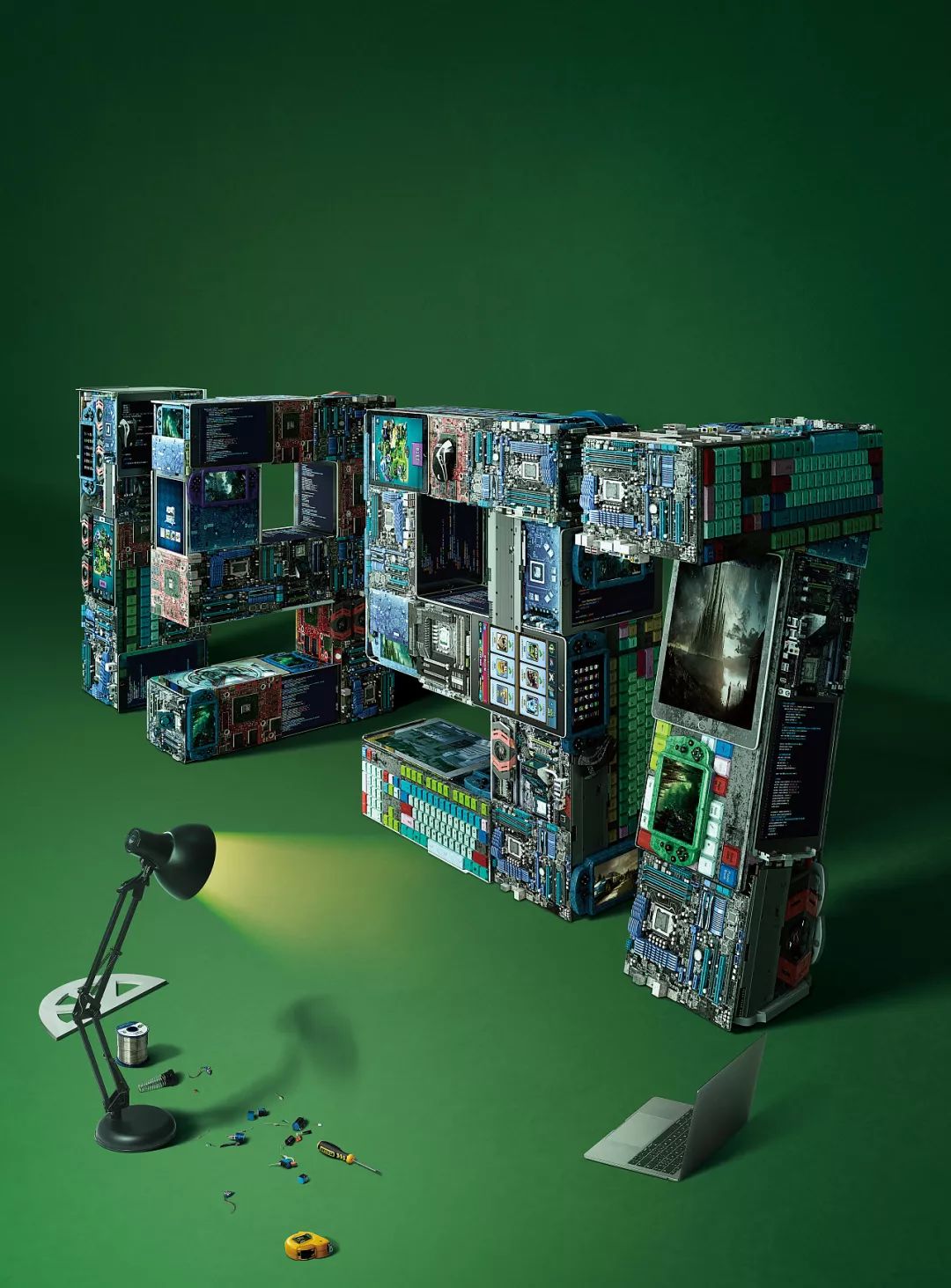
The wheels of the times keep moving. Designers followed suit and began to experiment with creating works in new dimensions. What about fonts?
With the emergence of emerging technologies such asVR, AR, photo virtual reality, 3D, a new dimension of design has also emerged out. Designs become freer to interact with the scene.
via "Jingdong XOneshow Attitude Poster"
With 3D technology, you can stretch, bend, rotate, etc. to change the way the font is rendered to create an immersive experience< /span>. Even different textures can be added to arouse the audience's sensory resonance with a sense of reality.

via Shane Griffin & Jay Giraldo
Designers like Andrew Johnson are constantly exploring the boundaries of type design to see what 3D technology can make type become.
This font designed by Andrew Johnson
It can be automatically adjusted according to the viewing angle
▼
Font application in AR
▼
LOGO Master Comments:
When Dajun shared similar trends with you before, I remember a comment saying: "These are the trends of big foreign brands, which are of no use to us small designers who only listen to Party A." Dajun has always wanted to say that maybe these international trends every year are more or less "too cutting-edge" for our daily design, but they are not without reference. Because design is a language that is shared by the whole world, there may be different presentation methods based on different cultures, but in fact there are many "transition points" that can be connected to our daily design. Such "absorption-penetration" ability is actually our designer's personal learning ability. I believe that people in the design industry have a certain pursuit of beauty, so I hope this article can be used as a spark to ignite everyone's inspiration, and I am very happy.
Today's Topic:
Which font do you use most often?
Welcome to leave a comment
"Learning affects people more than Danqing."
[Click the link for some cases:Buquan Tea Dew, Water Bear Biotechnology, Quguo Technology,Exploration Plus< /span>,Xiaoyinghe Community Cinema, He Beishu, Anai Way Tire, Laien Media, Anwo, Shallow Tea , is Scone , China Travel Group 90th Anniversary LOGO, porridge to 、Aibida、Coconut chicken in summer、Dehualou、Zhigan、 Li Xiangjia, Liu Ji Roast Meat, Qiao Xiguan, By-Health Hirun, Sanix, Le Island, Three Peppers, Ji Mu, Shu Chong,Panda Rabbit, More works reply to "case"】
【Cooperation WeChat: logodashi/logodashi200】
Articles are uploaded by users and are for non-commercial browsing only. Posted by: Lomu, please indicate the source: https://www.daogebangong.com/en/articles/detail/Eight%20Trends%20in%20Typography%20Design%20in%202019.html
 支付宝扫一扫
评论列表(196条)
测试