
As an important part of design, fonts are still a trivial, distant and embarrassing role that does not deserve too much attention for the public and even some design practitioners.
If you are not a professional graphic designer, I am afraid that very few people know about Helvetica. This matter is worth thinking about: almost every day, we have to face Helvetica from the moment we open our eyes, but few people really know and understand it.
Not much to say, let's start with the dry goods. That's right, this is the legendary English font usage guidelines, basically including some commonly used English fonts.

here Helvetica describes itself as "Always foolproof, although not everyone", don't think that it means that fools will use Helvetica, but that even fools use it, there will be no mistakes. So what kind of font is Helvetica?

Helvetica means "Switzerland" in Latin. It is very popular in the West, and its status is probably similar to that of Song Ti in Chinese. However, it is a relatively young font compared to Arial. It originated from the Swiss style and was designed by designers Max Miedinger and Eduard Hoffmann in 1957.
Modernism believes that the font itself only conveys information, and what needs to be paid attention to is its recognition and readability.
Concise and clear fonts can convey information faster, which is more important than visual performance and style.
A simple metaphor is "a font should be a container", and Helvetica was created in this context.
Compared to the serif font, Helvetica is concise, clear, balanced and calm, focusing on the structure and readability of the font, without any personal emotion and redundant design, and was widely used in the 1960s and 1970s.
Then the question is, what is serif and sans serif?
In typography, serifs refer to decorative strokes other than the structural strokes of letters. Fonts with serifs are called serifs; fonts without serifs are called sans-serifs.
It is generally believed that the serif font originated from the stone inscriptions in ancient Rome. Before the Roman letters were first carved on the stone tablets, they had to be written with a square brush. Because of writing with a square brush, the strokes started. There are jagged strokes at the end and the end of the stroke, so the ending action is added at the beginning, end and corner of the stroke, and the "serif" is naturally formed.
The sans-serif font is much younger, born in the industrial age, which is characterized by power and geometry. The sans-serif is fully integrated with the architectural and product design of the industrial age, and is completely consistent with the minimalist ideas of the Bauhaus.
You can compare the two Helcetica with sans serifs.
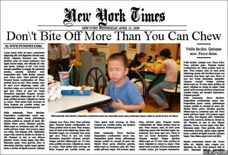
Obviously, the sans-serif stylesimplicity and clarity. Serif fonts have more decoration, look better and are better for reading. Can you imagine Times newspapers becoming sans-serif?
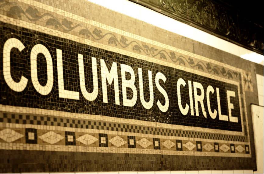
ButHelvetica is easy to read and is especially suitable for public facilities. After designer MassimoVignelliused Helvetica when designing signage and maps for the New York subway,< span>Helvetica has a near monopoly on public design standard fonts.

Of course, some people love you and some people hate you. Many people like Helvetica, and many people sneer at it, thinking that it kills personality, is too calm, and is simply "sexually frigid", without emotion and vitality.
Finally, serif/sans-serif is a classification method of Western fonts, which is not suitable for Chinese fonts. In Chinese fonts, serif fonts are generally called white fonts (such as Song Ti), and sans-serif fonts are called black fonts.
Having seen Helvetica, let's take a look at Chinese fonts. Let's take a look at the life of the most famous and widely used Song typeface that has been disliked.
Arial, as the name suggests, is a Chinese printing font invented in the Song Dynasty. Strokes vary in thickness, thin horizontally and thick vertically, with decorative parts at the end (that is, "foot" or "serif"), strokes such as dots, skimming, pressing, and hooks have sharp points, which belong to white body, and are often used in books, magazines, and newspapers. Typography for printed text.
Many websites, software, and books use Arial by default. For example, when you open Office software, the default is Arial.
Then the question is, why is it Arial?
Because it's straight. (=.=)
Is it because the Song font looks good? No, if you learned calligraphy when you were young, you generally learned it in Kai instead of Song.
But take a closer look, the same font size, Song typeface is much larger than Kai typeface, which is easier to read. Let's think back again, the movable type printing that we are proud of, the characters can only be printed by engraving.
Song typeface with straight strokes, and Kai typeface that looks good but is crooked. The result is obvious, choosing straight or curved is not a matter of orientation, but a matter of efficiency.
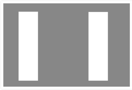
Let's look at two more sets of pictures. Who is wider, the rectangle on the left or the one on the right?


The human eye pays attention to objects on the left first, then to the right, first to the top and then to the bottom, so for two rectangles with the same width, we will feel that the left one is wider than the right one, and when the vertical and horizontal When we put it on, we will feel that the horizontal is wider than the vertical, which is the so-called optical illusion. The Song typeface's horizontal, thin, and vertical thickness just solved this problem, and achieved the great unity of font life.
Of course, to put it bluntly, Arial is really not very beautiful. However, the Arial with straight strokes is indeed much more convenient for printing. You said that I don't need convenience, I just want to look good, um, yes. Rich literati are printed in italics individually.
In the industrial age, the mechanized operation and the horizontal and vertical Song typefaces are a perfect match, and the Song typefaces have become more beautiful. It's like when you chat with a goddess, you always talk nonsense, hehe, you take a shower and go to bed, but you open up with ordinary girls and talk about everything. In a word, fit is the most important thing.
By the way, do you still remember the English alphabet usage guidelines mentioned at the beginning?
The last item in the is, never use ComicSansMS. So the supporters of ComicSansMS couldn't stand it anymore, so they replaced many famous LOGO fonts with ComicSansMS. The result...

It really turned ugly! But there is also a different feeling, a new look, is there any wood? ComicSansMS is like children's clothing, children look good in it naturally, and it's good for adults to wear it occasionally to look cute, but if you wear it to a meeting, it's your fault.
The font itself is innocent. There is no distinction between high and low in the use of fonts, just like Helvetica, which is cold but works well as a logo text, and Arial is despised by people but has a good printing effect.
Again, fit is the most important thing.
At the end of the day, I would like to recommend a documentary
(mysterious benefits, reply "I want", you understand)
Graphics|Reposted from ZUO Design (WeChat public account id: zuodesign2015)
WeChat Editor | Zhou Tao
Articles are uploaded by users and are for non-commercial browsing only. Posted by: Lomu, please indicate the source: https://www.daogebangong.com/en/articles/detail/Easy%20to%20set%20up%20%20Paper%20PPT%20is%20always%20not%20goodlooking%20Font%20Tutorial%20to%20the%20rescue.html
 支付宝扫一扫
评论列表(196条)
测试