As a marketing ghost, Durex's copywriting and design Often can provide us with a lot of inspiration.
But this year's Valentine's Day, Dudu didn't do it on the poster Things, but turned the present to the brand logo.
February 14 Valentine's Day, Durex announced the rebranding, and launched a new logo, packaging, brand image and positioning.
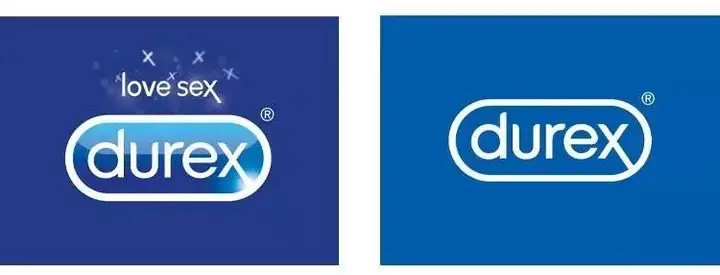
The left picture is old, the right picture is new logo
The global creative design agency Havas is in charge of this brand upgrade London and Design Bridge.
The new logo retains the two elements of the old logo, the logo and the rhombus, and removes the blue gradient and highlights of the background.
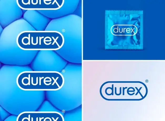
Lorenzo Fruzza, Head of Design at Havas London also In the interview, the reason for the design was expressed: "We want to show a clear, honest brand that talks about some of the most sensitive issues in people's lives."
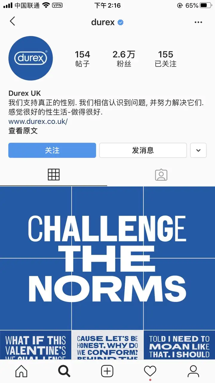
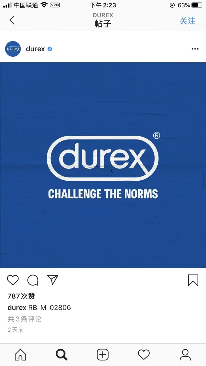
Durex ins
Durex's move this time aims to break this traditional , Treating sex as a taboo and stigmatizing sexual concepts, allowing more people to tolerate and accept correct sexual concepts.
Durex official website screenshot
Currently, Durex has not replaced the flat new LOGO on the official Weibo, but Durex's foreign official website has replaced it.

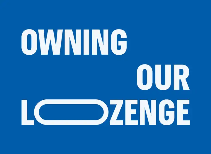
And in order to make the brand image more Profound and holistic, the new LOGO and graphic "rounded rectangle" elements are used in the promotional screen design of various channels.
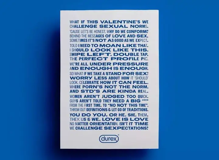
Packaging poster

Outdoor advertising


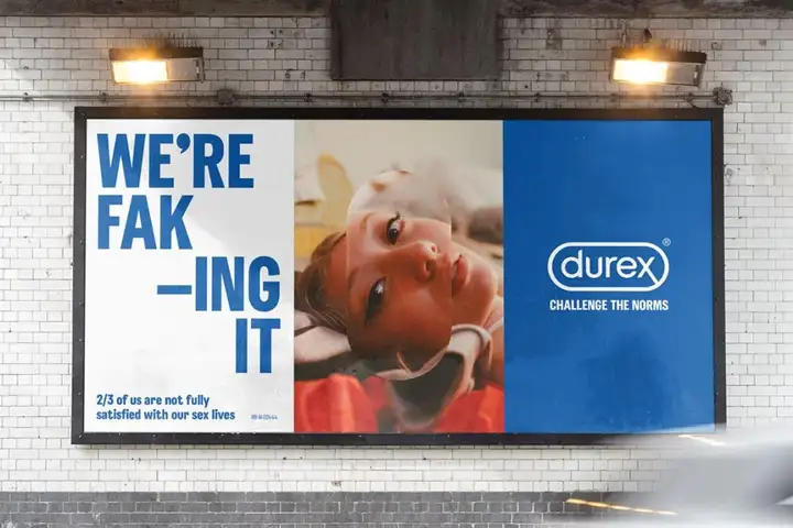
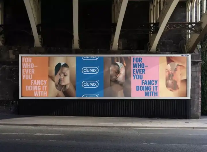
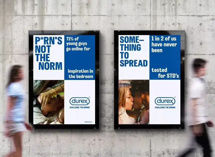
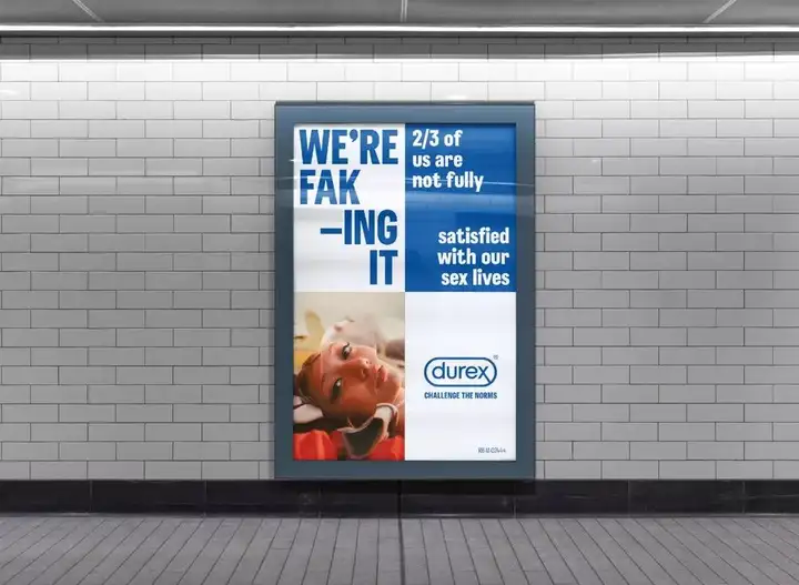
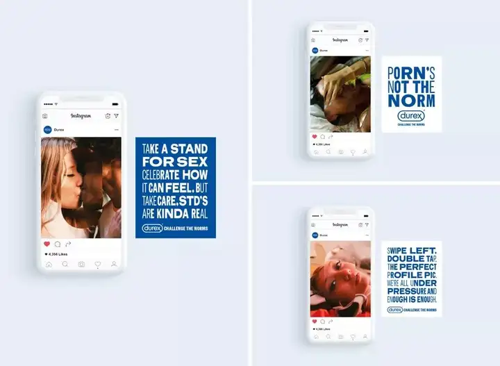
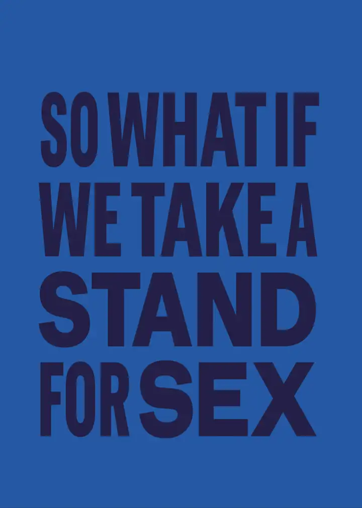
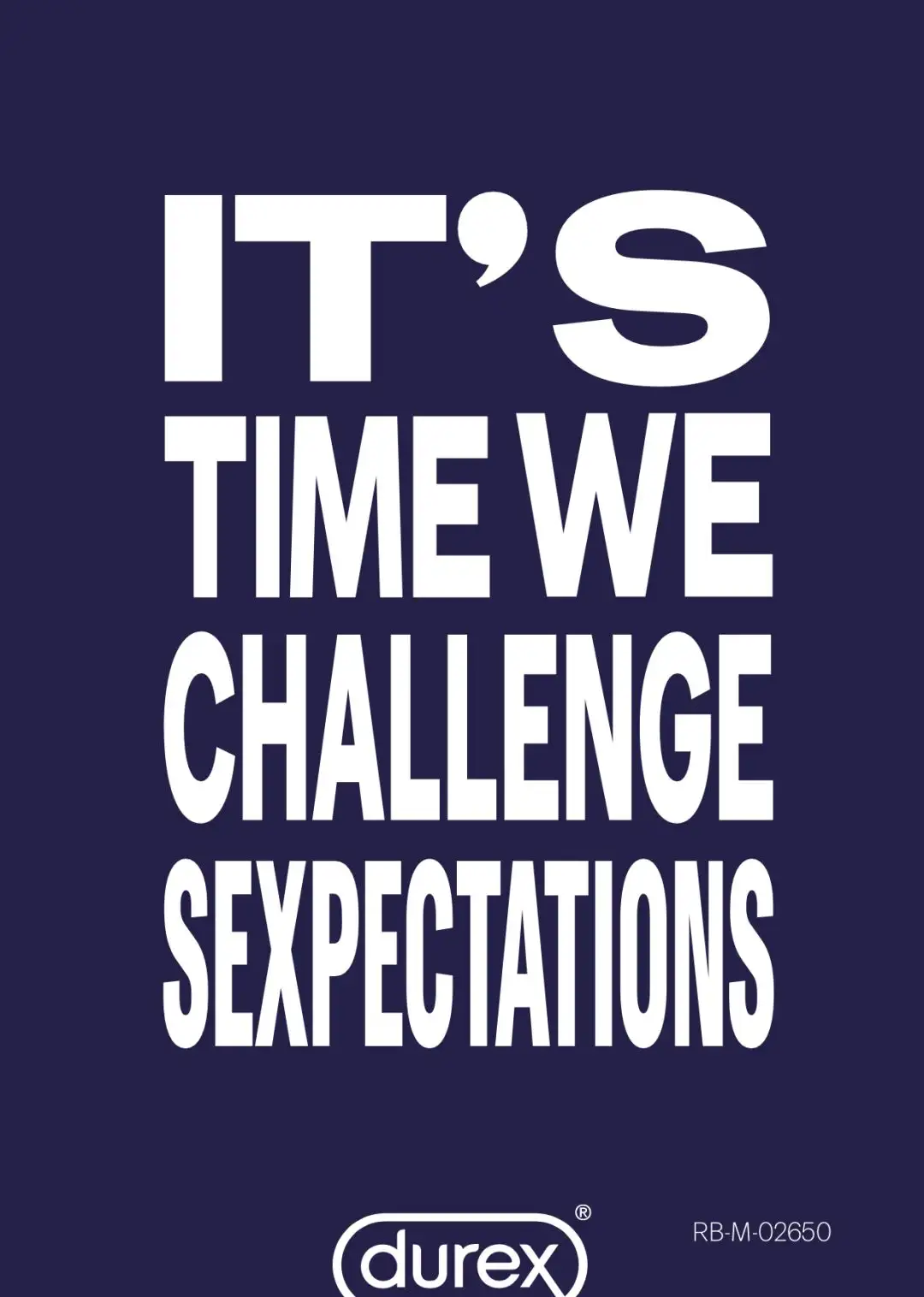
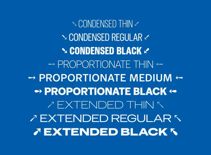
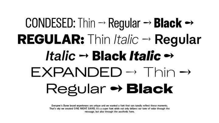
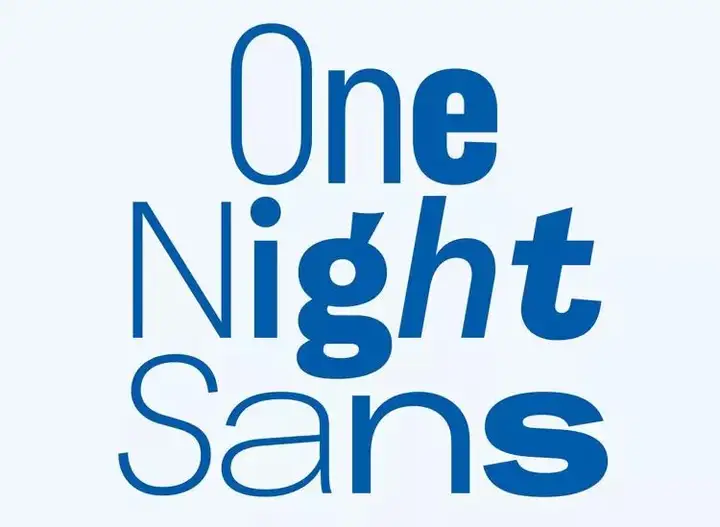
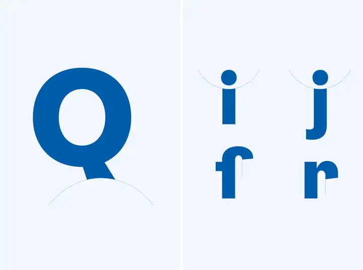
In addition to the flat LOGO adjustment, Havas London and Colophon Foundry also designed a font "One Night Sans" for Durex. The original intention of the design is still to create a A "clear and reliable" effect.
Articles are uploaded by users and are for non-commercial browsing only. Posted by: Lomu, please indicate the source: https://www.daogebangong.com/en/articles/detail/Durex%20Font%20updated%20the%20Logo%20and%20launched%20a%20custom%20font.html

 支付宝扫一扫
评论列表(196条)
测试