
Don’t think that soft fonts are just a patent for brushes, you can also write beautiful soft fonts with marker pens. Today's tutorial starts with writing with a marker pen, and takes you step by step to understand the essence of hand-drawn soft font.
start
use tools:
Mu Namei hook line pen coated paper
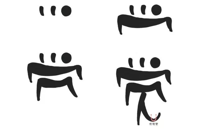
The main points of writing soft fonts are big top and small bottom, big left and small right, and the font is written in a counterclockwise arc from top to bottom. The strokes are thick and thin, generally the first stroke is a thick stroke, and the last stroke is a thin stroke.
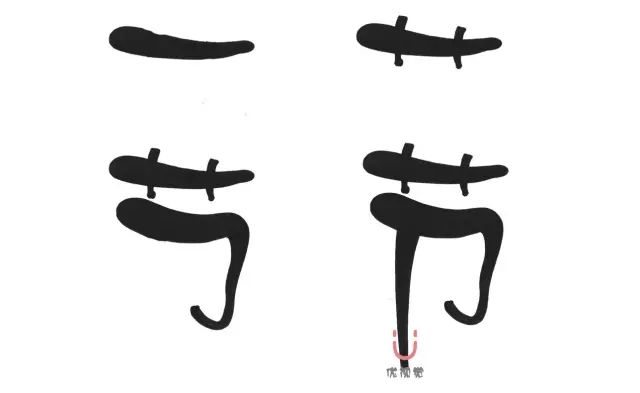
Pay attention when writing strokes horizontally, with the middle down and both ends up. Make the strokes look radian to a certain extent, but the radian should not be too exaggerated, which will make it look unnatural.
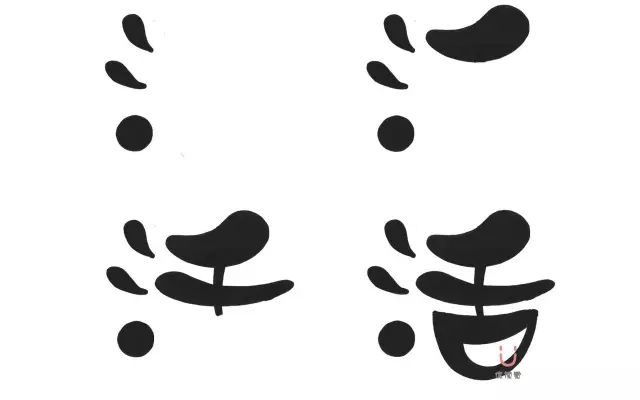
Pay attention when writing strokes vertically, the middle is to the left and both ends are to the right. According to the direction of writing, the thickness should be keep consistent as much as possible. When writing a relatively long vertical stroke like the last stroke of "section", you can write the feeling of thickness at the top and thickness at the bottom.
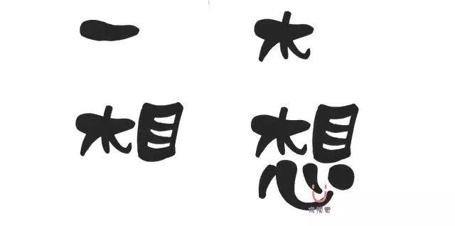
【口】【日】【目】【田】 and so on with a frame, generally can be written flat and wider, and after the other vertical writing, start writing the right half from the middle of the vertical Bend, and then fill in the horizontal or vertical inside of the frame.
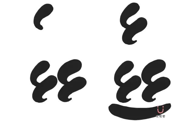
【心】【忄】, the point behind the hook of the word heart can be written rounder, and it is connected with the hook of the hook. The dot to the left of "忄" is written as a vertical hook, and then a vertical hook is added. Generally, "忄" is smaller than the right, but it depends on the situation.
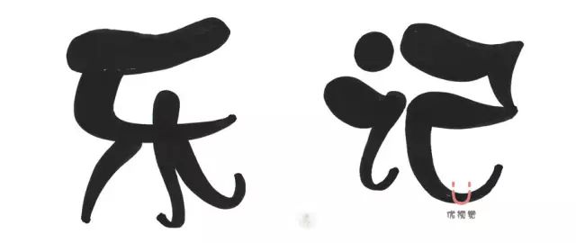
The characters next to 【亻】 are generally written smaller next to a single person, and then larger on the right. Of course, if you want to exaggerate, you can also change it, depending on the situation. 【是】【因】【景】【易】 with 【口】【日】 framed, you can turn the word 口 into a circle.
Let's take a look at more works written in soft fonts, and compare the above tutorials to understand the characteristics of soft fonts.
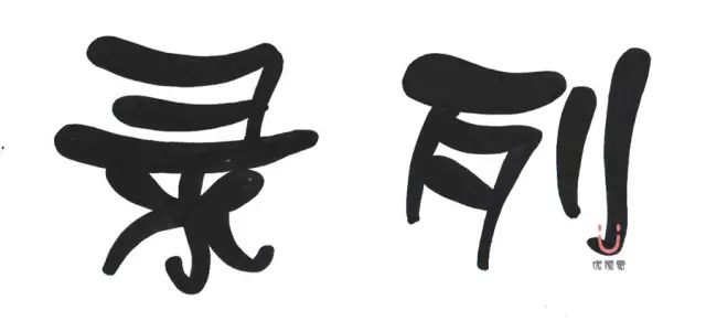
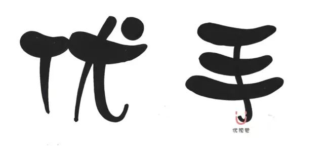
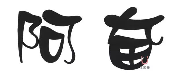
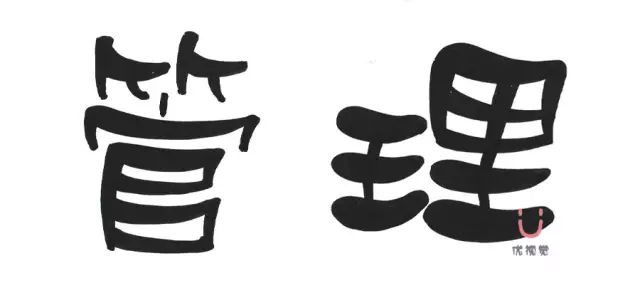

End
The writing of soft characters is much simpler than that of Song typeface and Taiwanese characters, and it is very suitable for beginners to practice. It is also the font of choice for large hand-painted POP titles. Note that the lines of writing must be written in one stroke. While ensuring the natural strokes and lines, pursue the beauty of the font step by step. We will send out more content related to fonts in the next subscription account, welcome to pay attention to the official subscription account of Axiang™ YouVision, and present the beauty of life with hand-painting .
Reading Recommendations:
Dry goods丨Visual records of basic materials, let these contents become fuel for your creativity
Dry goods丨Travel notes, giving special meaning to every trip
Dry goods丨About the layout of visual records, maybe you don’t know yet...
Course Recommendations:


For registration details, please click to read the original text
or call 400-078-7278
Articles are uploaded by users and are for non-commercial browsing only. Posted by: Lomu, please indicate the source: https://www.daogebangong.com/en/articles/detail/Dry%20goodsFont%20tutorial%20you%20can%20easily%20write%20soft%20fonts%20with%20a%20marker%20pen.html

 支付宝扫一扫
评论列表(196条)
测试