Hello everyone, today, the editor will explain to you a very simple and inconspicuous little trick.
Even people who are new to PPT will know this skill.
It is the technique you usually use to remove the watermark in the lower right corner of others - cropping.
However, don't underestimate this trick! ! !
If this technique is used properly, it can make your PPT look soaring!
Next, let's get to the point!
1. Make your pictures more diverse
From a large high-definition image, different areas can be cut out, and the more elements in a image change, the more angles to extract and the more varied styles, The field of application will also be wider.
For example, the following picture:

The quality of this picture itself is very good, whether it is used as a cover, a transition, or a full picture, it is very suitable.
But this picture is only used in this way?
Of course not!
For example, several parts can be cut out at will.
Then, any small piece can be made into a PPT——


So, you can declare to the world domineeringly: "Give me a picture, and I can make a PPT!!!"
Of course, this requires the "mother image" to be high-definition enough. In addition, you must have a spectrum in your heart. You know what you want, so that you can see a variety of images from a large image. Possibility, this is the intuition formed by long-term accumulation.
2. Effective use of vertical images
Understand this point, the use of "vertical pictures" in PPT can also be saved.
Because the PPT is a horizontal version, after the vertical version of the picture is placed in the picture, there will be a lot of blank space.
For example, this basketball——
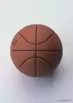
If the original size is followed, the PPT will basically look like this:

Ah, I always feel that there is a lot of difference in justify...
The most trouble-free way, disk... ahhhh, just cut it!
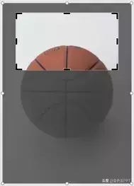
Then it can be made like this...

Short oil, not bad~
The grade has risen a lot!
Then don't try to cut out the middle area this time?
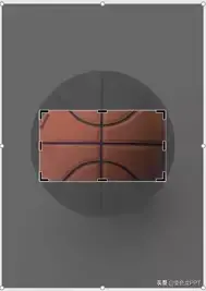
Then add a layer of translucent color blocks as a mask——

See, isn't it easy?
Third, the distinction between primary and secondary
Many times, if there is no clear goal, then no good works can be made. Because, without a definite point in this way, the realization of the viewer is free, without a fixed position.
For example, this PPT——

Using the complete picture directly is quite satisfactory, but the details are too complete. So many coins and such a cute piggy bank are distracting. It can even be said that I am sure that the moment you saw this picture for the first time, you first realized that it was this little pig! Of course, I have nothing to say if the money fan says to find the coin first ╮(╯3╰)╭
So, if we want to let the viewer focus on where we want, we simply use "cropping" to intercept a small part:
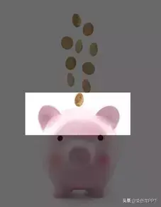
Then insert the slide, center——
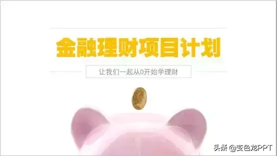
Is it going to be different soon? !
So, like someone said: there are no bad skills, only bad ones!
That's all for today's sharing,
If you think it is helpful to you, remember to like and forward~
Bye bye~~~
Articles are uploaded by users and are for non-commercial browsing only. Posted by: Lomu, please indicate the source: https://www.daogebangong.com/en/articles/detail/Dry%20goods%20sharingthese%20three%20tricks%20of%20cutting%20PPT%20so%20that%20you%20no%20longer%20have%20to%20worry%20about%20no%20picture%20source.html

 支付宝扫一扫
评论列表(196条)
测试