Text | Mingo, former McKinsey strategy consultant, Accenture management Consultant, an old driver who likes to use mind maps to construct PPTs, workplace skills, breaking apart and talking Listen to you, welcome to pay attention to Mr. Xiao @mindmapPPT, let’s work together Improve and become an elite in the workplace.
I've worked so hard, but in the end I can't do that who can write PPT!
Obviously there are achievements and can be summed up, but PPT always lacks impact?
I have been writing PPT late at night, but lack of materials and expression skills, the PPT looks very low, what should I do?
……
It's time for the year-end report and year-end selection, and it's time to compete in PPT and network, come on~
This is a period full of expectations, apprehensions, and anxiety. In our company, once an outstanding employee is selected, the cash reward will be tens of thousands, the year-end bonus coefficient will be increased by 0.3, and the minimum salary will be upgraded by 1 level. Isn't it tempting? But there are only a few places, and there is no one in the court, what should I do? Let me share with you some of my small observations and insights over the years.

1. Sorting out the content structure of the report
Sorting out the content of the report first, One is to ensure that the report is focused, and the other is to ensure that the content is logical.
Also share 2 small suggestions:
1. Use the 325 rule to clearly report what content and determine the main content of the content Second-rate.
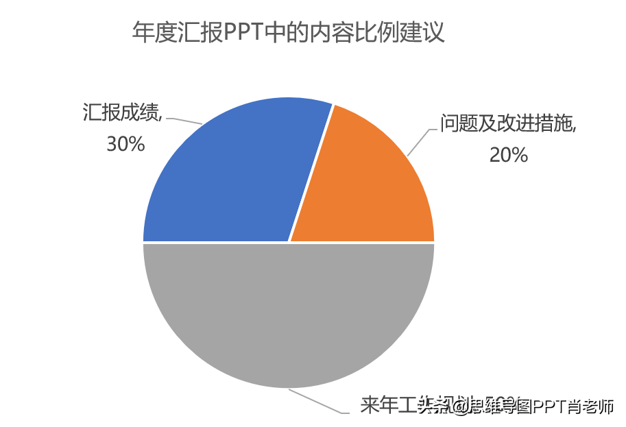
Figure 2, 325 proposals for report content
30% of the content, report the results.
20% of the content, report problems and improve directions,If you only report the results, it will make people feel that you are proud and complacent. On the contrary, reporting the problems properly will give people an image of humility and continuous pursuit of progress. In the end, the process of reporting how to make up for the shortcomings is to give positive feedback to the leaders feedback process.
50% of the content is to report on the plan for next year, and the leader depends on expectations , If there is no way to make people expect you, then you are at the end, please remember, The greater your expectations, the greater your chances.
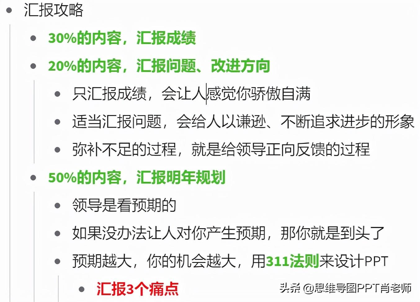
Figure 3, root cause analysis of the 325 reporting rule
2. Use the 311 rule to design PPT and use 3 pain points to Grasp the attraction and tell it with a complete story logic.
Report 3 pain points, For example The current pain points of the leader, the pain points faced by the department, and the pain points that need to be solved in order to complete the pie you drew, etc.
Adopt a set of story logic, The three pain points must follow a story logic, and all pain points must be specific, quantifiable, and achievable after hard work. If the last three pain points support each other, avoid solving one pain point and interfering with the other A solution to a pain point.
Apply a PPT template with a unified style and a tall style, It is necessary to use roadshows to write PPT in a way that attracts investors. The content of PPT must be logical and self-consistent, with a unified style, using less text and more diagrams.

Figure 4, 311 report logic diagram
How to design the story logic of reporting PPT?
It is recommended to refer to the SCQA story model in the pyramid principle to design the story structure. The story is attractive. The greater the conflict and the greater the need, the greater the value of the report.
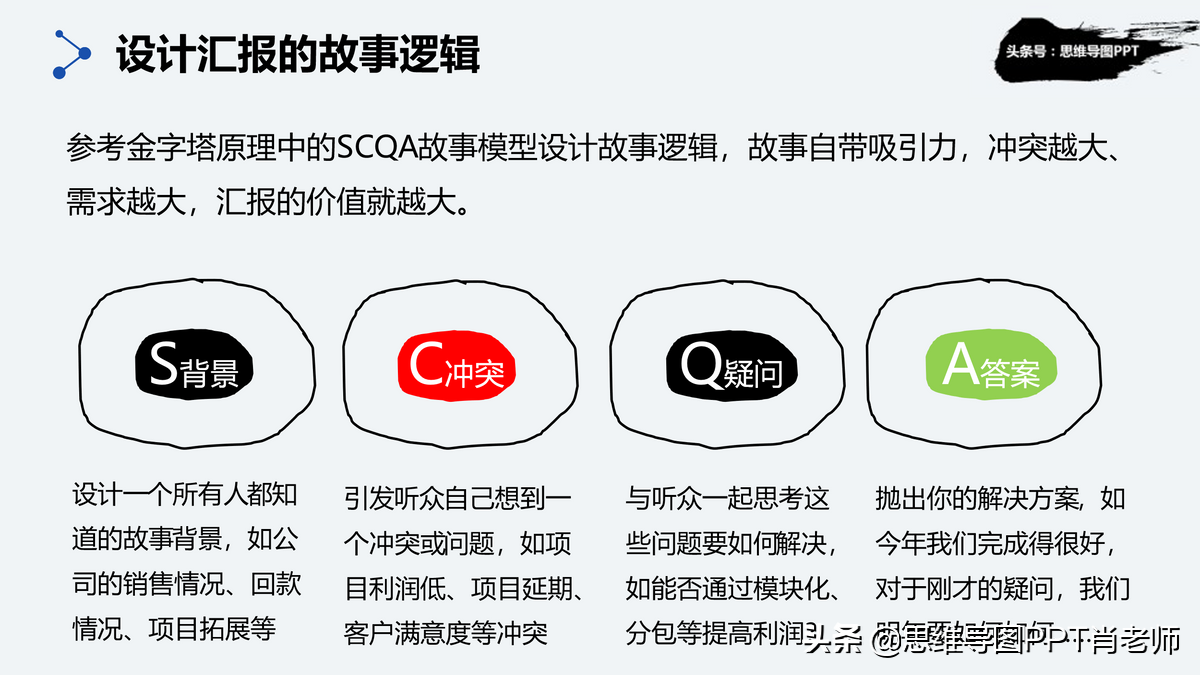
Figure 5, the logic of SCQA storytelling
Introduction background:Design a listening The background of the story that everyone who reported, such as the company's sales situation, payment collection situation, project expansion, etc.
Initiate conflict: Initiate listeners themselves Think of a conflict or problem, such as low project profit, project delays, customer satisfaction, etc. conflicts.
Spontaneous Questions: with the audience Think about how to solve these problems, such as whether to improve profits through modularization, subcontracting, etc.?
Resolve conflicts: throws you For example, we have done a good job this year. For the question just now, what should we do next year...
Remember, the story should revolve around the "why, how, what " Golden Circle Rule, Introduce what your audience cares about, not yourself Content.

Figure 6. The core of PPT is to introduce what the audience cares about, not what you care about yourself
Second, the cover is the facade
The cover is the face of a PPT, and it is also the first impression for people. 3 small suggestions:
1. Try not to use dull titles on the cover,< /strong>For example, XXX work report, it is best to use some Highly summarized viewpoints or slogans, For example, "Manage every penny of the company well, and keep every account of the company well."
2. The cover can use dynamic background pictures, video effects, etc. as the background , which can increase the appeal to the audience.

3. The cover uses artistic effects such as brushes and honeycomb effects, give PPT add some literary points.
3. Color matching, catalog, transition page
1. Set the color in the master to ensure that the color style of the entire PPT is unified, please refer to Accenture consultant's common color matching, the high version of office supports color picking through the straw, and the low version can be set to RGB to complete the color matching.
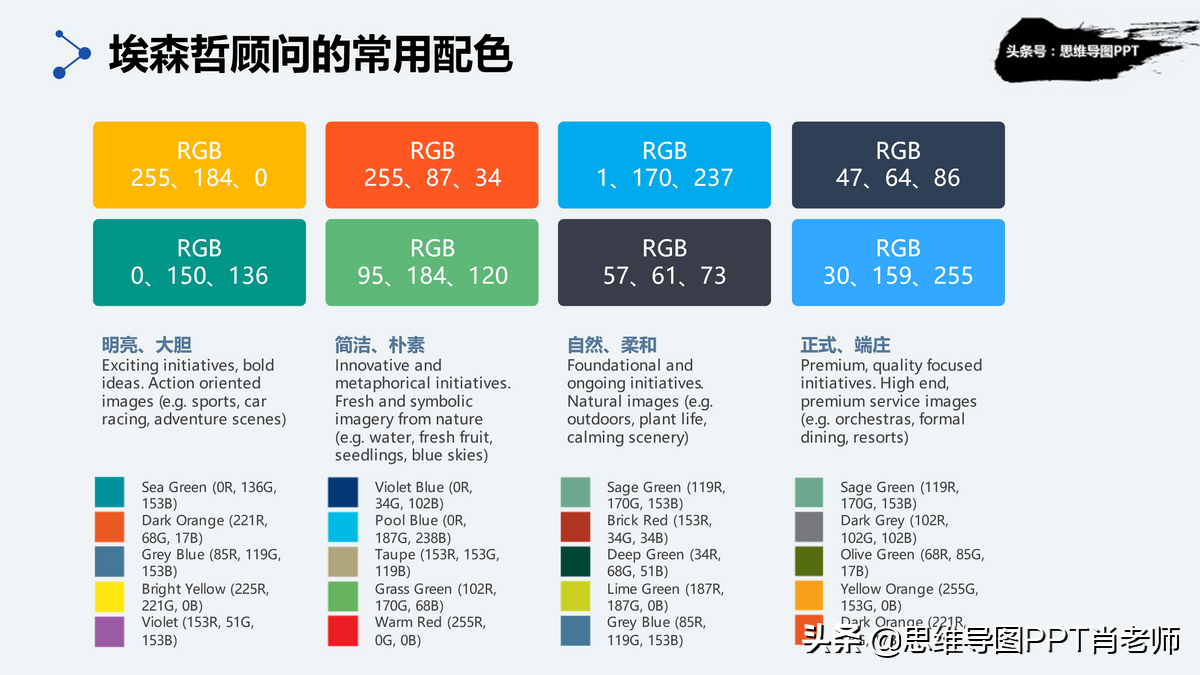
Figure 8, Accenture color matching
Regarding the transition page, many PPT designers will suggest that you spend a lot of energy on designing the transition page. Indeed, a high-end transition page can add a lot of points, but most of us are not PPT designers Teacher, We are more important to sort out the content and design the story line, at Deloitte Consulting company, almost all PPT transition pages use a solid color background, such as the following, a dark background, an orange headline, simple but not simple, and the focus is prominent.

Fourth, master, chart, graph, relationship, presentation skills
1. Set master
The most important form of PPT is the master version, The master is not a template. The master is equivalent to the CSS file in the web page, which defines the overall style, font, color, and the position, height and width of graphic elements, etc.
As shown in the figure below, when creating a new page, select this master, and the content structure of the entire page will be determined. "For the two words, just choose the appropriate picture. In the year-end report strategy document, I shared 4 A more practical master effect can be obtained at the end of the article.
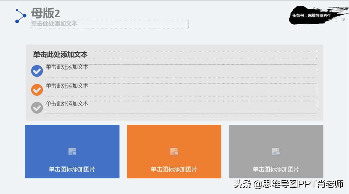
Figure 9, the master is not a template, the master defines the overall style framework
2. Project progress, planning for the coming year
It is more convenient to use the Gantt chart for planning, The advantages of the Gantt chart It lies in the graphical expression of the plan, on a one-page Gantt chart, at a glance You can clearly see who, when, what tasks, how you are doing, what problems are there, etc., such a very efficient 5W2H structure has been formed.
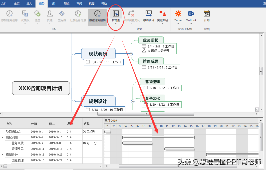
Figure 10. Gantt chart in mind map style
As for how to make a Gantt chart, my consistent suggestion is to use mind mapping software, It is fast and good, and the graphics will be updated automatically after the content is modified. At the same time, During the process, you can check the logic and comprehensiveness of the content.

Figure 11. Update resources and progress in the Gantt chart, automatically synchronized to the chart
3. Use fishbone diagrams, Venn diagrams, etc. to express and analyze Effect of Problem and Resolution:

Figure 12, fishbone diagram analysis
4. Tips for making PPT:Total first, then points:

Figure 13, summarize first and then divide, outline and outline
5. Tips for making PPT:Contrast creates beauty:
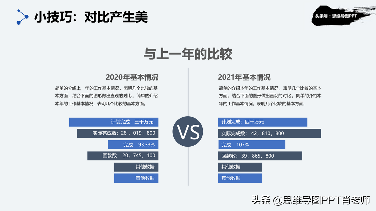
Figure 14. Example of data comparison chart
6. Tips for making PPT:Use Dynamic Charts:

Figure 15. Dynamic chart of sliding ball effect
7. Tips for making PPT:Use a custom show, check presenter view:
The biggest advantage of custom screening is that the same version of PPT can show different content to different report objects, avoiding the problem of inconsistent content in multiple report versions; use the presenter view, so that only You can see the content to be reported on the next page, so that the content of the report has a better cohesion effect.
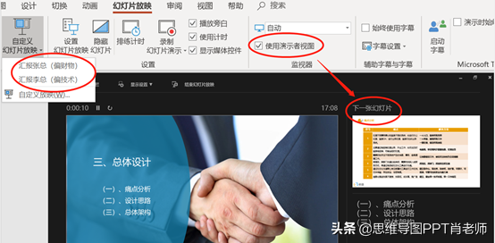
Figure 16. PPT custom show and speaker view settings
8. Learn from and apply some good logical expression effects,Good-looking PPT relationship comes with bonus items:
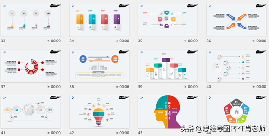
Figure 17, commonly used PPT logical relationship diagram
9. Reference and apply templates,Instead of reinventing the wheel:
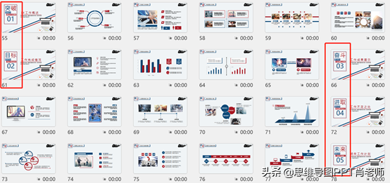
Figure 18. A complete set of report PPT templates
The template advocates the use of doctrine, the template not only has material, more importantly, it has complete expression logic , apply the template, you can modify and replace it according to your content logic, and put the core focus on content refinement. As for expression style, graphic layout, etc., leave it to The template is OK.
5. Ending page, tiger head and leopard tail
Most people’s ending pages are the same "Thank you Everyone may have forgotten the "total score" Structure, The end page can use a page to summarize the content, or you can extract a loud The slogan to take care of the content of the cover, the effect is awesome, for example, as follows:

Figure 19, example of the end page
6. Fan benefits
Encounter is a kind of ape dung, share this 83-page year-end report strategy PPT source for free File, after like + forward, Private message "51168". Reminder: will only bury your head in downloading without forwarding, and block it directly after finding it, then this PPT will become the last gift .
#Workplace Gas Station#, you have to cheer every day~
I think it is helpful to you, sympathize with my hard work, welcome to type Reward and encouragement, how much I like~
Wishing you a bright future, promotion and salary increase every year!
Articles are uploaded by users and are for non-commercial browsing only. Posted by: Lomu, please indicate the source: https://www.daogebangong.com/en/articles/detail/Dry%20goods%20a%20complete%20set%20of%20yearend%20summary%20strategies%20to%20help%20you%20get%20promoted%20and%20raise%20your%20salary%20forward%20and%20favorite.html

 支付宝扫一扫
评论列表(196条)
测试