Liu Bingke Station Cool
Note: Comment function has been added at the bottom

In my usual design work, I do a lot of writing, and in my font live broadcast class, I also correct a lot of writing for students. When I see a new font, out of professional habits, I am not modest. Can find problems and errors in it. And this font consultation room is a series of font design revisions I made earlier. Most of these fonts are fonts sent to my email by other design colleagues, and also include a few I gave to students in the live font class. The modified font homework is always, it's all about changing and changing, talk about it. I have written a dozen of such graphic tutorials intermittently, and changed about fifty or sixty fonts. In fact, there is also a high-definition uncensored video version. This time, I sorted out some graphic cases, although the number is not There are many, but the text and ideas in it are really dry goods. If you happen to be interested in font design, and if you have enough patience to read the text, then you can touch and read:
The first case: "Youshi No. 1" diagnosis idea:
 A /Many friends who are beginners in fonts will have such doubts, whether to design fonts and then modify them, or use other methods. In this example, the student used conventional fonts, and then made slight modifications on this basis. This cannot be called a design, but a "modification", unless the conventional fonts are used to make a very powerful Changes can be seen to improve the sense of design, otherwise, it will be difficult to break through the shackles and limitations of conventional fonts; B / There are many ways to change the face of commonly used fonts. In this example, I increased the horizontal and vertical thickness contrast of strokes. Corresponding simplification and connection have also been carried out, such as the modification of the left part of the word "Shi", such as the smooth sailing in the upper right corner of the word "优", such as the stroke connection between the two characters. These changes subvert the impression of the original font. In addition to being stable, it will show more design feeling and be more convincing; C/ The revision of the graphic symbols is not the key point, it is enough to be natural, smooth and concise. I only helped to change the words. The graphics have been changed without hesitation. Please give a positive comment above the cross and take a screenshot to the customer service; Feeling, making progress, every font is the designer's own child, so, we must try our best to have our own children, and don't play with other people's children.
Second case: "Diagnostic thinking":
 A/This classmate, you sent me the three words "Jijila", but forgot to leave your room number in the email, bad review; B/The importance of font recognition , I have to mention, especially the first two words, if your cries and appeals cannot be discovered by all the men, even if Ji Ji Fu Ji Ji, you can only sigh in vain; C/ According to the theme, such strokes can be made Very flexible and interesting form, including font size, stroke thickness, and font arrangement, can be used for creative expression, which is more conspicuous and stronger, and easier to be flipped; Three times five divided by two multiplied by four equals eight, it is completed in an instant, and it will be done quickly, and my mother no longer has to worry about me doing the foundation; E/background image (ju) shape (hua), can be tailored according to your own size and color Made to order, draw one, too domineering, draw two, good feelings; F/After modification, the blue figure is also one of the key points, two male symbols are lingering in one, Qingqing me, as if there is no one else, I am embarrassed to continue writing!
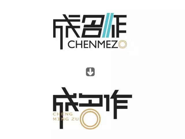
Case 3: Diagnosis of "Famous Works":
 The design of several characters of A/ generally needs to be coordinated and orderly, and there are rules to follow. It is unforgivable to flirt openly, so it must be straightened; B/ is the same as above, not only the posture needs to be adjusted, but also the thickness of their strokes should be coordinated Consistent, very helpless, it is still the naughty "name", some strokes are a little thicker, so fix it; It was messy, so I removed the blue strokes and focused on expressing the creativity of the round "口" character. I married Chinese and pinyin, and added a bit of creativity and beauty to the font;< /span>
Case No. 4: "Uncle Joker" Diagnosis:
The recognition of the A/ font is very important. It must be recognized at the first glance. If the word makes people think about it and ponder it for a while, it means that the font deformation you made is a bit too much. This is exactly the case for the first character of the font; B/In the original font, the deformation of the strokes of the font is quite good, such as the continuous strokes in the lower left corner of the character "Uncle", this type of stroke deformation is very consistent with the font content, but, in The details of the strokes are a bit twisted, not natural and smooth enough, such as the two strokes under the word "ke"; in the revision, I used the rounded lines of the pen to create characters, and on the premise of ensuring smooth strokes. Continuation of some stroke deformation of the original font; C/ In terms of font effect processing, the original font uses highlights, these white arcs can be used, but the details need to be more refined, its size and position are worthwhile We treat it carefully, otherwise, the beauty of the entire font will be affected by your later additions, so the loss outweighs the gain. I gave up the highlight modification in the modification and used dotted stroke lines to cover the font. I think it's quite fun; D/ Regarding the final combination of fonts, the original font is a bit compact and regular, and it is recommended to be more lively and unrestrained. This seems to be a song by Jay Chou. I have never heard it. I am nearly 30 years old. middle-aged people, always listen to Andy Lau's songs.
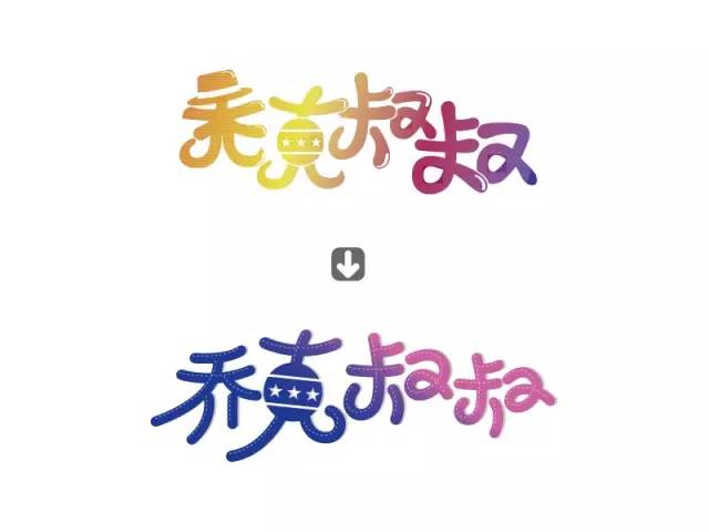
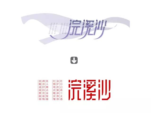
Case 5: Diagnosis of "Huanxisha":
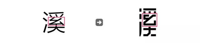
A/ is still an understanding of the meaning and content of the font. This should be a traditional or Chinese element theme. I think it should not be too exaggerated or too personal. Its form should be quiet and restrained; (write here , I suddenly remembered something. Last time someone said that the fonts I changed were all based on my "Liu's" thinking, which completely changed the meaning of the original author. I want to say something: since I took the To change, it must have my thinking, my understanding, sometimes the scale of the change is smaller, sometimes the scale is slightly larger, the size of the scale is changed according to my idea, if my understanding is similar to the original design, then Just make small changes, if my understanding deviates greatly from the original design, then make big changes, small changes will take less time, big changes will take a lot of time, and after a long time of changes, it will be thankless in the end. Heart.) B/ Regarding the font structure, it seems that I haven’t mentioned it for a long time. Let’s borrow this word, let’s say again, in the original design, the center of gravity of "xi" is too high, and the strokes in the middle and above appear crowded, which is not suitable. In addition, Look at the picture below, the structure like the one in the font, it seems that the strokes are not easy to change, and it is a little difficult. Here, I used the "addition" of the strokes, which finally improved the design sense. This type of strokes, is The design opportunities provided to us should be grasped and utilized as much as possible. The more difficult it is, the more exciting and exciting the design will be, and the more fulfilling it will be after finishing it:
 C/font combination and matching problem, in fact, this is similar to the first point. This font should be calm and quiet. The processing of the background in the original font and the text layout on the left are messy, so the processing will be done later. , I made a new adjustment in unity.
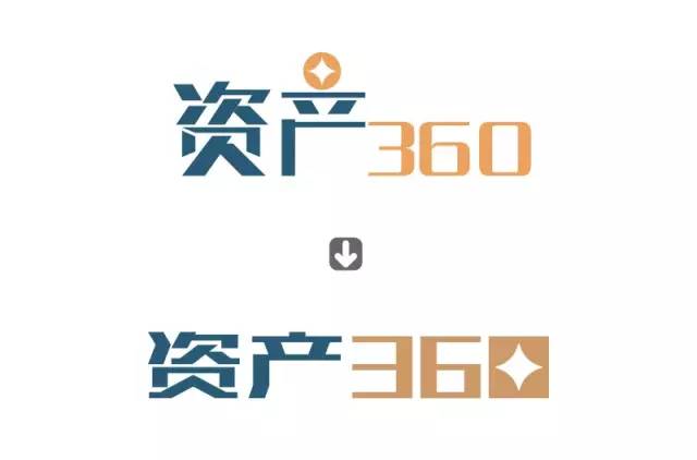
Case 6: "Asset 360" diagnostic thinking:
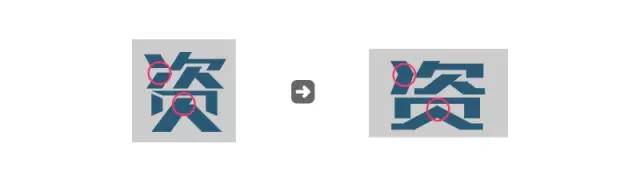 A/Understanding the industry background and attributes is what we must consider before designing, whether it is serious or relaxed, or regular or flexible, different industries and different themes have completely different requirements, the above "asset 360" I think it should show the feeling of being stable, reliable and rich, so that people can feel trust and attractive, while the design of the original font, "asset" is not strong enough and not big enough; B/Aiming at the above problems, It is still very simple to modify, two words: "squeeze", we only need to muster up our strength, open our hands, push, force, and touch. It looks solid when you touch it flat. Of course, in the process of exerting force, the design sense of the font can also be improved by the way:
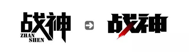 In the original font of C/, huge coins are placed directly above the word "production", which is too capricious and naughty. In fact, this is still a question of the position of the graphics. Graphic creativity can be expressed, but it must be concise and powerful, and it is necessary to find a suitable position for him to blend in. Only in this way can he be natural and comfortable, and too low-key and high-key are extreme , are not advisable, if you want to do it, you must let others see it, but you must not be loud and public, and you must create a low-key sense of luxury; D/ Whether it is the combination of Chinese and numbers, or the combination of Chinese and English, it is necessary , Good-looking. There should be a formal relationship between the two, either similar or identical. In the original font, "asset" is hard and "360" is soft, one hard and the other soft, resulting in a visual imbalance, so in the subsequent revisions, I decisively hardened them all.
Case 7: Diagnosis of "God of War":
 A/I think of a cartoon I watched when I was a child, it seems to be called "Voltron", and a loud cartoon line whizzed past in my mind: Who can form the feet and legs, form the torso and arms? Say the next sentence? (This is a cartoon we watched after the 80s. If you don’t understand what I’m talking about, it can only mean that you are too young...) B/In rectangular characters, the strokes are often thin and thick It can make the font more powerful, stronger and more majestic. After this treatment, use your hardworking and intelligent hands to touch the hair and muscles of the font, and pinch it a little flat. Sometimes, it will feel quite flat; C/The endpoints of the strokes can often enhance the sense of design by changing the details. After adding the anchor point and moving the anchor point, various forms of bulges can be formed at the speed of light. In this example, the strokes on the upper part of the vertical line change like this:
 Of course, the physical state of each stroke is different, and the form of bulging can also be like this:
 In short, the sense of font design can be strengthened through the modification of details. Whether it is horizontal or vertical, whether it is thick or thin, you can use this "addition" method to shape new strokes. This is really not difficult. As long as you do more and dare to do it, you will You will know how broken the pattern is; D/In the word group, it is quite common to highlight one or two strokes so that it is higher than the upper level of the word group, or lower than the lower level of the word group. In the front " In point D of Haogecheng, I also mentioned this point, and in this case, this special stroke is undoubtedly the apostrophe of the word "战". This apostrophe is not only specialized in position, but also Moreover, in terms of form and color, it is also distinctive. Such brush-like strokes can play the role of exaggerating the atmosphere, highlighting the sense of situation, bluffing, and scaring the enemy.
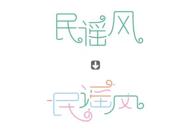
Case 8: "Folk Song Wind" Diagnosis:

A/Using the pen tool to create characters is a very interesting thing. For usual design exercises, I suggest that you can fiddle and play a lot. The more you play, you can play tricks, play more creativity, and achieve fitness. Brain-replenishing and physical strength; B/ In this font, not only ordinary straight lines and arcs, but also spiral lines, which are rare in the world, are added, but the design of the spiral lines in the original characters is not clever enough to look good, nor stable enough , in the subsequent modification, I consoled and appeased these spiral lines, and gradually stabilized their emotions; , it mainly depends on our understanding and feeling. Everyone’s ideas are different, and the degree of color is naturally different; D/If it’s straight, it’s straight, if it’s curved, it’s curved. The straight cross form is not very beautiful. In the subsequent modification, I decisively bent it with force.
----------------------------------------------------
Want to learn PS? Hurry up and pay attention to the account below! Instantly improve!
The harder you work, the luckier you get.
This is the right path of Pangmen.
Articles are uploaded by users and are for non-commercial browsing only. Posted by: Lomu, please indicate the source: https://www.daogebangong.com/en/articles/detail/Dry%20goods%20There%20is%20a%20problem%20with%20font%20design%20in%20this%20way.html
 支付宝扫一扫
评论列表(196条)
测试