The following article comes from Font School, author Liu Baikun

Enjoy the time of making characters~
Chinese style? We must be familiar with this term. Do you think of splash-ink landscape painting or Jay Chou first? I guess everyone thinks of the latter first. In my impression, Jay Chou’s song "Dongfeng Po" sang the word "Chinese style" into our lives, and we will see it in music, movies, advertisements, home decoration, clothing, etc. The imprint of Chinese style.
The "Chinese style" in font design will naturally not be absent, except for the current popular calligraphy types, how to create a Chinese style in a stroke?
The first thing to explain is that the Chinese style we are talking about today is actually a style of font design, just like describing the style of fonts, there are modern simplicity, retro nostalgia, cute cartoons, etc. The theme of this time says To be more straightforward, what are the rules and methods for designing Chinese-style fonts!
So what is Chinese style? I think everyone's understanding will be different, but the word "tradition" must first pop up in your mind, and then look at how it is explained in Encyclopedia: "Chinese style, that is, Chinese style, is based on traditional Chinese culture. Basically, an art form or lifestyle that contains a lot of Chinese elements and adapts to global trends." Don’t worry about global fashion trends in font design, as long as you can reasonably apply Chinese elements to fonts, everything will be fine!
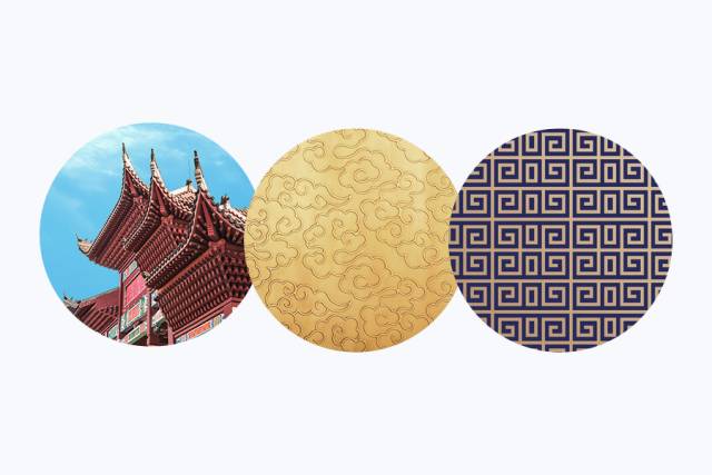
Then the question arises again, how should Chinese elements be used in font design? In the picture above, I briefly listed some representative traditional objects in China. Although there are various forms, we can find a common feature: complexity.
Remember the point I mentioned in my previous article "How to Know the Character of Fonts"? The more cumbersome the strokes, the more classical and traditional the character of the font will be! You can see that many theoretical points are well-founded, so some friends must not think that the theory is tasteless and useless, and there is no reason to just focus on designing without knowing why they do it!
The font strokes and details from top to bottom in the picture above are getting more and more cumbersome, and the final visual effect will be more and more Chinese-style. If "complexity" is the rule, then what are the specific methods? Below I summarize four points to share with you.
Special reminder: Complexity is based on the refinement of traditional elements, not too many, not miscellaneous, and not chaotic! Don't get off track.
1. Stroke detail modification
The details of the strokes are the most intuitive and accurate expression of the character of the font, just like the color patterns of the facial makeup in Beijing opera are closely related to the character of the characters. We can simply understand it as a superficial article of fonts, so what kind of details can reflect the Chinese style?
Before we mentioned that Chinese style must be based on traditional culture, so we must combine traditional elements. The most common ones are cornices in ancient buildings. Of course, there are also some auspicious cloud totems or fretwork. Below I will use these elements to make a few small examples for your understanding.
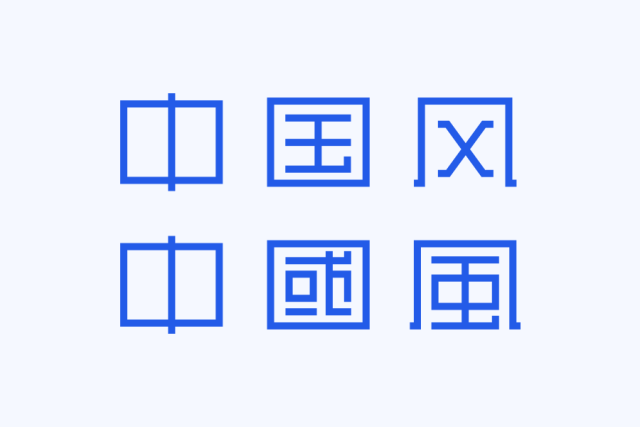
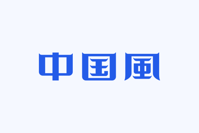
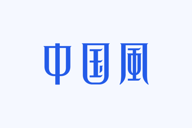
Flying eaves and angled corners are a very distinctive structural form in ancient Chinese architecture, showing the unique charm of Chinese architecture, so it is very suitable to be used in fonts. It is mostly used at the start and end of the horizontal strokes in strokes. For example, in the above picture, the horizontal strokes and the upper corners of the characters are treated similar to "corners and corners", and the fonts will show a strong Chinese style.
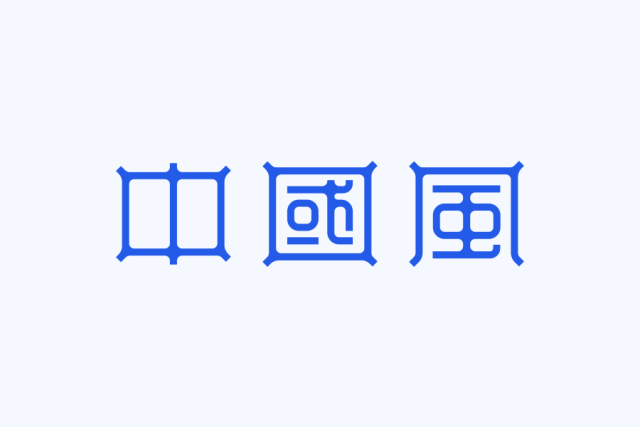
The "cornices and corners" in the font can have many forms. The biggest difference between the characters in the above picture and the previous example is that the strokes use the form of line segments, but the form of "cornices and corners" can also be used. The difference is that some horizontal pens have not been processed. Why? As we mentioned at the beginning, complexity is neither too much nor too chaotic, and the degree should be mastered according to the typeface.

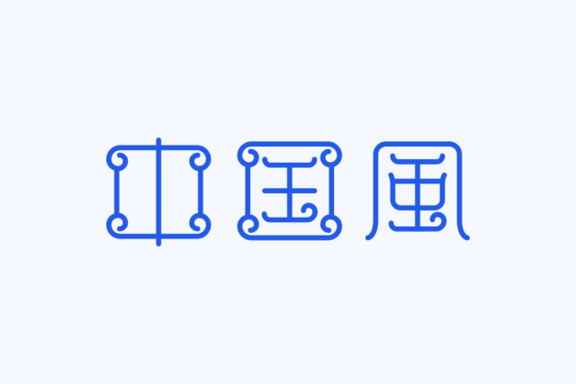
The biggest feature of this group of characters is the use of auspicious cloud elements. Perhaps many students will say that this is not the same. Here I think many friends will have a little misunderstanding. When doing font modification details or adding some graphics, you must It should be concise and general and can fit well with the font. All changes should serve the font itself.
2. Stroke deformation
What we often see are horizontal, flat and vertical strokes. If the strokes are made into some deformed fonts, at least it is different from the conventional fonts in our impression. The deformation of strokes is actually one of the commonly used techniques in font design, but the key is How to make it taste Chinese.
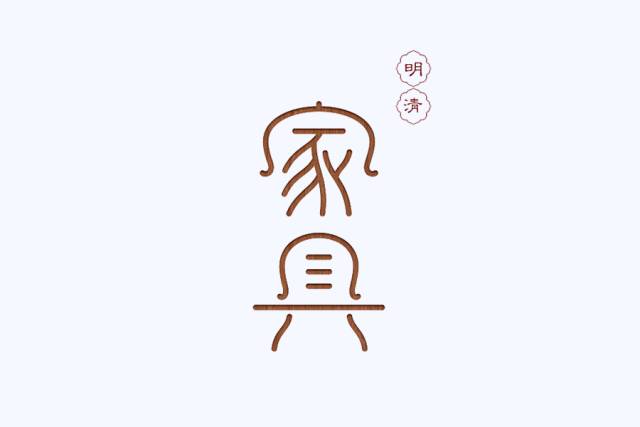
The forms of traditional objects such as porcelain and Chinese chairs are impressive and representative, so we can apply some of the basic forms to the font design.
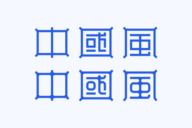
In the above picture, without any stroke modification, we simply deformed the vertical pen in the font, and made a certain inward arc from the vertical vertical pen, which is the simplest deformation.
The deformation of this group of characters is a little more complicated, and then the details of the strokes are also treated with some broken strokes and elements similar to "back lines". This deformation is not only Chinese, but also a bit more feminine. softness. This kind of deformation is regular, so you can directly use the effect-transform tool in Ai to complete it quickly.
The top of the is still horizontal and vertical, but at the bottom of the font, it becomes approximately circular. Combined with some changes in the small details of the horizontal strokes, the structure of the whole character is deliberately made higher. In addition to the Chinese taste, the quality will also be improved. So this kind of deformation seems to be used in many community logos like this.
The picture above is the work of the calligraphy studio
In the picture above, the style of old-fashioned furniture is cleverly combined to make the font very graphic. There are still many interesting elements in traditional Qi utensils that can be used in font design. You may wish to dig out and see what interesting font design works you can create.
Three, the reference of traditional Chinese and seal script
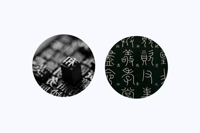
If conditions permit, you can try the design of traditional characters. Traditional characters have more strokes than simplified characters, and they will also have a sense of age; sometimes we can learn from them further, such as seal script. The characteristics of ancient hieroglyphs are extremely decorative, and we use this characteristic.
One thing to point out in particular is that although the seal script is good, don’t copy it completely, because not many people can recognize the seal script today, that is to say, there is a problem with the recognition, so we don’t copy it completely, but also according to The actual and reasonable adjustment must first ensure the recognizability of the text.
First, you can look up some ancient books to find the text you want to design, or you can directly check the seal script on the Internet to save trouble. The strokes of seal script have many changes and many curves. In the picture above, I kept the stroke form of seal script and changed the curve to straight line. This can make the font feel less old.

The second character is still a bit complicated, especially the interspersed oblique strokes and other gestures are not as integrated as desired, so it is further simplified. The final effect is as shown in the figure. In fact, you can continue to add details.
Fourth, the combination of graphics
Add some auxiliary graphics to the plain text logo, and the sense of form will be stronger. There are generally two ways to integrate graphics into fonts. One is outside the font, which is to add an auxiliary graphic outside the font, which does not have too much relationship with the strokes inside the font; the other is inside the font, such as adding the strokes directly Changing to a certain type of graphics will naturally be more troublesome to deal with.
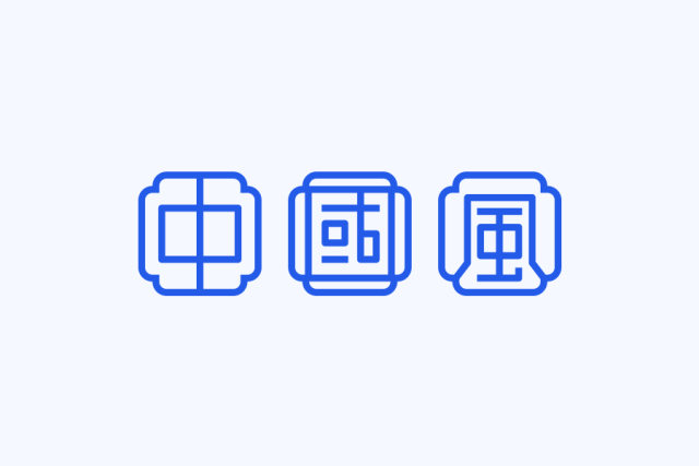
Windows, doors in gardens, or seals in traditional Chinese paintings are good elements to extract graphics. Most of these graphics are used as graphics outside the font to play an emphatic role; such as plum, orchid, bamboo, chrysanthemum, dragon and phoenix, etc. These more representative animals and plants can also be subtly combined into the font design. Let's take the window as an example of an element graphic.

The shapes of some Chinese-style windows are briefly listed, and you can feel the strong Chinese style just by looking at the graphics. If you look at these windows in reality, they are really poetic and picturesque. When you choose window types, try to choose concise ones. Some window types are really too complicated. If complex Chinese characters are added inside, the visual effect will be a bit messy. You should pay attention to this.
To make full use of the characteristics of graphics, and to make the strokes of the text and the graphics have a good positional relationship and interspersed, it seems very simple to say, but in fact it is still difficult to do, which requires everyone to spend more time on draft paper Tutu painting, if a certain type of graphics and text cannot be well combined, then it is recommended to change the type of graphics decisively, and the mind may be opened in an instant.
Okay, that's all for today! It is emphasized again that the above methods can be used in coordination with each other in daily applications, and the effect is better; there are more than the above four methods for Chinese style font design. This article hopes to give some small inspirations to friends and discover more Ways to create more interesting typography.
-END-
乚亅丿乛 word 、B 一 勹>体卜>
Learning a few strengths Learning People>Chamber 廴>
Articles are uploaded by users and are for non-commercial browsing only. Posted by: Lomu, please indicate the source: https://www.daogebangong.com/en/articles/detail/Dry%20goods%20Four%20skills%20let%20the%20font%20design%20blow%20Chinese%20style.html
 支付宝扫一扫
评论列表(196条)
测试