
Hello, everyone! I'm brother Lee!
I found that many people in the workplace have a habit of doing PPT, that is, they will not deal with important information, but only one trick, that is Marked red.
In the end, the entire PPT is full of red dots, which looks very messy.
Let me show you three cases.

So how to emphasize the key information since it is not allowed to be directly marked in red?
I have summarized three situations for you today, and we will explain them to you one by one.
01
encounter to key figures
Refined Information, magnified for emphasis.
Let's look at the first case first. There are many key numbers in this case.

In a paragraph like this, there are many PPTs with key data, which is very simple.
Remove the numbers, enlarge and bold them, similar to the following.

The next step is to polish
You can add pictures, add icons, and rearrange the layout, isn't it pretty?

The text can add a little accent color,Then this color can be taken from the picture.
It is more appropriate to use blue here.

Of course, you can also come with a full-graphic PPT, and the effect is also good.
Masked with a dark blue gradient, the text turns white. Just like the picture below.

Let's have a top-down structure, this kind of PPT is very business-like and very atmospheric.

02
encounter Go to table or comparison page
Yes Contrast with color blocks
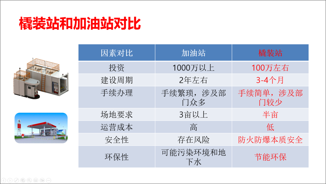
Let's look at the second case again, which contains a comparison table. It mainly emphasizes the advantages of skid-mounted stations.

In this case, we don't mark it in red directly in the form.
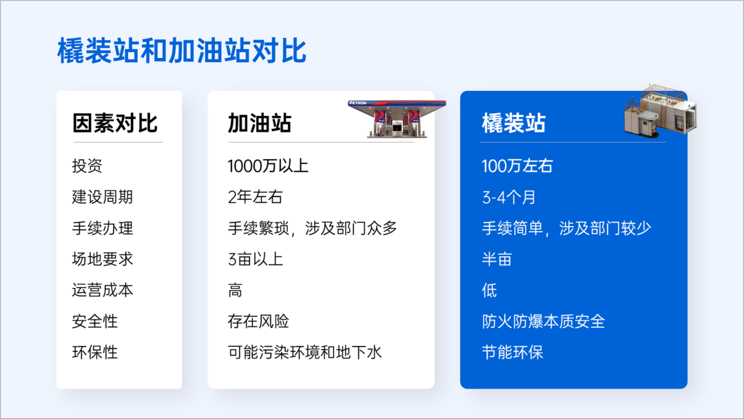
can make the color block of the background contrast.
Let's see the modified one, so it also highlights the skid station.
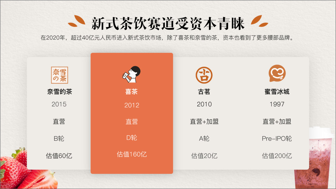
Of course, there are others, such as the following form.
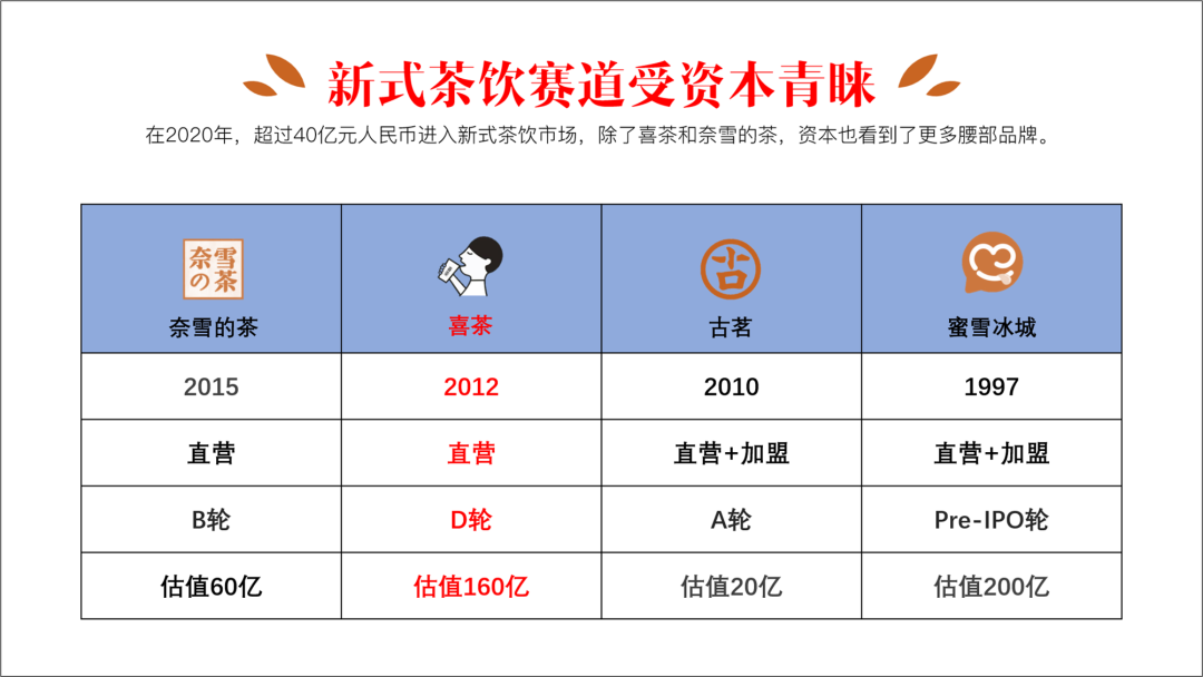
If you want to highlight HEYTEA, you can directly change the color of the cell of HEYTEA, or make it bigger overall .
03
encounter to the graph
emphasis Main data, weakening secondary information
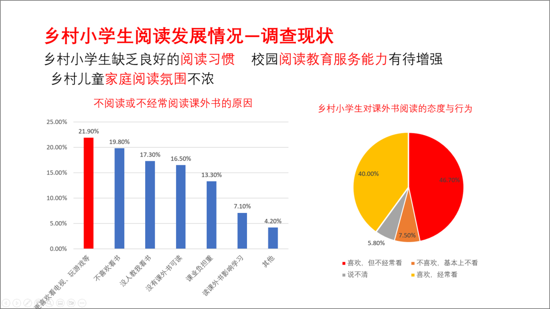
Let's look at the third case again. This case has two charts and some text. The current layout is too dazzling.
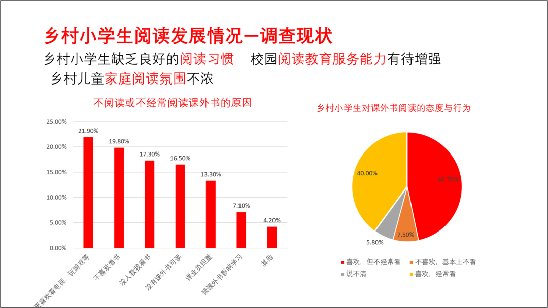
Let's fix it.
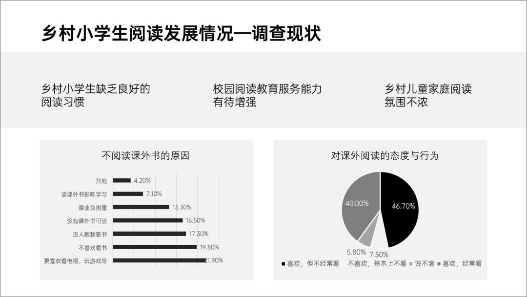
First divide the area, the current PPT is divided into four parts from the content, we first use the color block occupancy method to divide area.

Then, we typeset the text, regardless of the color.
Next, let's polish it, add pictures, add icons.
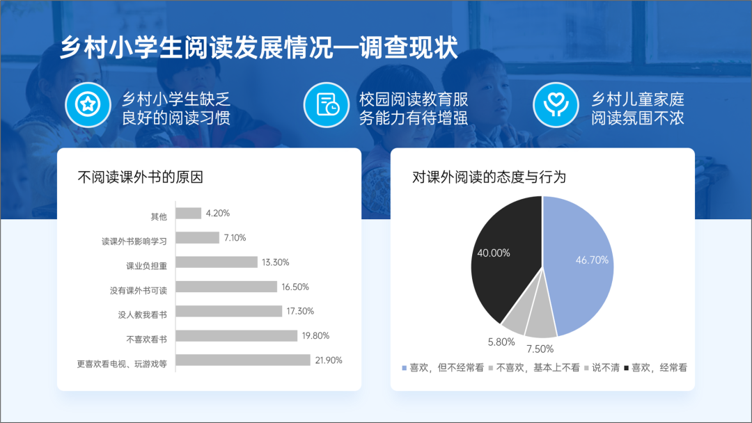
Next, let's paint.
If it is an icon, use a single color system, use dark colors for emphasis, and light for secondary ones color.
This way the chart is more coordinated.
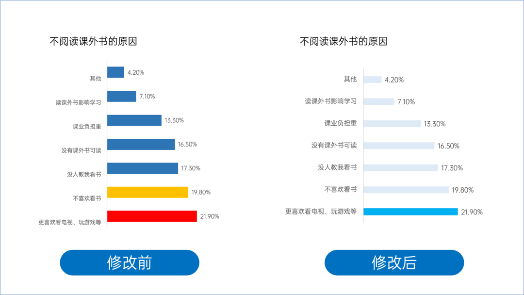
Finally, let's look at the modified PPT.
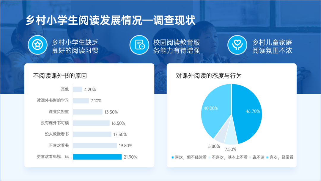
This kind of PPT that weakens the secondary information is also often used in text layout.
For example, the following PPT page.
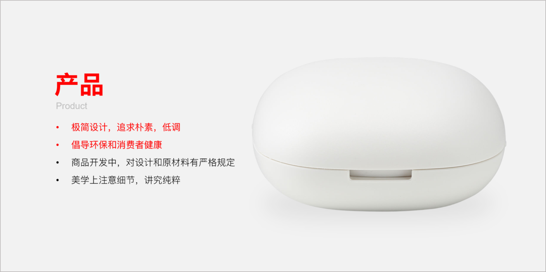
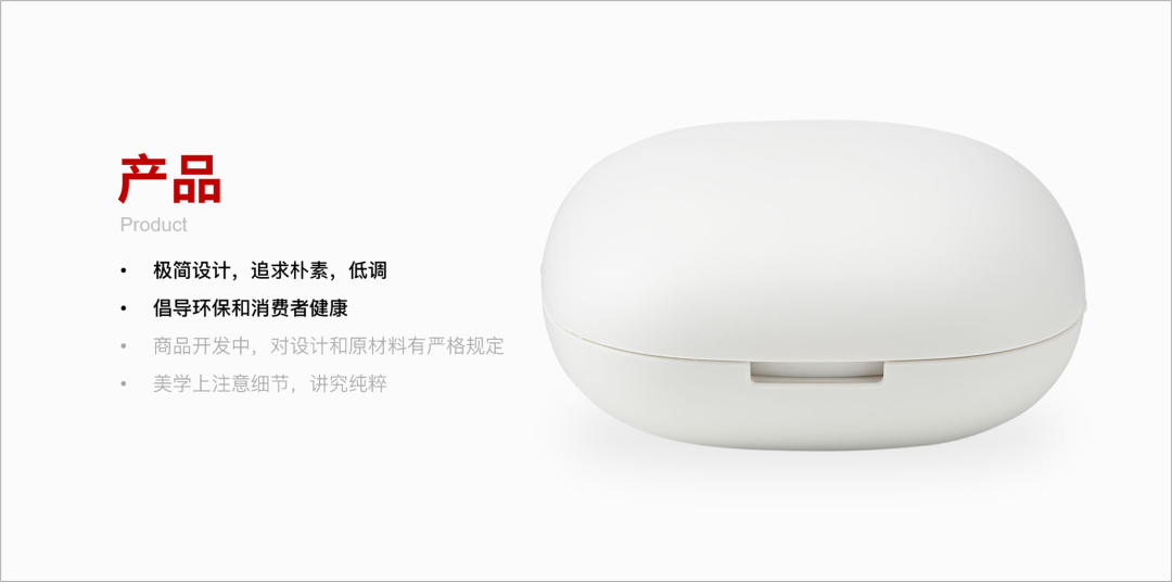
We can turn the secondary information into gray and the important information thicker and darker.
The above is the main content of today.
I hope to inspire everyone.
End of this article!
PS: I am Lixiong, a PPT designer who has been working for 9 years.
If you also want to make a good-looking PPT, you can learn from Brother Li. There are a total of 40 video lessons in the column , very systematic and of super high quality.
There is also a question-and-answer community, and 5G PPT materials are also given away
Articles are uploaded by users and are for non-commercial browsing only. Posted by: Lomu, please indicate the source: https://www.daogebangong.com/en/articles/detail/Dont%20mark%20the%20key%20points%20in%20PPT%20in%20red.html

 支付宝扫一扫
评论列表(196条)
测试