Author: Design Noodles
Written in front
Today we will talk about the long-awaited dry goods in terms of color matching.
In fact, I wrote an article about color matching a few years ago. I probably still have an impression of the early flour. In that article, I have basically summarized the main essence of color composition that designers need to use (at the end of the article A link to the article will be attached, don't worry).
But because the work content of different design industries is different, and everyone's foundation and understanding ability are different, so only one article cannot solve everyone's problems, so today's article is about that color matching Supplementary articles for knowledge explanation.
However, before explaining how to match colors, we should first remember some theoretical knowledge about colors, because with the theoretical basis, we can be rational when designing, instead of wasting time in random color matching and blind trials.
So this article is mainly divided into the following parts:
1. What is the color in the general sense?
2. Design process and color matching ideas sharing
3. My other color matching magic weapon
Four. Summary
1. What is the color in the general sense?
To put it simply, color is color. Color can be divided into two categories: colored and five-colored. To see colored, it mainly depends on the attributes of three aspects: hue/purity/brightness. Achromatic is white/black/various shades Gray, or achromatic, is a color with zero saturation.
Hue, that is, the name of the color can be clearly expressed, such as red orange yellow green blue indigo purple:

Colors can be divided into warm and cold, I roughly mark it with the concept of temperature, where "0" means neutral, "-0" means neutral and cold, "+0" means neutral Warm (Of course, the temperature here is marked by myself to embody the concept of cold and warm, mainly for the convenience of everyone's understanding, so don't worry about whether this value is accurate haha, you understand that they represent very cold / very hot / generally cold /General heat is fine!~)
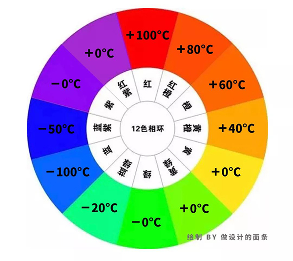
Brightness refers to the brightness of the color (in layman's terms, the more white added to a certain color, the brighter it will be, and the more black added, the darker it will be).

Purity (saturation) refers to the purity of the color. Let me take red as an example, as shown in the figure below:
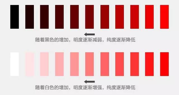
If you want to read a more detailed explanation of the principle of color composition, you can go to baidu or google by yourself. In this article, you only need to understand the above knowledge points.
2. Design process and color matching ideas sharing
No matter what kind of design we do, whether it is a design exercise or an actual project, before designing, it is best for us to be able to clarify what our design purpose is, and then determine a theme, based on this design purpose and theme, to conceive Creativity, after you have the idea, go to discuss the specific implementation, which includes the design, layout and color matching of the font (title copy), the overall composition and color matching of the screen, detail optimization, atmosphere rendering, etc.;
Of course, I will only talk about other aspects this time, because our main content today is about color matching.
Take a photo poster design I did recently as an example:
Below is a photo I took with my phone a few days ago. The content of the photo is that I hold a flower in my hand.
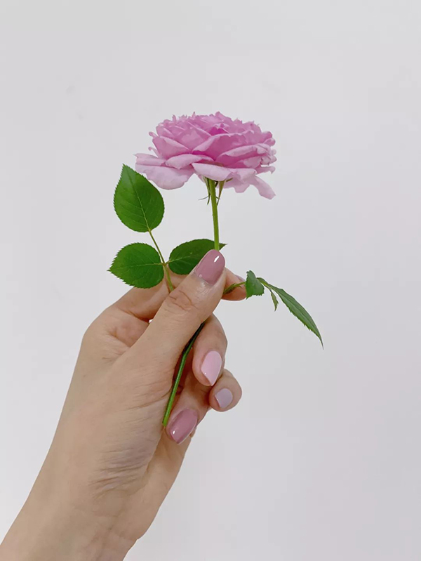
1. Determine the theme before designing
For example, this time I decided on the theme of the design: romance.
Because I saw that the flowers in this photo are pink, and my finger nail polish is also pink, and I am also a woman who likes pink (the older I get), at the same time because I like to try various styles Theme, I have never done the theme of romance before, so why not just be romantic this time.
So when it comes to romance, what is the first reaction in everyone's mind? I don’t know what everyone will think of, anyway, I will think of many scenes, such as the 2002 Korean drama "Winter Sonata", the scene of the hero and heroine embracing in the snow, with snowflakes floating in the sky, and the background music playing "My memory";
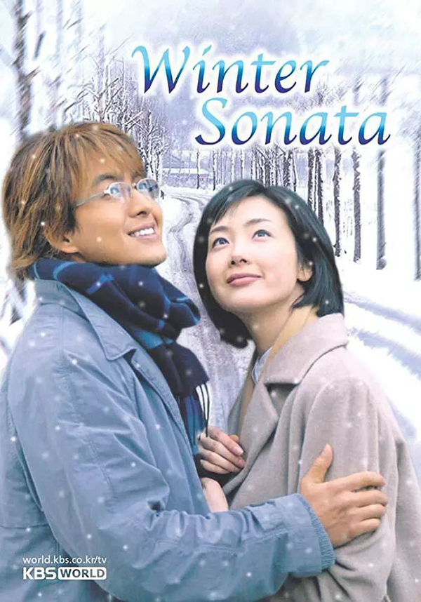
"Winter Sonata" is a Korean drama in 2002, so it is a bit outdated to look at the poster now, but the drama is a good drama
Another example is the 2017 movie "La La Land", where the hero and heroine dance and kiss under the wonderful starry night sky, while the background music plays "City Of Stars";
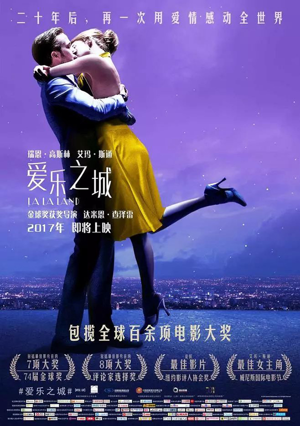
La La Land movie poster
Another example is the ending plot of Hayao Miyazaki's anime "Listen to the Ear" released in 1995. The hero and heroine who met after two months sneaked away to a corner overlooking the city and the sunrise to express their love to each other. The short hair of the Lord, tall buildings permeated in the hazy mist, the afterglow of the sunrise reflected on the rippling water, and "Take Me Home, Country Roads" played in the background;
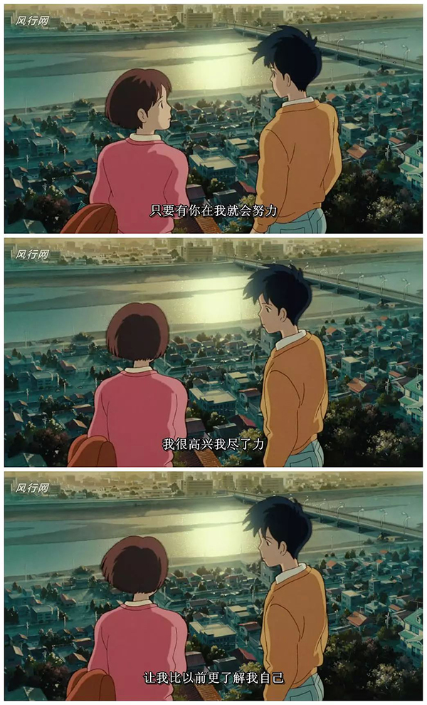
Still stills of Hayao Miyazaki's anime "Listen"
Wait, wait, there are many romantic scenes, so I won't say more.
In short, there are many forms of expression and color matching of romance, but there is one thing in common, that is, to create a romantic feeling, background music, color matching and atmosphere rendering are very important.
For example, in addition to the auditory background music rendering the atmosphere, there are also visually the white snow Kaikai and snowflakes in "Winter Sonata", the blue-purple night sky and starry sky in "La La Land", and the warm yellow in "Listen to You" Sunrise and breeze.
So back to the photo I took myself, this large area of gray and white background can only make people feel very frigid and not romantic at all, so I must cut out this photo before it can be used; From the perspective of my own age, preferences, and content limitations of the original photo, it may be more suitable to take the romantic color of "La La Land": use dark purple to match the pink color in my original picture.
Ok, let’s stop here for the analysis, let’s not continue to worry about how to refine the color matching. At this time, we only need to have a rough color feeling, because before the color matching, we still have a very important step. , that is the composition.
2. Composition before color matching
The reason why many people always say that they don’t know how to match colors or feel wrong no matter how they match colors is actually because it’s too early to match colors. You have to finalize the composition and basic frame of your entire picture first. To think about color matching.
Compose first, then color
Compose first, then color
Compose first, then color
Say important things three times! ~
Because the composition is equivalent to laying the foundation first when applying makeup. If the foundation is not laid well, no matter how much makeup you do, it will be futile. In the same way, if your composition is messy or the basic model has not come out, you should consider the color matching. It is very likely that you can’t design a satisfactory result after a long time. Not good-looking is a very important reason.
Because your design steps are wrong.
For example, I want to use this flower to make a poster today. I will not consider the color matching and atmosphere rendering. It is the original conditions of the photo, and one is to do it around the theme of romance. The final layout is as shown in the figure below:
A light color and a dark color, you can compare and see the effect.
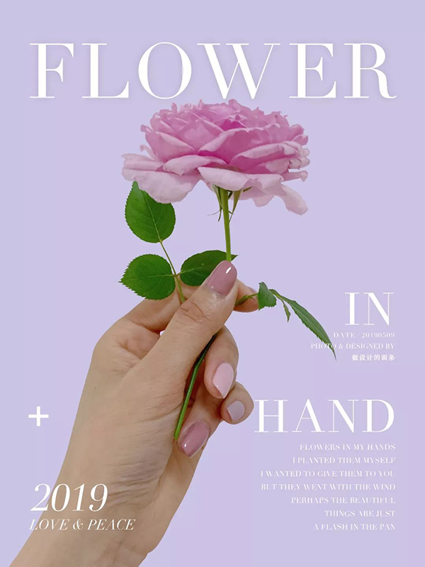
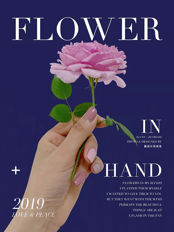
This poster is actually okay to look at casually like this, but it lacks details and emotions, and it is not particularly attractive. The most important thing is that it is not romantic enough.
So at this point, we can continue to refine the color scheme, assign color ratios, optimize details, and add some of the most important steps of atmosphere rendering.
So I continued to optimize the poster and ended up with this poster:
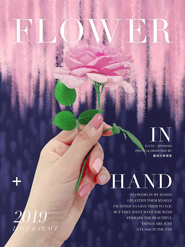
The background of this poster was painted by me with the brush that comes with PS, brushing in one direction to create a sense of falling, which is to play a role in rendering the atmosphere.
Then, although pink and purple can be regarded as the same color, but because there is a big difference in lightness between bright pink and dark purple, there will be a feeling of collision when they are combined, giving people a visual The memory will be stronger, and the dark color will also give people a more mysterious feeling, which makes people unable to figure it out.
After all, people who can't figure it out give people more associations and guesses than people who can see through it at a glance. Romantic love with episodes and accidents will give people a deeper impression, right~
At the same time, in order to facilitate everyone's understanding, I have made the following versions, and you can compare and see the changes in the perception of the difference in color.
For example, if I change the brightness of the picture and increase the brightness of the picture, as shown in the following figure:
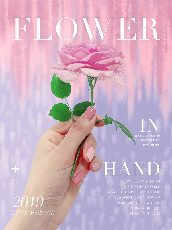
Looking at it this way, does the picture give people the feeling that it is much more girly? And it gives people a very gentle feeling, but it will feel sweet and greasy after staring at it for a long time.
If the dark tone of the first version above is a romance designed for women around 20-40 years old, then the above version is like a romance designed for girls around 20 years old.
On this basis, if I change not only the lightness but also the color matching, and add a color of a non-same color to the picture, as shown in the following picture:

Looking at it this way, it actually feels beautiful, right? The beauty is beautiful, but it feels more greasy than the above version, because it seems to be romantic designed for children or little loli princesses, and the applicable psychological age group is even younger.
ok, let's move on.
If I change the background color to any color, but keep the background color in the same color system with different lightness, there will be light and dark in the picture, as shown in the following figure:
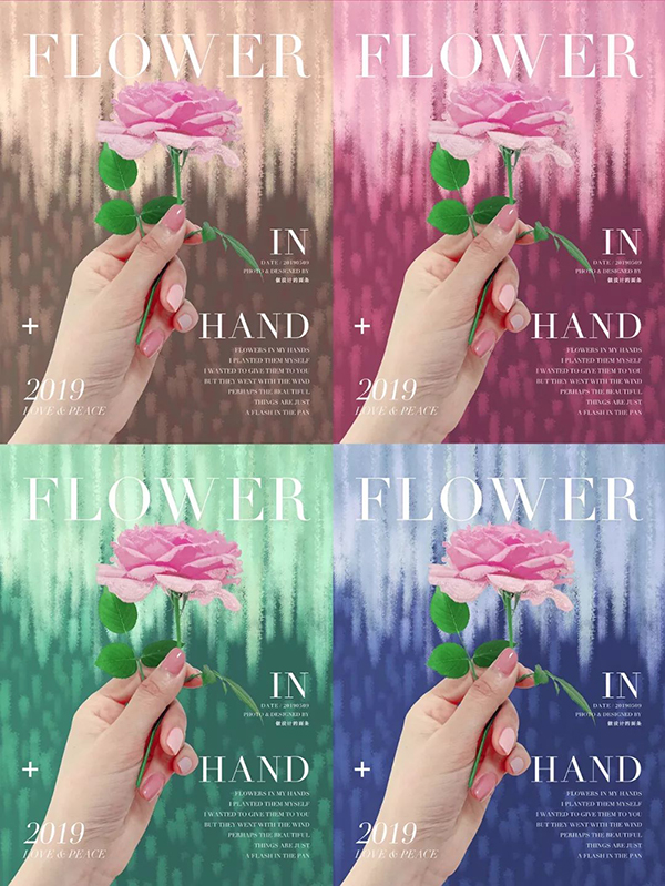
The feeling that came out in the end is actually okay and beautiful, but it lacks some eye-catching feeling, and I feel that it is quite satisfactory and nothing special, just like that kind of plain emotion, emotion that lacks passion.
However, this method of the same color system is the favorite color matching method used by platforms and brands in order to unify the image and facilitate visual standardized management. For this, you can pay attention to some channel pages of Tmall or JD.com or various branches of large-scale events. The page color of the venue.
Ok, everyone probably found the previous color matching skills. I either use the same color system for color matching, or use the same color system to change the lightness and purity, or use different color systems with different purity but keep the lightness consistent, so I use this method to match colors, no matter No matter how you match it, in fact, the final feeling will not be too bad, but the target audience is different, and you can choose what you need.
So if you don't know how to match colors, then just change within these basic framework rules. This is a very safe color matching method.
But if you don’t follow this rule, but randomly match colors, the following situation is very likely to occur, either the picture looks dirty, or the picture looks gaudy, fancy and messy, as shown in the following error demonstrations :
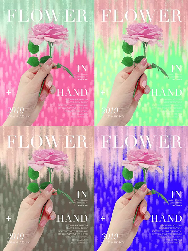
Although the above pictures are some wrong color matching demonstrations, many children who are not sensitive to colors may also think: "Hey, it's actually okay", in fact, the main reason is that there is a basis for composition. The foundation is there, so even if the color matching is not good enough to fool it, it's okay.
Take make-up as an example, why do you think that those people who have a good appearance look good even if they dress or make up indiscriminately, once she dresses up and puts on make-up, she is simply a fairy, but What about people with bad foundations? Maybe even if you know how to dress up again, you can only look good, and you can't reach the point where you have a fairy appearance.
So I would like to emphasize again that it is very important to compose the picture and lay a good foundation before color matching.
To sum it up, before designing, first determine the theme, then set up a framework to fix the layout style, then consider color matching, then render the atmosphere, and optimize the details in the last step, over.
Third, my other color matching magic weapon
The following knowledge points are some color matching tips that I usually summarize. They are some methods that I have tried time and again, and I will share them with you.
To sum up, my color matching skills mainly include the following: association method, extraction method, and purpose-oriented rule.
(1) association method
The so-called association method is similar to brainstorming. When I get the design requirements or determine the design theme, I will extract some keywords, associate many related possibilities according to the keywords, and then filter some results for my use.
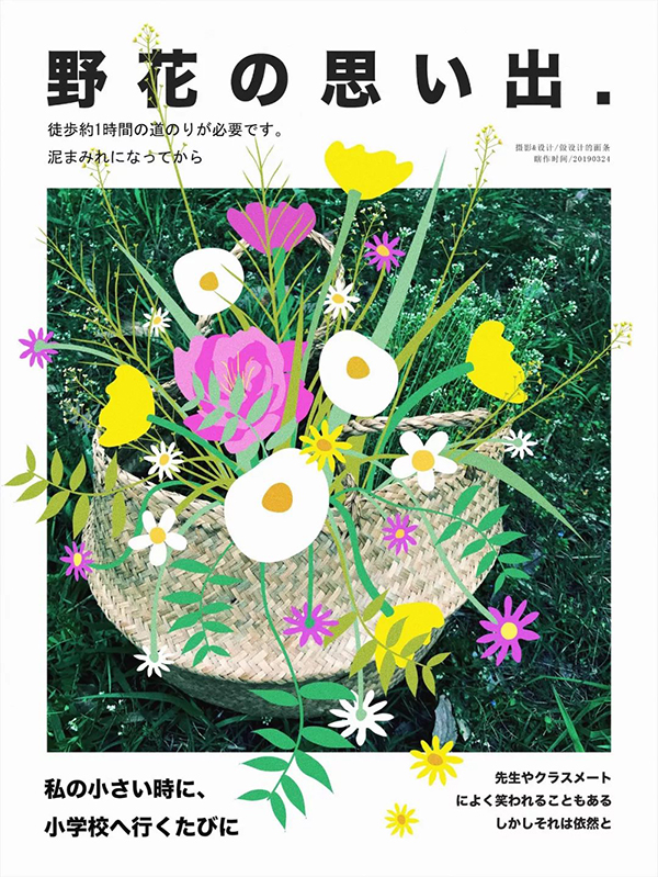
For example, in the photo below, the color of the original photo is very simple and single.

But because the theme I determined for him was "Memories of Wildflowers", I would think about it: "What are the colors of wildflowers?" Wildflowers are mainly in brighter colors, such as rose red, bright yellow, white, etc. As for memories, they may have a sense of age, so the main tone is dark.
So the color matching of the poster below came out.
There are many other color schemes that use association methods, such as the following group. Original photo:

After making a poster:
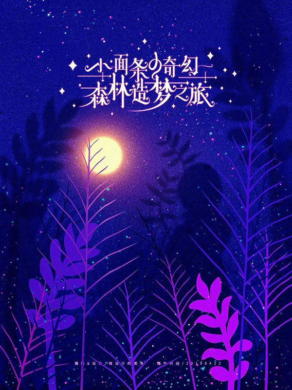
But what needs to be explained here is that the method of association requires you to be able to associate, so it is best for you to pay more attention to the things around you, observe nature more, and understand color psychology properly, and you will understand each color All can represent different feelings and things.
By exercising your sensitivity to color for a long time, it can help you quickly match the color you want.
(2) Extraction method
The so-called extraction method means that when we get a certain product or model and need to design around them, we can directly absorb colors from them, which can be used as the main color or embellishment color. The advantage of color matching in this way is: save time and trouble It is not easy to make mistakes, and it also has the effect of echoing the theme and finishing touch.
For example, in the photo below, the original color of the photo is green and lavender.
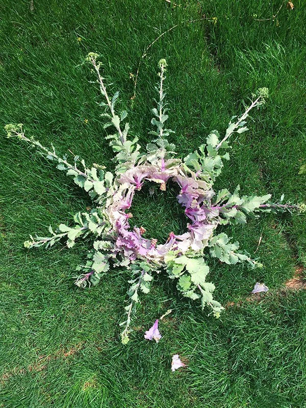
Then the color scheme of the poster I finally made is also these colors, except that the text part is white alone.
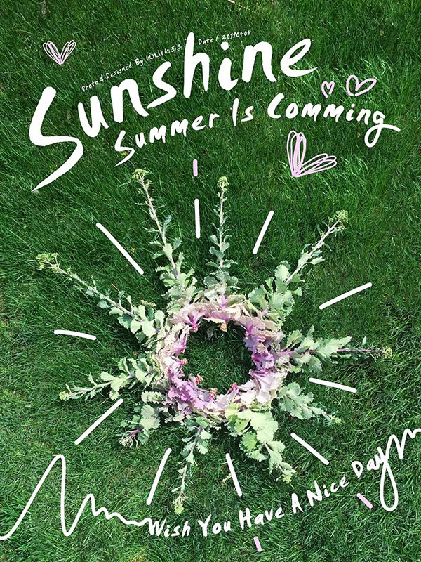
Oh, by the way, the two achromatic colors of white and black are the most suitable colors for titles or text content, and they are also the least error-prone. In fact, the method and the extraction method can be used in conjunction with each other without conflict.
However, sometimes if we want the picture to be more lively, we usually make a design that is more kawaii, and the title will also use color instead of black and white and no color. As for the color of the title, we can also use association and extraction Well, as shown in the figure below:
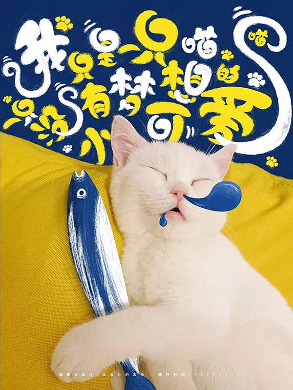
(3) Purpose-oriented law
The color matching method of the previous association method and extraction method is to teach you how to choose colors, but what color to use, what lightness and hue to use depends on what your design purpose is, so I will It's called the purpose-directed law.
For example, I mentioned to you before that some designs take the artistic route (mainly conveying emotions, focusing on emotional expression), rather than the general commercial design route that ordinary people understand (mainly conveying information, emphasizing Accurate communication of information), the former applies to all art-related designs or the designer's personal free creation, and the latter applies to all commercial activities designed for the purpose of selling goods.
The design purposes of these two types are different, and the target audiences are also different, so there will be differences in color selection.
For example, when we mentioned that a certain platform had another activity and discount, he also made a store promotion page. You can check it out. It is definitely based on warm colors such as red and orange, and the atmosphere of the page is well-designed. It’s very lively, so I went to the shopping mall with you, and I saw all kinds of sale and big discount signs, and some people shouted with loudspeakers: “Come in and have a look! Come in and have a look! I bought it at a big sale on the last day. If you don’t suffer a loss, you won’t be fooled if you buy it!” The sense of sight.
Moreover, some information on the page that consumers are particularly expected to notice must be highlighted. Not only must the font size be large enough, but the color will also be prominent.
Taking my book "Such a Design Can Be a Hot Seller" as a product illustration, I made a promotional poster, as shown in the picture below:

However, if you go to some stores or official websites that are relatively indifferent or have a big-name style of painting, it is completely a tone that I don’t care whether you buy or not. It’s not because he doesn’t want to do business, but because he wants to do business. The tonality is just like that, compare yourself or hold it.
For example, someone's positioning is aloof, or they are the young lady and son-in-law that you can't afford, the people who buy things from him are of this type, or they hope that others will think that they are this type, after all, they have to show One's own worth and taste cannot be lowered.
Therefore, you can see that ta will basically not show you a large font size, nor will it use some very fancy colors on the title, but mostly achromatic such as black, white and gray, and will not use some prominent colors to stand out Distinguish some words, in short, the page does not seem to have too much promotional atmosphere
Although my book cover design itself is not in the style of frigidity and big names, I still want to give you a demonstration, as shown in the picture below:
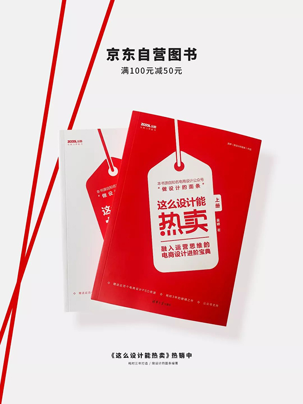
And those in between, that is, those fashion brands, or those with a little promotion in fashion, or those brands that can lower their figure and take a down-to-earth route, will still be appropriate on the basis of maintaining a good-looking fashion. Use larger font size or conspicuous colors to highlight some important information, but the colors will not be too fancy, as shown in the picture below:

As for the situation above, which is more friendly than big brands and more fashionable than big stores, the vast majority of them are in between. After all, there are only a few who are niche, and only a few become big brands. Although it is a big store now, I don’t want to There are a small number of people who take the big-name route, and there are almost no merchants who don't want to make money, so in the end they all become the majority of neither high nor low.
In summary, the goal-oriented law can be divided into two situations:
If you want to be low-key and restrained, you should be conservative in color matching, try to use as few colors as possible, such as within three colors, or use the same color or softer colors.
Just like a very gentle or introverted person, not aggressive, quiet.
Take for example a photo poster I made earlier.
Originally, I was thinking of making this poster look more visually impactful, but I didn’t want the picture to be too ostentatious. After all, the color of the clothes I wore that day was a soft orange-pink, so I used a contrasting color instead of the same color system, and control the color in the picture to no more than 3 at the same time, and the lightness of the colors in this poster is almost the same, as shown in the figure below:
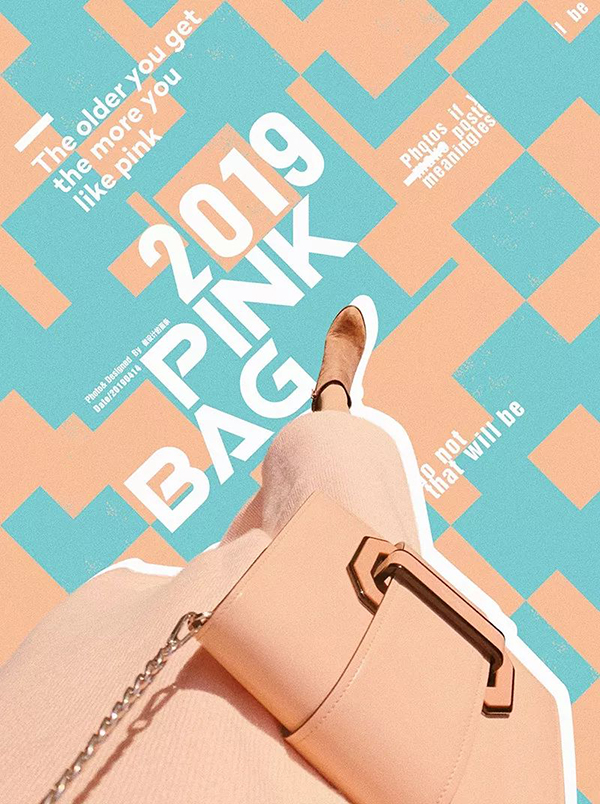
But if I use the same color system with different lightness and purity to match the color, the feeling will be as follows, and you will feel that the picture is more ladylike and quieter, without any aggressiveness:
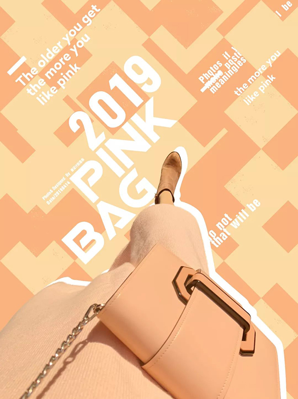
But if you want to be more high-profile, then you can use more colors in the color matching, such as three or more colors, or use contrasting or complementary colors instead of matching colors of the same color, or use higher purity and higher lightness Colors, and then colors of different lightness and purity collide with each other.
Just like a person with a hot temper and a flamboyant personality, they don't want to be submerged in the crowd, but to be the most eye-catching one in the crowd.
I still change the color of the above poster for everyone to see, the result is shown in the picture below:
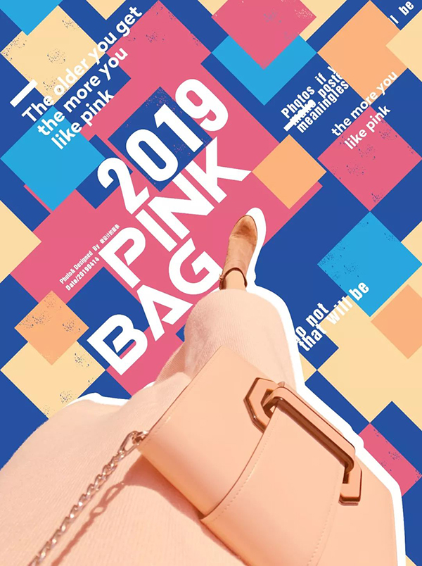
If I want to continue to highlight the headline copy, then I can also change the achromatic white of the title to bright yellow. There are more colors in the picture, the impact is greater, and you may even feel a little fancy:
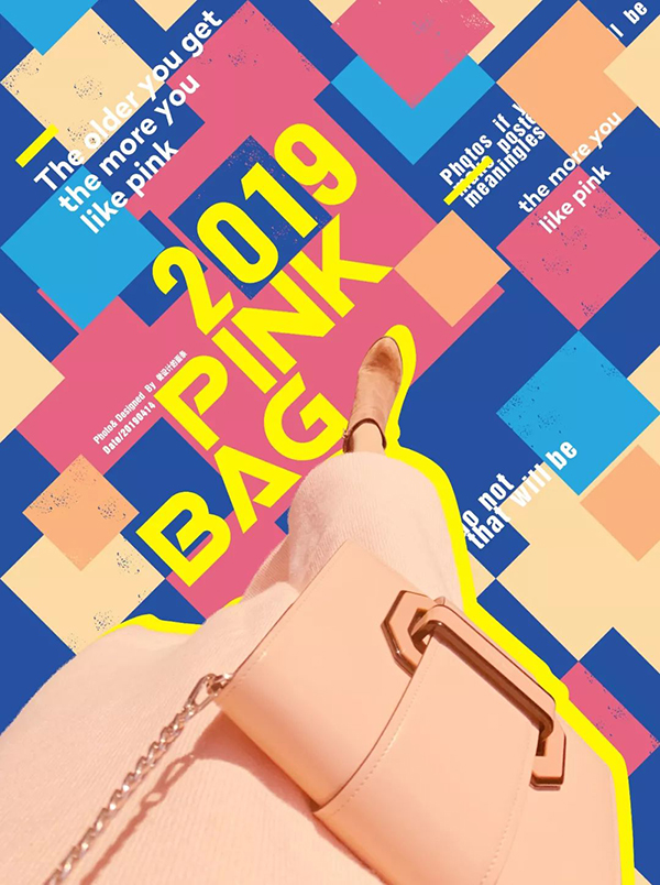
Ok, if you compare the above pictures, you will know the difference.
So remember, color matching is not random, it must have rules to follow, and it must be matched according to your purpose.
Of course, some people may say: "Sometimes the theme given by the customer is too obscure, I really can't think of it", or the color matching of your product itself is ugly. If you directly absorb the color Then the design made must be ugly, so, at this time, it depends on whether you have a flexible head that can adapt to the situation! ~
If you can't think of it, it means that you can always use Baidu, and then you have to read more and accumulate more goods in your head.
If the color matching of the original product itself is ugly, then you can analyze where it is ugly and improve it? For example, it is very gaudy because the purity is too high, so is it okay to use the same color system with a lower purity? For example, if it is fancy because it has too many colors, can we just choose one or two colors for use?
Another example is that some people say that the product given to me has no color at all, pure white, pure black, pure gray, so how should I absorb the color?
God! ~ This type is best done, because achromatic is a universal color. Achromatic can be matched with achromatic or any other colored color. This goes back to the law of purpose I mentioned earlier. If you don’t understand it, you can Look back and take a closer look~
write at the end
Usually, people often ask me what books I should read to improve my color matching ability. In fact, I want to say that as long as you master the basic knowledge of the basic color composition principles I mentioned earlier, you don’t need to continue to read the rest. Other coloring books too.
Because reading other books is nothing more than to expand your knowledge, it is just one of the ways to increase your knowledge reserve, but the reality is that many books written by people make people sleepy and difficult to understand, even if you buy them To waste money, it is better to develop your sensitivity to color by reading design websites, fashion magazines, watching movies, observing nature and other interesting ways, and then read my dry articles and practice more, practice more and think more useful.
Especially the colors of nature, it is really a super treasure of color matching, just look at those flowers and plants, blue sky and white clouds, sunrise and sunset, seabed and earth, which color matching is not beautiful and amazing? Even those nasty caterpillars come in all these awesome colors.
Many of the designs we do, no matter what industry the design is related to color, whether it is film, three-dimensional, or two-dimensional, are basically derived from nature.
So, that’s all for the color matching. Attach the color article I mentioned at the beginning of the article: six steps to explain the mystery of the color of the e-commerce banner design. See you next time! ~
Articles are uploaded by users and are for non-commercial browsing only. Posted by: Lomu, please indicate the source: https://www.daogebangong.com/en/articles/detail/Dont%20know%20how%20to%20match%20colors%20in%20design%20Dont%20worry%20I%20have%20a%20coup%20.html

 支付宝扫一扫
评论列表(196条)
测试