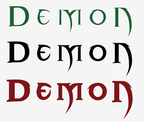
Step 1. I choose Blade 2 as the font. Before making the effect, I need to make minor adjustments to the font. Generally, I choose illustrator to adjust the font. We need three versions of the title : regular version, thinner version and larger version. The thickness of the font can be achieved by adding a stroke, and then uniting the graphics.
Step 2, we copy the finished font shape to the newly created ps, keep the text as a smart object
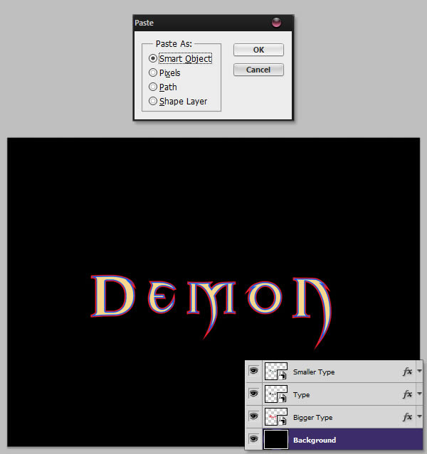
To distinguish the three layers, you can use layer styles to give them a specific color. Right click on the layer to choose a different color.
Step 3, make a red background
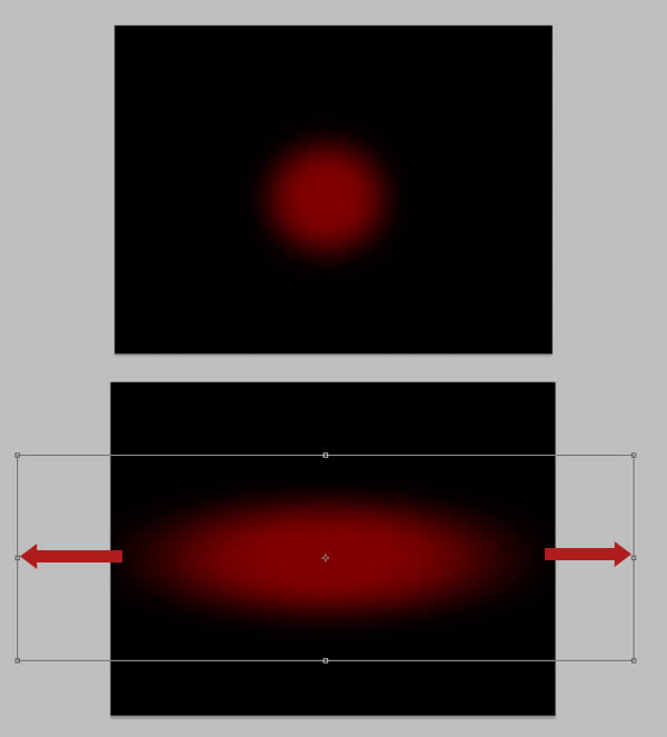
Create a new layer, take the Brush Tool (B), set the Hardness to 0%, choose the color #6d0100, and draw a big red circle in the middle of the canvas. Press Command/Ctrl + T to enter Free Transform mode, and stretch the circle horizontally. Name the layer "red dots".
Give the layer a mask by clicking the Mask button next to the Layer Style button. In the Channels panel, make sure the Mask channel is selected and hide the RGB, Red, Green and Blue channels. Go to Filter > Render > Clouds. Then, go to Filter > Warp > Polar and select Rectangle to Polar. Finally, go to Filter > Blur > Radial Blur and set the blur to scale, around 80.

Press Command/Ctrl+F to repeat the Radial Blur effect a few times, then Command/Ctrl+M to give the following Curves adjustment.
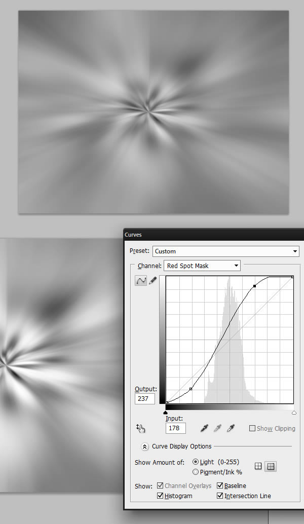
When done, you can select the RGB channel and unhide it. You should have the following result.

Duplicate the "Red Spot" layer and compress it horizontally, and scale it vertically.
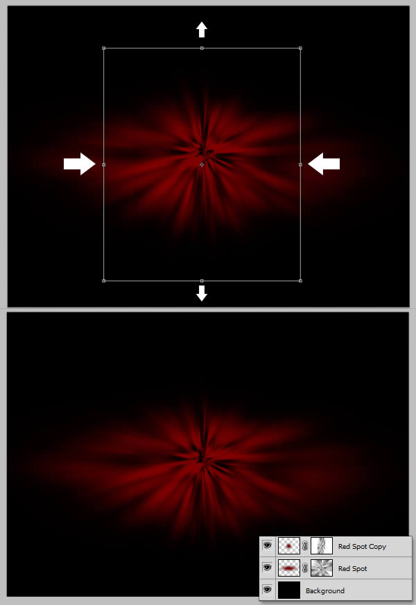
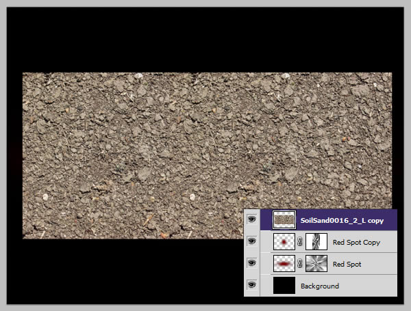
Download the soil material and place it in the canvas, you may want to duplicate it and place two layers so that the texture completely covers the red shape. , if you do, make sure to merge the two layers before proceeding.
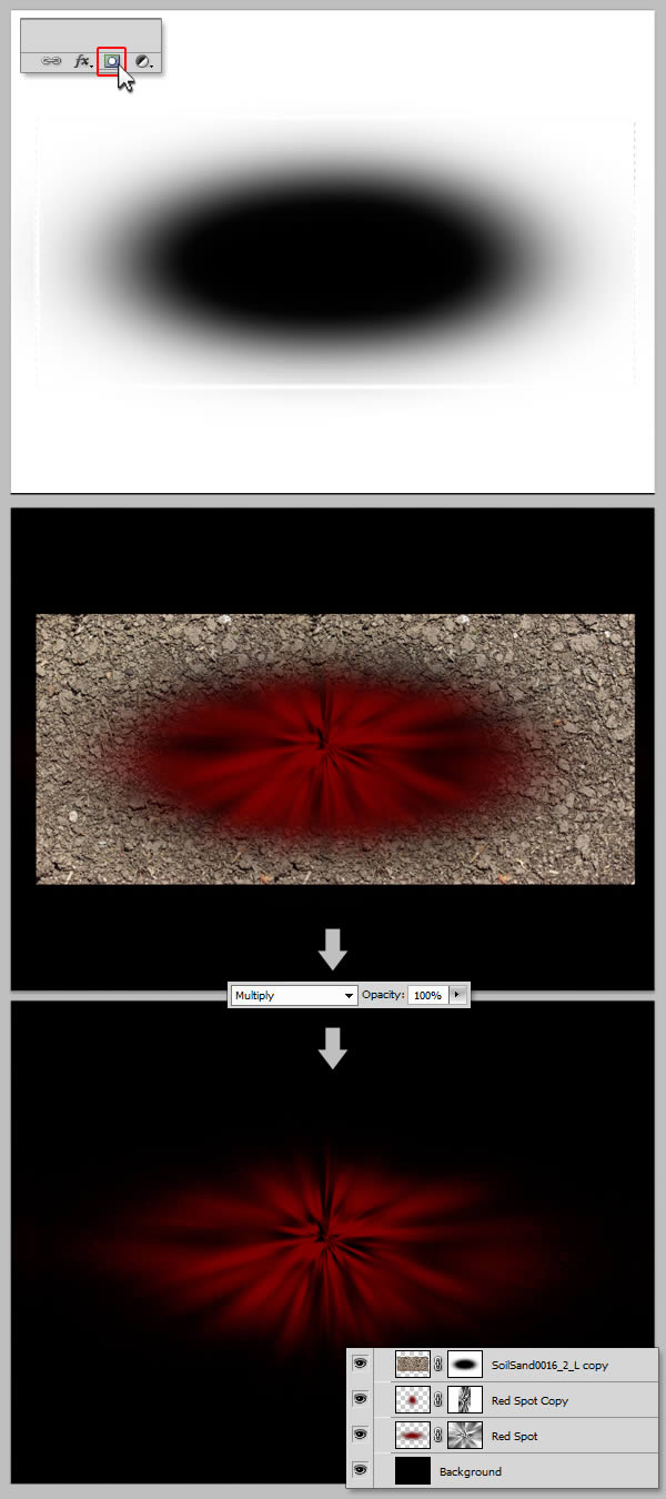
Give your "soil" layer a mask, and draw a soft oval, making the texture invisible in the red center. Set the layer to "Multiply".
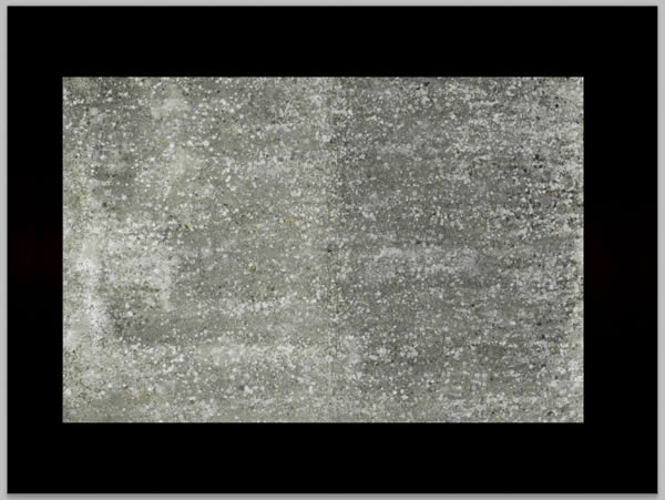
Let's make our background smoother by adding another texture. Download the tile material and put it in the canvas.
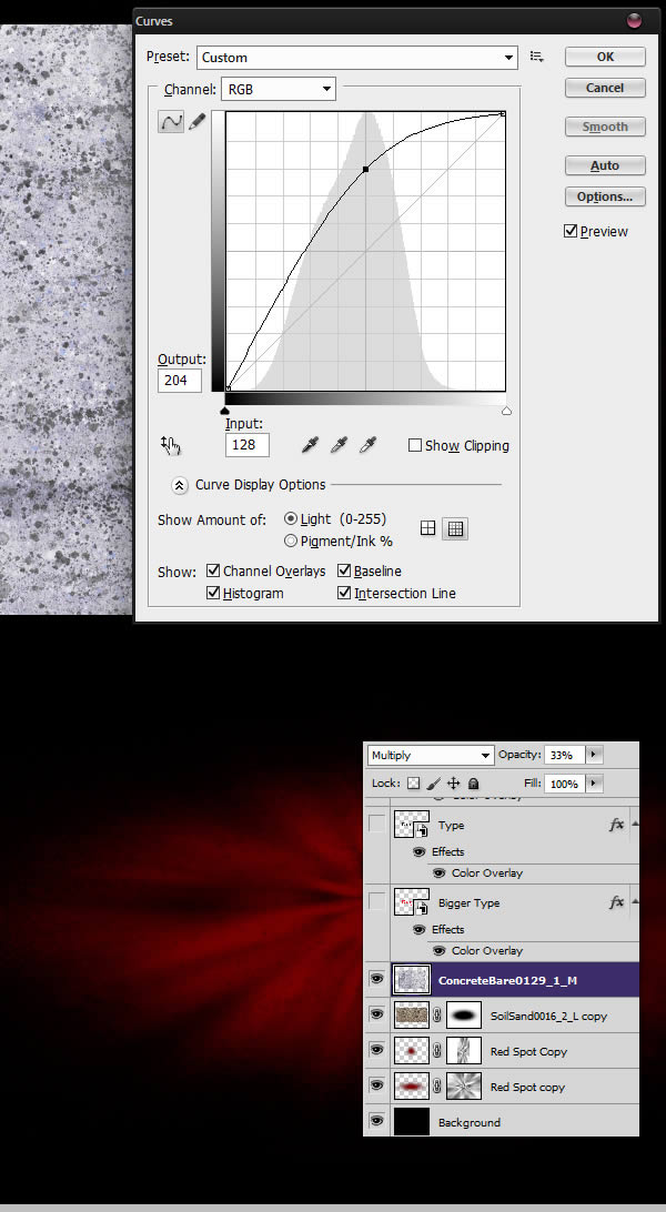
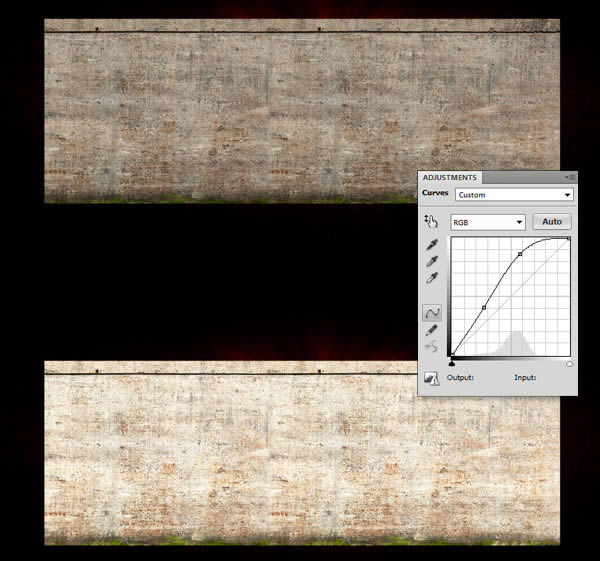
Press Command/Ctrl+I to invert the image, then, press Command/Ctrl+M to initiate the Curves adjustment and give the following curves, when done, set the layer to " Multiply" and 33% Opacity.
Step 4 - Decorative Pattern
Download the pattern material and open it in a new file. Use the Curves adjustment to increase the contrast and press Command/Ctrl + Shift + U to desaturate the layer.
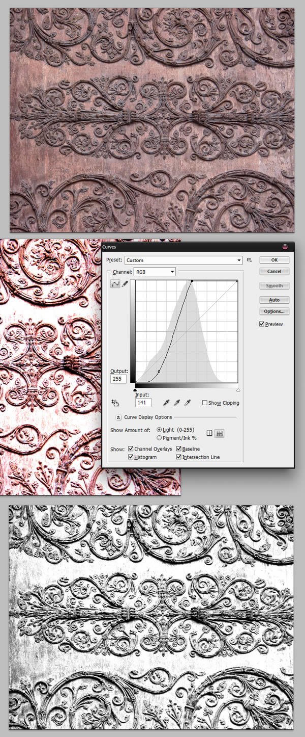
Create another new Photoshop document and give it the following settings. Go back to your pattern document, use the Rectangular Marquee Tool (M) to select part of the decoration, copy (Command / Ctrl + C) and paste it into the newly created file.
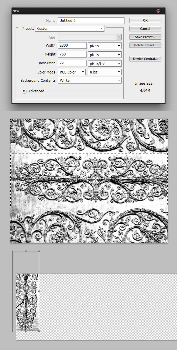
Repeat this process until the canvas is filled. You can use a dark blend mode to help you. You may also want to use the Eraser Tool (E) to erase parts of some layers, thus blending them together.
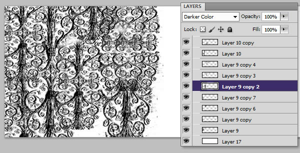
When you're done, expand the layer (right click layer > Tile Image). Press Command/Ctrl + A to select the entire image, then go to Edit > Define Pattern to create a new pattern. We named this pattern "decorative pattern".
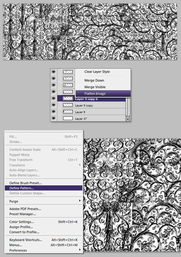
Step 5 - More Patterns
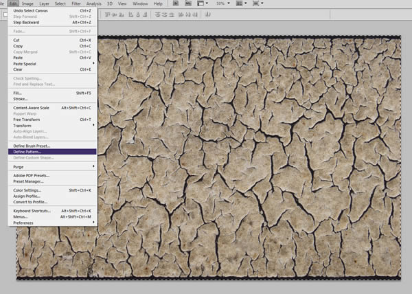
Next, we'll give some layer styles to the or medium sized text. However, before we can do that, we need to create another schema. Download and open the cracked ground footage in a new file. Hit Command/Ctrl+A, then go to Edit > Define Pattern, we'll name this "Cracks Pattern".
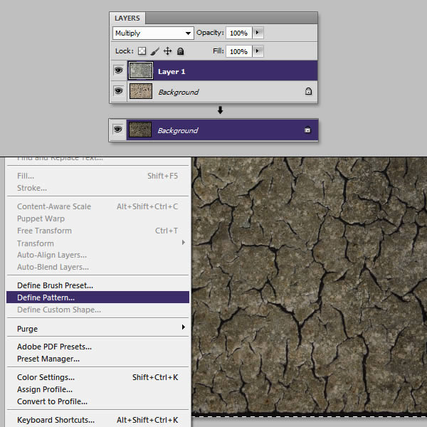
In the same file, place the Cracked Land clip and set it to Multiply. Flatten your image and create a pattern again, let's name this one "Cracks Pattern 2".
Step 6 - Apply Layer Style to Text
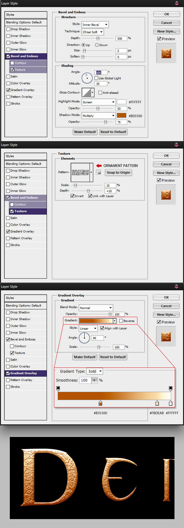
Go back to the main Photoshop document, select the smaller text layer, and give it the following layer style.
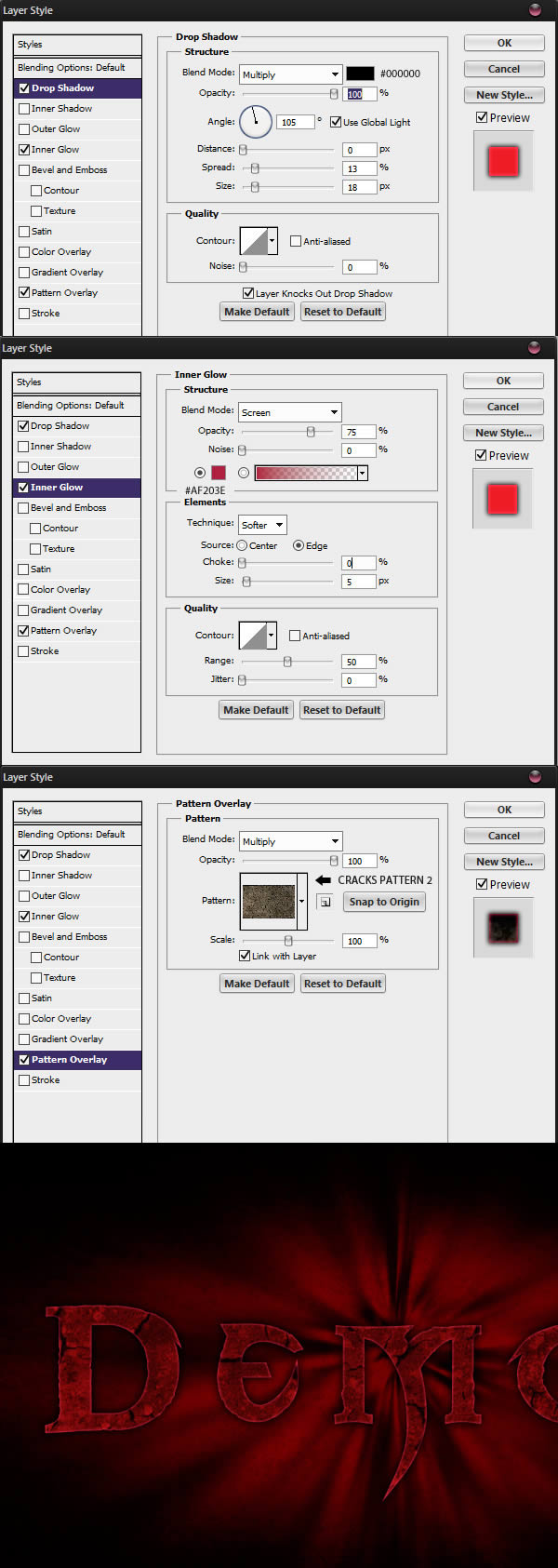
Give medium-sized text the following layer style

Finally, give the larger text layer the following layer styles.
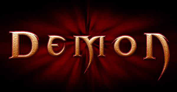
Unhide all layers and you should have the following result.
Step 7 - Red erosion text
We can also help make the text easier to see with more red erosion by changing a few things in Illustrator. To do this, double click on the larger text layer widget to open it in Illustrator.
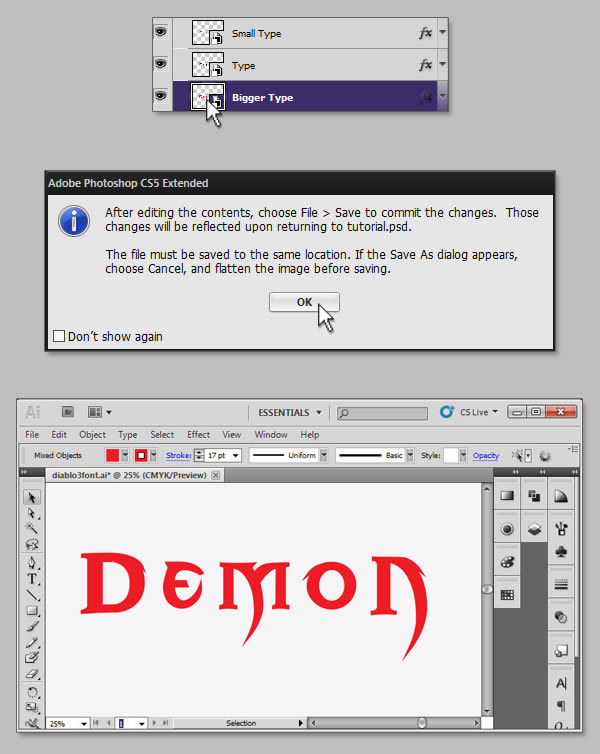
Select your text and add some anchor points by going to Object > Path > Add Anchors. Select the wrinkle tool and paint the text to add wrinkles. You can double-click a tool icon to adjust its options.
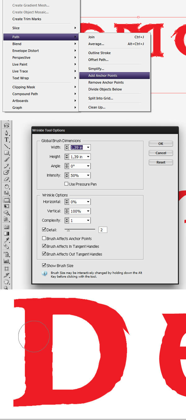
When finished, you can save and exit the Illustrator file and the shape should update in the Photoshop file.
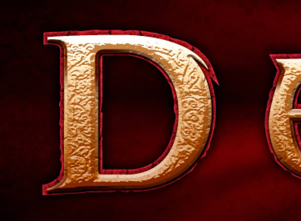
Step 8 - More beveled highlights and shadows
I wasn't too happy with the bevel effect of the layer style at this step, so I went ahead and created a new image placed between the smaller text and the middle text layer layer, and while keeping the selection active, paint some highlights with a soft brush (B).
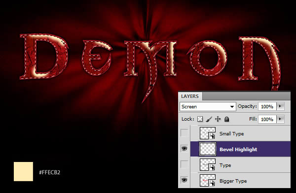
I then created another layer and this time, using the same technique, painted some shadows. In this example, I've filled the text with white, so you can see where I've drawn the shadow.
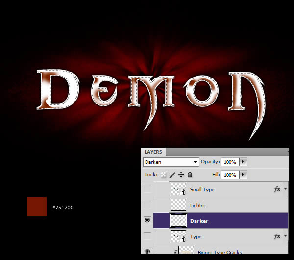
This step may only be done using layer styles. However, I tend to prefer hand painting as it allows more freedom than layer styles. Unhide all layers and you should have the following result:
Step 9 - More work on text
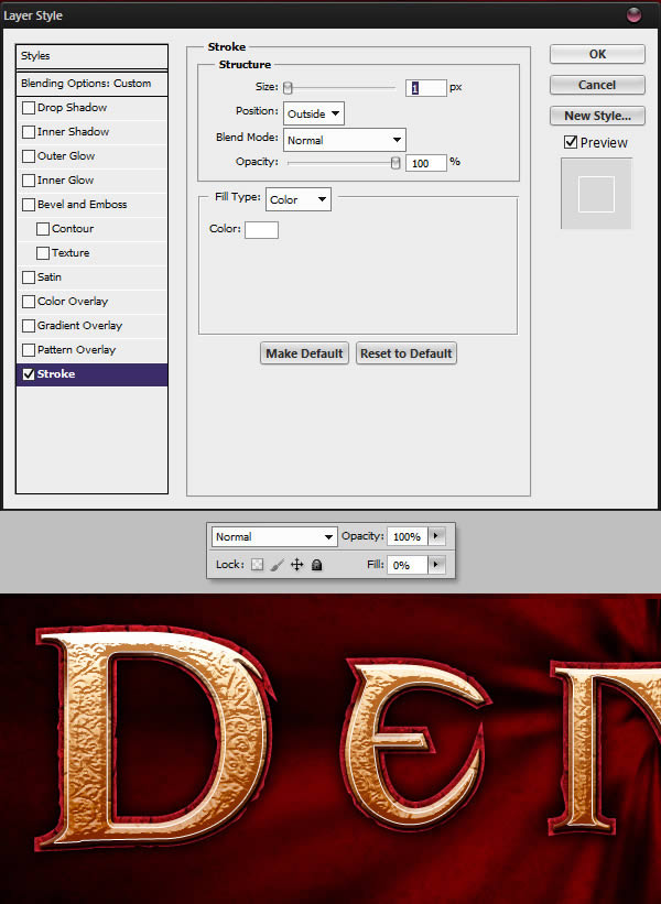
In this step we will create a nice white outline in the highlight area. Duplicate the "Small Text" layer (Command/Ctrl + J) and clear the Layer Style (Right Click > Clear Layer Style). Give the layer style below the new layer. Make sure the layer fill is set to 0%.
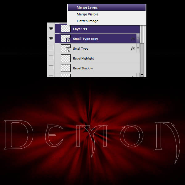
Create a new layer (Command/Ctrl+Shift+N) and merge it with the previous layer, this will apply the layer style, leaving only white on the new layer strokes.
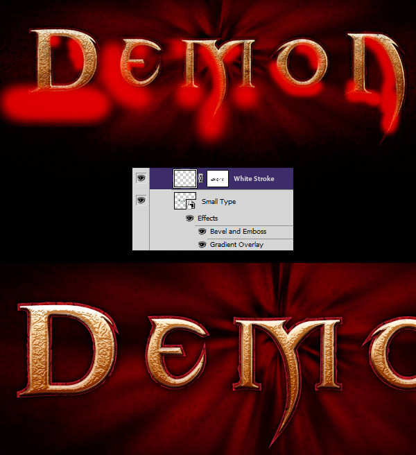
Name this layer "White Stroke" and give it a mask. In the mask, paint the less exposed areas below the text.
Step 10 - More Textures
Let's add rougher texture to our text, download and open cu. Again, you may need to duplicate the layer to cover the entire text. Once you're done placing, use a Curves adjustment to increase the layer's highlights.
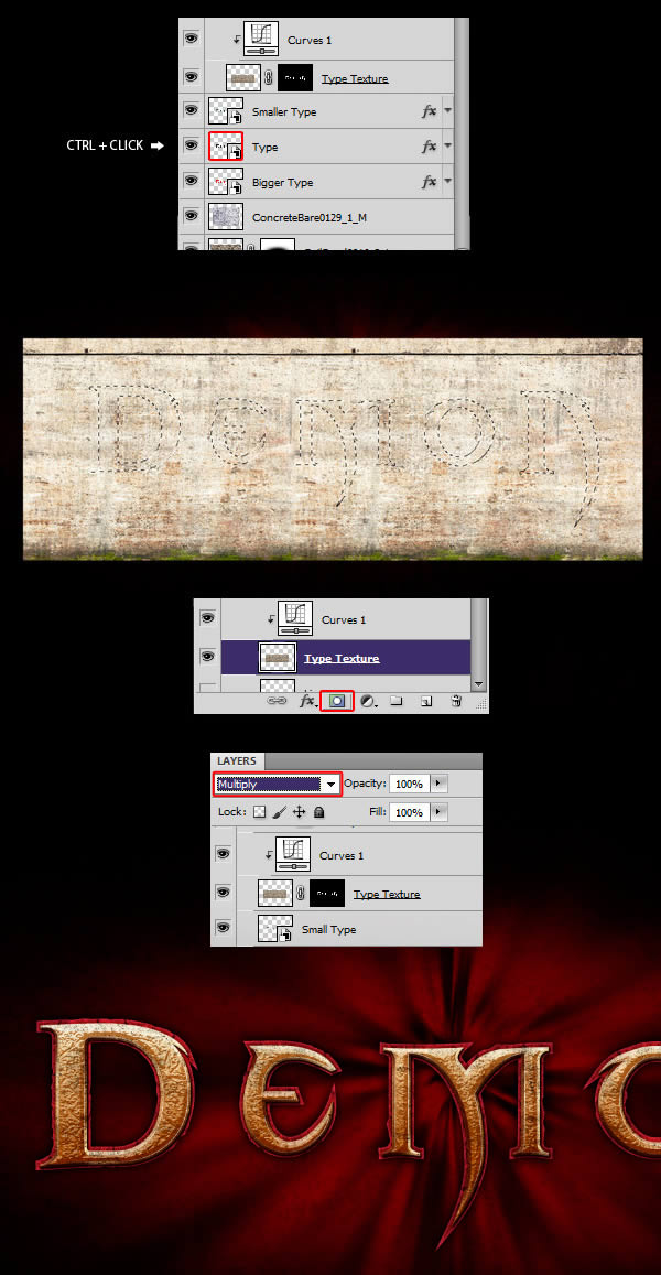
Command/Ctrl + click layer's vignette to get selection from medium sized text, use new texture layer. Set the layer to Multiply and make sure it is placed on top of the text layer.
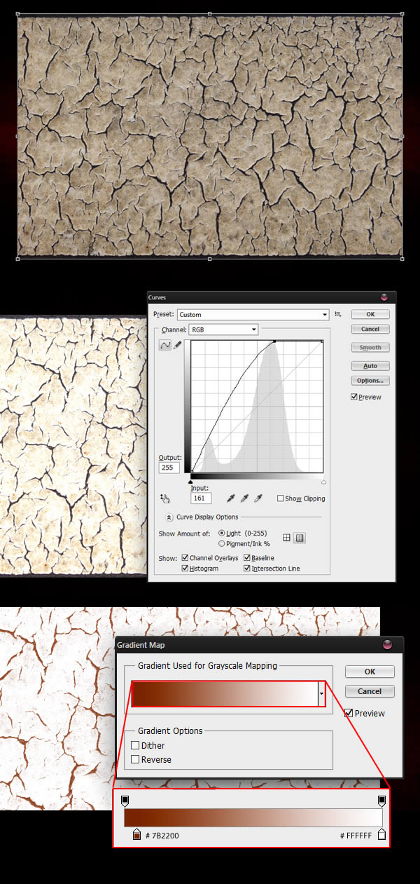
Open the soil crack material and place it on the canvas. Give it a nice Curves adjustment to boost the brightness, and then a Gradient map to colorize the cracks.
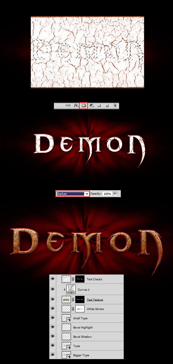
Retrieves a selection from the medium-sized text layer, using it to mask the texture. set texture to dark
Step 11 - Final alignment of the text
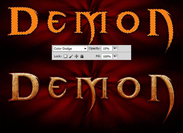
Our text is a bit desaturated due to all the textures we added. We'll fix that in this step, first by creating a new layer. Get a selection from the medium sized text and fill the layer with #F98111, set the layer to Color Dodge and lower the Opacity to around 15%.
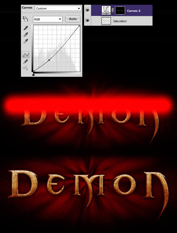
Create a Curves adjustment layer to darken the text, add a mask to the text, paint the top area of the text black, this will darken the bottom of the letters.
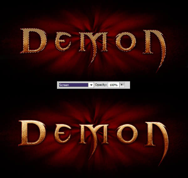
Create a new layer, and while the text layer selection is still active, grab the Brush Tool (B), set it to 0% Hardness, and paint the top of the letters using #92754C , set the layer to Screen.
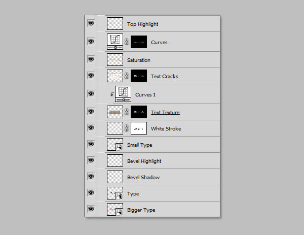
Once you are happy with everything, group each layer related to the text in a new folder (Command/Ctrl+G) and align the background layer Do the same.

Step 12 - Create a five-pointed star, return to illustrator, draw the following graphics, and copy them to photoshop
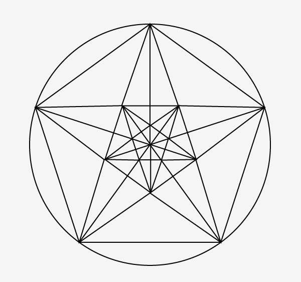
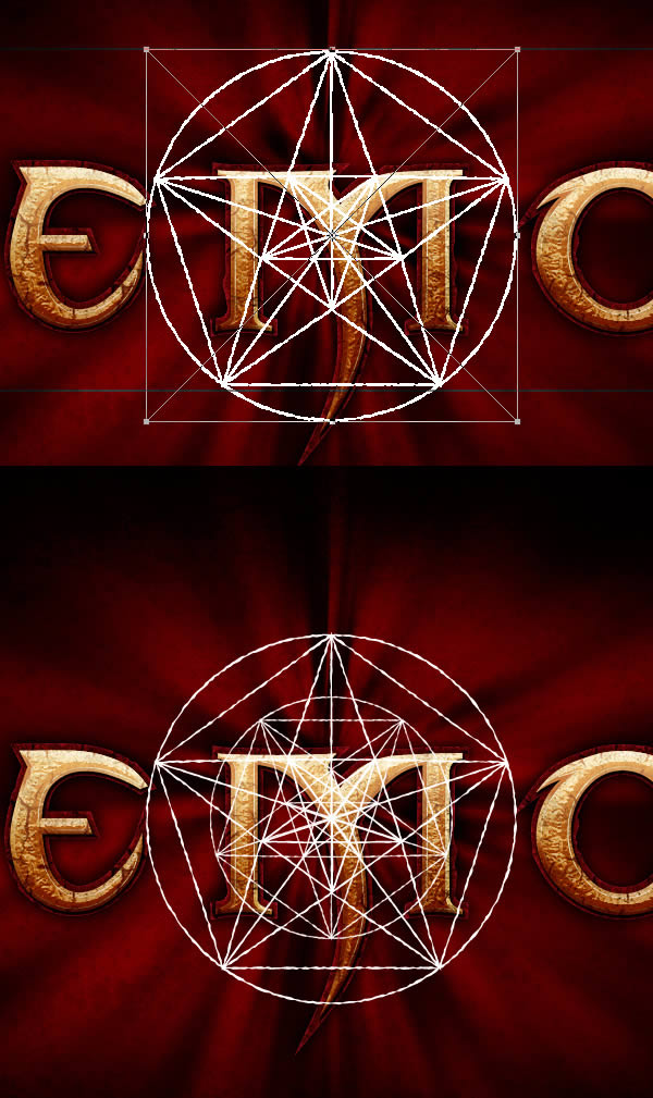
Make sure to put everything in the text to the back. Grab the Polygon Tool (U), set the Side Count to three, and draw a triangle. Press Command/Ctrl + T to rotate and stretch the triangle according to the example. Then, duplicate the layer three times and place triangles to match the example.
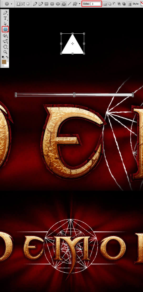
Once done, group each layer created in this step into a folder (Command/Ctrl+G), duplicate the group and merge, we need to .
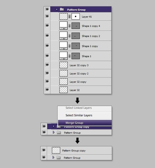
Step 13 - Merge Pentacles
Create a new layer and fill it with white, name the layer "Pattern". Retrieve the selection from our previously merged layer, and with Pattern selected, give the "Pattern" layer a mask.
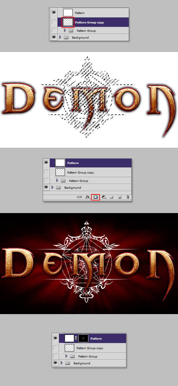
This setting will allow us to paint the color we want on our pattern. Take a large soft brush and paint in the colors as per the example. Again, this can be done using a gradient layer style, but this method gives us more freedom than a simple linear gradient.
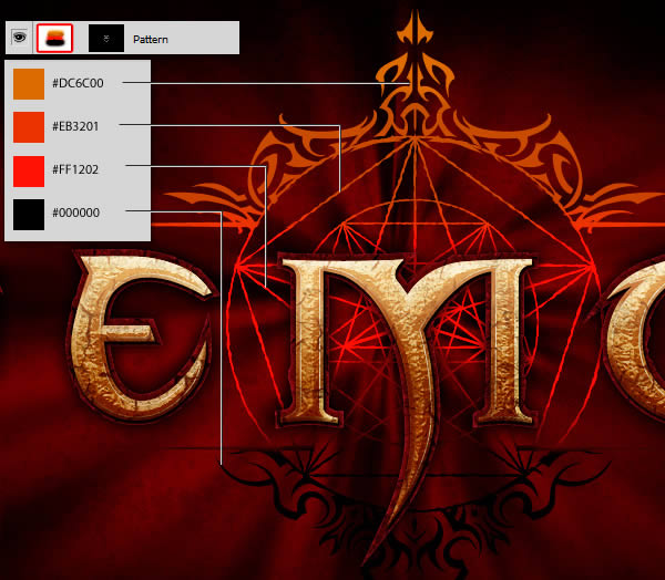
Step 14 - To complete the pentagram, select the "Pattern" layer, give it a mask, and paint the bottom area.
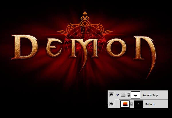
Give the layer style below the "Pattern" layer

Duplicate the group, invert the selection (Command/Ctrl + I), clear the layer styles and give the following:

When you're done, group everything and name the folder "Background Pattern".

Step 15 - Create the light
On a new layer below the "Text" folder and the "Background Pattern" folder, draw three small lines using a 2px brush. Quick tip: you can hold shift to draw straight lines.
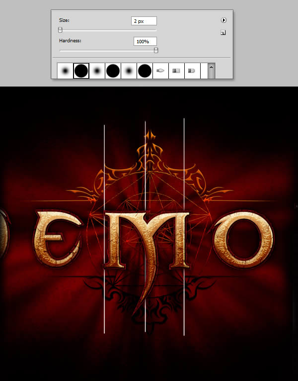
Continue drawing black and white lines until you achieve a result similar to the example. Then go to Filter > Blur > Motion Blur and apply a strong vertical motion blur.
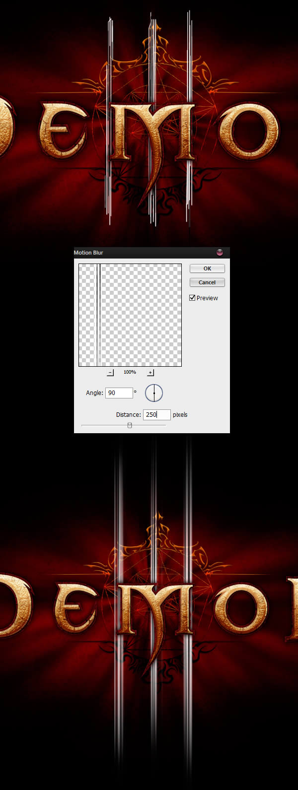
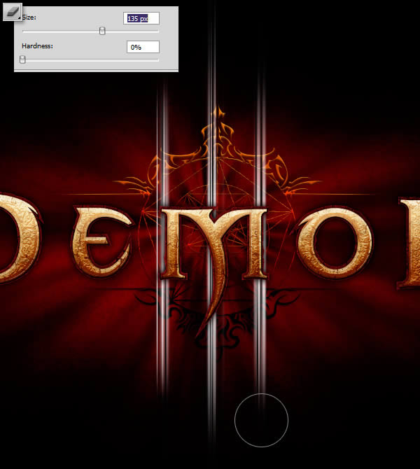
Using the Eraser Tool (E) set to 0% Hardness, paint some rays to achieve a symmetrical effect, with the middle line a little higher.
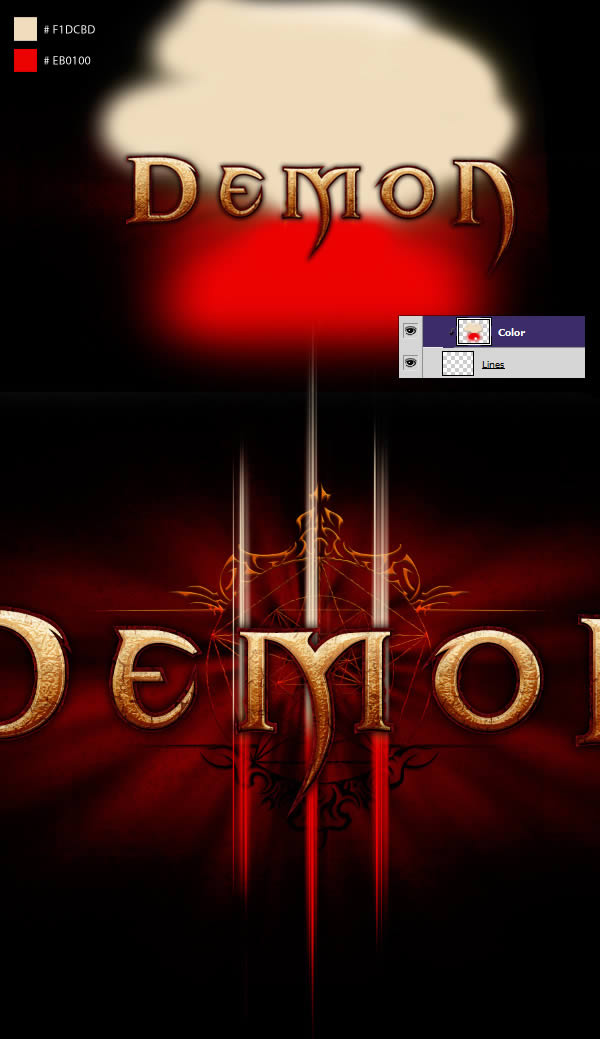
Step 16 - To color the lines, create a new layer and paint the following colors, then, clip the layer to the "line" layer created in the previous step.
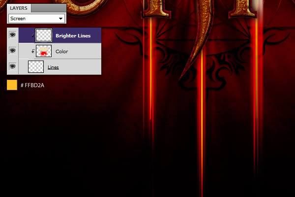
Create another layer and clip it on top of everything, using a 2px brush, draw a bright yellow line between the three lines, align the layer Mode is set to Screen.
Step 17. For the blurry light, duplicate the "lines" layer and scale it.
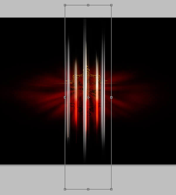
Go to Filter > Blur > Gaussian Blur and apply a voxel blur to the layer.

Using the Rectangular Marquee Tool (M), select the right and left lines, bringing them closer to the center and making them fit the layer we created in the previous step,
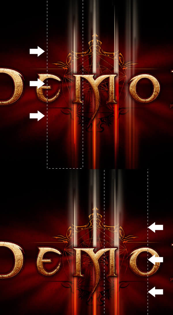
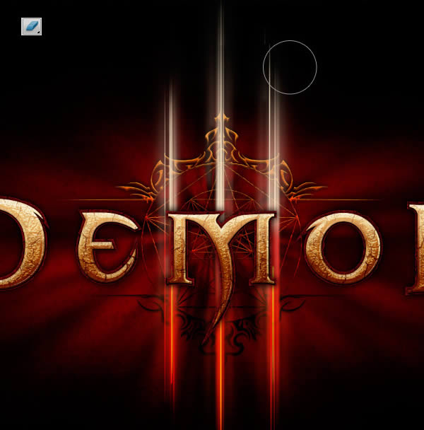
Finally, grab the Eraser Tool (E) and paint the top and bottom of the layer.
Create a new layer and fill it with the following colors. Clip the new layer to the "Blurred Lines" layer you just made.
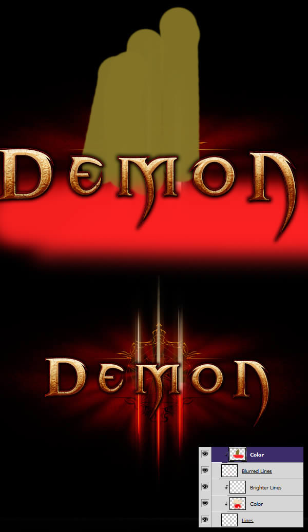
Step 18 - Sharpen the lines
We can make the lines more interesting by giving them a little sharpening. Group everything into a "Lines" folder and copy it over. Create a new layer filled with black and merge it with the "Line Copy" folder.
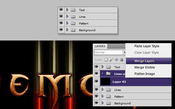
With the new layer selected, go to Filters > Sharpen > Smart Sharpen and enter the following values. Once done, set the layer to "Screen".
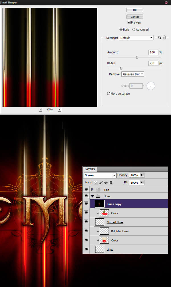
Step 19 - Final result
In this step, we'll add some final results to give our image a finish. First, create a new layer called "Shadow" and place it above our background layer. On this layer, paint some black with a soft brush behind the text. This will help reduce visual noise and readability in between.
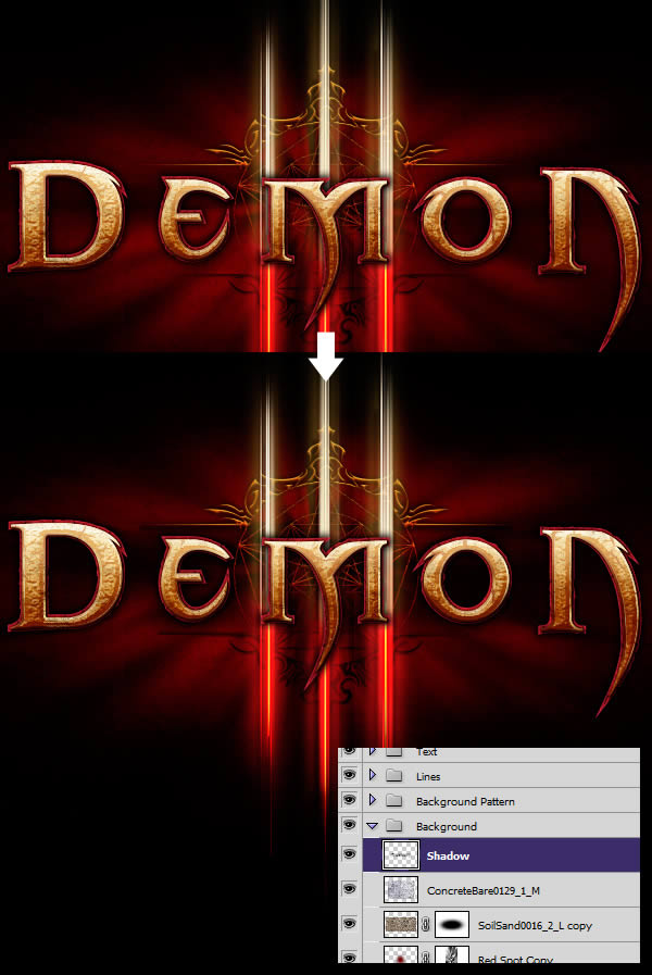
Next, we'll add a little shine to our image by creating a new layer and filling it with black. Go to Filter > Render > Lens Flare and choose 105mm Prime. Hit Command/Ctrl+M to bring more contrast, then apply a Gaussian Blur.

Press Command/Ctrl+T to enter Free Transform mode, zoom out on the layer, and align the bright lines with the letters. Set the layer blending mode to "Lighten" to get the night light refraction effect.

Repeat this process for as many times as you want, and when you're done, place all of these layers into a new folder called "Lens Flares".
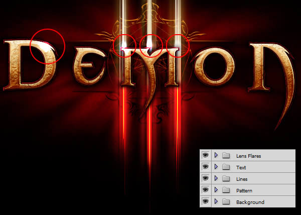
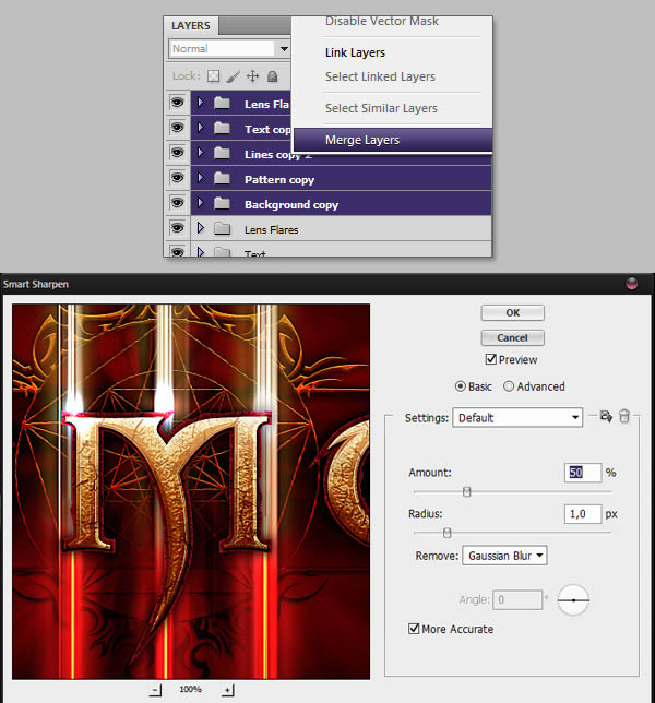
To complete our image we add a Smart Sharpen filter, for this, repeat and merge all the folders together. With the new layer selected, go to Filter > Sharpen > Smart Sharpen and add the following values.
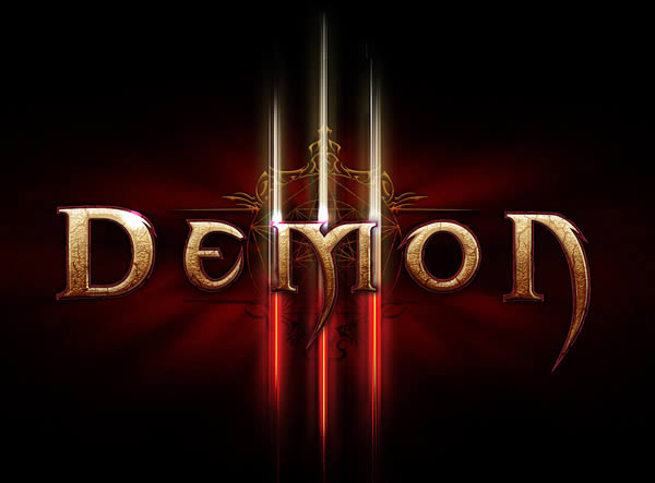
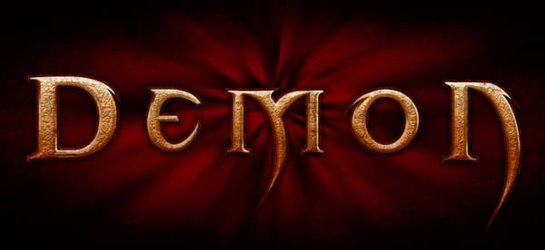
The final effect

Articles are uploaded by users and are for non-commercial browsing only. Posted by: Lomu, please indicate the source: https://www.daogebangong.com/en/articles/detail/Do%20you%20remember%20Diablo%20III%20Do%20you%20know%20how%20his%20font%20effect%20is%20achieved%20Come%20and%20watch.html

 支付宝扫一扫
评论列表(196条)
测试