
LOGO master organizes and edits (ID: logods) articles Tencent UED
Introduction: In addition to patterns, the most important thing for designers is to deal with fonts. Today I will share a wave of English fonts that are never tired of use. Thank you for taking them away
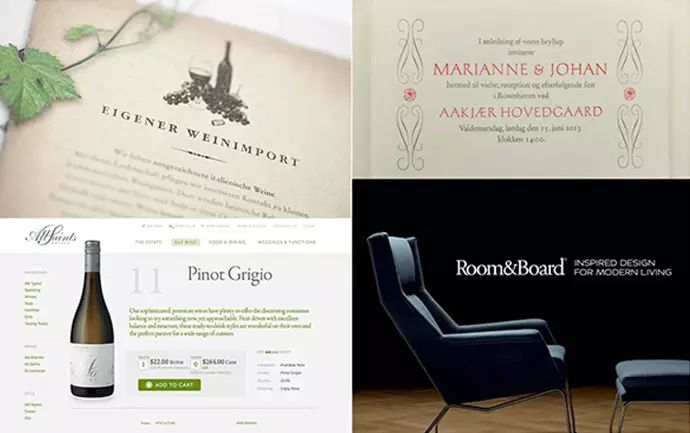
serif
Claws or lines are attached to the end of strokes called serifs. It is said that serifs help to move the eyes in the horizontal direction, so more traditional Roman fonts will be used in the typesetting of novels and other texts. The old Roman script from the Renaissance to the Baroque period, and the modern Roman script with straight serifs after the 18th century.

Centaur
has an epic orthodox style, which is especially suitable for expressing the age. Pay attention to the use of ligatures and old-fashioned numbers when typesetting. The signs of St. Mark's Basilica in Venice use this typeface to create an elegant atmosphere. The Lord of the Rings poster uses this typeface to enhance its epic atmosphere.
Garamond
A traditional, soft, thin font with a poetic feel, without a strong personality, very easy to read, a representative font of old Roman fonts
Caslon
The words used in the American Declaration of Independence are the most popular fonts in the era of movable type. There is a saying in the era of movable type: use Caslon when you are indecisive. Describe the breadth of its application

Baskerville
The representative font of the transitional Roman font (old font to modern font), very classic, giving people a classical and noble feeling.
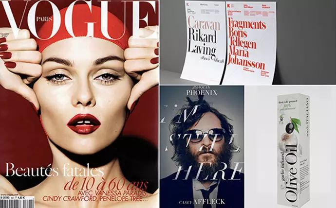
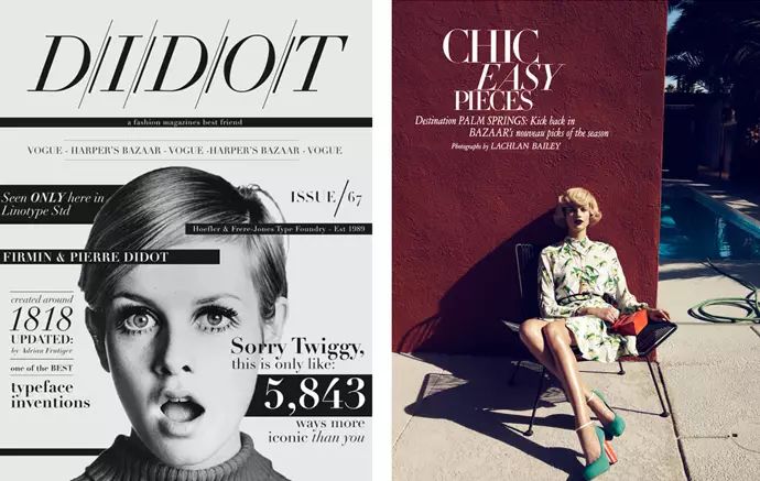
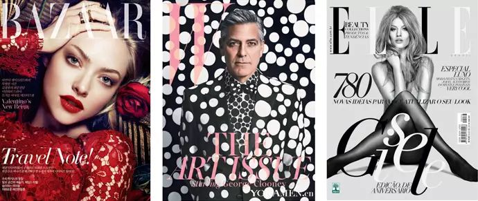
Didot
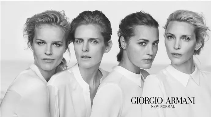
Modern serif body, hairline serif. It is characterized by strong stroke thickness contrast and horizontal serifs, stylish, modern and graceful. It is also a font that is widely used in the fashion industry today. This font is used in the logos of VOGUE, BAZAAR, W, ELLE and other magazines. The luxury brand ARMANI also uses this font.
Bodoni
Similar to Didot, it is suitable for large font performance, and it is tougher than Didot.
sans-serif
In the 20th century, sans-serif fonts began to be widely used. The fonts are concise and easy to recognize under harsh conditions. Therefore, they are mostly used in the titles of newspaper dictionaries and outdoor road signs.
Helvetica
is widely used as a classic typeface among modern typefaces, and it does not lack attention. Helvetica is a Neo-grotesque font with a rigorous structure and no emotional orientation. It provides a strong sense of security. When the temperament is relatively clear, it will be a better choice to find fonts with the same temperament. Some fashion brands also prefer this font, highlighting the brand's independent and concise personality.
Franklin Gothic
This font is a sans-serif font that appeared very early, so it has an ancient style, the strokes are rough and powerful, and it has a masculine feel. It is suitable for expressing strength and is also a commonly used font for posters.
Futura
Futura means the future in Latin. It is modern and has geometric features. It feels like a popular mainstream font. It can be used especially when you want to highlight the sense of fashion and design.
Influenced by the Bauhaus movement during production. It is the trademark word of LV, and it is also the font of choice for many magazines.
Gill Sans
The representative font of the British style has a classical skeleton, but also has a strong sense of technology and the future. The shape of the font is geometric, but it is a humanist font, which is softer than futura.
Optima
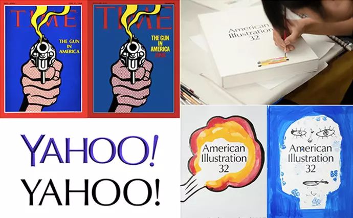
has a classical atmosphere, the strokes are thicker at both ends and thinner in the middle, with an elegant temperament. Time Magazine’s font change, and Yahoo’s 2013 use of Optima as a design benchmark for a new logo are testament to the typeface’s popularity.
Univers
Grotesque font, more concise than Helvetica. The font family is very comprehensive, so it is very convenient to use together.
Myriad
Humanist font, which has been popular for a long time, is more eye-catching with the widespread use of Apple, with soft and concise strokes.
Avenir
The typeface is simple and modern, although it also has geometric features, it does not lose its human touch. Avenir means the future in French, and it is a challenge to Futura, which has the same meaning of the future. Enlarging the x-height and elongating the descending part makes the text easier to read. The font family is also very complete.
"Which handwriting do you like best?"
-To make a better logo, find a LOGO master! -
WeChat: logodashi300/QQ:3269274917
【Click on the link for some cases:Just like its powder,Coconut chicken in summer,Dehualou,Zhigan ,Beaver Homesickness, Liu Ji Roast Meat, Qiao Xiguan, Tomson By-Health Hirun, Sanix, Le Island, Three Peppers, Ji Mu, Nolanka,Lu Zhisheng, Shu Chong , Panda Rabbit, Erhai Minor , and more works reply "case"]
Articles are uploaded by users and are for non-commercial browsing only. Posted by: Lomu, please indicate the source: https://www.daogebangong.com/en/articles/detail/Do%20you%20make%20English%20fonts%20that%20designers%20never%20tire%20of.html
 支付宝扫一扫
评论列表(196条)
测试