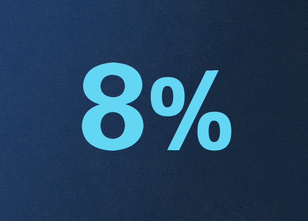
The editor was not idle during the big weekend. I made a discounted text effect that is often used in promotional banners. It is the goal of the editor to keep everyone learning and progressing every day. I don’t want to push it too much. Let’s upload the renderings first.

1. For the background, use a water ink brush, set the size to 1000, brush on the background a few times, then filter - add noise, set the value to 3, and check Monochrome. Everyone can handle this by themselves.
2. We start to make the effect of numbers, input the text "8%", here I use a very thick font, such as sports bold black simplified, we write the text "8" and "%" separately, and put them in two pictures layers. Adjust the size of the font, the font of "%" is slightly smaller than "8", and the slash can be bolder. In these methods, you can change the "%" right key into a shape for adjustment.
3. Start to make the particle effect of dissolution. First, we draw a small origin, then copy a row, and copy a few more rows until the "%" can be covered.
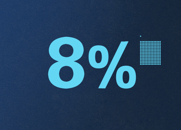
4. Merge all the small circle layers and delete the grid, select "%" and click the "origin" to make it a selection area, then invert the selection and delete, Then hide the "%" layer, ok, so that these small dots will replace "%".
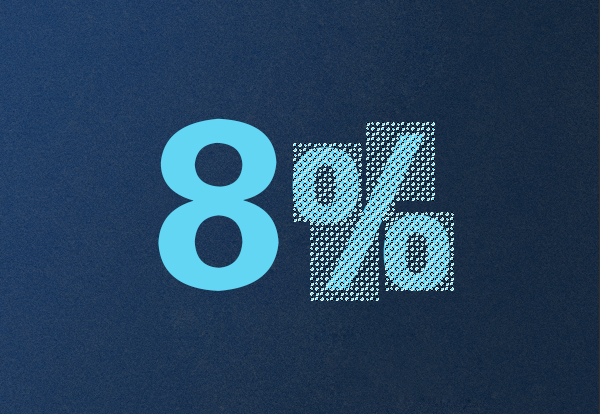
4. The following key points require us to be very patient. In order to create the effect of dissolving the text, we need to deduct the top part naturally. Then copy the previous small dots, place them in a scattered position, and show everyone what it looks like after deducting them.
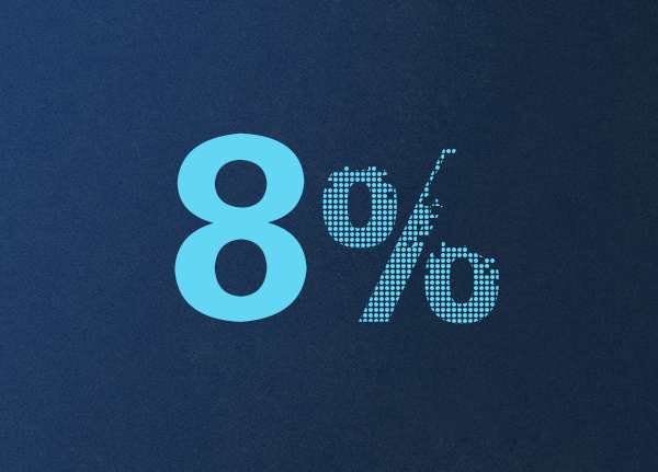
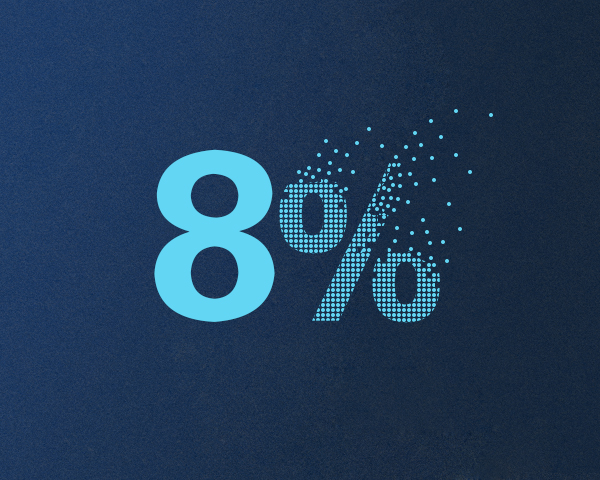
5. When deducting, I added small dots little by little, trying to make the bottom as dense as possible and the top loose. This effect, you can achieve according to your own understanding until you are satisfied. The editor is forced to come here, is it very simple?
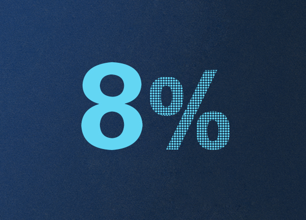
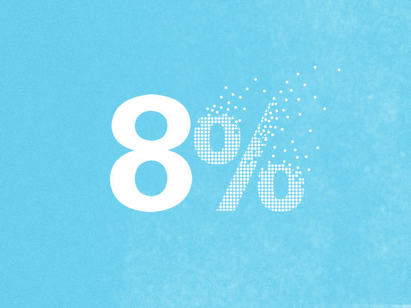
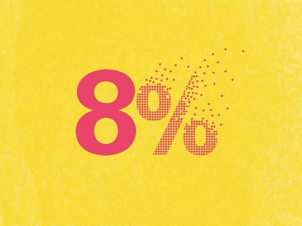
The following is the effect of adjusting different tones;
If someone asks why this design is beautiful? Because it uses the point, line and surface in the plane composition, it conforms to the basic theory of design. The editor is not serious nonsense, children's shoes who have studied graphic design know ~0~.
Articles are uploaded by users and are for non-commercial browsing only. Posted by: Lomu, please indicate the source: https://www.daogebangong.com/en/articles/detail/Do%20you%20like%20the%20banner%20text%20design%20like%20this.html
 支付宝扫一扫
评论列表(196条)
测试