
We all know that there are many pages in a set of PPT, among which the table of contents page is an indispensable page. Its main function is to build a logical framework for the entire PPT. So, how to display the catalog page clearly and beautifully?
Today, I will share with you a universal step to make a catalog page.
Universal steps
1. Extract content and distinguish levels
If the directory contains 2-level titles, the division of levels will make the directory look clearer. For example, use bolder font weight and larger font size for level 1 headings:
Or do character indentation for level 2 headings:
2. Re-typesetting
Common layout methods are three types: top-bottom layout, left-right layout and center layout.
Top and bottom layout:
Left and right layout:

Left picture right text

Left text right image
Center layout:

3. Add decoration
Use elements such as lines, shapes, or small icons to add layers and make the page fuller.
4. Insert pictures
Using content-related pictures can not only deepen the connection between the catalog and PPT, but also enrich the visual effect of the page.

After understanding this method, let's practice it through a case:
Actual cases
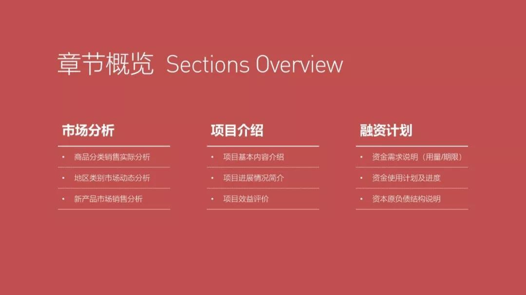
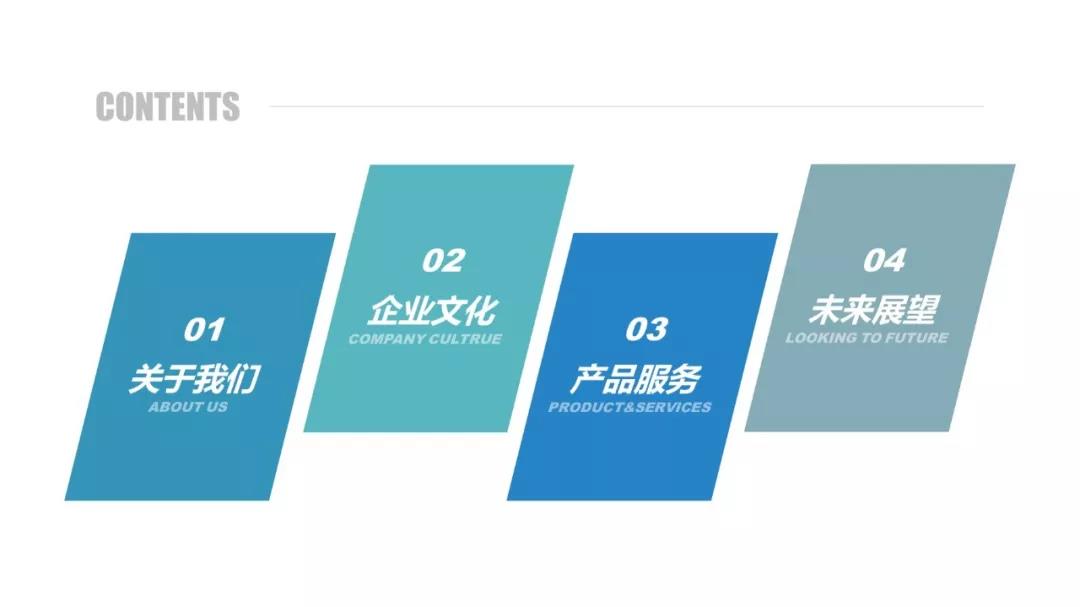
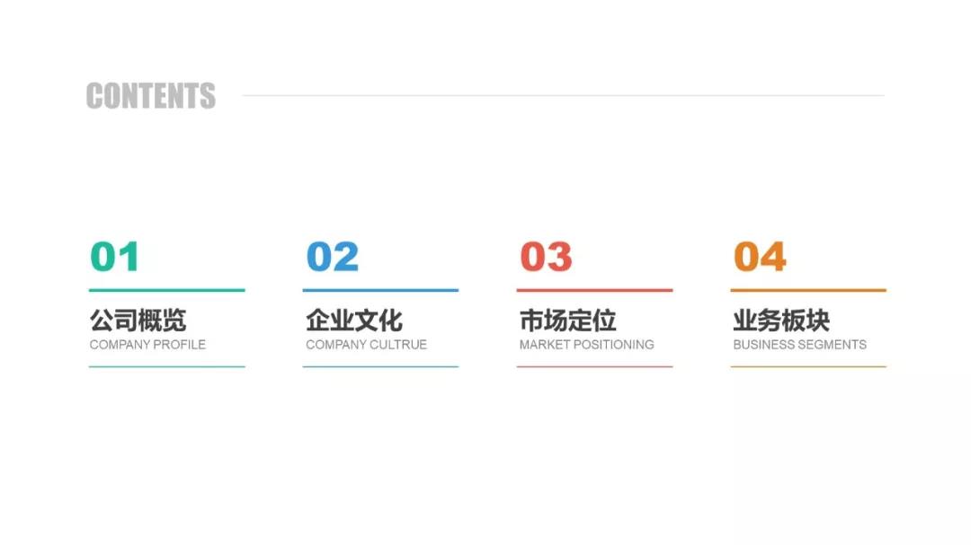
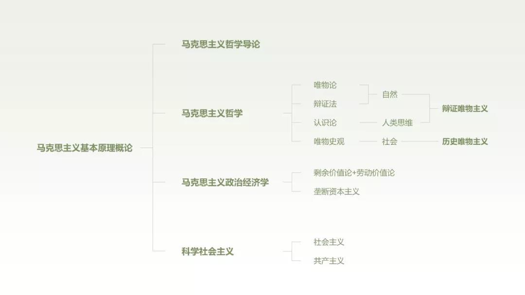
This is a corporate PPT catalog page:

First, extract the content and distinguish the hierarchy:
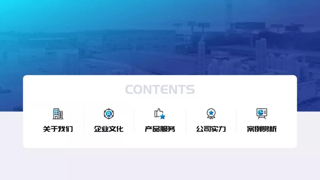
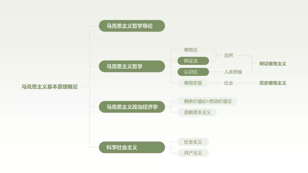
Then, the table of contents and content can be rearranged, adopting a left-right layout, and adding lines and English for decoration:

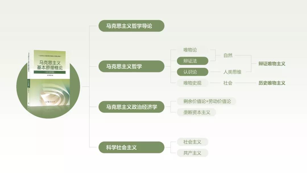
Finally, add pictures to make the visual effect of the page richer:

The effect is not bad, right?
Some people may say, what should I do if it is not an enterprise PPT, but an academic PPT?
Of course this is the step~
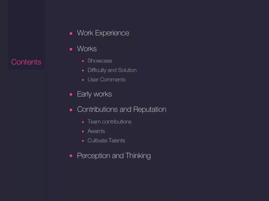
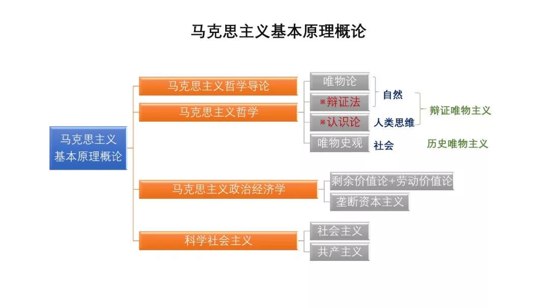
Take this PPT as an example:
First extract the text information, and align each level to the left:
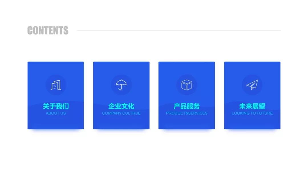
Next, add color blocks to distinguish primary and secondary information:
Finally, add a picture and associate it with the description:
It's not that hard, is it?
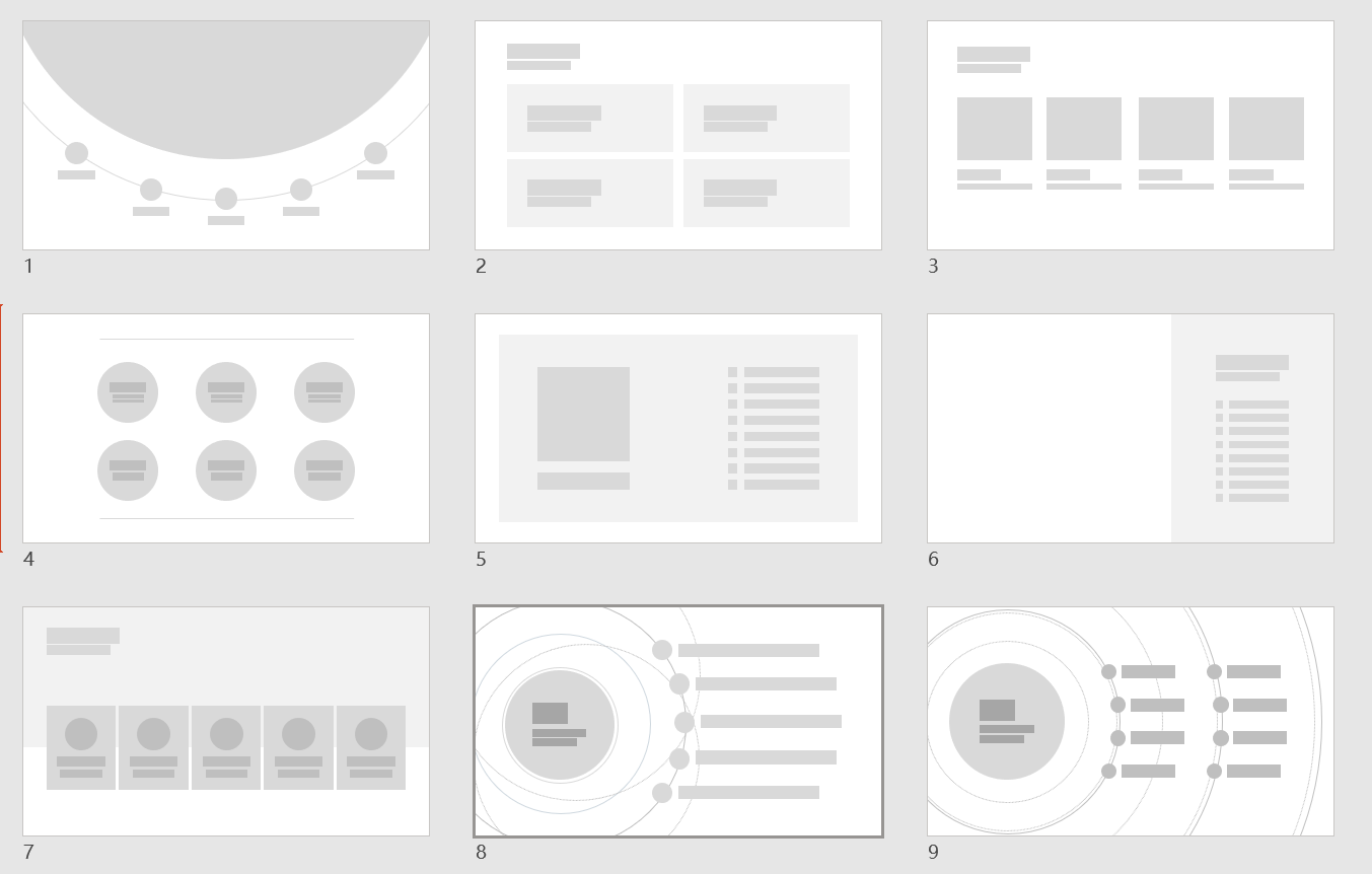
Learning from other people's excellent works is a learning method I have always admired. I have summarized good design works and made a collection of layouts for catalog pages:
If you need this resource, you can see how to get it in the picture below:


Articles are uploaded by users and are for non-commercial browsing only. Posted by: Lomu, please indicate the source: https://www.daogebangong.com/en/articles/detail/Do%20this%20on%20the%20PPT%20catalog%20page%20so%20that%20people%20will%20not%20be%20called%20ugly%20Netizens%20I%20learned.html
 支付宝扫一扫
评论列表(196条)
测试