Source - China Design Online
黑体 can be said to be the most "everyday" font. In a day's life, it is often seen in app buttons on mobile phone screens, web articles, book titles, and magazine content. This font, which is so familiar to everyone, seems plain but not simple. In fact, it has quite a lot of modeling details, which is worth appreciating and savoring.
This article will be divided into two parts. First, it will lead you to know the black body, learn to recognize the style, and understand the difference between it and Owen sans serif. Secondly, I will tell you how to appreciate the structure and modeling details of different black bodies, and understand the differences in style and use. I hope that after reading this article, you can choose the most suitable font for about 50 kinds of black fonts in the Chinese and Japanese market!

01. Know black body
What is boldface?
For the general public, it can be described as follows: "Writing with a pencil or pen, the thin lines are the skeleton of the text. The black body is to grow flesh from the skeleton, and thicken the thin lines until all the strokes are smooth. become consistent in thickness."
The vernacular version is: "It looks like a character written with a flat-head highlighter or a watercolor pen, and the strokes are of the same thickness, which is a black body."
The advanced version is: "Hei Ti, after thickening the skeleton of the text, keep all the stroke shapes consistent with the visual thickness, and the starting and ending strokes are cut flat font styles." By the way, the "Cut flat" is changed to "close round", which is a round body!

From bone to flesh, keep the thickness of the lines consistent, start and finish the pen and cut it flat, it is a black body.
Discover the important features of black body? It is "consistent in thickness". This has something to do with writing tools. Most Chinese fonts use a brush to define the shape of the strokes. The different strengths of handwriting will naturally make the thickness of the strokes vary. The black body is based on the flat-tip pen, so there is almost no change in thickness.

The choice of writing tools, such as brushes or flat-tip pens, will have an impact on the characteristics of strokes!
Chinese bold ≠ Owen sans-serif
This is reminiscent of the Owen letter design. Yes, the design of the black body is influenced by the western sans serif (sansserif), which is a very modern and concise font. However, it should be noted that many people say that "Chinese black body is a sans-serif body, and Ming body is a serif body." This kind of simulation is actually not appropriate. To be correct, "serif" is a proper noun for European fonts, and Chinese fonts do not have a direct corresponding name. It is the shape created at the beginning of the pen with a flat-tip pen and brush handling skills when writing Owen calligraphy.
As for the Chinese calligraphy using a brush, the special shape at the beginning of the brush can be called "the shape of the brush". Therefore, stop referring to Chinese boldface and Owen sans-serif as interchangeable, this is wrong.
02. Modeling details - the key to the style and use of black body!
Next, try to appreciate the shapes of different black bodies! First of all, I saw the word "Yong" in three sets of boldface. A is "Adobe Traditional Black Body", B is "Lanting Black", and C is "ToppanBunkyuGothic (Toppan Wenjiu Black Body)". Look carefully, then I will ask two questions!

A: "Adobe Traditional Black Body", B: "Lanting Black", C: "ToppanBunkyuGothic (Toppan Wenjiu Black Body)", are they very different?
Question 1: Which font has the most different "skeleton"?
The answer is A. Its biggest difference lies in the separation of the last two strokes - the stroke at the top right and the last stroke. In addition, many strokes of A are deliberately elongated, such as the top dot and the second horizontal stroke. The reason for this design is to allow the skeleton of the character to fill the space, which is the so-called big character cavity.

Among the three sets of boldfaces, "Adobe Fantastic Blackbody" (A) has the most special skeleton. It adopts the design of large character chambers, and the strokes are deliberately elongated, and the last two strokes are separated.
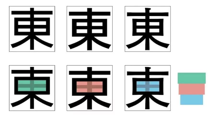
Replacing the character "Yong" with "Dong" will make it more obvious that A is a big character cavity. After covering the cavity range of "Tian" with different colors, the difference in size can be eliminated immediately: A>B> c.

After coloring, you can clearly see the difference in cavity size: A>B>C.
The accent will affect the look and feel. The strokes of A with a large accent almost fill the entire text. The square structure brings a sense of stability, but it is also a bit dull; while the C with a small accent, the outline of "East" is relatively thick. There is a change, the narrowed "field" in the middle is more like a human waist, giving people a graceful and vivid impression, so it makes people focus their eyes and look energetic. When observing any font, you can start by paying attention to the skeleton, outline, and cavity!
Question 2: Which font has the greatest difference in "stroke shape"?
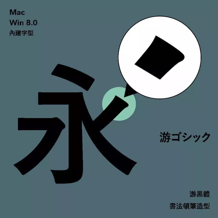
The answer is C. C stands out at the turning point and the beginning of the stroke. As mentioned earlier, the Chinese black body has "serif details" similar to "serif". The so-called stuttering details can be explained with the font "游ゴシック", which is a set of quite beautiful and practical black fonts, which are built-in on both Mac and Windows 8.0 and above:

「游ゴシック」, a beautiful and practical black body, built-in for Mac and Windows 8.0 and above!
You ゴシック has the most natural brush shape, add a dotted line at the starting point, and you will find that the outline looks like a brush. I believe it must be familiar to those who have learned calligraphy. As long as you press down a little when you start the pen, you will have such a shape. Many people often have stereotypes of modern, digital, stiff, and impersonal, but in fact, some strokes of black body are also integrated with calligraphy strokes, with soft and graceful shape details!

The starting point of "游ゴシック" incorporates the rhyme of brush calligraphy and soft and graceful modeling details.
Appreciation of the details of the black body shape: "starting the pen"
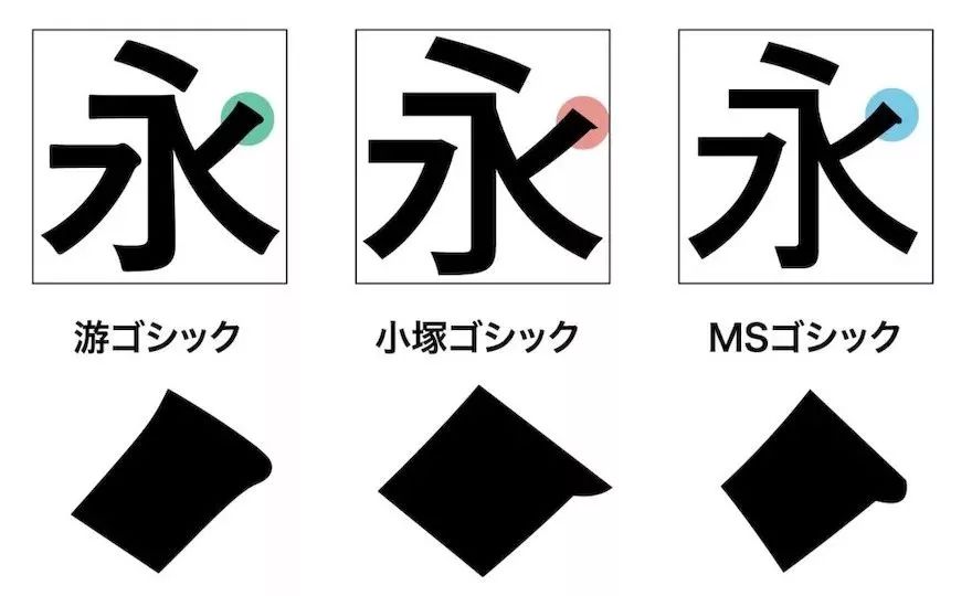
In addition to Yugothic, there are two other sets of boldfaces listed. From left to right in the picture below, the order is: "Yougothic", "Otsuka Gothic", and "MS Gothic". The Otsuka black body in the middle starts with a spike shape, like an Owen serif written with a flat-tip pen, and the MS black body on the right is rounded.

Observing the black body, you can pay attention to the beginning of the pen, like the Otsuka black body in the middle, the starting pen is in the shape of a spike, and the MS black body on the right is rounded.
In addition to the shape of the pen, there is a subtle difference in the beginning of the pen. Going back to the three sets of fonts A, B, and C, if you zoom in, you will find that A and B are both square, but the shape of C starts from wide and gradually narrows. Because it looks like a trumpet, it is called "bell mouth". In the era of lead printing, this was used to make the printed characters stable and clear. However, in the contemporary era of computer screen display and high-resolution output, the bell mouth becomes a modeling detail, and the curvature and strength of the lines change, adding beauty and charm to the font.

Among the three sets of boldfaces, "ToppanBunkyuGothic" (C) has the most special stroke shape, such as the "flare mouth" design at the beginning of the pen.
Appreciation of the details of the black body shape: "turning" and "finishing"
In addition to starting the pen, you can also pay attention to the turning point and ending. The characteristics of different black bodies can be clearly seen from the turning point. Like the horizontal stroke "フ", the handling of the three is very different, A is a cut corner, B is a right angle, and C is very similar to the return front of a brush.

When observing the black body, you can also pay attention to the turning point: A is a cut corner, B is a right angle, and C is like a brush back.
The handling of turning will affect the sense of speed, like A has a fast pen movement; C is carefully lifting the pen, returning to the front, and turning again, and the slow speed has the most writing feeling; B is like a combination of building blocks, which is removed Human-like rigid design. In addition, the shape design at the turning point will also allow the viewer to inadvertently try to figure out the writing trajectory of the characters. The following is an attempt to draw the trajectory of the pen movement in different boldfaces. By observing the details, you will find that it affects the font style: such as "light vs. steady ", "Mechanical vs. Humanities" or "Classical vs. Modern" is the key!

Turning will affect the sense of speed. Try to draw the strokes of different black bodies, and you will find that it is the key to affecting the font style!
Example: How to analyze black body in detail?
The following is a summary and review of two sets of boldfaces, so that everyone can learn how to analyze boldfaces and make judgments when choosing them. When analyzing, you can first fix the character size and put it into the character body box, which will help us effectively judge the overall outline of the character. For example, the black body on the left fills the box more than the right one, so we know that its cavity should be larger. The cavity on the right is smaller.

When analyzing bold, you can first fix the font size and put it into the font box. The overall outline of the character can help to estimate the size of the cavity, for example, the cavity on the left should be larger.
The first step in observing a black body is to look at the skeleton, outline, and cavity size, and then try to feel the influence of the cavity. Fonts with large cavity are more modern and design, and the typesetting effect is solid and firm, even a little stiff and lacking in personality. However, because the distance between each stroke is large, the font size will not affect the clarity. It can be used as large as signboards and station indicators, as small as enterprise standard characters and logotype. Characters with small accents have a more rhythmic outline, and the outward and inward structure not only makes it look more cohesive, but is also similar to the aesthetics of traditional Chinese calligraphy. The effect after typesetting is more rhythmic. Also more breathable.

Try to arrange two kinds of black fonts. Is the "Subway City Hall Station" at the top clearer, and is it a familiar MRT station indicator?
Then enter the second step of observing the black body, pay attention to the details of the beginning, turning and ending of each stroke. Take the picture below as an example. It can be seen that the shape on the left is simple, the starting stroke is smooth, the ending has no hooks, and the turning point is not deliberately created. On the other hand, the strokes on the right are full of changes, with pauses and flares at the beginning, upward curves at the end, and a sense of movement at the turning points.

Pay attention to the beginning, turning and ending, which is the second step to observe the black body, the shape on the left is simple and straight, while the one on the right is full of details and changes.
Stroke detail design will affect the typesetting effect. Words with few details are stiff and modern, suitable for presenting "information" and used in technology-related occasions. Characters rich in details are softer and have a classical charm, suitable for literature or occasions where you want to create a special atmosphere.

Try arranging two kinds of black bodies. Does the "Defense Against the Dark Arts" below make people more integrated into the magical atmosphere?
Small supplement: How do you call the "Heibo" style in Japan? What to look for in the Japanese font menu?
In Japan, the style of "black body" is called "corner ゴシック", and "corner" in Japanese is pronounced as kaku, which means square. And "ゴシック" is the word Gothic, so Japan uses the square Gothic style to refer to the Chinese black body. Occasionally, Japanese fonts are displayed in Roman pinyin in the menu: kakugothic, which is the bold style of Chinese. Here is a supplement to the Japanese way of calling "round body", which is the same Gothic style, but the prefix is replaced with the word "丸". Maru is pronounced maru in Japanese, which means round, so "丸ゴシック" is the circle in Chinese. body! Romanization is marugothic.
Japanese people love abbreviations, so you must pay special attention when looking for Japanese bold and round fonts in the menu. There are three ways to omit "corner ゴシック". The first one is to leave only "ゴシック", such as the "Otsuka ゴシック" that comes with Adobe. The second is to leave "角ゴ", such as "ヒラギノ角ゴ", which is a complete set of Japanese bold fonts that Mac users are familiar with. There are ten different thicknesses, which can meet various typesetting needs. The third method of ellipsis is the most exaggerated. Only "ゴ" is kept. The font "新ゴ" that is commonly seen on signs or posters of Japanese subway stations can be translated into new black in Chinese.

While looking for Japanese boldface (角ゴシック) and round font (丸ゴシック), pay attention to abbreviations. For example, there are three ellipsis methods in black body, and one in round body.
The round body is much simpler. There are only complete "丸ゴシック" or "丸ゴ" with the second half omitted, and there is no other way to omit it. I believe that after reading this supplement, everyone will be able to find the Japanese bold and round fonts!
Recommended
Font copyright free benefits 150 English fonts free commercial download
300 Japanese calligraphy brush fonts packaged download
400 types-free commercial Chinese and English font download classification
hao.ziticq.com
Articles are uploaded by users and are for non-commercial browsing only. Posted by: Lomu, please indicate the source: https://www.daogebangong.com/en/articles/detail/Discussion%20on%20font%20design%20of%20boldface%20characters.html

 支付宝扫一扫
评论列表(196条)
测试