Author: Ruby Transfer from: justfont (excerpt)
Written before, I opened the new mac computer a few days ago and saw that several fonts were automatically installed in the column of Japanese fonts. I thought I was wrong. No, I realized today that I was right. The Chinese font is really exquisite.
Text: Japanese craftsmanship has always had a high-level impression, and people often hear people say that Japanese fonts are of a high level. However, for people in the Chinese font industry, they will occasionally be picky when they see Japanese Chinese characters. However, when it comes to the fonts of "Ziyou Kobo", everyone will unanimously praise them, especially Osamu Tori, the font director, is more likely to be regarded as the number one font designer in East Asia.
Apple, which is super obsessed with fonts, has designated four sets of high-quality fonts produced by Ziyou Workshop to be built into the Mac. Including You Textbook Style, You Heiti, and the "Hiraiya Ming Dynasty" and "You Ming Dynasty" to be discussed next.
* The font menu may say ヒラギノ明朝, and its English name is Hiragino Mincho. The Latin pinyin of You Mingchao is Yu Mincho
Founded in 1989, jiyu-kobo is in the font revolution period - the end of the 1980s. Faced with the emerging computer font industry, the three founders Suzuki Tsutomu, Tokai Osamu, and Katada Kei are eager to try, hoping to open up a new world.
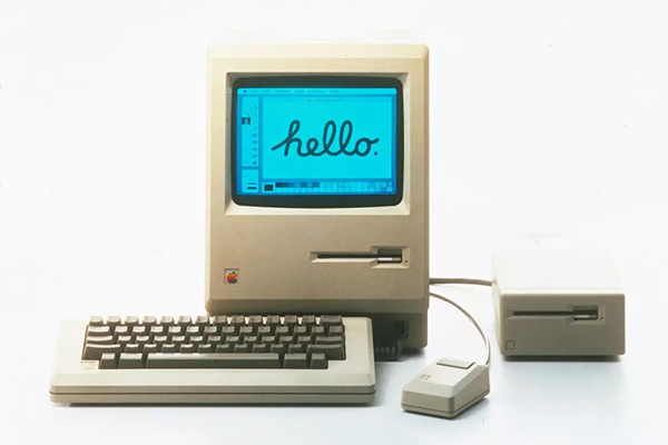
Technological progress has always been the driving force for changing font design. Influenced by the desktop publishing revolution led by the Mac in 1984, there was also a wave of change in the font design world in the 1980s. Not only the production tools have changed from machines to computers, but the products have also changed from movable type and phototypesetting to Chinese vector fonts (computer fonts), so that today you can easily apply them to typesetting just by pulling down the font menu design.
The Birth of "Hiraiya Meichao"
Although the three founders are looking forward to the arrival of the computer font industry, their imagination is still stuck in the production logic of phototypesetting as to how to make fonts.
Around 1990, Dainippon Screen Manufacturing Co., Ltd. in Kyoto commissioned Ziyou Kobo to design corporate fonts. Considering that "Ming typeface" is the core character used for internal text, and Ming typefaces used for desktop typesetting were quite scarce at that time, almost only "Longming typeface L", so they recommended the client to make Ming typefaces, and positioned this set of characters as For magazines and manuals, focus on uniform concentration.
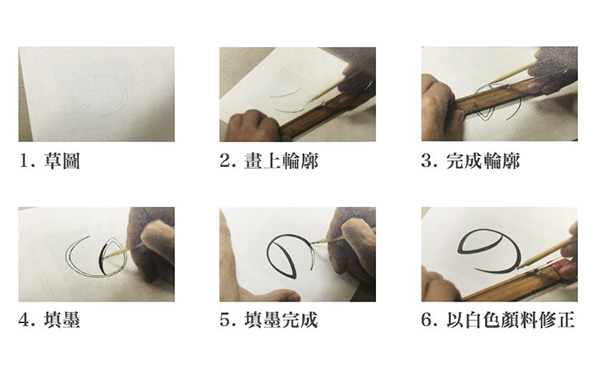
When actually implementing the design, they followed the logic of phototypesetting in the past, thinking that as long as they had a light-transmitting table and pens and inks, they could do it. They first entrusted a company specializing in the production of square-eye paper, "Shiwanwan", to print a large stack of paper with special ink that will not splatter as the original manuscript. In a 48 mm square, 6,500 characters of JIS (Japanese Industrial Standard) first level and second level are written word by word and filled with ink, and then handed over to SCREEN Manufacturing, which specializes in the production of color printing machines, for production.
However, this ignorance of digital technology immediately caused Ziyou Workshop to encounter unexpected problems. When digitizing, many of the handwriting features on the manuscript were not faithfully represented. For example, the slightly swollen shape of the horizontal strokes of the body cannot be expressed, and the strokes of dots, left strokes, and right strokes of each character are messy and inconsistent, and the thickness of the horizontal strokes is also inconsistent.

Seeing this miserable situation, Ziyou Workshop had no choice but to come by itself. They borrowed computers from SCREEN Manufacturing and digitized using the "Ikarus" system. However, with the aid of computers, will the production process become easier?
Word Tour Workshop also starts from "writing", and enlarges and photocopies the written manuscript into a 150mm frame. But because the details of the font will become blurred after zooming in, they had to use a pencil to correct the intersection points and sharp corners word by word, and repair the strokes into the ideal shape.
This kind of repetitive operation makes the production process quite time-consuming. Writing a word and digitizing it each take about 45 minutes, for a total of 90 minutes, or 1.5 hours. Assuming that they work a little overtime every day and work for 9 hours, they can only do 6 characters all day long. I don’t know when it will take to complete the complete set... So then they didn’t fill in the ink at all in the pencil draft, and directly wrote the outline after drawing the outline. Draw and adjust on the screen.
After seeing the finished product, the designer was stunned⋯⋯
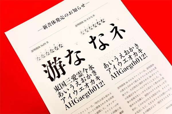
Is this set of "Hirono Ming Dynasty" made with such care very similar to "Honran Ming Dynasty" at first glance? Since the design goal of both is to create a uniform height, literal alignment, and basic Ming Dynasty, the font skeleton is very similar.
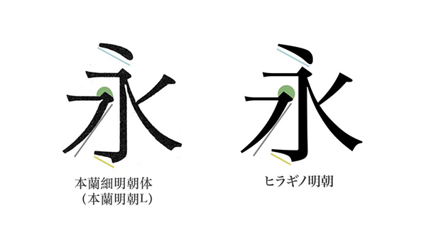
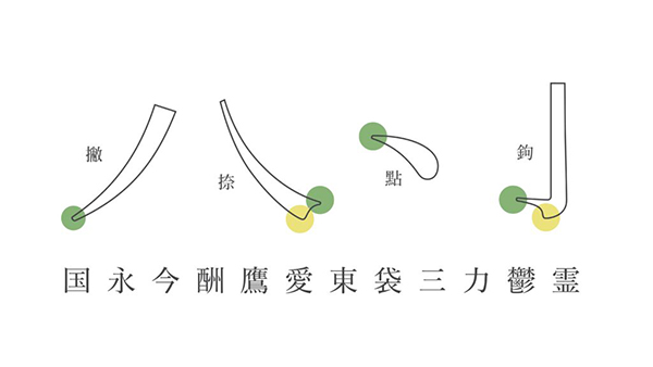
But as long as you make a further comparison, you will find that the point of "Hiraiya Mingchao" is longer, the hook is longer, and the curvature of the painting is relatively small. Larger, also became linear. Feel it carefully again, do you suddenly feel that "Hiraiya Mingchao" is actually more neat and sexy than "Honlan Mingchao"?

When initially thinking about it, Osamu Tori hoped that "Hiraiya Meichao" could convey a "modern and neat style". It is not easy to achieve such a sense of individuality, and the stroke shape must be set carefully. Considering that horizontal, thin, straight and thick are the characteristics of Ming style, the possibility of change is not high, so he tried to add features to the curvilinear strokes such as left, right, dot, and hook.
Based on the number of single-character strokes, horizontal strokes, vertical strokes, etc., he selected 12 characters as the basic characters, and added Shape the strokes into sharp corners, as if writing with a flat-tip pen, to create a sharp, sharp feel.

In addition, he also deliberately strengthened the strength of the font. He enlarged the mountain shape at the end of the horizontal pen to enhance the strength of the tail. As for the beginning and end of each stroke, the flat-headed cut corner shape is also used to give the font a rigid and strong feeling.
In fact, the reason for designing such sharp and sharp strokes is also related to the influence of phototypesetting. Because when I used a phototypesetting machine, I always took pictures continuously, and the sharp corners of the fonts were pasted into round shapes, so I always designed them to be sharp at the beginning, so that there is room for the fonts to become blurred in the future.
However, digital fonts do not have this problem. After the curve is drawn, the font will be set. This made the production team startled when they saw the finished product of "Hiraiya Mingchao" and exclaimed "Wow! It's so sharp...", which prompted them to start to reflect. When designing the new font "You Mingchao" later, they did completely different corrections.
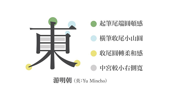
"You Ming Dynasty": the opposite of "Hiraiya Ming Dynasty"
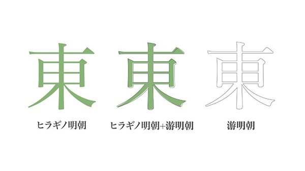
When you see "You Mingchao" for the first time, you may think why it looks so similar to "Hiraiya Mingchao"? The reason is that the skeletons are very similar, resulting in very similar first impressions. However, You Mingchao's curvature was significantly larger. Moreover, the strokes such as hooks, dots, and vertical pen endings are completely opposite to the sharpness of "Hiraiya Mingchao", and they have become rounded shapes!
This set of fonts was actually made by Tsutomu Suzuki two years before his death. The handwriting has an indescribable softness. Maybe it's because the design concept comes from Fujisawa Shuhei's period novels! Most of Fujisawa's novels are set in the Edo period, and the protagonists are often humble commoners or low-level samurai, describing their joys, sorrows, joys and sorrows.
Thinking of the plight of common people, the production team designed "You Mingchao" relatively softly, like the mountain shape at the end of the horizontal pen is made very small, not as strong as "Hiraiya Mingchao". And this kind of low-key stroke shape with less stroke tension has also aroused the resonance of the design circle. The designer Yu Shanda also liked the characteristics of "You Ming Dynasty"-almost "no characteristics", and used it to design three books including Horita Yoshie's "People on the Road".
However, can you really describe "You Ming Dynasty" as uncharacteristic? As Niao Haixiu said, even though their initial goal was to create "characters like air and water", there is indeed no strong claim for this set of characters. But in the process of creation, the nature of this set of characters is actually gradually revealed. The round, small and soft strokes are like hermits, isn't that the characteristic of "You Mingchao"?
Summary
"Hiraiya Mingchao" and "You Mingchao" are two sets of standard fonts designed by Ziyou Workshop. Their design details do not provide the public with different style choices, but tell more stories, not only inheriting the "Benlan Ming Dynasty" in style, but also reflecting the history of technological changes in the production process, witnessing the development of From phototypesetting to computer fonts.
I hope that after reading this article, you will have a deeper understanding if you happen to see them in the font menu in the future!
Articles are uploaded by users and are for non-commercial browsing only. Posted by: Lomu, please indicate the source: https://www.daogebangong.com/en/articles/detail/Did%20you%20know%20that%20mac%20has%20builtin%20very%20delicate%20Japanese%20fonts.html
 支付宝扫一扫
评论列表(196条)
测试