
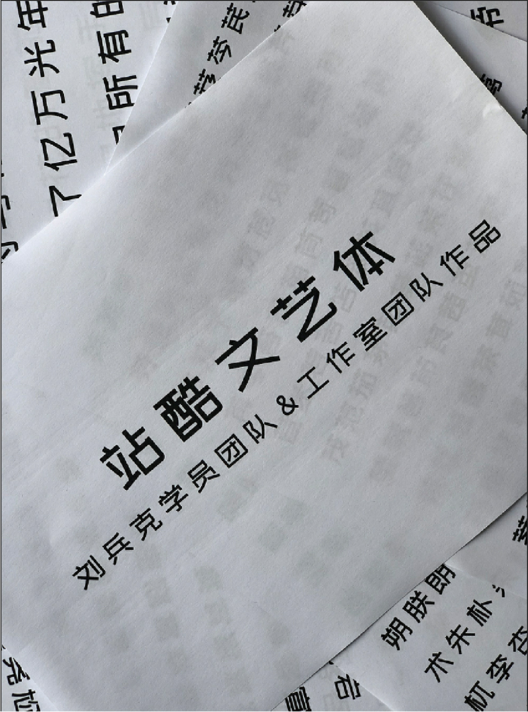
When designing, designers often use eye-catching, decorative, and visually impactful artistic fonts for titles, so as to quickly attract the attention of the audience. A good title font can accurately and quickly convey the aesthetic feeling and express the design concept. This issue recommends 22 free commercial art fonts suitable for use in titles.
01
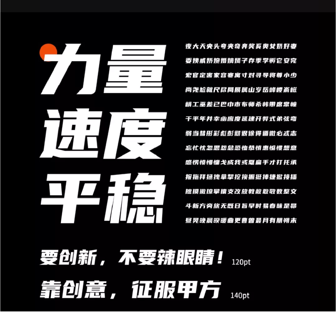
Horizontal tilt 8°, full of power and speed

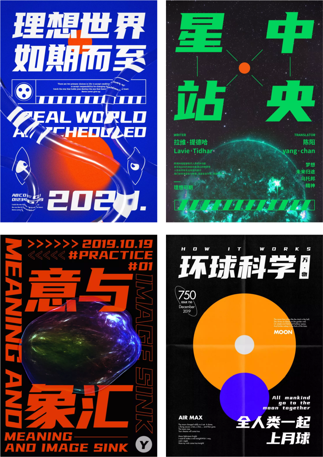
Use larger characters and bold strokes to strengthen the sense of strength. The design of each font with an 8° horizontal inclination endows the font with a strong sense of speed. In order to keep the font stable even after it is tilted, the designer set the overall font body to be wide and flat. The unique sharp corner design on the starting pen and the hook not only highlights the geometric sense of the design, but also facilitates later modification.
02
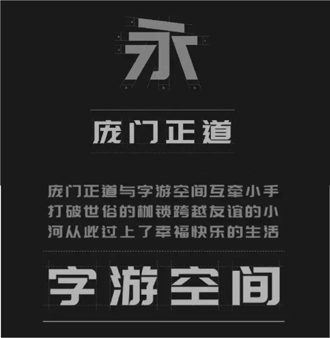
The font is flat, with a square in the middle Circle
A free commercial font jointly developed by Pangmen Zhengdao and Ziyou Space Creative Studio. The font is relatively flat and modern in style. The font is square and round, simple and stylish, and the design is highly malleable.

03
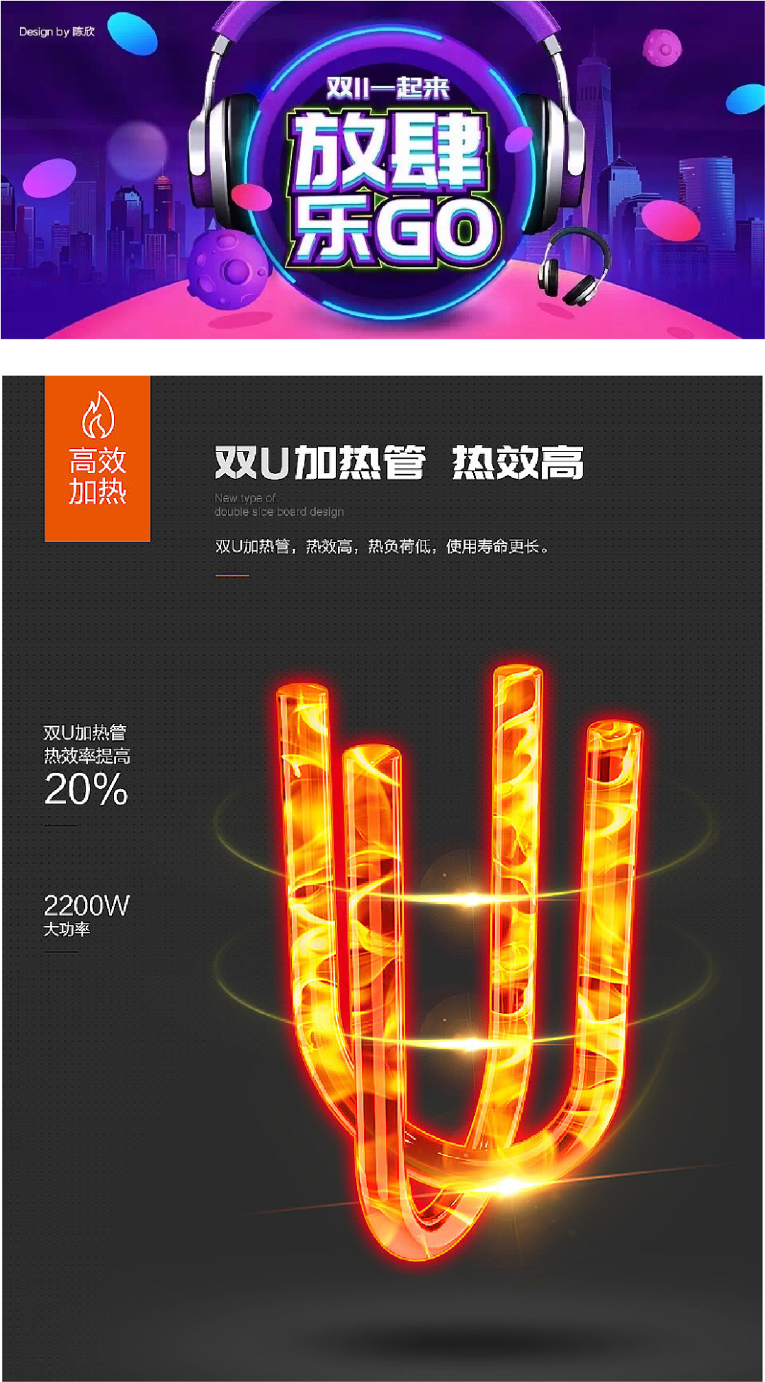
Wide and flat typeface, strokes Strong
The strokes of the font are rough and powerful, and the wide and flat typeface is used to build a thick font shape. The decoration of the stroke details not only enhances the design sense of the font, but also makes the font more delicate.
04
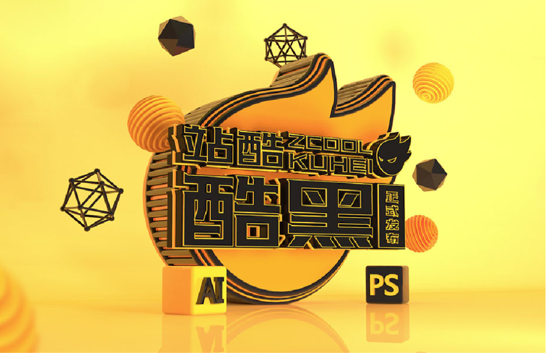
Flat text, simple and clear strokes
The aspect ratio of ZKU High-End Hei is 10:7, the font tends to be flat, the strokes are concise and clear, decisive and powerful, and the font shape shows unique design personality and creativity.
05
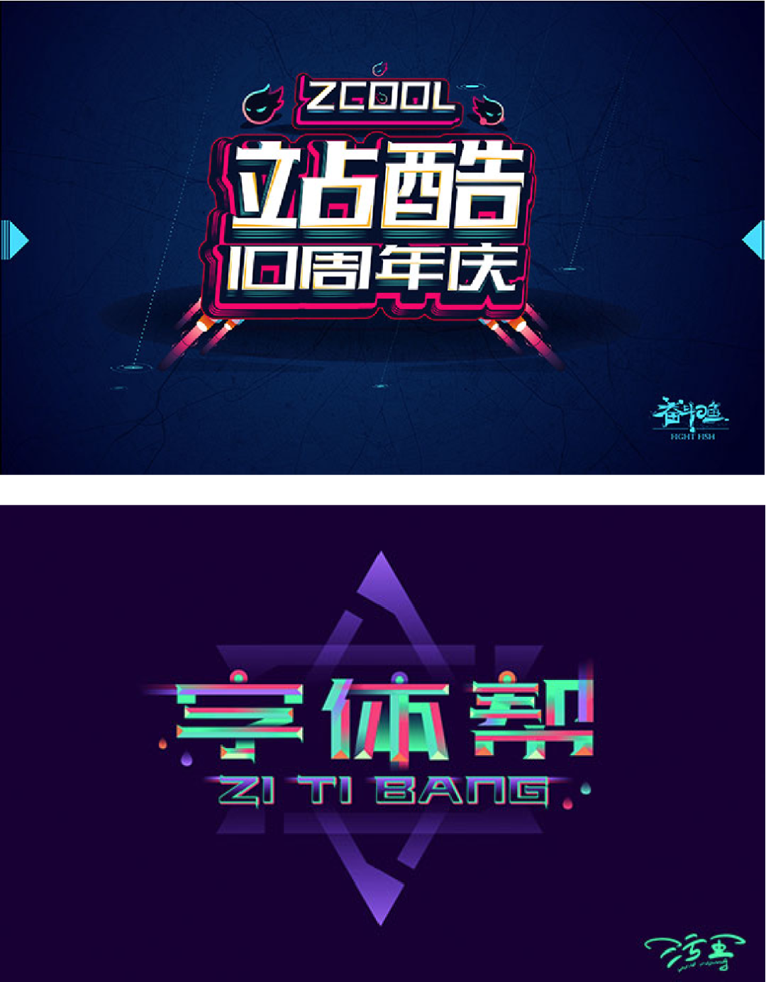
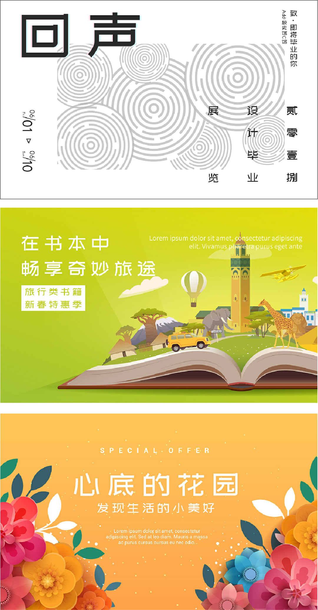
Fresh and elegant, full of literary style< /span>
The slightly flat shape is chosen for the structure, the font is novel and unique, fresh and elegant, full of literary style. In the details of the font, the appropriate rounded corner design, the vertical line design in the upper right corner of the "口" glyph, and the straight and straight contrast design of the left and right strokes, these new shapes and combinations make this font more original. sex.
06
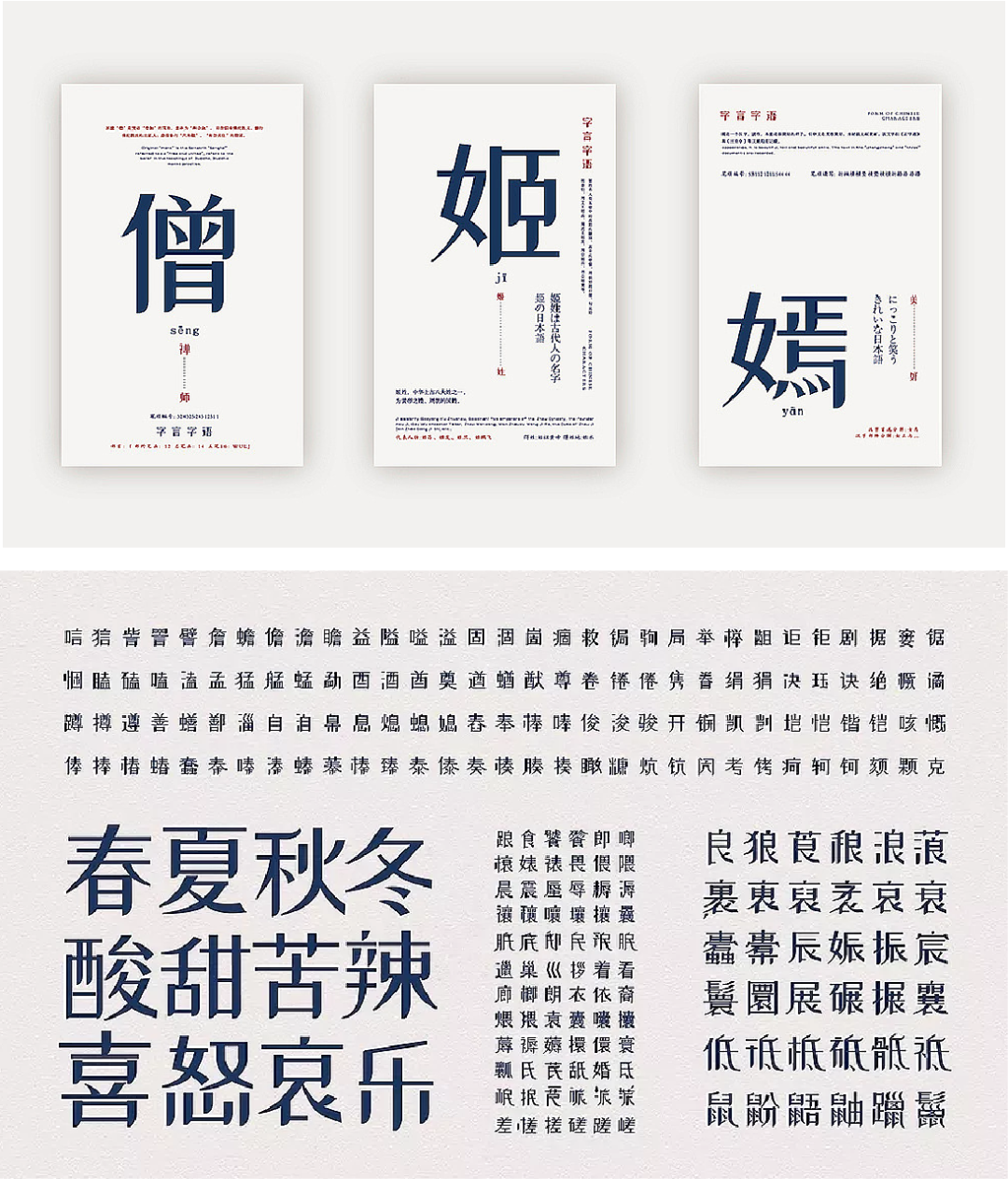
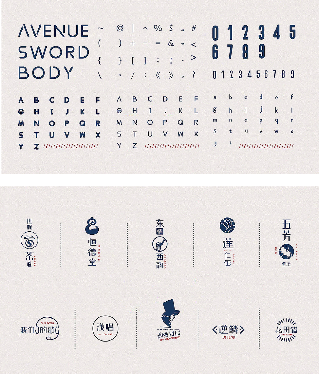
The strokes are slender, humble, and beautiful< /span>
The strokes are slender, modest, and elegant, the strokes and strokes stretch smoothly, the turning of the mold and the vertical is tough, and the sense of industrial design is full. The structure is simple and elegant, and the radicals are deformed like the word mark LOGO, which adds to the fun of deformation. While simplifying some original strokes, it still maintains a high degree of recognition.
07
Strong and powerful, horizontally thin and vertically thick , with sharp corners
The overall font design adopts the design style of horizontal thin vertical thick, the right end of the horizontal line is slanted, and the upper right corner of the vertical line is modified with a sharp corner. The overall vision is unified and powerful, and the structure is rigorous, standardized, clean and tidy.


08
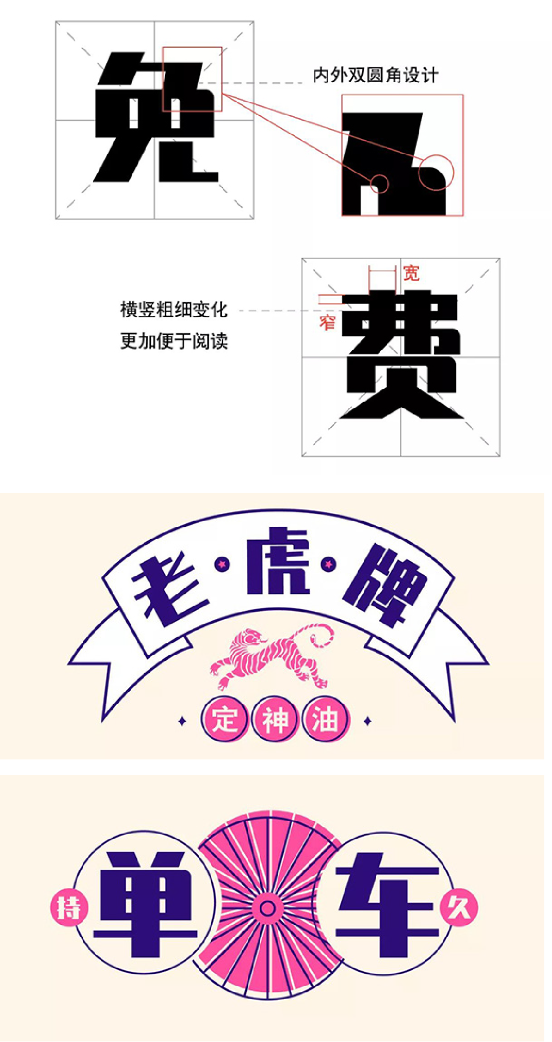
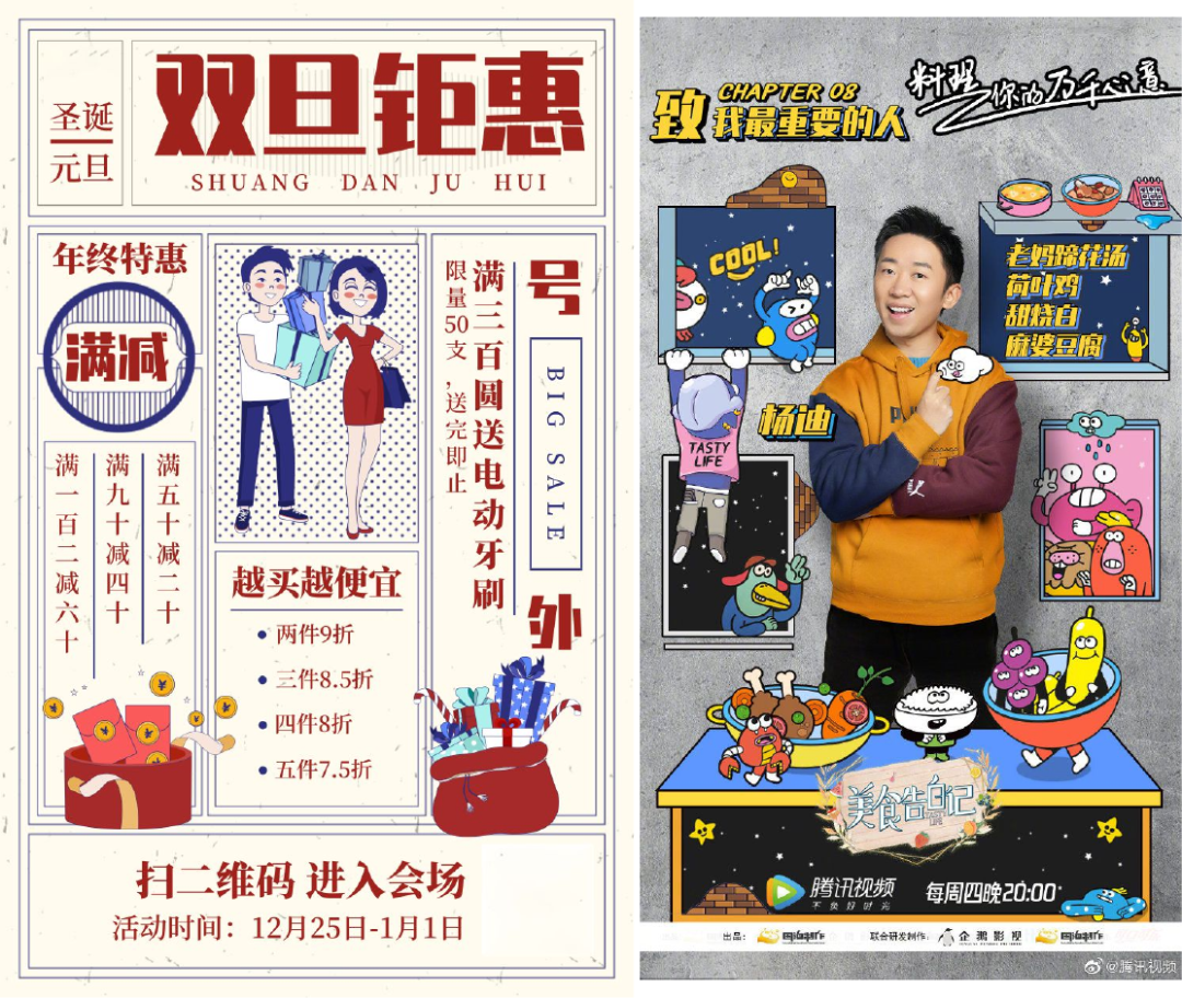
The strokes are thick and powerful, rigid and soft Economy
The strokes are thick and powerful, the strokes are tortuous, and the font has a distinctive personality, combining rigidity and softness. The combination of right angles and rounded corners makes the font graceful and elegant, giving people a feeling of strength, strength, rectification and conciseness.
09
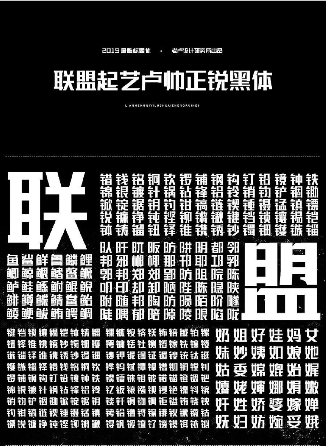
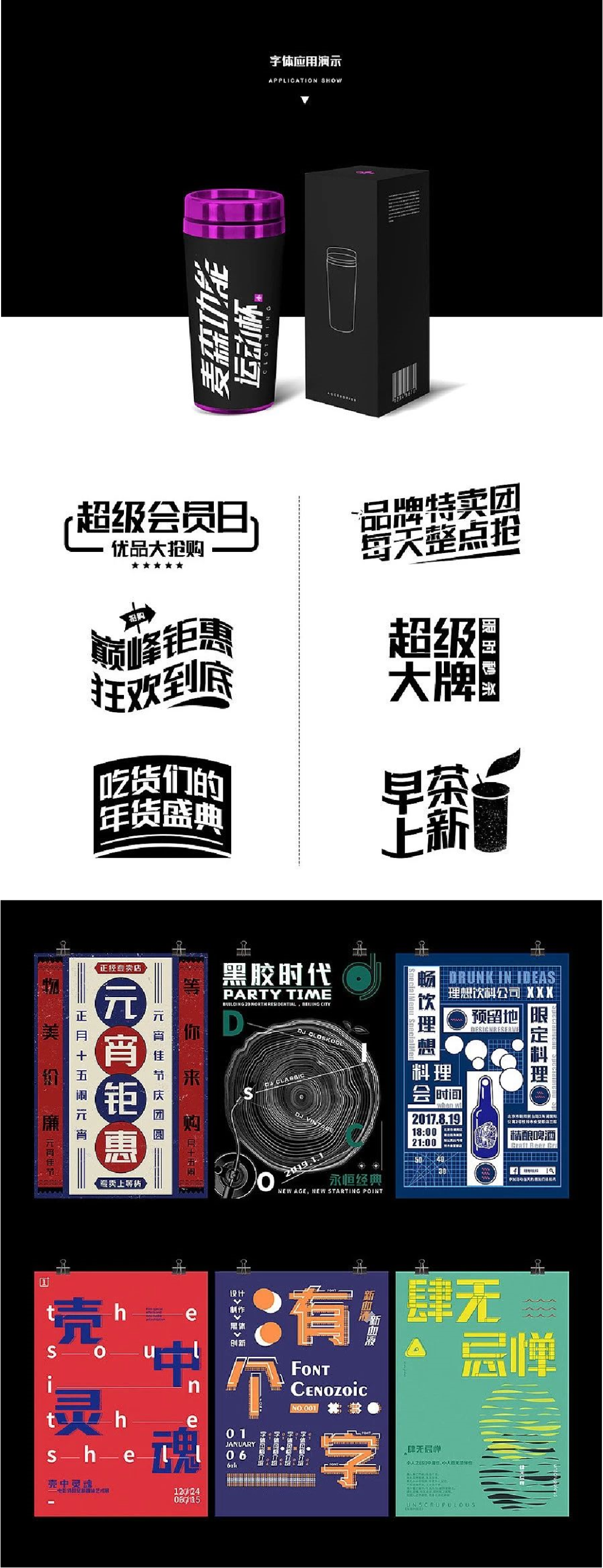
The font is thick and powerful, full of masculinity
10
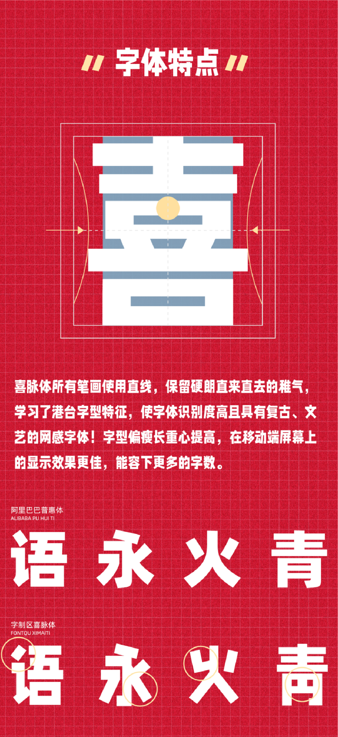
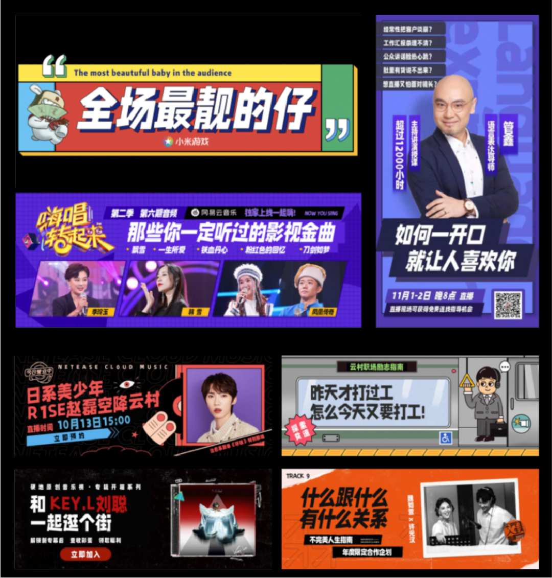
Retro, artistic web font
All strokes of Ximai font use straight lines, retaining the childishness of toughness and straightness, and learning the characteristics of Hong Kong and Taiwan fonts, so that the fonts are highly recognizable and have a retro, literary and artistic font! The font is thinner and longer, and the center of gravity is improved. The display effect on the mobile screen is better, and more characters can be accommodated.
11
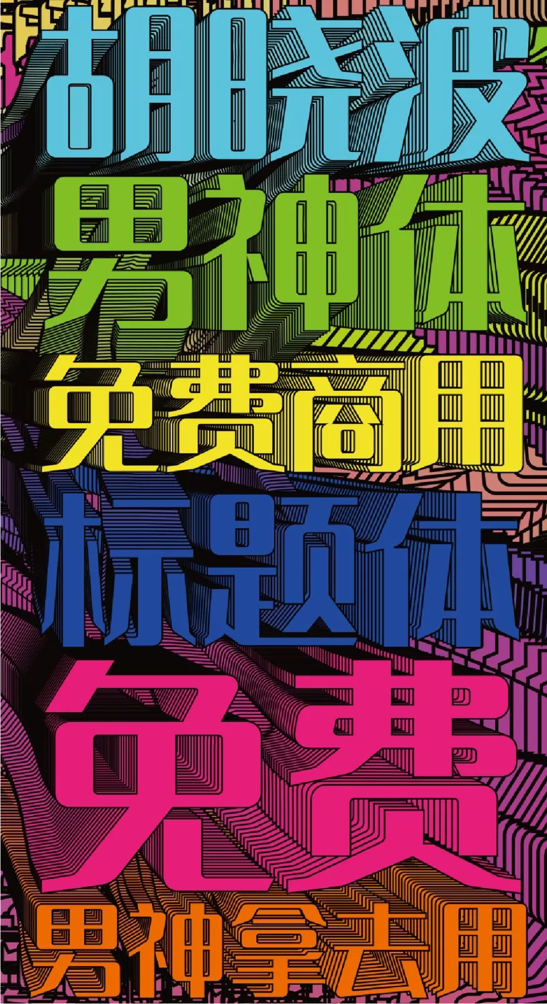
Strong strokes with clear rhythm and full of personality< /span>
This free font is designed by font designer Hu Xiaobo.
12
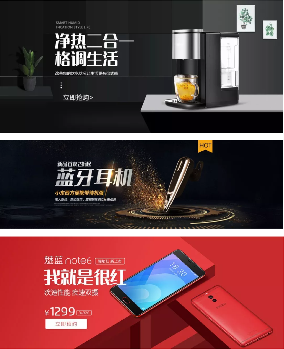
The font is slender and the strokes are slender and straight
is a long and thin font with slender strokes and no arcs. It is simple and stylish, full of rhythm and aura, and has a strong sense of design and modernity.

13
The font is flat, thick and round Title Font
The font is flat and the center of gravity is low. In the case of maintaining the recognition of the font, the strokes are as thick as possible, and the turning points are changed to rounded corners, which is very interesting.


14
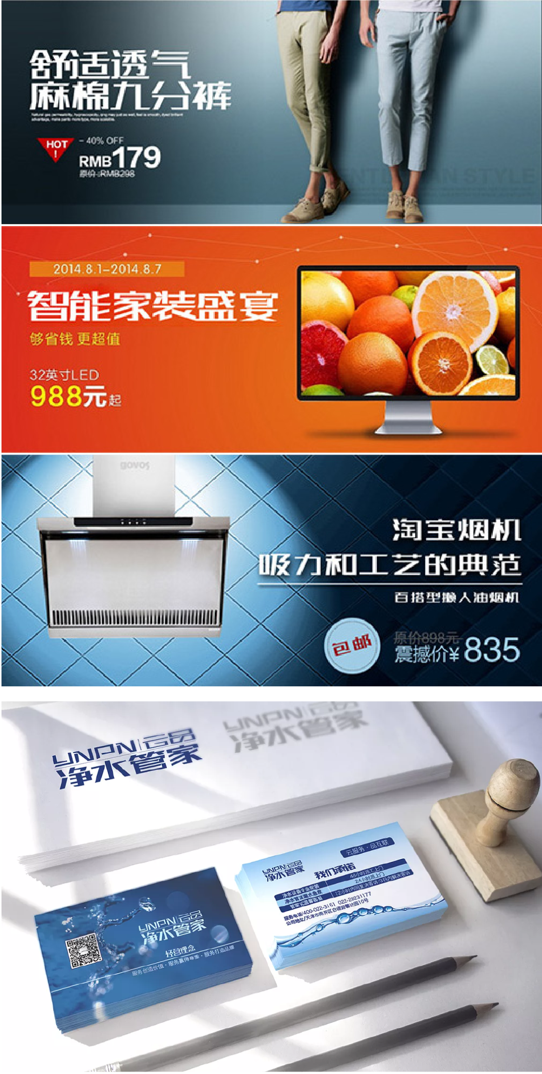
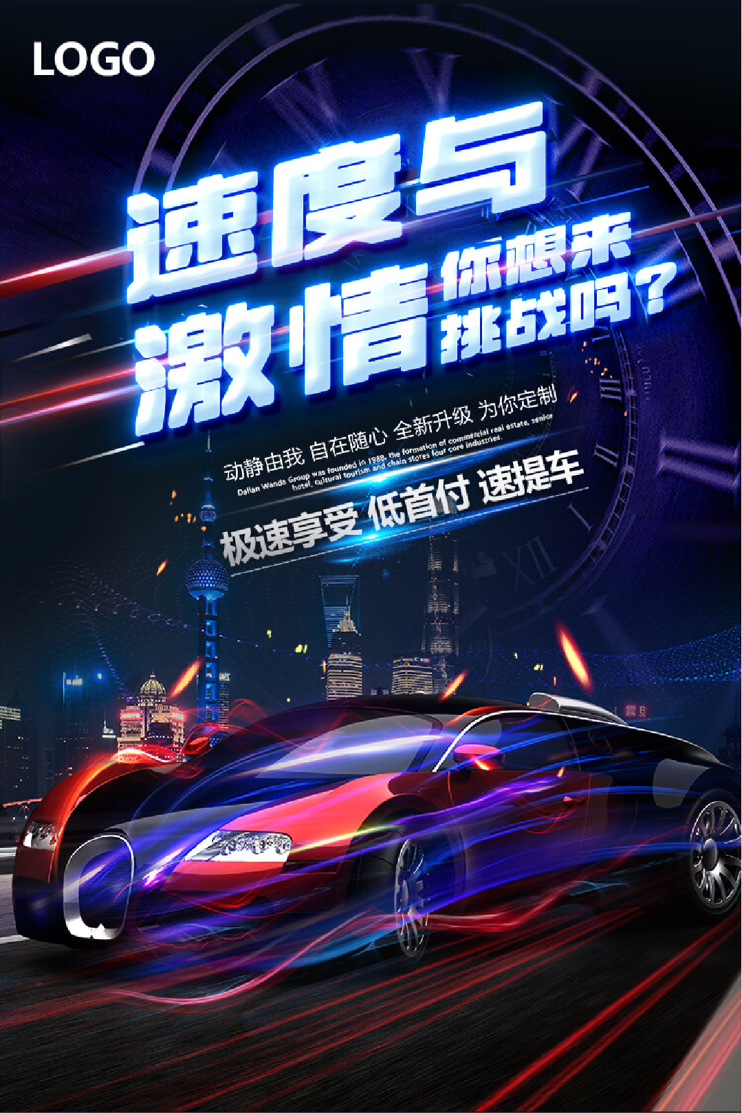
Tall and thin oblique blackbody

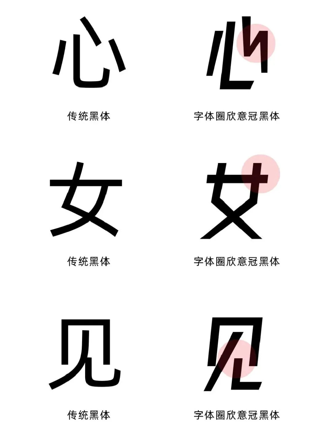
A tall and thin oblique black body with an aspect ratio of 4:5, which has a good sense of design and visual sense.
The official account "Font Circle" is the only download channel for "Font Circle Xinyi Guanhei". Follow the official account and reply to "Xinyiguanhei" to get it.

15
The strokes are square and simple without losing their aura Vitality
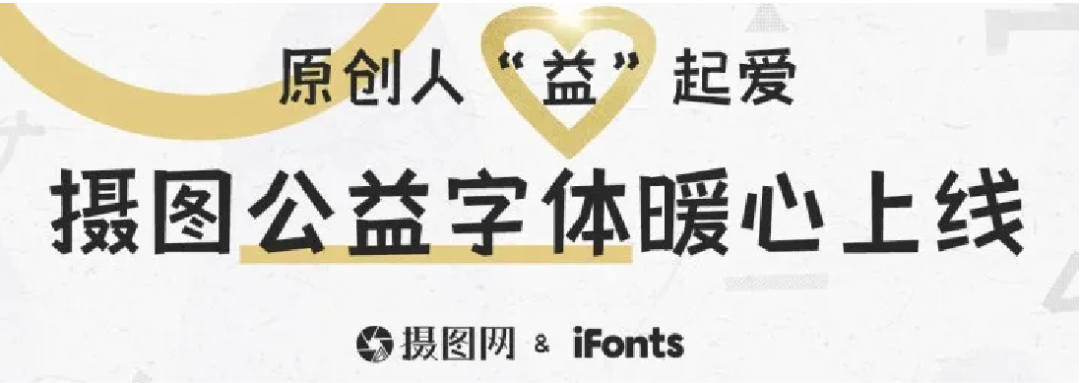
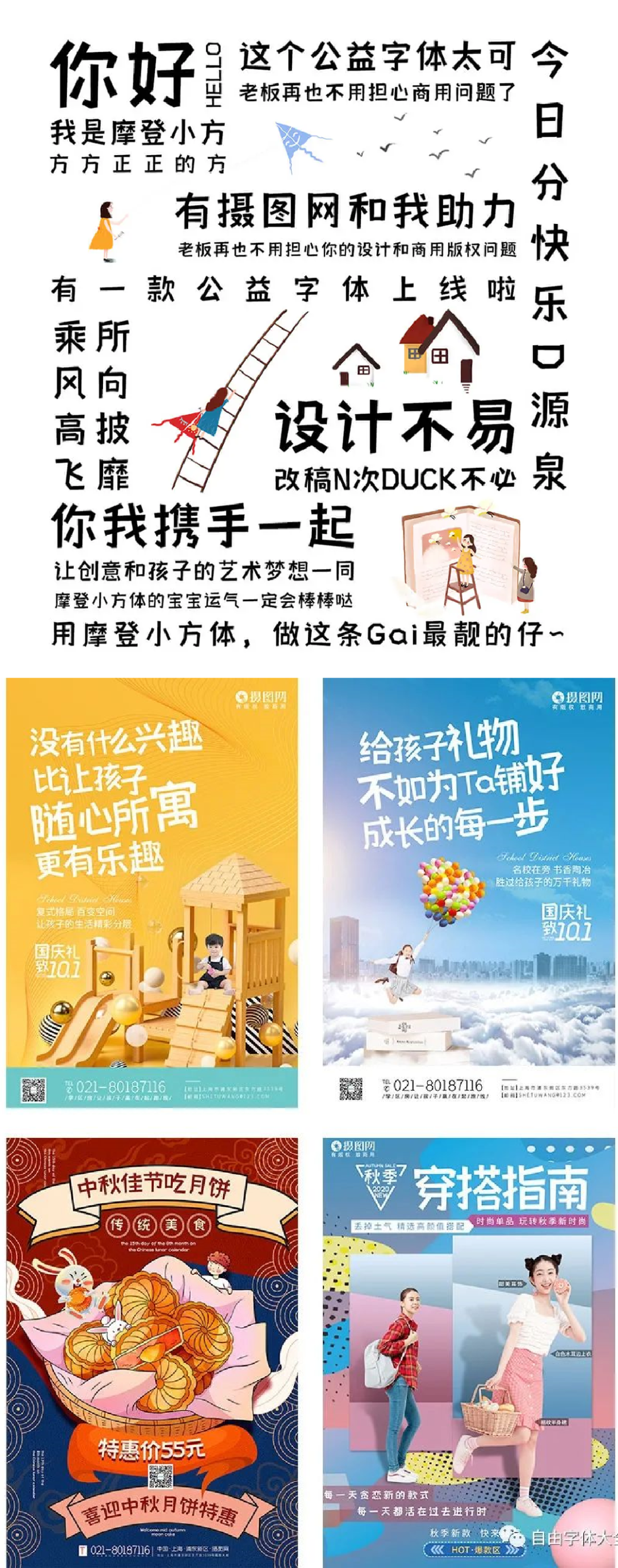
Through the treatment of the negative space of the font, the overall font feels stable and upright but not rigid, which is interesting. The strokes are square and simple without losing the vitality. The moderate stroke thickness and geometric detail design of the font make the font have a good visual application performance.
16
Combined Song and Hei two-body structure Characteristic font
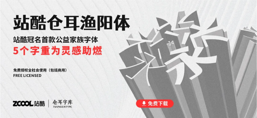
The first non-profit font library with family fonts (5 weights) named by Zcool. The font combines the structural characteristics of Song and Hei, and rounds the corners of some strokes, combining square and circle, which is thick and flexible.
17
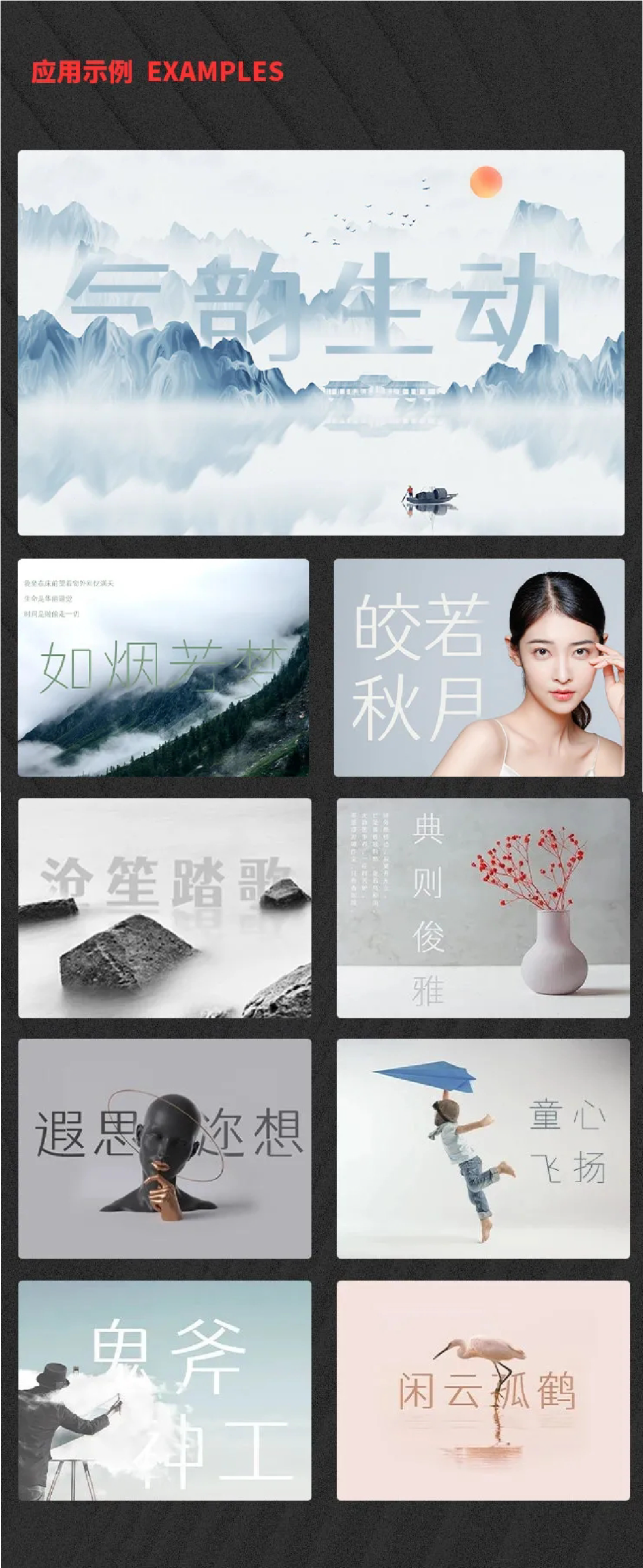
The "sword intent" of seal carving Incorporate creative fonts

Cang'er Yumo is a family typeface with 5 weights, emphasizing thickness and strength, with eye-catching, powerful and avant-garde features.
The font incorporates the "knife meaning" of seal cutting, and simulates the traces of knife carving similar to seal cutting when processing the pen shape. The processing method is to make the whole character square inside and round outside.
Tips: If you can't find the font in PS or AI after installation, please search for the name "TsangerYuMo".

18
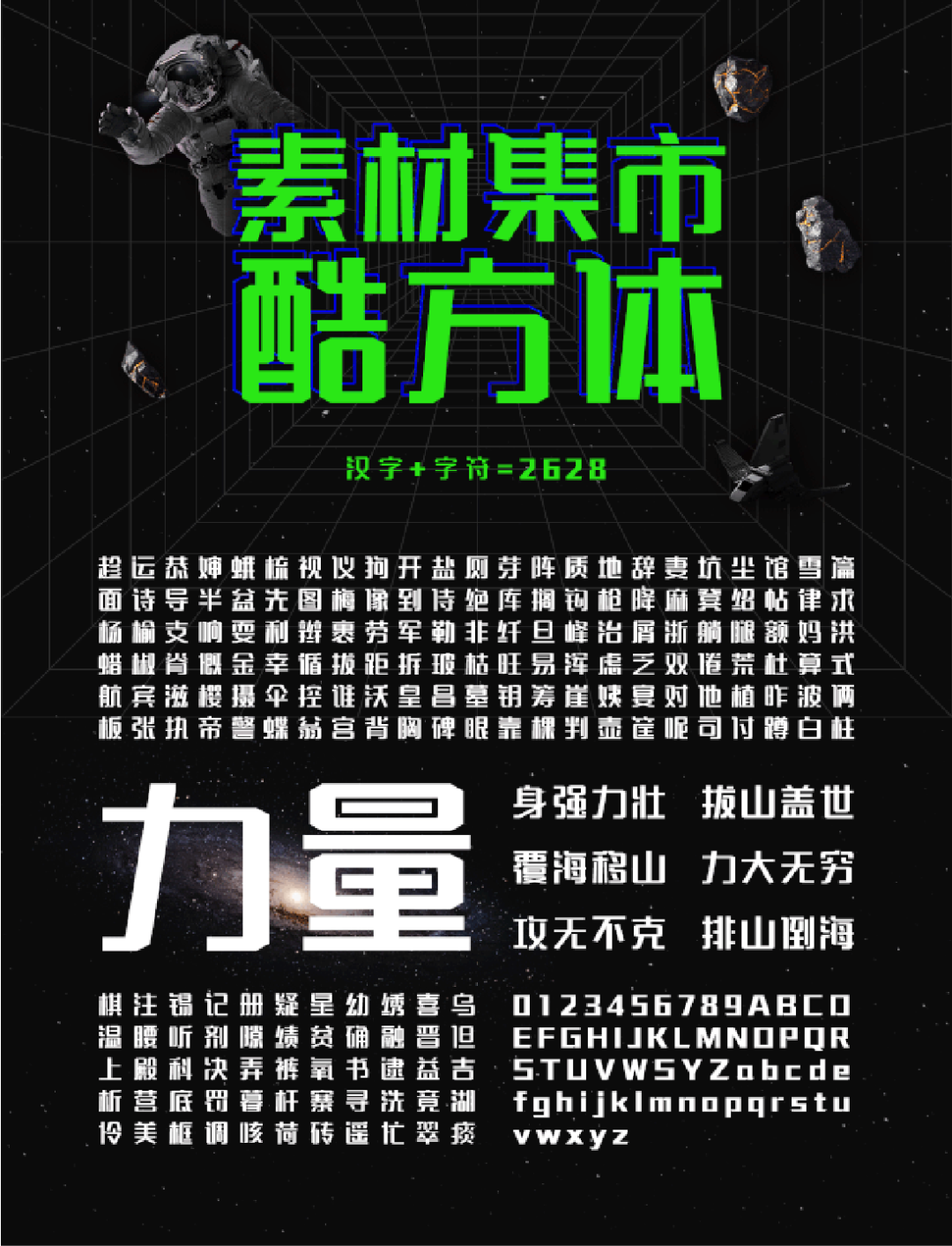
The font is square and the strokes are strong and powerful
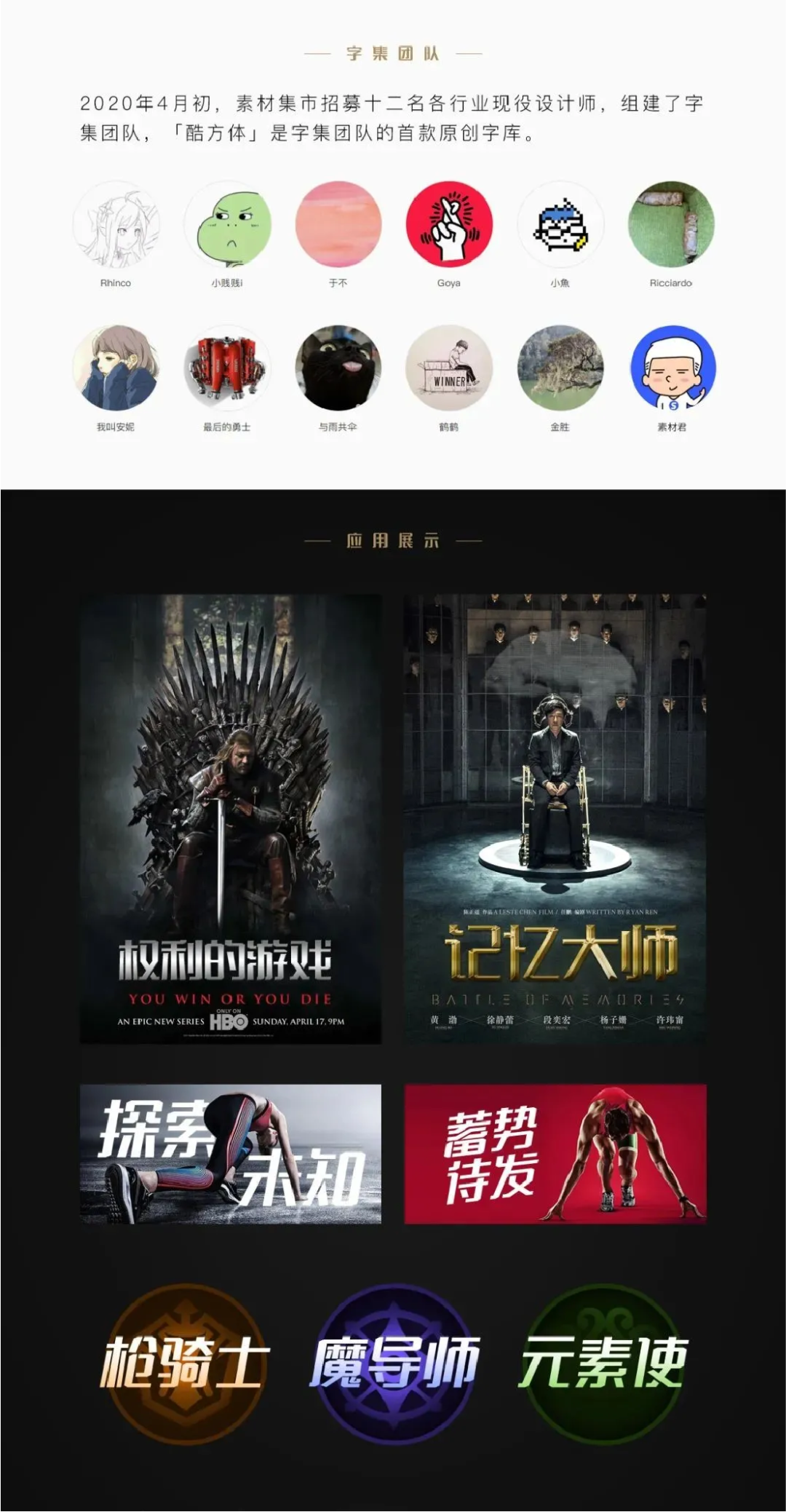
The font is square and the strokes are strong and powerful, which are the characteristics of "Cool Square". It was jointly produced by twelve designers from various industries in the font collection team. Considering that the designers participating in the joint production all have their own jobs, the number of words in the font library has been reduced. A total of 2628 Chinese characters commonly used in daily writing were screened.
19
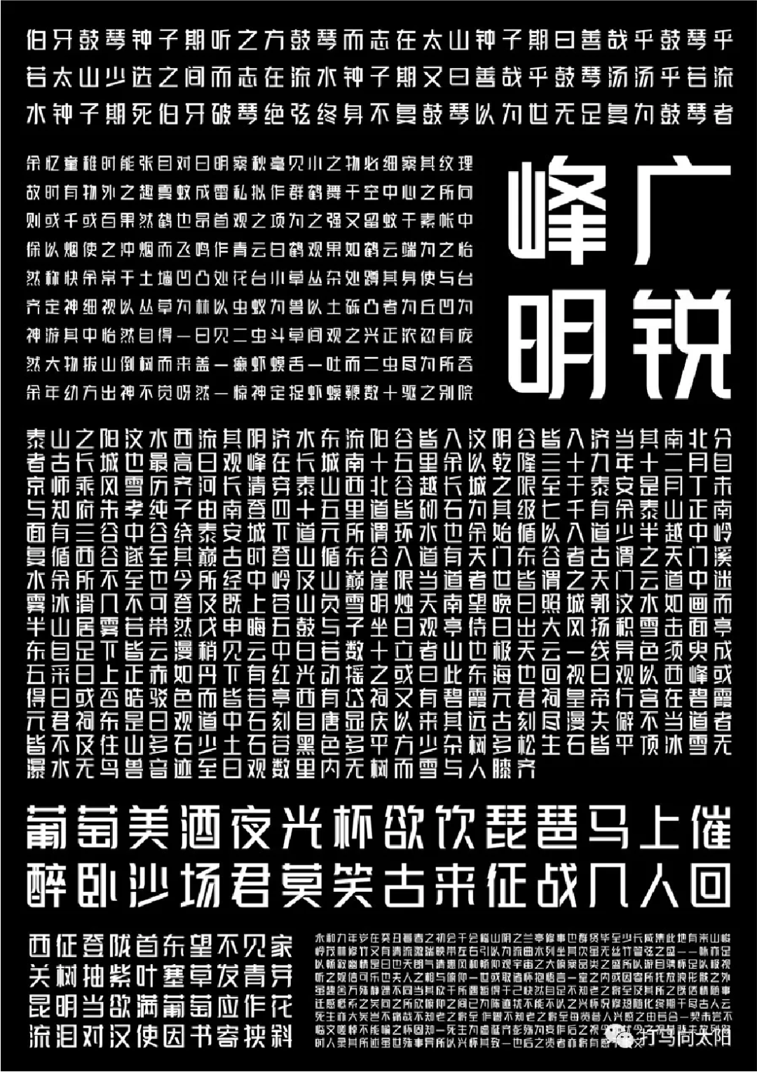
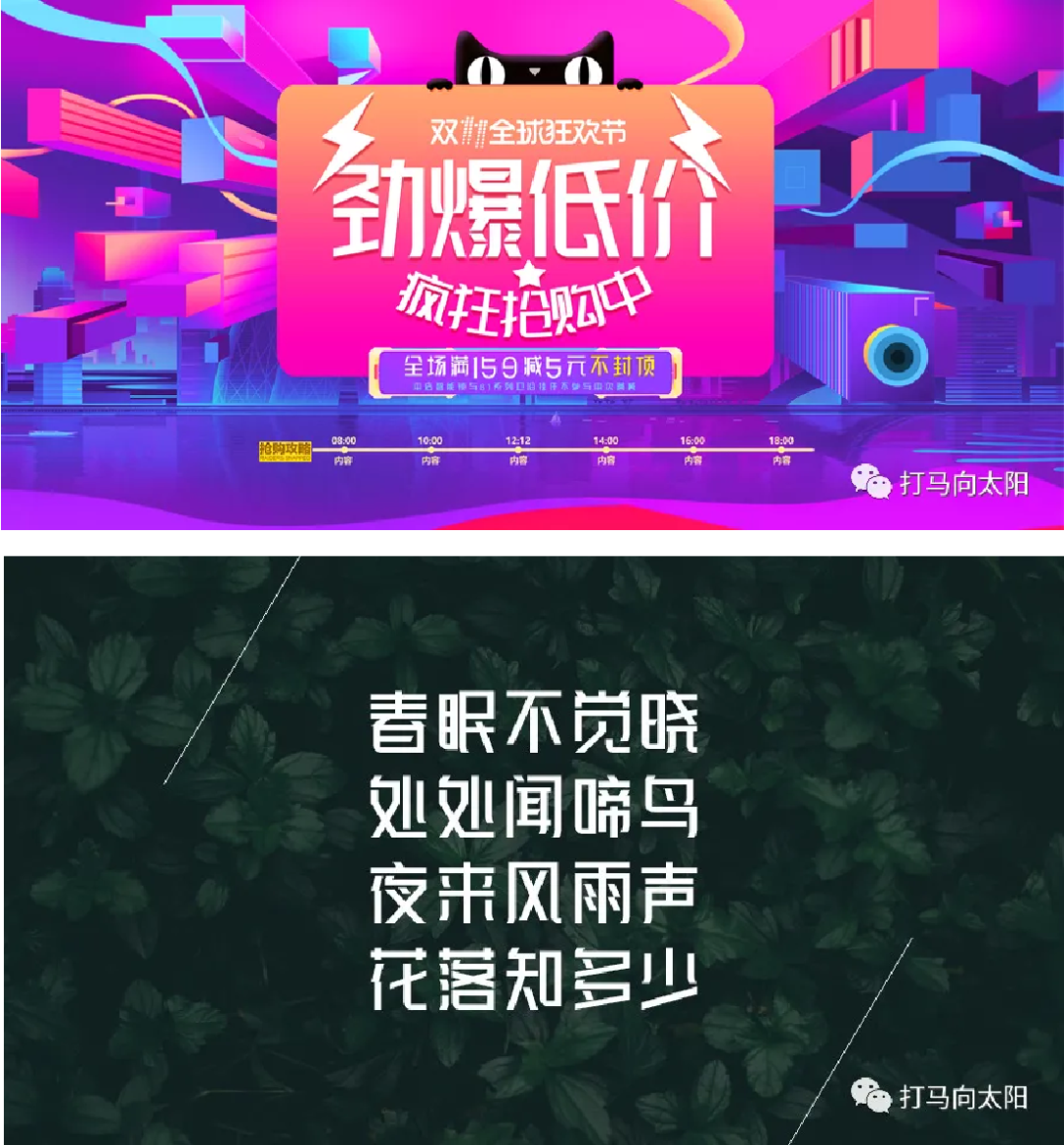
clear and sharp, upright and upright< /span>
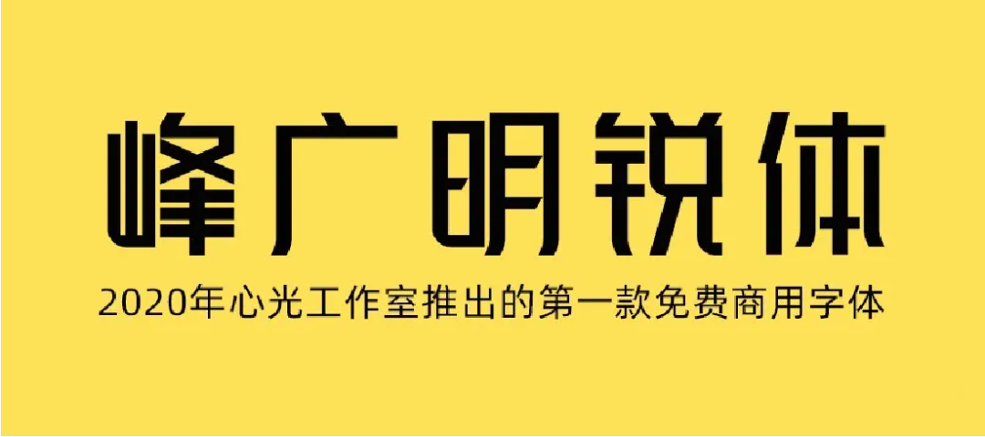
Free commercial font library launched by Xinguang Studio. The aspect ratio is 1:1.125, and the font is clear and sharp, straight and correct.
Currently, the official account "Da Ma Xiang Sun" is the only download channel for "Feng Guang Ming Rui Ti".
20
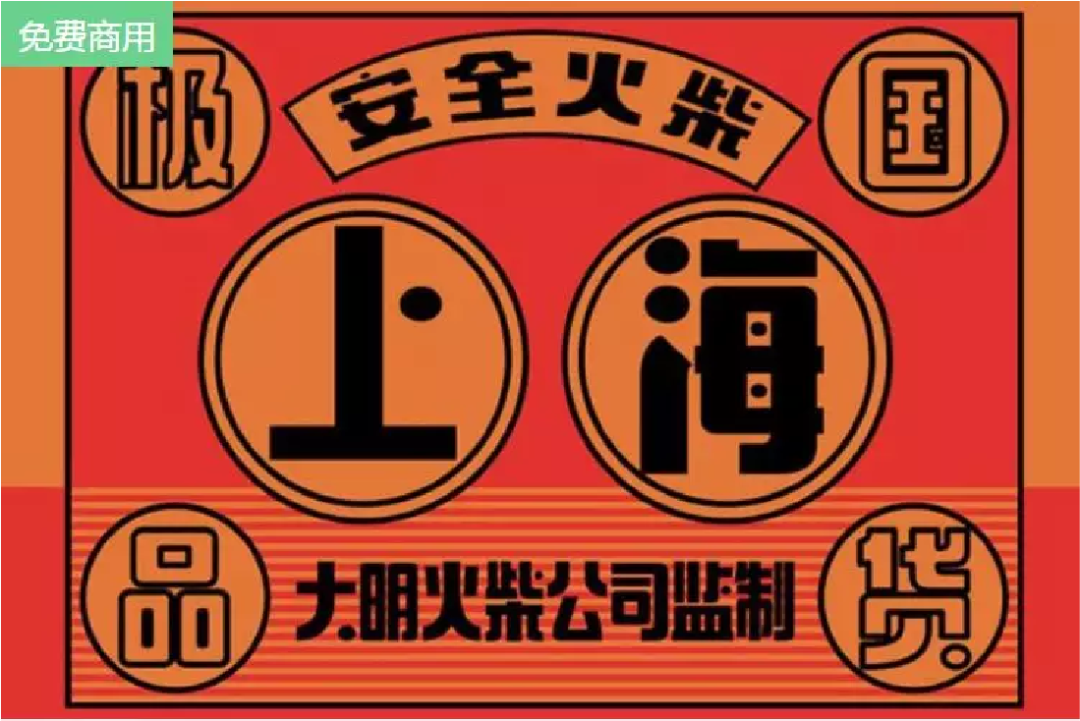
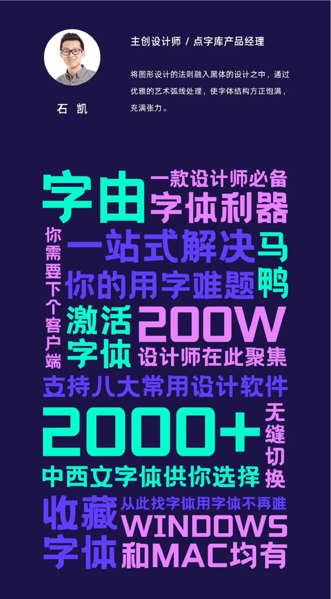
Peerless Fanghua has the charm of a Shanghai woman Elegance and style
Used only in "Word By" client

21
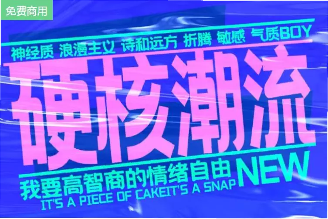
Retro art, with Beijing hipsters Unruly and stubborn!
Used only in "Word By" client
22
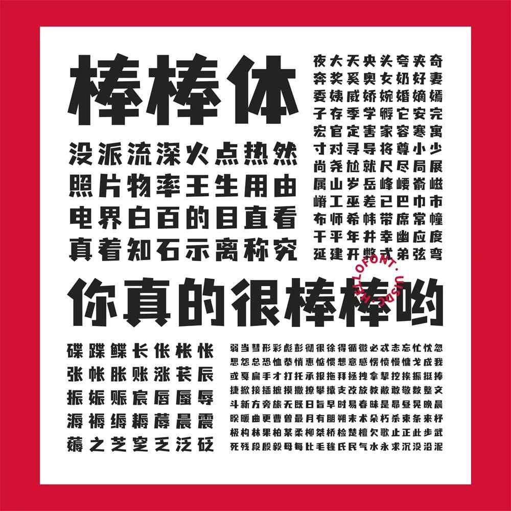
cute, straightforward and playful One-piece cartoon body
is a professional art title character that integrates cuteness, straightforwardness and playfulness. In the font, the contrast of "horizontal thinness and vertical thickness" is strengthened to enhance the text tension; the larger font weight makes it more conspicuous; the curved strokes in the font are removed and replaced with straight lines, which increases the feeling of cuteness and frankness; Some of the horizontal strokes are slanted, which adds a playfulness to the font.
Used only in "Word By" client



How much money can I earn by learning UI in 2021? Can you learn UI without art foundation? Can I learn UI by myself? How is the employment situation of UI?
If you want to learn UI design but don’t know where to study, you You can go to "Read the original text" to listen to it first, so that you can understand the learning route first, and feel whether you are suitable for learning this technology. Only after truly understanding can we make correct judgments and choices.
Consultation: Reply from the background: Customer service, real people answering questions online is convenient and fast. Consulting Damei WeChat: tedu521, to obtain resources.
Both are design positions, UI and UE Is there a difference?
5 practical suggestions for future design elites!
If you switch to UI design in 2020, is it easy to find a job?
Full analysis of UI workflow! Includes stage skill and tool guide!
Source: Yihai Shibei Design (id: YHSBds)


Articles are uploaded by users and are for non-commercial browsing only. Posted by: Lomu, please indicate the source: https://www.daogebangong.com/en/articles/detail/Design%20essential%20font%20library%20%20free%20and%20commercially%20available%20artistic%20fonts.html

 支付宝扫一扫
评论列表(196条)
测试