The book continues from the previous chapter, saying that bathing and changing clothes reflect the importance of knowledge. → In "Using Fonts" Golden Eighteen Styles (Part 1), everyone learned 9 graphic design skills. Today, what I bring to you are related techniques to make the layout more lively and lively:
-------------------------------------------------------------------------------------------
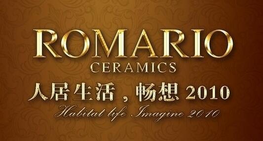
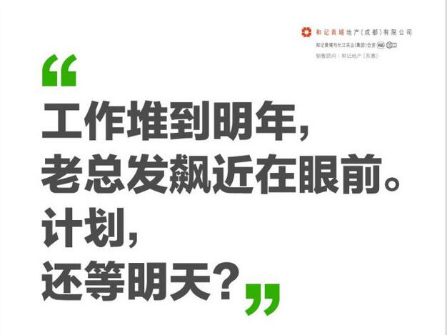
Highlighting of text is very important for legibility and quick browsing. A general rule is that no more than 10% of the text needs to be emphasized. If everything is emphasized, it is not emphasized. Of course, it is best to use two or three emphasis techniques at a time. In other words, do not use, color, font change, size, underline, italic, bold, etc. at the same time.

The first two paragraphs in the image above are left-aligned. This is the way we are used to reading, because it is usually the typesetting we see in books or magazines. A center-aligned paragraph is more difficult to read due to its lack of sharp edges. Each line doesn't have a consistent start or end point, so it takes your eyes some time to adjust to each new line. In practice, determine which is more important: readability or unique aesthetic.
Another thing to watch out for is mixing alignment modes. No matter which alignment mode you choose, try to be consistent in your design. It is usually (but not always) appropriate to center-align the title and left-align the body text. But trying to mix typography can lead to visual clutter and page clutter.
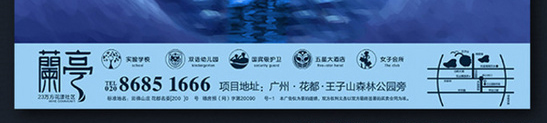
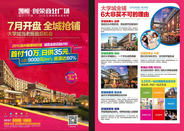
The most difficult thing to arrange for real estate posters is the content such as "project selling points". This content is usually very lengthy and boring, but it is also necessary to have content. At this time, a good way is to add some interesting icons, as shown above. The advantage of this method is that it can not only add interest to the content, but also help the audience to understand the content quickly, so this method is also a good way to have both beauty and comprehension. As for icons, I suggest that you go directly to major design material websites to find them, as the number of such materials is extremely large.
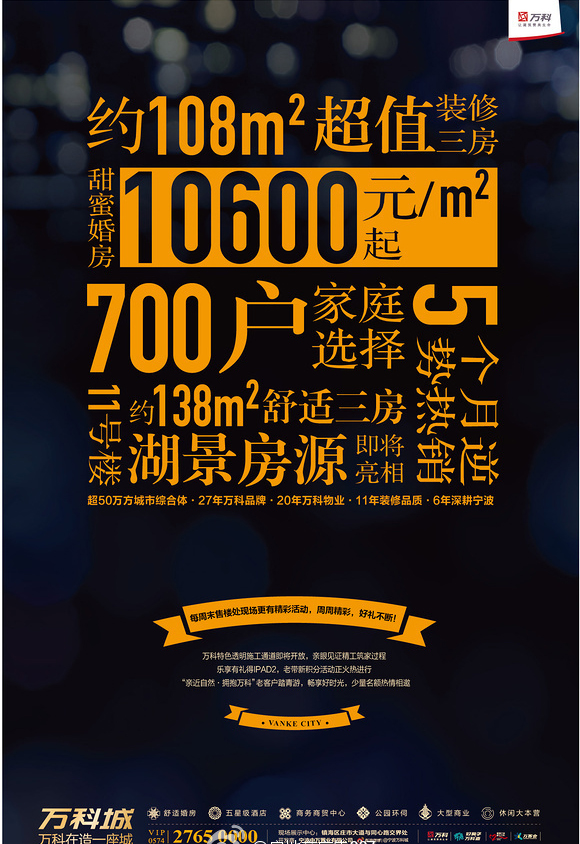
People's "vision" is wider, horizontal reading is faster, and reading from left to right is more in line with reading habits.
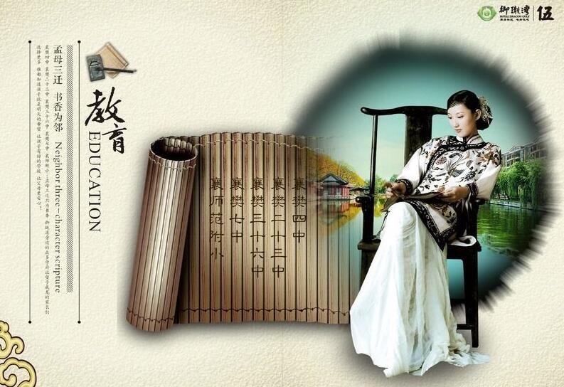
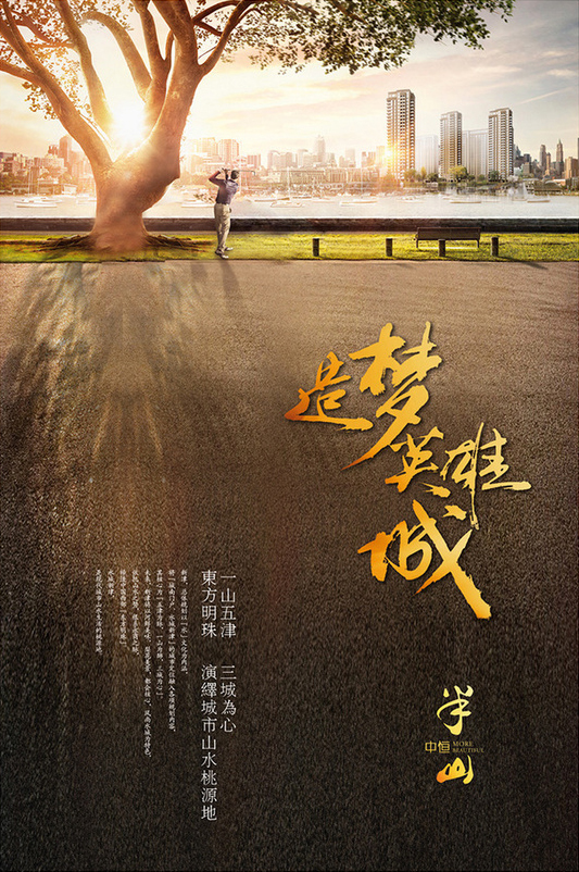
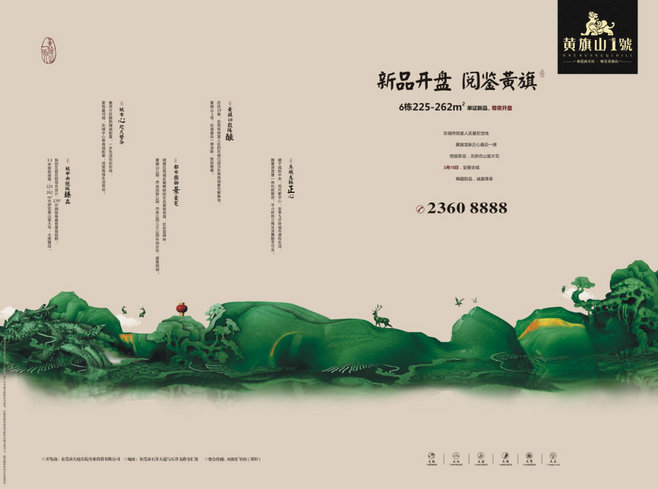
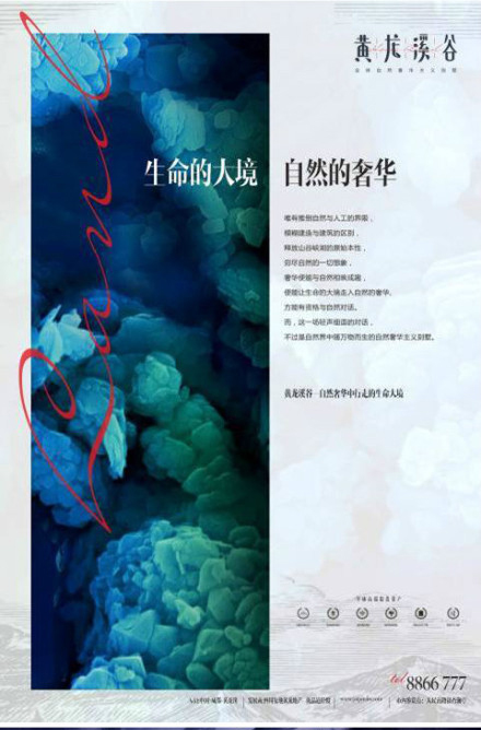
The vertical version evolved from the reading of ancient bamboo slips. The vertical text is more suitable for manuscripts that convey nostalgia, Chinese style, or convey artistic conception and feelings. At the same time, use nostalgic fonts, such as Old Song or Qing Ke.
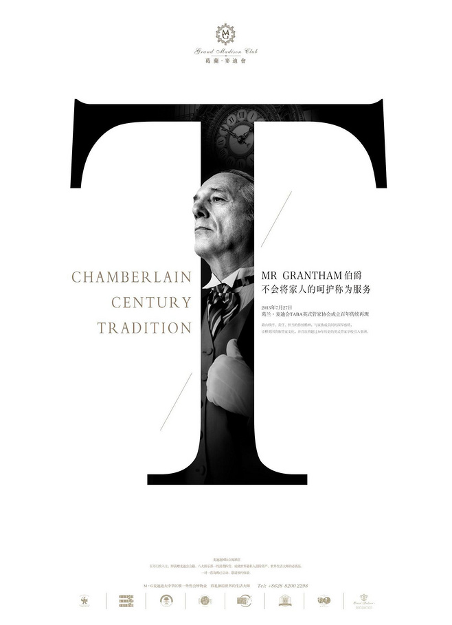
Effects such as drop caps, text shadows, text wrapping, and text boxes of any shape can make boring text blocks very interesting. But as a designer, we cannot blindly rely on the programmed effects provided by the computer. Many times we need to independently create some interesting layout effects, let the natural paragraphs be consciously staggered, set the placement angle of special text blocks, increase the Other visual effects, the effect of making text have images at the same time, subverting the traditional layout habits, etc., but no matter what kind of interesting effects, use at most two at the same time to avoid messy results.

Sometimes a word is equivalent to the length of a sentence in Chinese, and the words are separated by spaces, so when typesetting in English, even if it is a sentence, it is mostly used as a "paragraph"
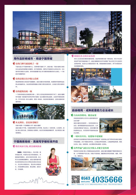
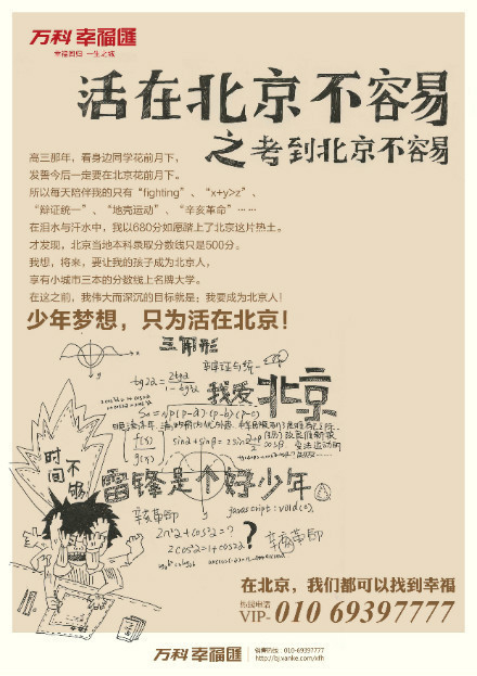
For the typesetting of manuscripts with a lot of text, first of all, pay attention to the division of pictures and texts. The graphic and text partition creates space for a large amount of text layout, and also avoids the complicated problem of adding words to the picture
▲There are many texts in the picture above, which still does not affect the beauty of the poster
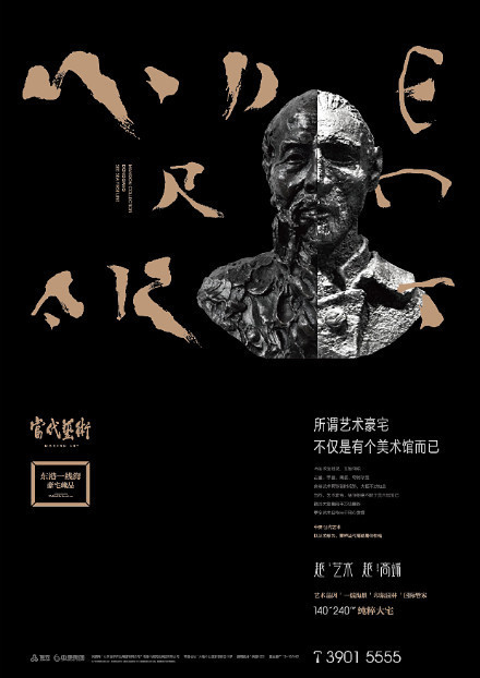
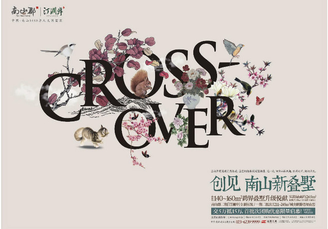
The second is the perfect combination of creativity and layout, making full use of the splitting of phrases, letters, and strokes, and performing pure plate processing without pictures.
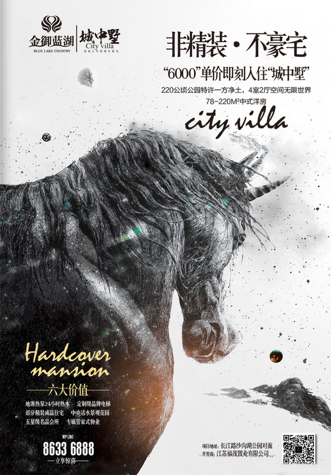
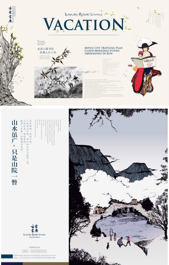
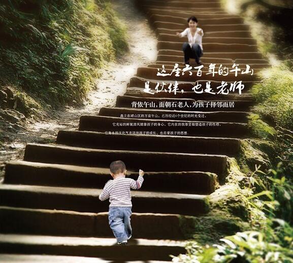
Using the different depth of field of the picture can improve the layering and three-dimensional interest of the text, and placing the text in the out-of-focus place can also highlight the text, increase readability, and achieve the effect.
15 kinds of punctuation marks, you can break his rules during use, cooperate with typesetting and beautification, and improve the interest of the overall style of the poster.
Thank you, for more communication, please pay attention to the WeChat public account: Ali Creative
Articles are uploaded by users and are for non-commercial browsing only. Posted by: Lomu, please indicate the source: https://www.daogebangong.com/en/articles/detail/Design%20Training%20%20Real%20Estate%20Poster%20Using%20Fonts%20Golden%20Eighteen%20Styles%20Part%202Ali%20Creative%20Agency%20Original%20Tutorial.html
 支付宝扫一扫
评论列表(196条)
测试