The article summarizes four points for everyone, let’s see what a quick and practical text design basic process is like~

In visual design work, we use fonts for almost every task.
Font is the most basic design element in our design process, and it is also an indispensable expression tool in design. Using appropriate fonts in different environments can make our design works more vivid.
In the design of the employer's customized page advertisement and operation activities, the text part is an important tool for information transmission. In addition to the basic function of conveying information, it also needs to be endowed with a beautiful form to make its visual communication stronger and more attractive to users. s concern.
Although the creative design of fonts is relatively free, the unity between characters should be maintained. In a group of font designs, a unified change rule should be maintained, otherwise it will cause a sense of clutter.
The following points are summarized in the work, a set of fast and practical text design basic process for your reference.

Below we mainly explain the creative design of Chinese fonts:
Font analysis and selection
In fact, it is to choose the font for reference when making characters. We need to analyze the project before designing. This is common in any design, and it is also true in font design. Before writing, you must analyze the theme and style presented by the font.
We use Genpact's 2019 campus recruitment project as an example to analyze: "Set sail to dream and achieve the future" Genpact's 2019 campus recruitment SLOGAN.
Genpact is a professional group company engaged in business process outsourcing (BPO). The overall design style of the company's official website is relatively business and concise.
Genpact's LOGO design is composed of several graphics to form a capital "G", the initial letter of Genpact's English. The overall LOGO is sharp and straight. Let's take Genpact's LOGO apart and look at it. It is composed of five geometric figures, and each figure is similar to the strokes of our Chinese fonts. After analyzing so many, I think our choice of fonts has something to do with it. specific goals.

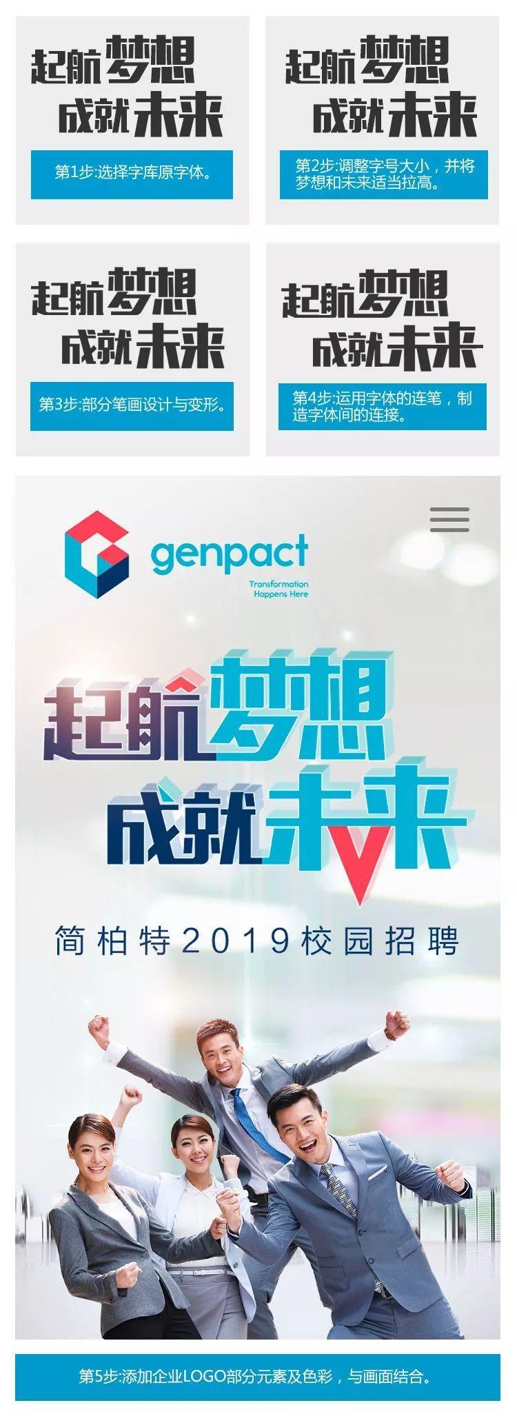
After selecting a suitable font, we designed and deformed some strokes of the font to make the overall look more in line with the characteristics of Genpact's LOGO.
Then, add part of the graphic elements of the LOGO to the text in it, replace a certain stroke of the font with the graphics in the LOGO, replace part of the text, and expose the connotation of the text, adding a certain artistic touch to the image and senses force.

The following are several different font design cases: "Looking for Enlightenment" Wuxi Hengxin Software 2018 Campus Recruitment SLOGAN.
Select the original font of the font library, use the continuous strokes of the font to create the connection between the fonts, find: the meaning of searching. Change the word search point into a slightly larger circle, meaning a magnifying glass, to find talents for enterprises faster and more accurately.

"The new Shanghai Bank believes in you who are outstanding" the pre-sales SLOGAN of Bank of Shanghai 2017 social recruitment.
Bank of Shanghai takes "boutique bank" as its strategic vision, selects fonts from the font library, and uses a straight line from low to high to connect the strokes of the four characters of "New Shangyin", which reflects the Bank of Shanghai's "sincerity first, trustworthiness and integrity" core values.

"Sharing with colleagues" Chengdu Shuangliu Airport 2018 Campus Recruitment SLOGAN.
Chengdu Shuangliu International Airport is located in the "Hometown of Pandas"——Chengdu, Sichuan, Western China. The fonts with Chinese elements are selected, and some strokes in the text are replaced by brush effects to make the overall look more design. .

Glyph structure reconstruction
After all, the basis of graphic design is text, which still needs to convey literal information, which is related to readability and the aesthetic feeling of fonts. Therefore, we need to analyze the glyph structure and visual experience from the principle and structure of Chinese characters.
Next, I would like to share a method of font reconstruction. Taking Wuxi Hengxin Software’s 2018 school recruitment project “Revelation of Finding People” as an example, the steps are as follows:

Overall adjustment and screen combination
In the font design, we carefully consider and try the variation of each stroke to choose the most suitable expression method. Only in this way can each stroke fit the font and the space rules of the entire group of characters.
Simplify or connect the completed font structure or strokes to make it more in line with the temperament of the theme or have a more sense of design.
Let’s take Genpact’s 2019 school recruitment project “Set Sail to Dream and Achieve the Future” as an example. The steps are as follows:

Font legibility test
After the text is designed, the image can be contextualized and visualized, the language effect can be strengthened, and it can become a visual symbol with a certain characteristic and tendency. We should be easy to recognize while pursuing font changes.
As a font design to convey the main information, or carry the purpose of operation transformation, it is more necessary for users to understand the content and characteristics conveyed by the text at a glance.
We can add a link when the design is completed, that is, to test the recognizability of the font. Let’s take a look at the following two cases. Let’s look at the text in (Figure 1) first. The viewer cannot recognize it immediately and needs to guess , hindering users from obtaining accurate information, this situation can be avoided by using the font recognition test link.

Looking at (Figure 2), although more graphic designs have been added, in terms of text recognizability, viewers can quickly recognize the text information in it, which forms a clear contrast with Figure 1.

Some of the following design cases are quickly realized through the above methods:


Conclusion
In short, the purpose of visual work design is the communication between people. As a designer, learning to use font changes will make the design more effective. Applying text graphics to the design can make the work have a strong visual impact, and make it easier for the public to recognize, understand and remember the theme of the design work, and then promote users' further consumption and transformation of the content.
Author: Yang Cunqing, visual designer
This article comes from everyone is a product manager cooperation media @58User Experience Design Center (WeChat public account @58UXD), author @杨宁庆
The title picture is from Unsplash, based on the CC0 agreement.
Articles are uploaded by users and are for non-commercial browsing only. Posted by: Lomu, please indicate the source: https://www.daogebangong.com/en/articles/detail/Design%20Meditation%20%20A%20Little%20Talk%20on%20Font%20Design.html

 支付宝扫一扫
评论列表(196条)
测试