Author: Lawrence_V
In the comments on the article "History of Grids" written by Lawrence_Z, a friend wanted me to talk about grids in Chinese text length.
History of Grid: https://www.zcool.com.cn/article/ZODk0NjIw.html
I think I can talk about it, so I recently compiled this article about text layout. @NERV_Puppy I hope this friend can see that I wrote an article for him and really learn something from this article.
There are two articles on text layout. This is the first article, which mainly talks about how to set the line height, the difference between line height and line spacing. Then the next article mainly talks about the line length, how to restrict the line length in the page to make it more reasonable and more comfortable to read. In addition, I also hope that you can decide the content of my articles. I can intersperse the knowledge you want to learn into a series of articles to meet everyone's needs as much as possible.
Table of Contents
1. Font size settings
2. Random combination according to needs
3. English line height
4. English line spacing
5. Chinese row height
6. Chinese line spacing
7. The taboo of row height
8. Header row height
9. Text Line Height
10. Hybrid choreography
11. Font selection
1. Font size setting
The font size is the size of the font, and the text should be configured with corresponding font sizes from the main title H1-H7, subtitle, body text, and notes. I increase the font size of the page based on 4, and it is better to use an even number. Like the main text of size 14 and notes of size 13, such relatively small characters can be made without base 4. No matter how the designer defines the font size, as long as it is visually beautiful and relevant, it doesn't matter what rules it uses to constrain it.
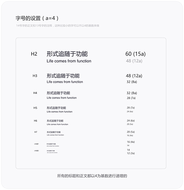
In addition, all fonts should be debugged into dark and light colors, and applied to white background and black background respectively. If the display effect of the black background color is not good, it will not be displayed.
2. Arbitrary combination according to needs
When we define the font size, the title and text can be freely matched according to the actual project needs. When choosing font sizes for titles and texts, pay attention to the contrast between them. The larger the difference in font size, the more obvious their hierarchical relationship, but the difference between them should not be too large. If the difference is too large, it will affect the overall visual balance. Gives a sense of dissonance and unnaturalness.
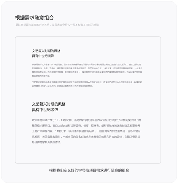
For example: headline font size 20px with body font size 12px; title font size 24px with body font size 16px. Which title to choose to match which text is also determined by the designer's aesthetic sense.
3. English row height
Before setting the text line height, you need to understand the difference between "line height" and "line spacing". Drawing software such as front-end DIV+CSS and design Affinity Designer are defined by "line height". The CSS-Style line-height property is the line height, and the values are expressed in percentage, number and pixels. For example: h1.test {line-height:112px}, then the line height of the title h1 is 112 pixels; the line height is also used to control the distance between the lines in the drawing software. Okay, let’s get down to business. There will be some differences between the Chinese line height and the English line height. The English line height refers to the distance between the baseline of one line of English and the baseline of the next line of English, as shown in the figure below.
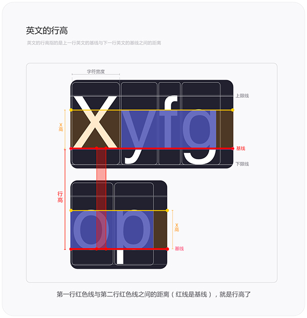
Baseline is a concept in the structure of English fonts. Let’s briefly understand it first, and we will talk about it later when we talk about fonts. When we fill in the value of the line height in the drawing software, what we change is the distance shown in the figure above.
4. English line spacing
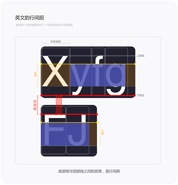
The line spacing in English is not as complicated as the line height, and there is no need to draw a baseline. The line spacing in English is the same as in Chinese, which refers to the distance between the bottom line of one line of English and the top line of the next line of English. In fact, it can also be simply understood as "the distance between lines" and called line spacing. In addition, if the English bottom and top have corresponding proper nouns, the two hidden lines at the top/bottom in the English font structure are called "upper edge/upper limit line" and "lower edge/lower limit line". Just understand this piece of knowledge first, and I will talk about it later in the font structure.
5. Chinese row height
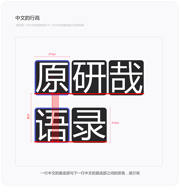
Next, understand the line height in Chinese. As mentioned above, the line height in English is determined by the baseline, but the structure of Chinese fonts is different from that of English fonts. There is no concept of baseline in Chinese, so how to define line height. The structure of Chinese belongs to square characters without a baseline, so the line height of Chinese refers to the distance between the bottom of a line of Chinese and the bottom of the next line of Chinese. There is no upper edge/upper limit line and lower edge/lower limit line in the Chinese font structure, they only exist in the English font structure.
6. Chinese line spacing
The Chinese line spacing is easier to understand, which is the same as the English line spacing. It refers to the distance between the bottom of a line of Chinese and the top of the next line of Chinese. It can also be understood as the distance between rows.
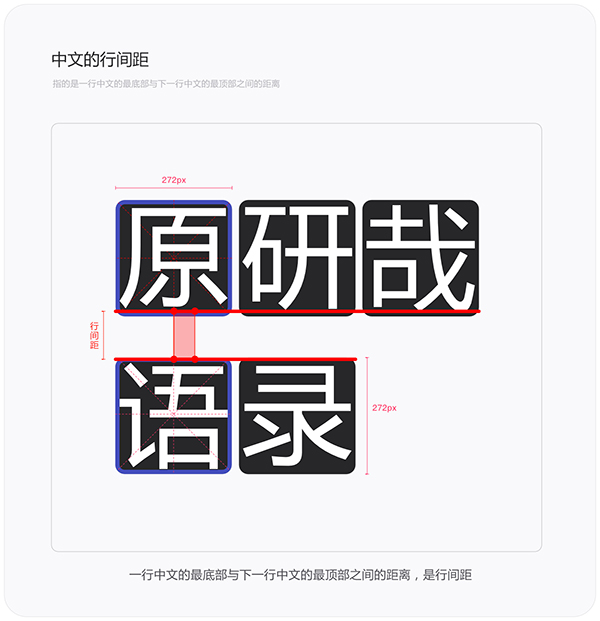
Although the difference between line height and line spacing is not easy to distinguish, and it is a bit confusing, it is still necessary to understand them.
7. Taboo of line height
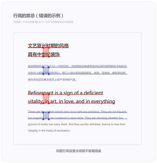
Whether it is the title, text or comments, their line height should not be too high. If the line height is too high, the content will be difficult to read, and the integrity of the text will be broken. The larger the font size of the title, the smaller the line height should be, and the smaller the text size, the larger the line height should be. Of course, these rules are relative, and the row height should be controlled reasonably, not too large or too small. So how to set the line height reasonably, look down.
8. Title line height
The line height of the title is determined by the font size. Sometimes in graphic design, the line height can be set to be the same as the font size. For example, it is no problem to set the line height to 120pt for a font size of 120pt. The line height in the page is calculated in this way, font size x multiple = line height. For example, as shown in the figure below, the font size set for the headline H3 is 48px (12a), and the line height is 62.4, that is, 48x1.3 times = 62.4. The multiple of font size and line height is measured little by little, because the ratio of font size to line height will not be less than 1.0 (1 times), I will test according to my own aesthetics, starting from 1.0/1.1/1.2/1.3.... , until the line height you are satisfied with is measured. As shown in the figure below, the colored numbers are multiples.
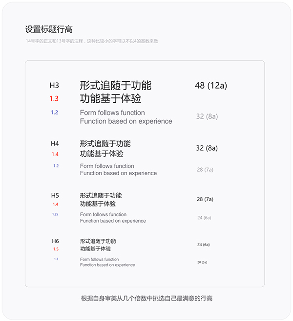
The final line height is determined by the designer's intuitive judgment. Therefore, rationality should be mixed with sensibility in design, and the coexistence of rules and creativity is the quality that an excellent designer needs to have. Then I will take the Chinese font size of 36px and the English font size of 24px as an example, so that everyone can understand it better. As shown below:
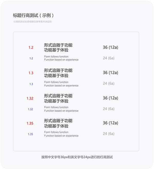
Just find the line height you are satisfied with from the test results. Font size x multiple = line height, here is not afraid of the problem of too many decimal places in the multiple. In the drawing software, the unit is pixel, but sometimes the front-end code uses the parent inheritance unit "em". For example: the font size of the headline H3 is 48px, the line height is 62.4px (48x1.3 times), 62.4px=1.2816667em, then converted to the front-end code is h3.test{line-height: 1.3em}, which is approximately equal to That's it, barely noticeable.
9. Text line height
Come and continue. The line height of the body text is the same as the line height of the title, and the difference is that the line heights selected by different font sizes are also different. The multiple of the line height of the title is about 1.0-1.6, and the multiple of the line height of the text is about 1.6-2.4. There is no certain standard for this, and it still depends on the project situation and the actual effect. As shown in the image below, the colored numbers are multiples of the row height.
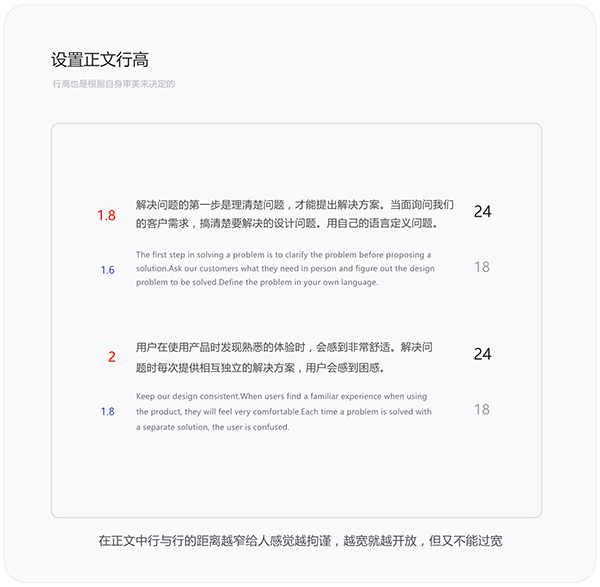
Speaking of this, people often ask me how to set the value of the line height of the text. Everyone will use the 1.5/2 times relationship when designing, but this is not absolute. The multiple of the line height is also affected Influenced by font size. Like the text of Sina News, the font size is 18px, and the line height is set to 32px, that is, the font size (18px) x 1.777 (multiple) = 32px (line height), if the line height multiple is set to more than 2 times, the distance between words The larger the distance, the harder it is to read.
10. Mixed arrangement
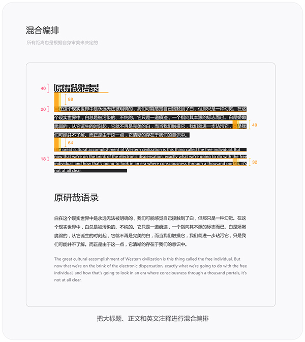
Okay, fully understanding all the above knowledge can mix and arrange titles, texts and notes. The headline font size is 40px, the body text size is 20px, the text line height is 40px, the comment font size is 18px, the comment line height is 32px, the spacing between the title and the text is 88px, and the spacing between the text and comments is 64px.
11. Font selection
There is nothing technical about choosing a font. There are only a few commonly used fonts for web pages, such as Microsoft Yahei, Arial, Verdana, arial, and Times New Roman, so I won’t give examples. The most commonly used Chinese website is Microsoft Yahei+Arial, and the browser compatibility is also the best. After reading this, some people may ask, it is also possible to load other fonts. Yes, it is possible to load other fonts for corporate websites, but it is almost impossible to load other fonts for functional pages and background pages. Therefore, it is still necessary to estimate the actual project needs/brand needs to choose a font style that matches it.

Articles are uploaded by users and are for non-commercial browsing only. Posted by: Lomu, please indicate the source: https://www.daogebangong.com/en/articles/detail/Design%20Language%20%20Typography%20Line%20Height.html

 支付宝扫一扫
评论列表(196条)
测试