In the process of our actual work, there may be some Tibetan-style font projects, but some friends feel that this type of font is difficult to make, and they have no clue at all, so that they don’t know how to start, so I will share my experience And method, hope to help everyone!
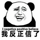
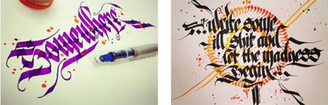
There are two methods I usually use. One is to do it yourself. Of course, besides writing with a pen, you can also use software to simulate writing; the other is to use the strokes of ready-made fonts to piece together. Since I think Tibetan and Gothic have certain similarities in writing, I will mention Gothic by the way.
In this issue, we will focus on writing and drawing by ourselves, using ready-made strokes to put together this method, because it is not limited to Tibetan and Gothic, so we will leave it to the next issue of "Scrabble".
Some friends are stunned when they hear that they are writing and drawing by themselves. Writing by yourself is actually not as difficult as we think. Many times we can get things done as long as we are willing to do it.

How to make these two styles of fonts? I divide it into three.
1. Deconstruct glyphs, that is, understand the characteristics of related glyphs and writing tools.
2. Imitation drawing, that is, redrawing according to the characteristics of the original glyph.
3. Late adjustment, that is, the final adjustment and optimization.
Let's talk about it one by one.
1. Deconstruct glyphs, understand the characteristics of related glyphs and writing tools.
Writing implements are key to both glyph features, so let's start with writing implements. Both Tibetan and Gothic scripts are written with flat-tipped pens, such as the ones below.

Even...
As you can imagine, as long as it is parallel, it is ok, so we can simulate these traditional tools with software brushes later. Of course, you can also DIY bamboo pens and dip pens by yourself.
The thickness of the strokes written with this pen is consistent, and the angle of the pen tip is kept unchanged when writing. Different angles can write different styles of fonts. Typefaces such as Tibetan, Gothic, Italian, Roman, and Ansel can all be written with flat-tip pens.
Tibetan font generally tilts the nib angle by 45-75 degrees, and Gothic font is 30-45 degrees. Since I only talk about Tibetan style and Gothic style here, I won’t talk about other fonts. Friends, if you If I like it, then I will take the time to write about the English fonts, haha.

Back to the topic, let's see what are the characteristics of the following Tibetan styles.

After looking at the pictures above, we found that the Tibetan style is characterized by horizontal thickness and vertical thinness, and the strokes like to bend, similar to ribbons.
Then use a flat-tip pen to write. If the tip of the pen is tilted at 45 degrees, then the writing will be as thick horizontally and vertically.
So what are the characteristics of Gothic? In fact, gothic is called Blackletter in the West. It is an artistic font used by institutions such as the ancient church to copy. It is a rather gorgeous writing and printing style, and it is more common in theological documents in the Middle Ages. The vertical lines are relatively thick, and most of them have strong decorative lines, which are difficult to identify.
Blackletter is actually a general term. There are actually many fonts of Gothic fonts, and there are many variants. The following ones can be called Gothic fonts.

When writing Gothic, the nib is generally at 45 degrees, and the thickness of the horizontal and vertical strokes is similar.
Gothic font is relatively decorative. To write Western Gothic font well requires systematic learning and practice. If you just want to make Gothic-style Chinese glyphs, you only need to add some elements of Gothic font. Diamond heads, pointed corners, flowers, etc. are ok.
After knowing the characteristics of the two glyphs, we proceed to the second step, imitating drawing.
2. Imitation drawing, that is, redrawing according to the characteristics of the original glyph.
According to the characteristics of Tibetan style, thick and thin, and curved strokes, I wrote the following

It can be seen that there is a feeling of Tibetan style in it. It is also the word "Xi". You can experiment with different writing methods and styles. Although my writing is not very good, it is enough to make a sketch, and we only need to draw it with a pen in the later stage.
So how to use software to imitate a flat-tip pen?
First of all, we need to set up the brush and create a new calligraphy brush, as follows.
The angle is adjusted to 75 degrees, because the Tibetan body is horizontally thick and vertically thin
Set roundness to 0
The size of can be set according to your needs.
It is worth mentioning that these values are not fixed, and you can adjust them according to your own needs. For example, if I want to write Gothic, Italian, etc., I can adjust the angle to 45 degrees or 30 degrees.
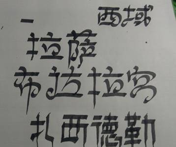
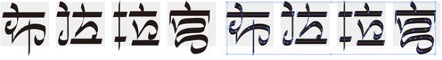
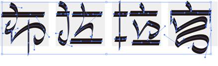
Taking the four characters "Potala Palace" as an example, you can first draw four boxes to determine the size of the characters, then select the brush tool, and select a ready-made brush to write in it. Here you can directly use the mouse to write, Of course, it is better to have a hand-painted board. The following is what I wrote with the mouse. It is a bit ugly, and there are many anchor points, so it is not smooth.
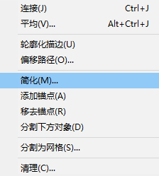
At this time, we can use the object-path-simplify command to simplify.
The simplified anchor point is as follows:

The next step is the post-adjustment stage, combined with the direct selection tool (white arrow) with Convert Anchor Point Tool
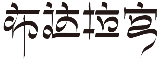 , adjust and optimize, the picture below is optimized.

The handling of the final strokes of the word "Gong" is a bit borrowed from Xiaobo's "Potala Palace" work, haha, after all, he is an unsurpassable god-level boss.
Of course, in addition to using a brush to make a draft and make adjustments later, you can also use a pen to outline the glyph frame, and then follow the brush stroke.
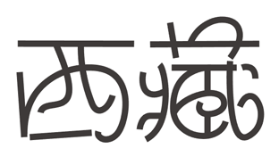
Taking the word "Tibet" as an example, first use the pen tool to outline the basic frame, as follows.
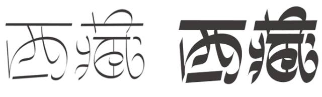
Because of the thick and thin vertical lines of the Tibetan style, I omitted one horizontal line of the word "Tibetan", and there are many horizontal lines of "Tibetan", so I might not be able to put it down if I don't omit it.
After drawing out the stroke structure, we attach the brushes we made, as follows.
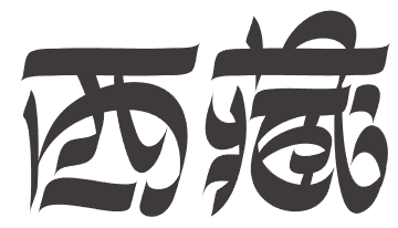
Adjust the thickness of the stroke to get the effect on the right.
The effect of has come out, but I want to make it more individual, it doesn’t have to be a straight line, so I combined the conversion anchor point and the direct selection tool, and adjusted the stroke and anchor point to the following state to make them irregular .
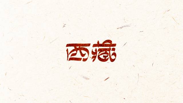
The horizontal line in the middle of the "Tibetan" character is adjusted to be more comfortable and thinner. We can also expand the font and change the sharp part to rounded corners to increase the change and affinity. In order to be more stable and feel more comfortable, I stretch the font horizontally Stretch it. The following is the final effect.
After talking about Tibetan font, let’s talk about Gothic font. Each glyph in blackletter has a set of writing standards, so it is difficult to write without systematic practice. Of course, you can also use the AI brush to adjust slowly at 45 degrees. If you want to study systematically, you can go to the round body English bar and the Pingjian bar. These two post bars are often haunted by great masters, haha.
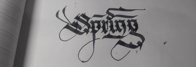
The group below is a combination of handwriting and simulated brushes.

Handwritten draft, slightly ugly, after all, I am a big scum
Import it into AI after scanning, and outline with the pen tool to ensure that the number of anchor points is as small as possible and the curve is as smooth as possible.

Okay, I have already finished the post-adjustment work when I sketched the line.

3. Late adjustment, that is, the final adjustment and optimization.
Because I am funny, I accidentally mentioned this step together in the previous step, so let’s do it, the last step is to adjust and optimize, everyone knows the meaning. Can everyone make Tibetan-style glyphs?
ArticleChapter reproduced from:Visual State Design Institute
For more information about the course, please click to read the original text
Articles are uploaded by users and are for non-commercial browsing only. Posted by: Lomu, please indicate the source: https://www.daogebangong.com/en/articles/detail/Deconstruction%20of%20Tibetan%20characters%20how%20to%20learn%20how%20to%20design%20Chinese%20fonts.html
 支付宝扫一扫
评论列表(196条)
测试