@刘伯坤
I wrote this article on the spur of the moment while doing a small promotional text for enrollment. Hand-drawn fonts are warmer, but do you know how to make an interesting hand-drawn title? Here are some ideas and techniques to share.

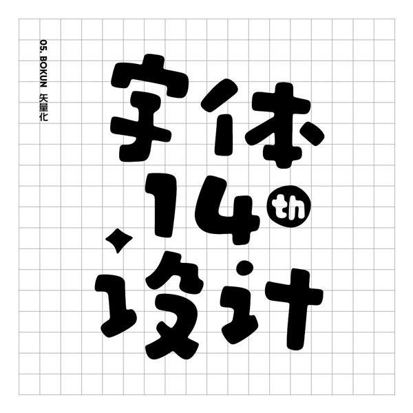
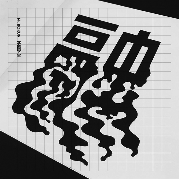
These words I made are for the title. I wanted to make them cute but not completely cartoony, so I thought of using hand-painted forms. Hand-drawn fonts have a natural temperature, unlike the deliberate lines in software. Even if AI or PS can realize hand-painted processing, the feeling of paper, pen and handwriting is still unmatched by software.
I will break down the steps below, I hope you can gain something from it.
* 01. Structure
As a first step, it is recommended to outline the basic structure, which has many advantages. This step is tantamount to planning in advance so that you know what you know, so as to avoid unreasonable structure and nowhere to place the strokes.
As shown in the picture below, this step can be drawn with thin pencil lines. The effect may not be so pretty, but it can arrange the space structure well in advance, including the combination position and form. Because I want to feel cute, the structure is more changeable and loose.
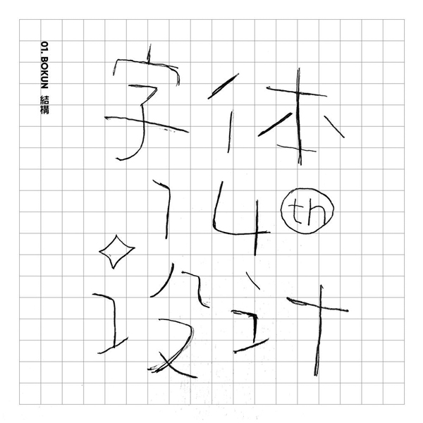
It should be noted that if your filling strokes are thick, the internal space should be full, that is, the strokes should not be too close together, so that the strokes can be stuffed in the next step.
* 02. Stroke
With a reinforced concrete structure, the next step is to add bricks and tiles. The stroke characteristics of this group of characters are relatively obvious. The thickness of the starting and ending strokes varies, and the corners are mostly irregular rounded corners. Some points are made into stars and dots, which have a stronger graphic sense and also serve as embellishments.
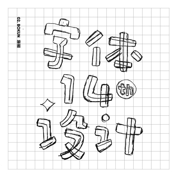
When I was drawing a sketch before, I remember the teacher said: Don't draw the lines to death. When outlining strokes, don't think about just one line and get it done. Repeated outlining will gradually become clear.
Of course there are many forms of strokes, round and square can present different styles, the key point is to unify the characteristics of strokes, unless it is the kind of font that is mixed and matched.
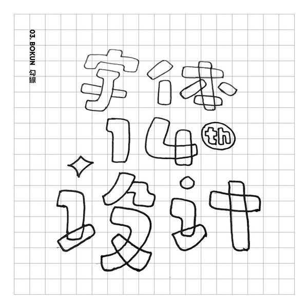
* 03. Hook line
Switch to a neutral pen to outline, that is, to determine the outline of the entire font. There is nothing to explain about this step. There is a problem with the shooting angle of the picture below, sorry.
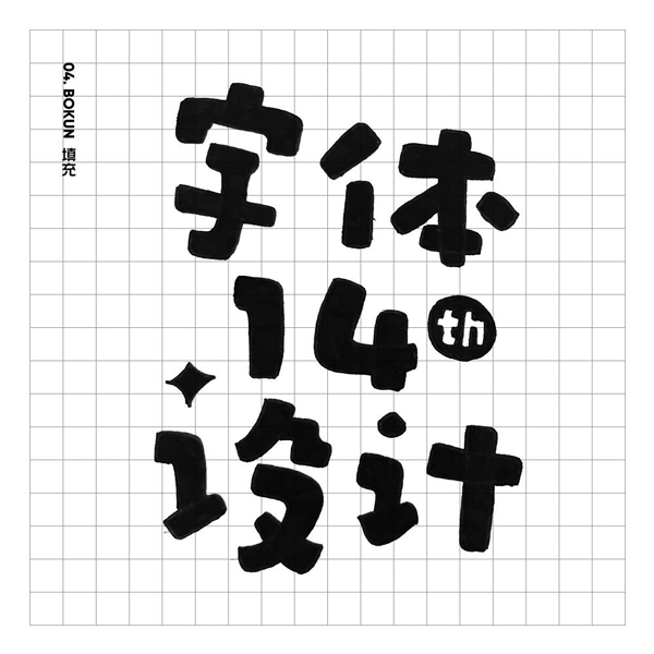
* 04. Padding
Fill in the color with a thicker pen. To be honest, this is my favorite step. You don’t need to use your brain to paint it and you will feel a sense of accomplishment, but be careful not to apply too much force.
As shown in the picture below, I have covered it all. If you want a mottled feeling, you can selectively leave it blank. Well, at this point the work on paper is complete, and the next step is vectorization.
* 05. Vectorization
Take a flat photo or scan the drawn words into a picture, and then throw the picture into the AI drawing board. Pay attention to keep the size of the picture, and try not to zoom too small. Select the picture in the software, click [Image Tracing] in the menu bar above, and then click [Extend] to complete.
As shown in the picture above, you did not notice that the outline of the font has become more rounded and smooth. Before the previous step [Image Tracing], you can do a little [Gaussian Blur] on the picture, if you want 100% Restoring the font on paper eliminates the need for this step.
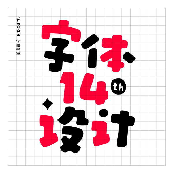
Is the method super simple? You can also use the same structural foundation, and a slight difference in strokes will make a huge difference. As can be seen in the picture below, the strokes are thicker, the space is more compact, and the colors have also been changed. Isn’t it more fun?
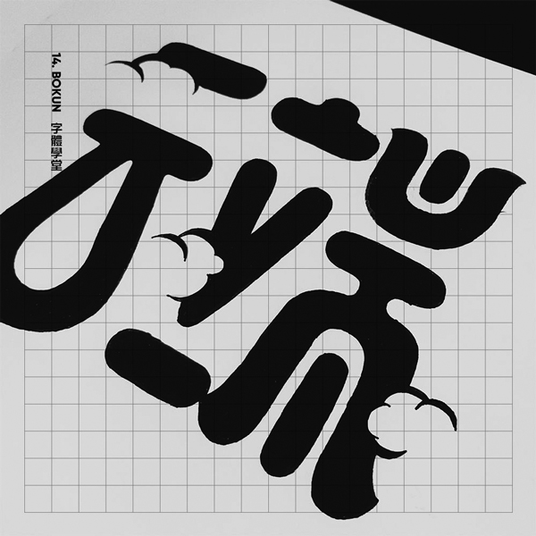
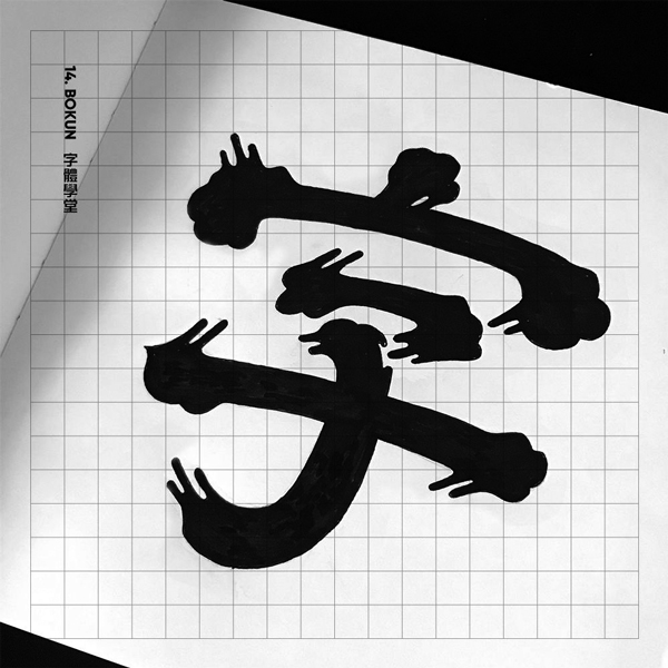
The following are a few texts made by the same method. They are all daily exercises and have not had time to vectorize. Compared with the words above, there are more graphical processing.
Articles are uploaded by users and are for non-commercial browsing only. Posted by: Lomu, please indicate the source: https://www.daogebangong.com/en/articles/detail/Deciphering%20handpainted%20title%20words%205%20steps%20couldnt%20be%20easier.html
 支付宝扫一扫
评论列表(196条)
测试