Click on the top blue word, Set me as a star ☆ bar


Yesterday, designer Chen Guanying shared on the website: Decathlon Chinese logotype transformation experiment
The French sports brand "DECATHLON" has many loyal customers in Taiwan because of its high-functionality, high-quality and low-cost products, and closeness to sports life, and the brand's logo also has a high exposure rate. This transformation experiment is aimed at the Chinese version of the logotype based on the characteristics of the English version, try to see if there is any possibility of optimization!
Design coordination + font design|陈冠颖 GYChen
Dynamic Vision|Ke Weiting DoryKo


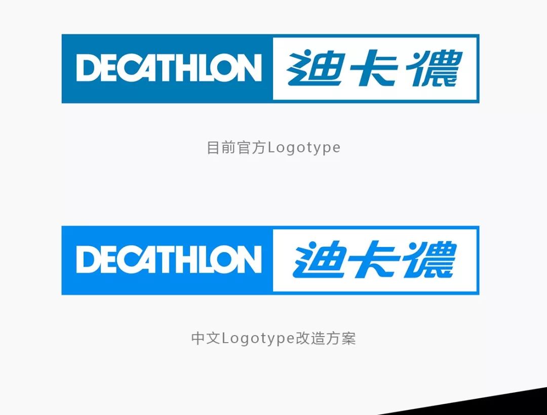
▲Decathlon's official website and official logo in China
▼Decathlon Chinese Logotype transformation plan
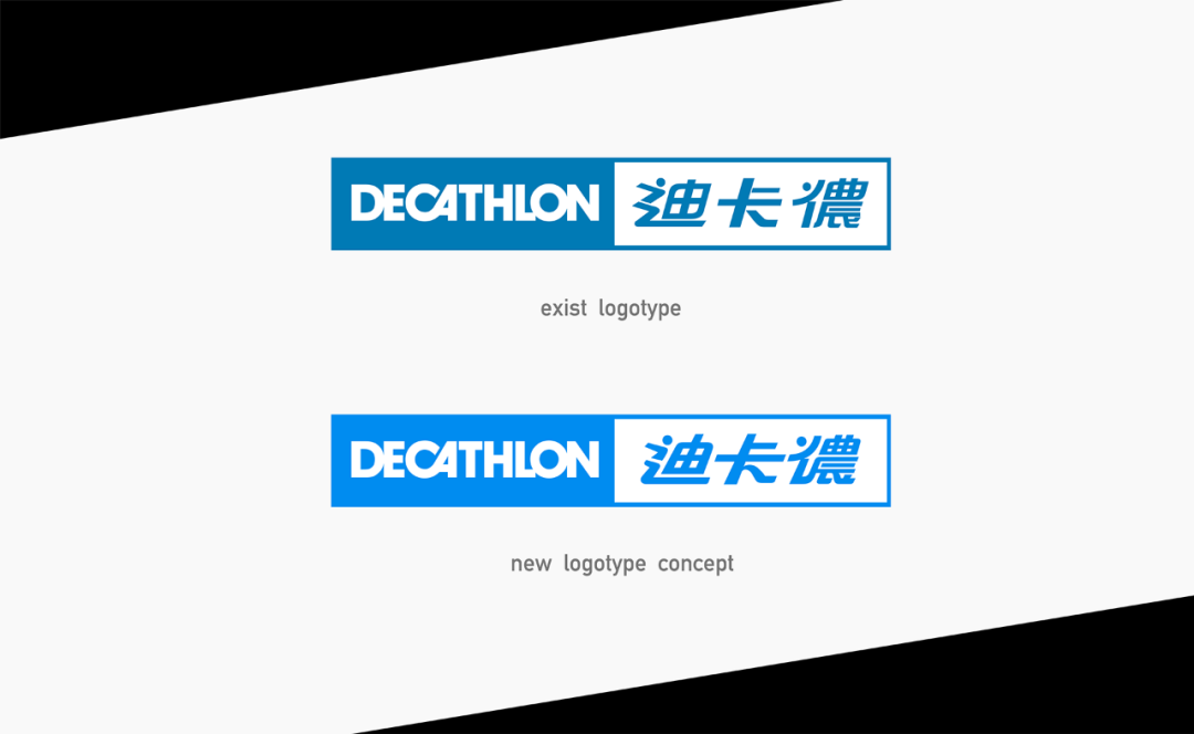
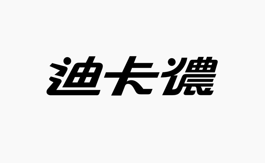
Official VS Experimental
Zoom in
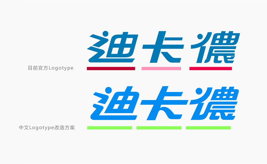
There are several places to discuss the original standard characters:
ㄧ, literal size rises and falls;
2. Uniformity of stroke thickness;
Third, the inclination is independent, and there will be a sense of frustration when reading visually;
Fourth, the overall concept is slightly disordered
Try to come up with solutions to these problems!
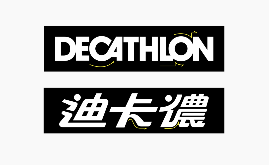
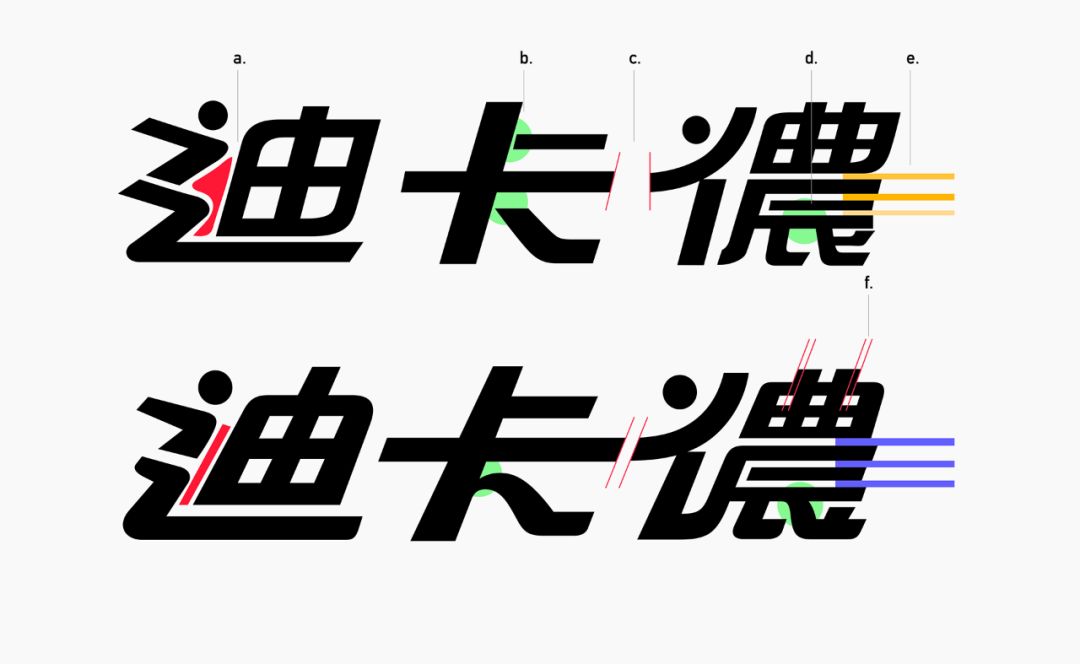
a. The negative space between the "辶" part and the "you" part is too large, and the structure of the characters tends to be loose, so it is reduced and designed as a strip-shaped space
b. Refer to the standard characters of the English version, reduce ambiguous breakpoints, and increase the stroke characteristics of links to bring out the dynamics
c. Unify the cutting angles of the two, increase the fluency of reading, and increase the coordination between words
d. Adjust the writing style of the strokes, so that the strokes have more space to be placed, and the visual experience is relatively stable
f. Use the characteristics of human visual illusion to fine-tune the thickness of the external strokes


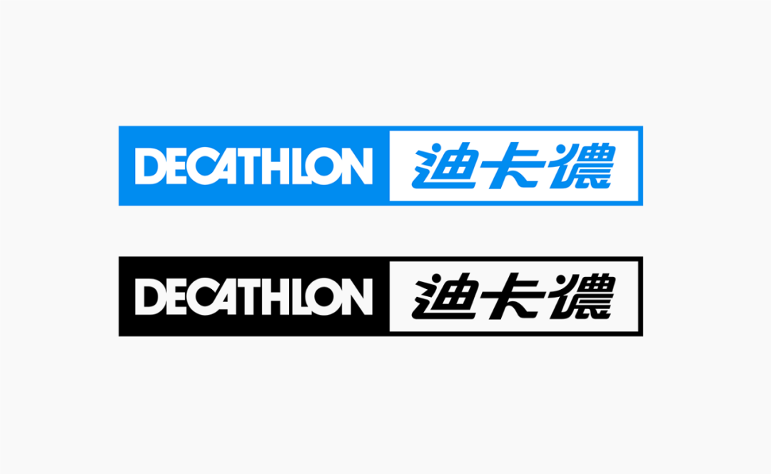

(The above is an experimental concept creation rather than an official version. The official version is mainly based on the official website!)
Tosee more work in progress, please follow:
Instagram: gy_chen

Do you like Decathlon's Chinese Logotype transformation plan?
****************
The copyright of the work belongs to the author
@Font design editor release

Farewell to Helvetica, the BBC fully replaced with a new custom font (with new word download)
Kashi Sato and the latest Logo design are actually four squares! ?
Analysis: Various details of the new Toyota brand upgrade, including custom fonts
U.S. government releases first custom typeface: PublicSans
How about buying this Japanese design book to add value to yourself
Articles are uploaded by users and are for non-commercial browsing only. Posted by: Lomu, please indicate the source: https://www.daogebangong.com/en/articles/detail/Decathlon%20Logo%20Chinese%20font%20transformation%20experiment.html

 支付宝扫一扫
评论列表(196条)
测试