 Running script is a style of calligraphy in our country. It has unique artistic charm and is appreciated and loved by many people. Nowadays, the pen calligraphy works of running script have very high characteristics, which have a certain influence on people's appreciation ability. The following are the high-definition pictures of cursive script calligraphy works compiled by the editor.
Cursive pen calligraphy picture display
Running script is a general term, which can be divided into two types: Xingkai and Xingcao. It was developed on the basis of regular script, a font between regular script and cursive script, which was created to make up for the slow writing speed of regular script and the difficulty in identifying cursive script. "Xing" means "walking", so it is not as sloppy as cursive script, nor as correct as regular script. In essence, it is the cursive of regular script or the regularization of cursive script. Those with more regular script than regular script are called "Xing Kai", and those with more cursive script than regular script are called "Xing Cao". Running script has high practicability and artistry, while regular script is a character symbol with high practicability but relatively insufficient artistry; in comparison, cursive script has high artistry but relatively insufficient practicability.
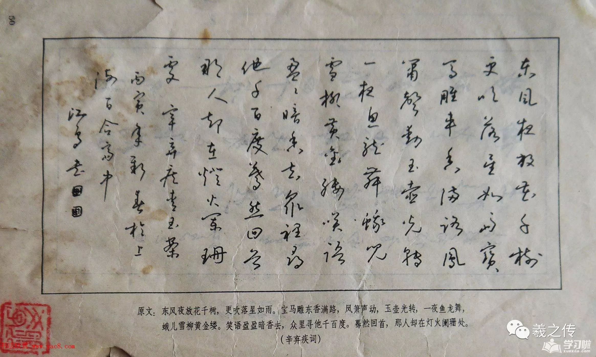
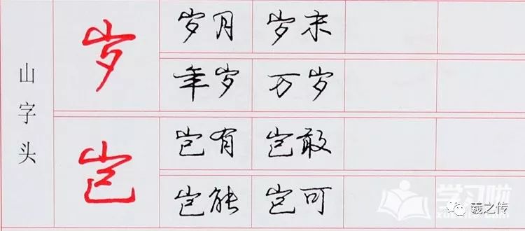
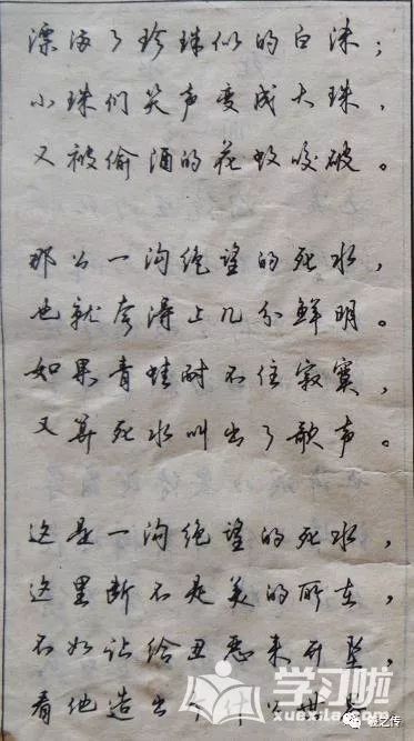
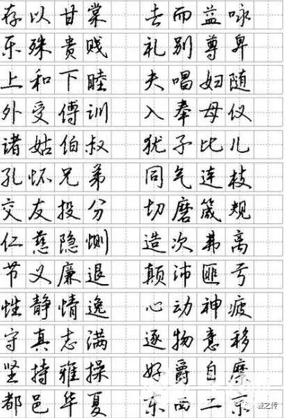
Appreciation of excellent pen calligraphy works in running script
According to Wang Sengqian's "Names of People Who Can Book in Ancient Times": "Zhongyou's books have three types: one is the book of inscriptions on stones, which is the most wonderful; Those who have heard of each other. Kaizi of Hedong Wei adopted Zhang Zhi’s method and used Kai’s method to make a draft. The draft is also a book of acquaintance.” From this, we know that Xingshu is also called Xingyashu, which was originally developed from the signature of the painting company . Those who hear about each other refer to pens, letters and letters.
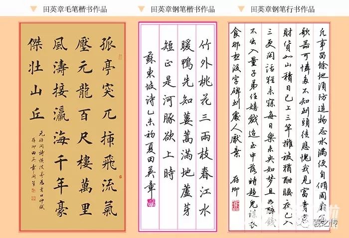
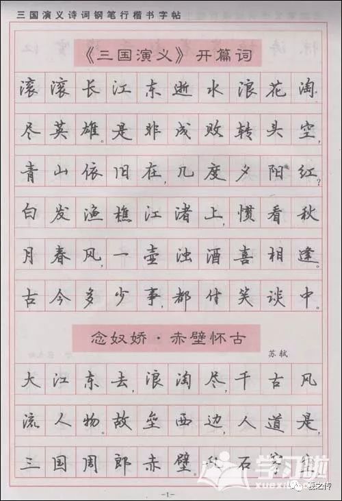
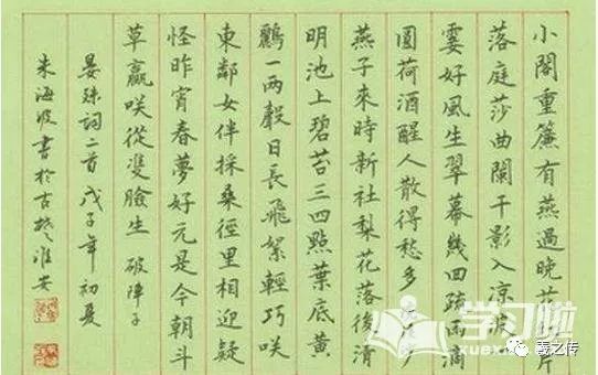
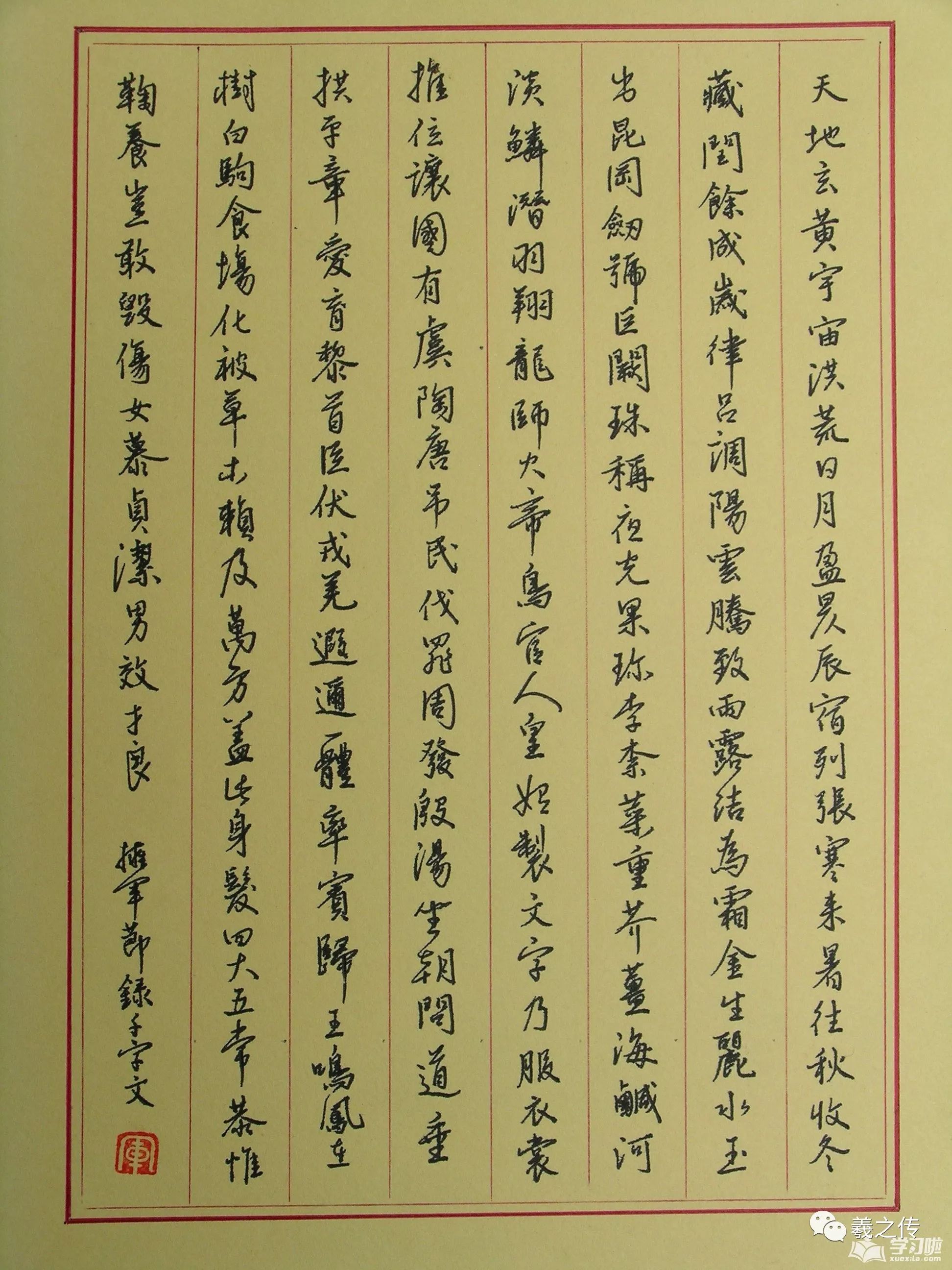
Structural features of running script
Both big and small. That is, each character has a different size, and there is a connection between the pen and the pen of a character, and the connection between the characters.
Combination of retracting and releasing. Generally, the short lines are closed, and the long lines are released; the back front is closed, and the side front is released; most of them are left and right, up and down, but they can also be converted to each other. It does not rule out left and right, up and down receive.
The density is decent. Generally, the top is dense and the bottom is sparse, the left is dense and the right is sparse, and the inside is dense and the outside is sparse. The central palace is tightly knotted, the smaller the blank space for the frame, the better, and the smaller the blank space for the circled strokes, the better. In the layout, the character spacing is tightly pressed, the line spacing is widened, and the characters are vigorous and colorful.
Blend of shades. Writing in running script should be relaxed, lively and quick, and master the combination of sickness and delay, movement and stillness. In the ink color arrangement, the first character should be thick, and the last character should be dry. The lines are long and thin, short and thick, appropriate in weight and shades. It's similar to cursive, but not as cursive.
Currently 100000+ people have followed us


Articles are uploaded by users and are for non-commercial browsing only. Posted by: Lomu, please indicate the source: https://www.daogebangong.com/en/articles/detail/Cursive%20script%20font%20pen%20calligraphy%20works.html

 支付宝扫一扫
评论列表(196条)
测试