
Chinese is the most beautiful, English is weak!
Variation of fonts. Fonts have various personalities, which are reflected in different stroke thicknesses, straight and straight lines, and dense and dense structures.
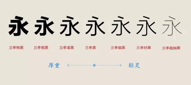 The thick strokes are thick, thick, and powerful, like a thunderbolt; the thin strokes are thin, light, and delicate, like a weak willow supporting the wind, which is the most direct and shallow impression.
Thick stroke fonts will form high-density text blocks in typesetting. This is because the strokes are thicker, the negative space of the font will be reduced, the visual area will be increased, and a sense of oppression will be formed, thereby forming a visual center of gravity and emphasis role. Therefore, bold fonts are often used in titles and slogans, occupying a conspicuous position and creating emphasis.
If the bold type is a burly man's shout, then the thin type is the soft language of Xiaojia Biyu's Wu Nong, speaking eloquently. Thin stroke fonts are lighter in visual area. After reducing the visual area, the negative space of strokes increases, and the structure appears clear and clear. The small visual weight will not make readers feel oppressed.
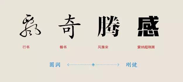 The curving and straight strokes of the font endow the font with strength and elasticity. Straight lines are cliffs, falling rocks, towering ancient trees, or vast plains, thousands of miles of clouds. Straight lines represent magnanimity, crispness, and courage, but they may also mean rigidity and paranoia. The straight line gives the font a masculine temperament, while the curve represents the feminine side. The curves are soft silk, floating clouds, and willows, and they are nine-curved ileum, which is more tolerant and tactful.
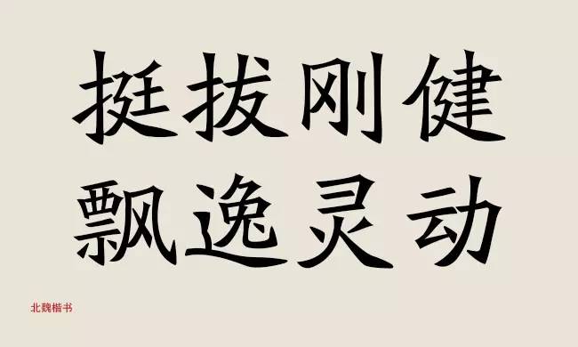
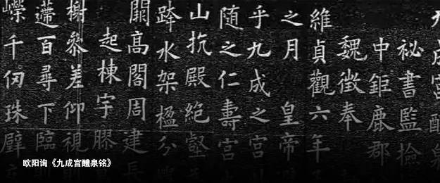
The vast majority of fonts are not composed of simple straight lines or simple curves. They are straight horizontally and vertically, and curved. For example, the starting point and the turning point of the regular script of the Northern Wei Dynasty are like cutting gold and breaking jade, crisp and neat, the whole font will appear upright, vigorous and heroic, and there are beautiful curves at the part of the stroke and the stroke. The more rounded, the more rounded. Elegant and agile.
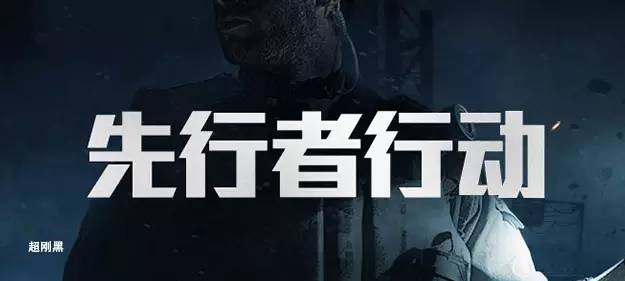
Super rigid black is a typical pure linear font. The thick strokes and sharp lines make the font have an unquestionable and resolute attitude. If the curve is removed, there is no room for maneuver.
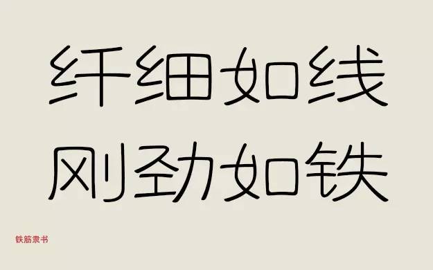
Any theory will have exceptions. For example, although most of the strokes in iron-bar official script are curved, there is a sense of power everywhere. Although slender as a thread, it is as strong as iron. In essence, it is because its radians are elastic. Adding radians to the horizontal painting will not reduce the rigidity, but will have a rebound force.
 The writing in daily life appears relaxed and lively, with a kind of casual and uninhibited beauty. However, written in temples, cast in bells and tripods, or printed in books and passed on to later generations, there is a kind of rigorous and dignified beauty. The essential difference is the loose and rigorous structure.
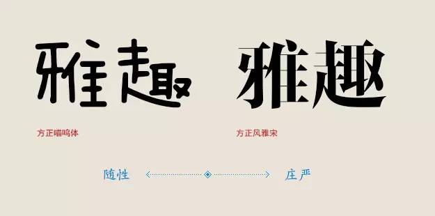
Innocence and liveliness are the nature of teenagers. There are not many rules in the children's world, and children's fonts are also immature and lively. Therefore, handwriting with loose structure is often used in children's subjects or in a relaxed and humorous reading environment.
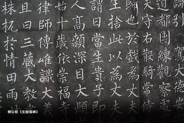
Regular script, as the name suggests, means a model, square and elegant, with precise and strict laws. It also symbolizes the standards of human beings in traditional Confucian culture, with good conduct and integrity. Therefore, regular script with strict structure is often used in solemn calligraphy or inscriptions.
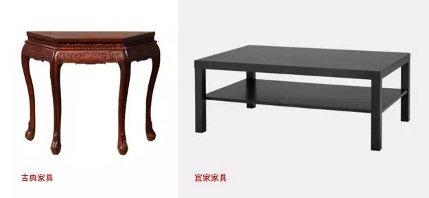
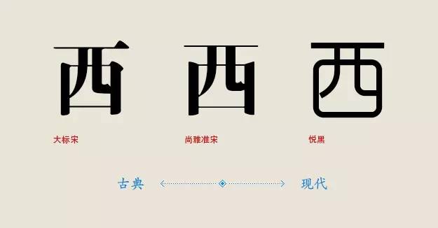 The simple and complex mentioned here are not simplified and traditional, but the complexity of stroke details. To take the simplest example, serif fonts are relatively more complicated than sans-serif fonts, and Arial is also more complicated than black fonts. Just as the complex and gorgeous patterns are typical features of classical furniture, and the simple and practical IKEA furniture is a model of modern life, the complexity and simplicity of fonts also represent the trend of classicism and modernity to a certain extent.
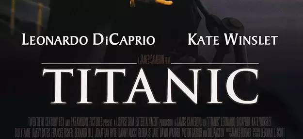
TrajanPro is an ancient Roman-style font, with rich details on the serifs and elegant arcs, and varying thickness of the lines. It was originally engraved on stone pillars in ancient Rome, and has a strong historical deposit, so it is often used in movies with classical themes poster.
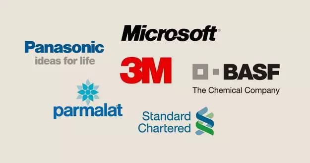
Helvetica is regarded as a typical representative of modernism in the font design industry. It is a classic sans serif font that strips away redundant details and uses standard geometric shapes as the structure. Instead, this typeface without any style becomes a style. The simpler and more modern, so it is often used in the logo design of modern enterprises, magazine layout, guide system, etc.
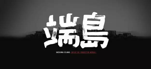
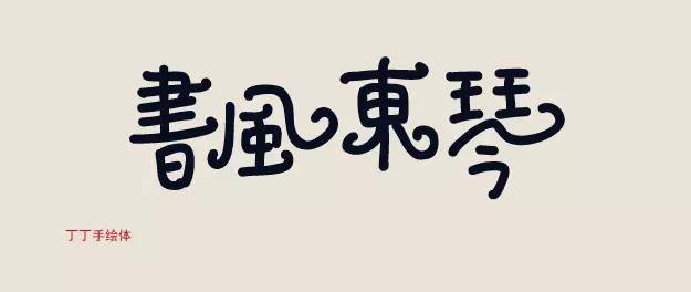
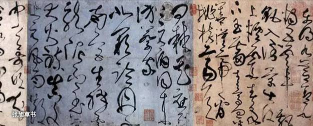 Different writing tools will endow fonts with different characters, and brushes endow fonts with rich texture and changeable lines, which may be graceful like a dragon or thunderous.
The brush endows the font with soft and gentle characteristics, and the characteristics of the knife technique are incorporated into the engraving on the stele, so that the lines have a sharp edge.
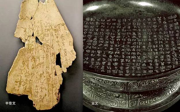
Oracle bone inscriptions and bronze inscriptions belong to contemporary fonts, but oracle bone inscriptions need to be engraved on the tortoise shell quickly after divination, which has a kind of uninhibited beauty. Bronze inscriptions are cast on bronze and placed on temples, so the structure is rigorous and regular, with a solemn and sacred meaning. Different tool carriers have different flavors.

Modern computer-aided drafting endows the font with the accuracy of lines and the standardization of components, which endows the font with modern and fashionable characteristics. But compared with other tools, it lacks some texture and agility.
So type design is not limited to computer screens or pen and paper, there are endless possibilities to experiment with different tools.
 In Chinese, there are often metonymy techniques. Women refer to women, and men refer to men. This is a highly generalized technique. Chinese characters are pictographic characters, and "landscape, sun, moon, wind, rain, thunder and lightning" are all highly pictographic generalizations of all things in nature. Modern font design incorporates the characteristics of other things into the glyph on top of the basic glyph, which is also a common font design technique.
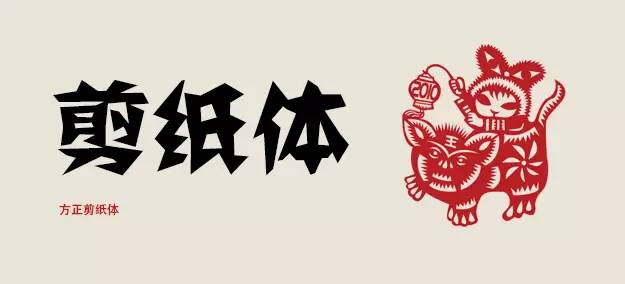
The paper-cut font incorporates the traditional folk art of paper-cut into the font, the angles are scattered, and the strokes are glued together. The irregular lines are playful and relaxed, and mixed with some ethnic styles.
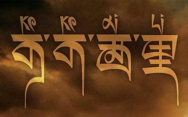
The movie "Koke Xil" integrated the style of Tibetan fonts into Chinese fonts, giving the fonts an exotic style.
Metonymy is to borrow the character of a thing into the design, and it often becomes the finishing touch of a work. If it is handled properly, it will have the effect of making a difference. Making good use of metonymy also gives fonts more possibilities.
Articles are uploaded by users and are for non-commercial browsing only. Posted by: Lomu, please indicate the source: https://www.daogebangong.com/en/articles/detail/Comprehensive%20interpretation%20of%20the%20mystery%20of%20Chinese%20fonts.html
 支付宝扫一扫
评论列表(196条)
测试