Font Classification System
The most widely used, systematic classification of fonts is the Vox-AtypI classification formulated by MaxmilienVox in 1954 and revised by the AssociationTypographiqueInternationale (International Typeface Association) in 1962. Among them, fonts are divided into 11 categories: see the definition on Wiki Vox-ATypIclassification.
The British Standards for Type Classification was published in 1967, based on a slight simplification of the Vox-AtypI classification.
Other rough categories include:
Bringhurst, the author of the famous font book Elements of Typographic Style, proposed a classification based on art history, such as Baroque, Rococo, and Romanesque. In the early days, French font artist Francis Thibaudeau divided fonts into four categories, Antiques (sans-serif sans serif), Egyptiennes (slab-serif flat serif), Didots, Elzevirs (triangularserifs triangular serif), which is the basis of Vox classification.
Classification of serif fonts
Humanist/Venetian
The beginning of Western fonts began in the middle of the 15th century (1400), and the Italian Renaissance began. Around 1465, printers began to use a font that imitated the handwriting of intellectuals and scribes for printing, drawing a line from the Blackletter used in early Gutenberg printing.
So the style of this era is named Humanist, or Venetian (Venetian), which mainly has the following characteristics:
It is developed from handwriting, so there is an obvious inclination angle on the axis of the lowercase o, and the same treatment on the horizontal line of the lowercase e. Other traces of handwriting include changes in font thickness, but the contrast is not exaggerated, and the x-height will be too small.

Representative font: Jenson (named after Nicolas Jenson, a designer who went from France to Venice.). Centaur, Guardi, Arno, ITCBerkeley, StempelSchneidler.
Garalde/Aldine/OldStyle
It is a style developed from the end of the 15th century to the 18th century. The name of Garalde comes from two famous designers: Calude Garamont in France and Aldus Manutius (GaramontAldus) in Venice.
In the style of this period, the handwriting style of the font is gradually reduced, the horizontal line of the e is completely horizontal, and the oblique angle of the o becomes less obvious. In addition, the thickness contrast in the font is strengthened, the x-height is also increased, the serifs are made more refined, and the overall design of the font is more proportionate.
The fonts in this style include Calson, Sabon, Palatino, Galliard, Janson (named by another Dutchman, Anton Janson).
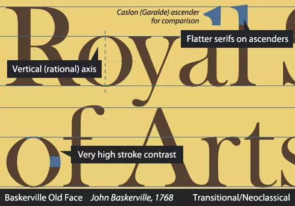
Transitional/Neoclassical/Realist
After gradual development from Humanist to Transitional, fonts have completely got rid of the influence of handwriting, and began to design independently and even use grids. In the late 17th century, Louis XIV also participated in the development of a set of fonts, made with grids, and was called "The Romain du Roi" (Roman Roman font), but the most famous designers during this period were John Baskerville and PierreSimonFournier.Baskerville After designing the font named after him, he got crazy ridicule from his friends.
Style features:
The e and o are completely straight, the contrast between weight and thickness in the letters is more prominent (even exaggerated), and the serifs are straighter.
Represents fonts: Baskerville,Mrs.Eaves,Melior,Clearface.
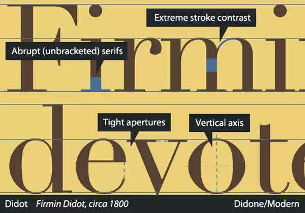
Didone/Modern
After the promotion of Baskerville, the French Didot (1764-1836) and the Italian Bodoni (1740-1813) pushed the design of serif fonts to complete extremes. Thick lines are extremely thick, thin lines are extremely thin, serifs are extremely flat, and openings are extremely small. Until now, these two fonts are still frequently used schemes for fashion magazine headline fonts.
Represent fonts: Bodoni, Didot, Basilia, Avaiano, Walbaum, Ambroise, ScotchRoman.
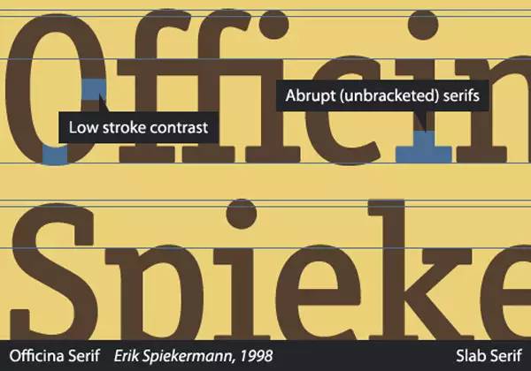
SlabSerif/Egyptian/Mechanicals
The main features of are: the thickness contrast is not strong, they are mainly used for advertising, and their identification is very easy. It's a flat serif.
Represents: There is no particularly famous font name, and there are Slabs in the general font name, such as MuseoSlab.
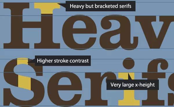
AbruptSerif
is generally a strong advertising font.
Represents: Clarendon, Sentinel, Belizio.
To summarize the distinguishing features of serifs:
Humanist: The horizontal of e is oblique, and the o is partial;
Garalde: the horizontal of e is flat, and the o is partial;
Transitional: o is vertical, the serif is simplified but not completely flat;
Didone: The serif is flat, the horizontal and vertical contrast is very strong, and the horizontal line is very thin;
Slab: The serifs are flat, but the horizontal lines are thicker.
Classification of sans serif fonts
A little history
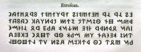
The earliest form of sans-serif fonts appeared on inscriptions, and it was used in Etruscan (Etruscan (Etruscan) also translated Etruscan, is an ancient ancient Italian northwestern Iraqi). Ancient people of the region of Truria, whose settlement was between the Tiber and the Janu.) Civilized. William Calson has done a lot of research in this area, the picture below is from his 1766 book:
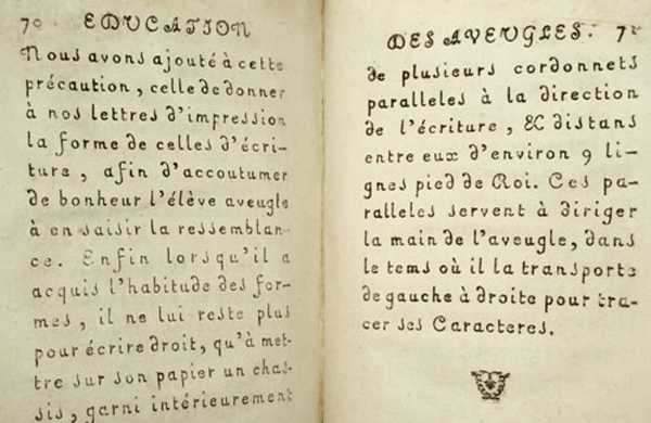
In addition, there is another faction that around 1784, Valentin Haüy made fonts for blind children. In order to facilitate the identification of fonts, the letters were simplified, and the fonts made were of equal width, much like handwriting.
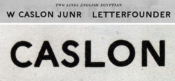
The earliest true sans-serif font was WilliamCalsonIV (IV), named Twolinesenglishegyptian. And only capital letters. (But still looks modern.)
It was Vincent Figgins who really called the font Sans-serif, and the inventor of the earliest Slab-serif.
Grotesque
The earliest sans serifs were called Grotesque mercilessly, with strange shapes. Usually appeared in the late 19th century to the 20th century. It has some variation in the width of the strokes, but is not influenced by handwriting. The most representative one is Akzidenz-Grotesk in 1896, and its descendants also include Neue Haas Grotesk and Univers.
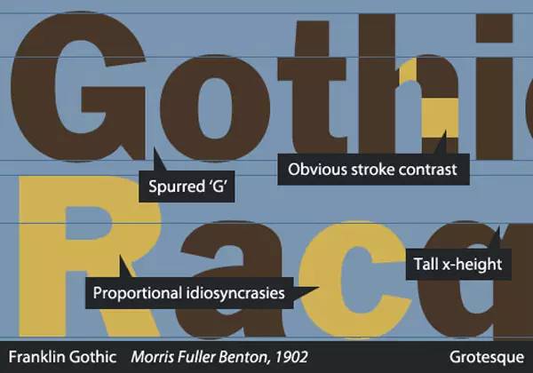
Its characteristics are: the bottom of G protrudes, the font stroke width will change, the x-height is high, and the characteristics of a certain letter will be reproduced in other letters in proportion. Anyway, immature.
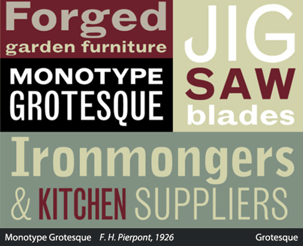
Represent fonts: FranklinGothic, MonotypeGrotesque, SchelterGrotesk.
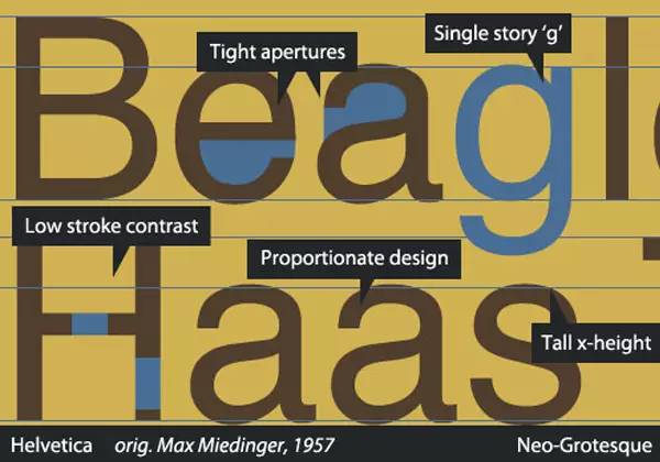
Neo-Grotesque/Transitionals/Realists
After continuous optimization, designers have removed a lot of redundant elements in the Grotesque style, especially the change of stroke thickness. The shape of the font is also more reasonable and beautiful.
features: almost no change in stroke weight, higher x-height, and narrower gaps for letter openings. Especially the design of the letter g is simplified.
Represent font: Univers, Helvetica(NeueHaasGrotesk), BellGothic, DIN1451
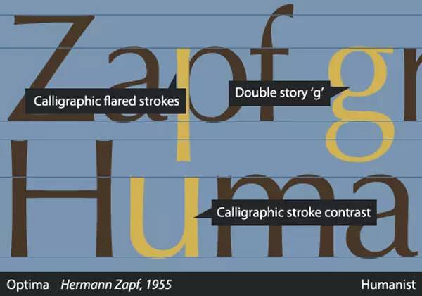
Humanist
Although Humanist is very important in the serif typeface and can be regarded as the origin typeface classification, it is characterized by handwriting, and the influence of earlier serif typefaces. And there are few characteristics of Grosteque fonts.
Features: The strokes of the font have the influence of handwriting, and the g is in a complex shape.
Represents: Optima, GillSans, Frutiger, Myriad, Trebuchet, Calibri
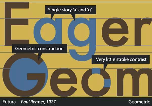
Geometric
It is characterized by designing letters completely from geometric shapes, so traces of circles and straight lines can be clearly seen. Jakob Erbar's Erbar-Grotesk established this style in 1920.
The features of are: a and g are in simple form, the stroke width is almost the same, try to use geometric shapes to form letters.
Representatives: Futura, Kabel, AvantGarde, Gotham
To summarize the distinguishing features of sans serifs:
Grotesque: The style is relatively vague, the strokes are uneven but do not imitate handwriting, the vertical of G is prominent
Neo-Grotesque: Simple form of g, uniform strokes, high x-height
Humanist: With the influence of handwriting, the stroke thickness changes closer to handwriting
Geometric: It can be seen that the combination of circle and square, a and g are simple forms.
Other Categories
handwriting
Represent fonts: SnellRoundhand, AshleyScript, ComicSans, MarkerFelt
Glyphic
Features: The fonts appearing in inscriptions usually have weak serifs, and most of them only have uppercase letters.
Represent font: Trajan (common in Hollywood fonts), FrizQuadrata
Blackletter
The style of the Middle Ages, Gutenberg invented movable type printing and is using it, full of Gothic style. When the Humanist font abandoned it, it was called Whiteletter because it saves ink.
Gaelic
A separate branch similar to Blackletter, used in Ireland.
Note: The content of this article comes from Zhihu, translated and organized by Cheng Zhida.
Font Workshop: http://makefont.com
Email contact: service@makefont.com
Subscribe to WeChat: Zizigongfang or makefont
Follow Weibo: @Zaozigongfang
Font Licensing: 400-860-5700
QQ: 350003556
Articles are uploaded by users and are for non-commercial browsing only. Posted by: Lomu, please indicate the source: https://www.daogebangong.com/en/articles/detail/Common%20sense%20of%20English%20font%20classification.html
 支付宝扫一扫
评论列表(196条)
测试