Article source network

The shape of fonts has undergone a long-term evolution process, and has formed a fixed pattern until now. However, with the development of human culture to a certain extent, conventional fonts are becoming more and more rigid. It has become one of the directions of modern design to deform fonts from different angles and give them new meaning and vitality.
At the same time, the main purpose of our font design is to convey accurate and clear information to users, so the key point of font design is to meet the requirements of the theme, reach agreement with the theme content, and not be mutually exclusive If the theme is determined, then the aesthetic feeling of the font can be considered, that is, to make the font more expressive and appealing, not only to convey the theme to the user, but also to move the user, To arouse the user's feeling of beauty, so it is the last word to transform the font.
Here I will share the grafting technology of font design with everyone, Baoxue Baohui, if there are some who are not well taken care of, please also ask Haihan... Hehe, let’s not talk nonsense, then I will start to teach others !
Before the battle begins, let's start with a good idea.

Transplanting flowers and grafting trees is a euphemistic term. To put it bluntly, it is grafting, which is to graft the branches of one plant onto the branches of another plant. Living prickly pears (spheres with various colors on top) and rhododendrons (flowers of several colors) are common examples.


The purpose of plant branch grafting and font gesture grafting is to make it unique, and they are all grafted from a to b, so the principle is the same.
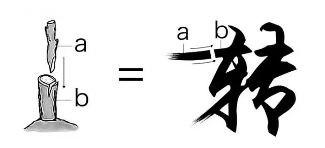

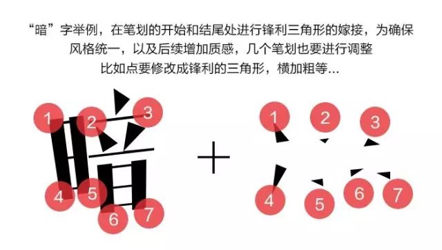
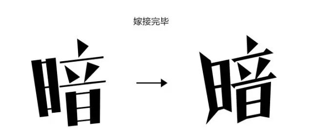
Typeface grafting must first understand its structure and combination form, that is, the ins and outs of strokes. The main parts of grafting are generally at the beginning and end of character strokes, so that the font will be more in line with the logic of the composition, and also It will make it appear more tense, and the middle area can also be slightly modified, which depends on the font.
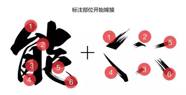
Take the calligraphy font 'neng' as an example. Before giving an example, I will complain. Many students asked me why handwritten calligraphy is different from the calligraphy in the special posters. In fact, the calligraphy-like fonts we often use are not Calligraphy in the true sense of reality, there are rules to follow in the true sense of calligraphy, the fonts we use have been modified, just feel like it, the purpose is to make it more tense and appealing.
So much has been said, please see the example. I believe that everyone can understand this diagram at a glance.
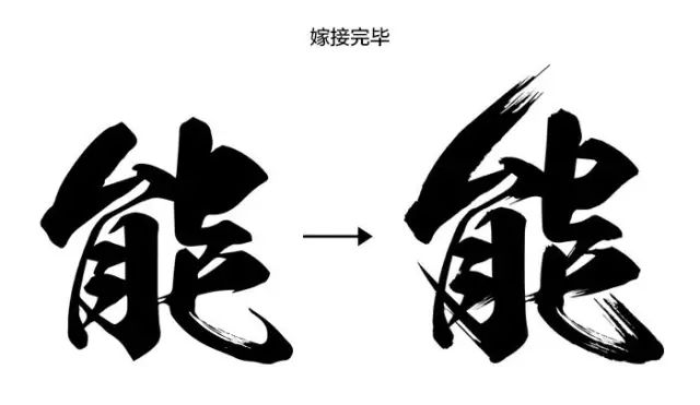
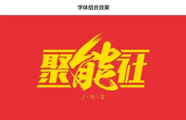
The calligraphy font on the top is RiWenMaoBi font, which itself is a relatively beautiful font. I can use material strokes (ink) in AI format or the strokes captured after converting calligraphy fonts into shapes. If conditions permit, I can also draw strokes by myself. As for strokes and brushes, is this a thing! Believe me, it really doesn't work.

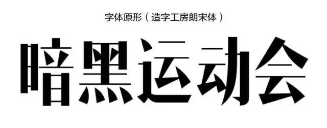
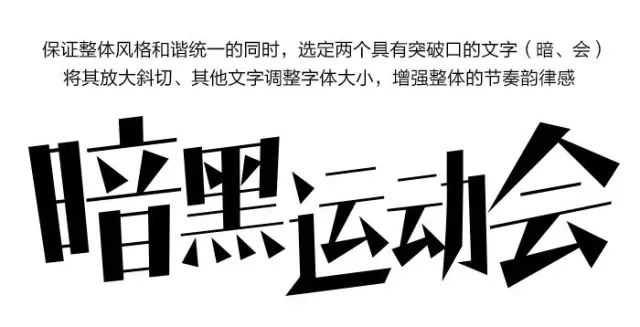
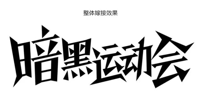
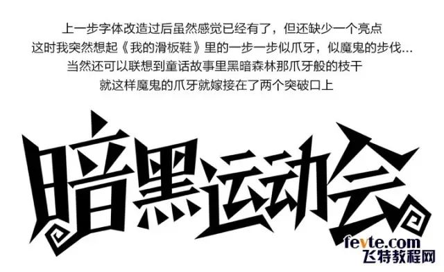
Next, I will analyze the cases I have done in my daily work. The first small case is a font design for the dark part of the team fun sports meeting. Our fonts are prohibited for commercial use, so they must be deformed before they can be used. It’s best to change them so that even their own parents don’t recognize them, haha, and the fonts look very plain and far from the dark style, which prompted us The desire to transform fonts, hehe... There is still a process of transformation before grafting!
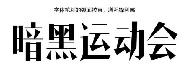
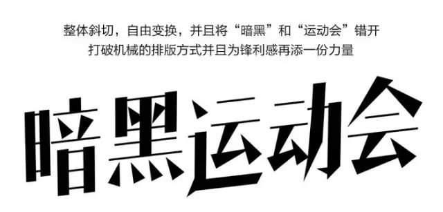
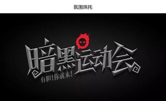
This case is not a pure grafting, there will be some deformation process before, but to make the font design reach a certain depth, it must go through twists and turns, only the font after thinking and constant adjustment can will be more flexible.
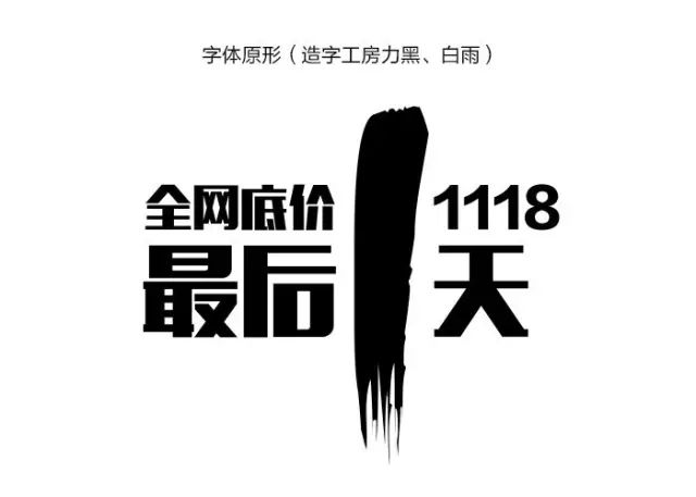
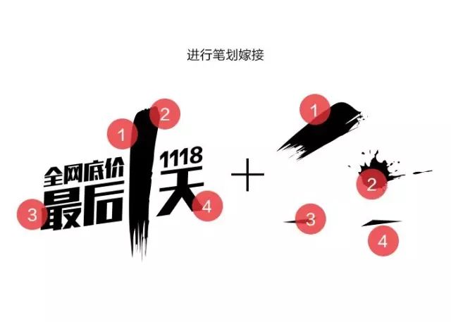
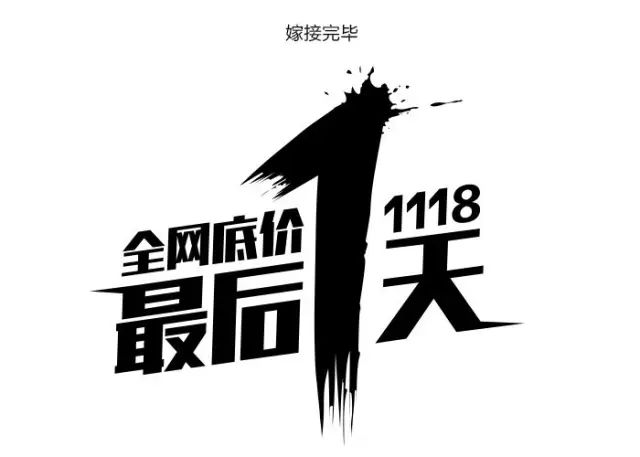
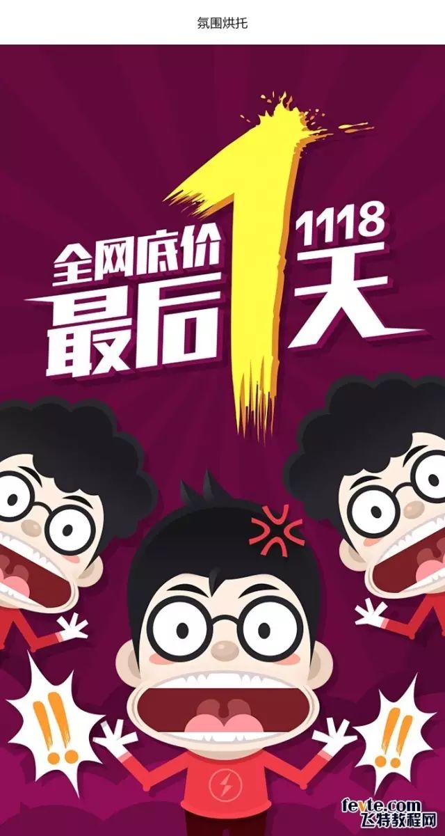
The second case is the font design of the startup page of the big promotion. Compared with the previous case, this font grafting will be purer and simpler. In order to leave a deep impression on users in seconds, it is necessary to transform the original font to make the font more tense, and at the same time create a sense of urgency for users, so as to arouse their desire to rush to buy.

If you are a worker in the advertising signage industry
Please identify the QR code above
or
Click to read the original text
Articles are uploaded by users and are for non-commercial browsing only. Posted by: Lomu, please indicate the source: https://www.daogebangong.com/en/articles/detail/Common%20routines%20of%20advertising%20font%20design.html
 支付宝扫一扫
评论列表(196条)
测试