
font effect is a very important design content in font design. After designing the basic glyphs, matching them with appropriate effects can not only make the font more design and attractive, but also communicate more effectively Font information to achieve better practical effects.
So, it is very important to be able to design fonts, and it is necessary to install X appropriately!

This series of tutorials will share with you the production steps of 10 types of common font effects. For experienced designers, these methods may not be complicated, or even a bit childish. But for many novice designers, it may be a brand new learning experience. In short, if you want to get the "routines" of these font design, please continue to read the text!
In order to avoid too long, let’s share the first 5 cases first, let’s go!

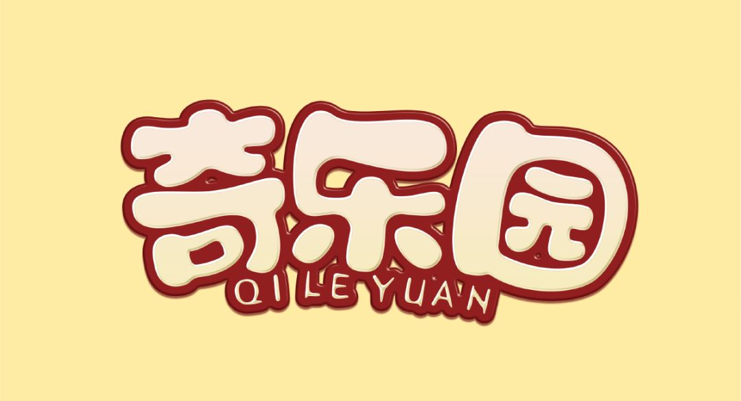

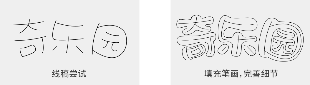
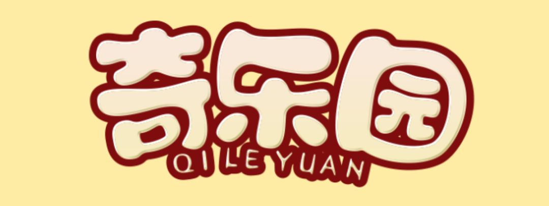
Qiyuan is a children's playground. The fonts of this kind of theme are generally more lively and cute. The characteristics of the font are obvious: small negative space, round and full strokes, we can try to draw first Finish the draft, and then improve the strokes and details:
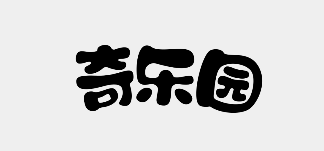

In AI, copy a layer in place, select the stroke tool, add an appropriate size outer stroke, after expanding in the "object", select the pathfinder, select the first option "link Set", and then place this layer behind the original font layer, so that two parts, one white and one red, are obtained:
Remember, there must be two parts, neither can be separated.
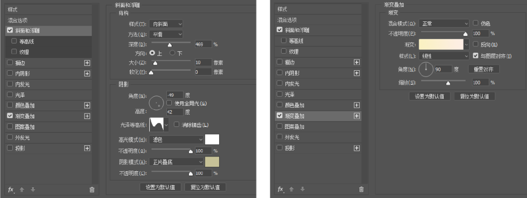
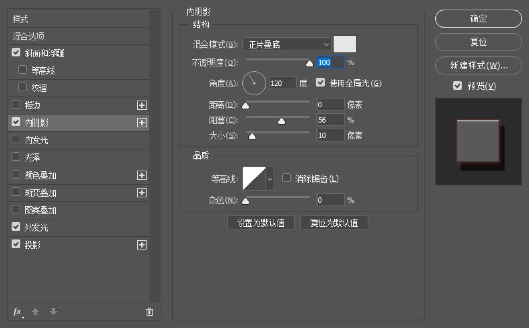
Then, build the document in PS, copy the original font layer in AI and the stroke layer just finished to PS in the style of "shape layer" (this There will be no AI at that time). Select the font layer, click the right mouse button, select Blending Options-Bevel and Emboss-Gradient Color, adjust the value, the value of the attribute is not fixed, just follow the feeling, just choose a favorite effect, the value in the figure below can be For reference:
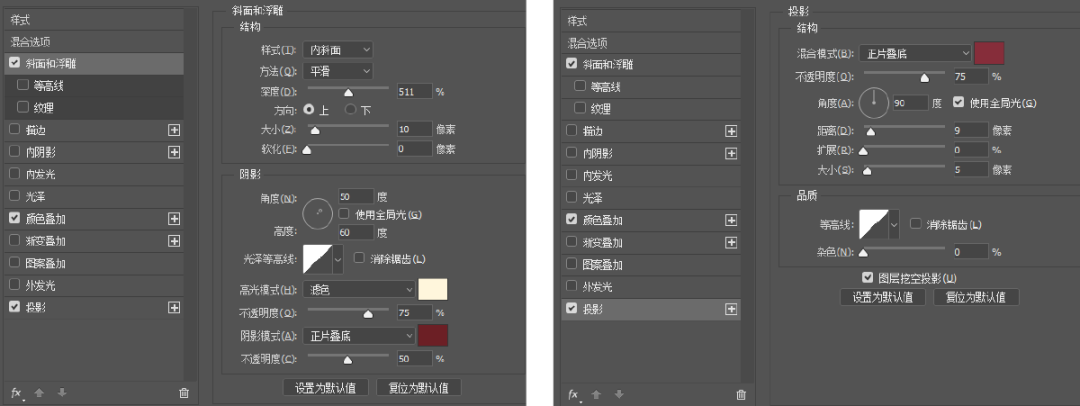
In the same way, continue to perform three-dimensional processing on the stroke layer, select Blending Options, Bevel and Emboss, Drop Shadow, and adjust the values, as shown below:
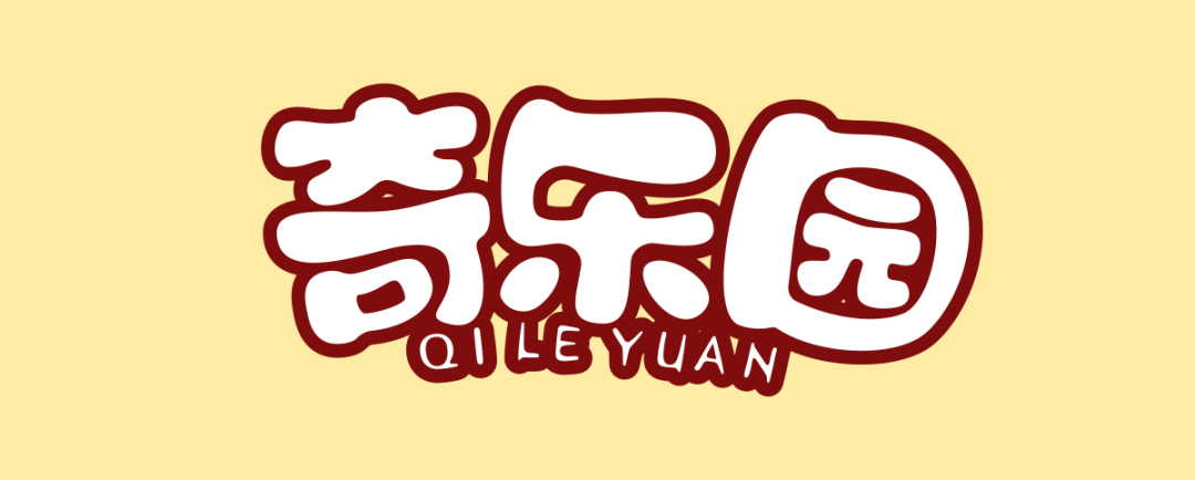
Finally, it's easy and happy to get it done!

You can zoom in a bit, let's take a look at the details:

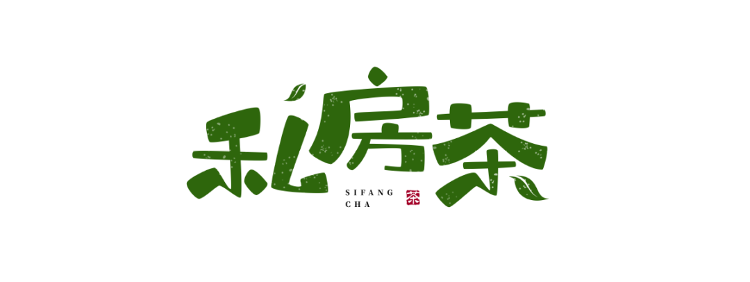
 Private House Tea is a tea shop. When designing fonts, I tried the feeling of handwriting, so that it will look more relaxed and comfortable, in line with the style and feeling of this theme.
In this typeface, the thickness contrast of the strokes is very obvious. The outer edges of the strokes are properly rounded. In addition, in the tea typeface, the graphics of tea leaves are also incorporated. These details will make the whole set of fonts More accurate, making the whole picture richer and fuller:
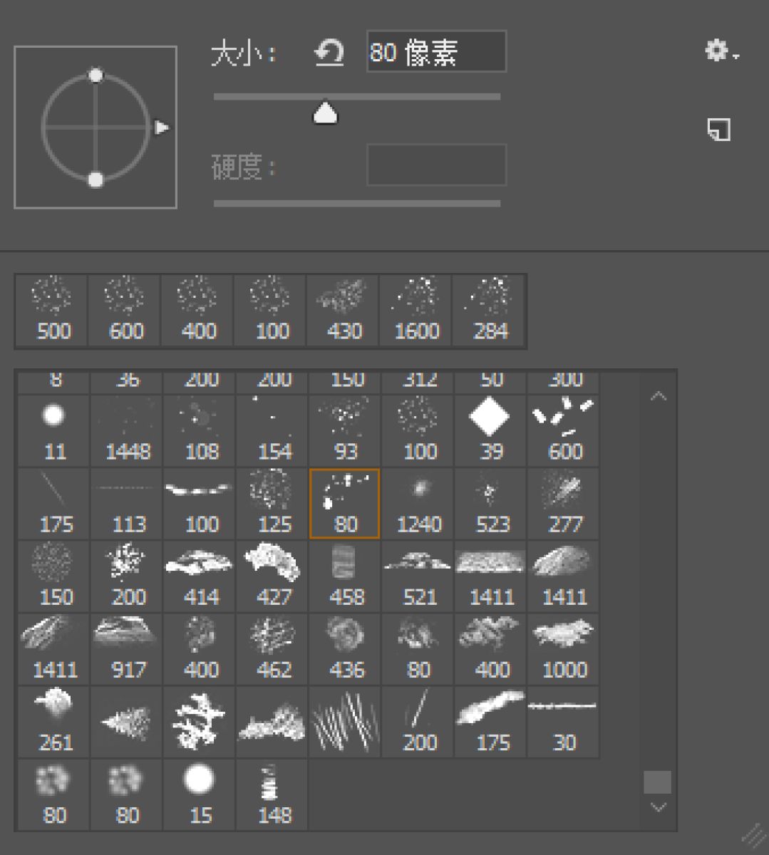
After determining the basic font, adding some texture effects to the font will make it more flavorful. Although this type of effect is relatively simple, it is also one of the commonly used routines. The method is as follows:
Copy the designed font into PS, carefully select a suitable brush (different brushes have different effects, you can try more here), the brush should not be too large, too large will appear rough At the same time, the texture of each character should not be too much. It is necessary to grasp the proportion, pay attention to the uniformity and layout of the texture, and repeatedly debug when doing it.
emmmmm~~~
Well, yes, this is also a small tutorial, a little short and a little too fast.
Look at the final effect again:
Here, let me say a few more words, the key to making this type of font is not the effect.
but...
You have to be able to design the first step!

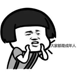
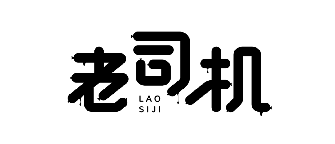
In AI, the basic font is built with the pen tool. As for why such graphic creativity is done, I will not explain it. After all, everyone is an adult and understands:
Copy this group of words, paste them into a new folder, open the layer panel (F7), select the "layer 1" layer, click the four-bar icon in the upper right corner - release to the layer (sequence): >
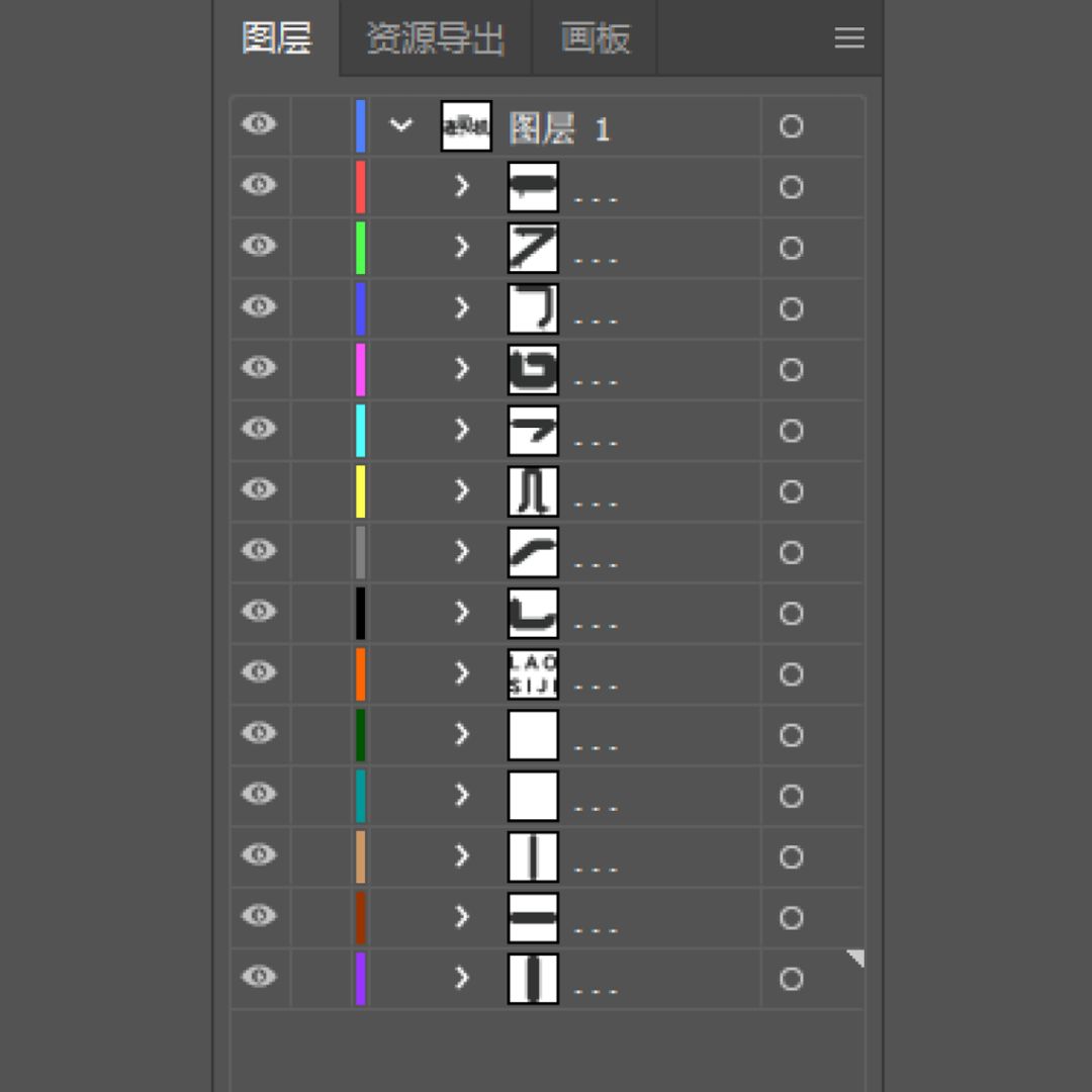
At this time, all the graphics originally in one layer are released and form a single layer.
Select the layer below "Layer 1", slide down to the bottom, hold down the Shift key, and click on the last layer. At this time, all the layers except "Layer 1" are selected. Drag these layers down. At this time "Layer 1" is an empty layer, just delete it.
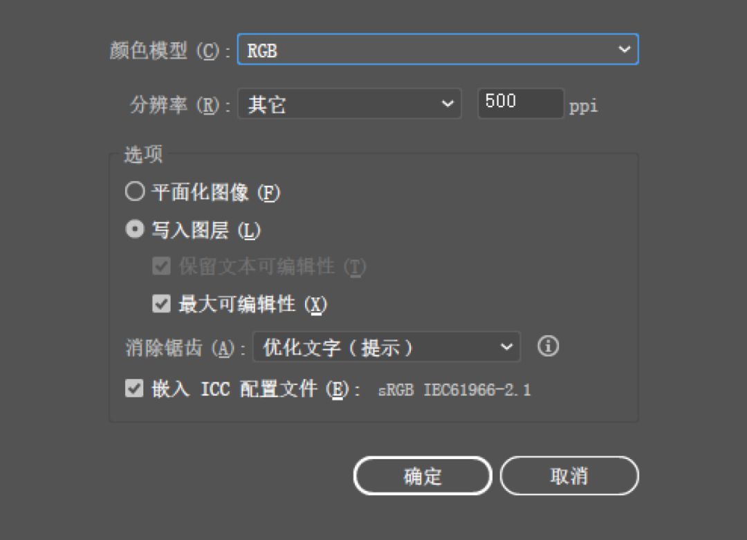
File-Export-Export As, Save Type: PSD, File Name "Layered Word", Export Options, Color Mode: RGB; Resolution: Other 500. Set the resolution according to the size of the finished word, try to make it as large as possible, click to write to the layer, and confirm.
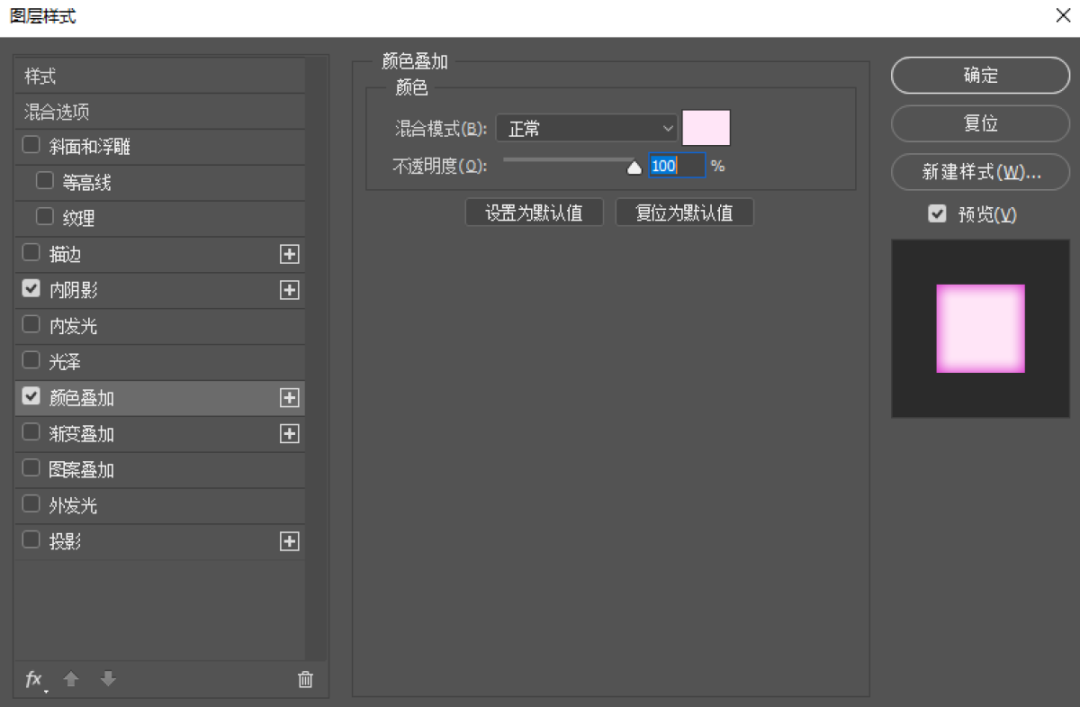
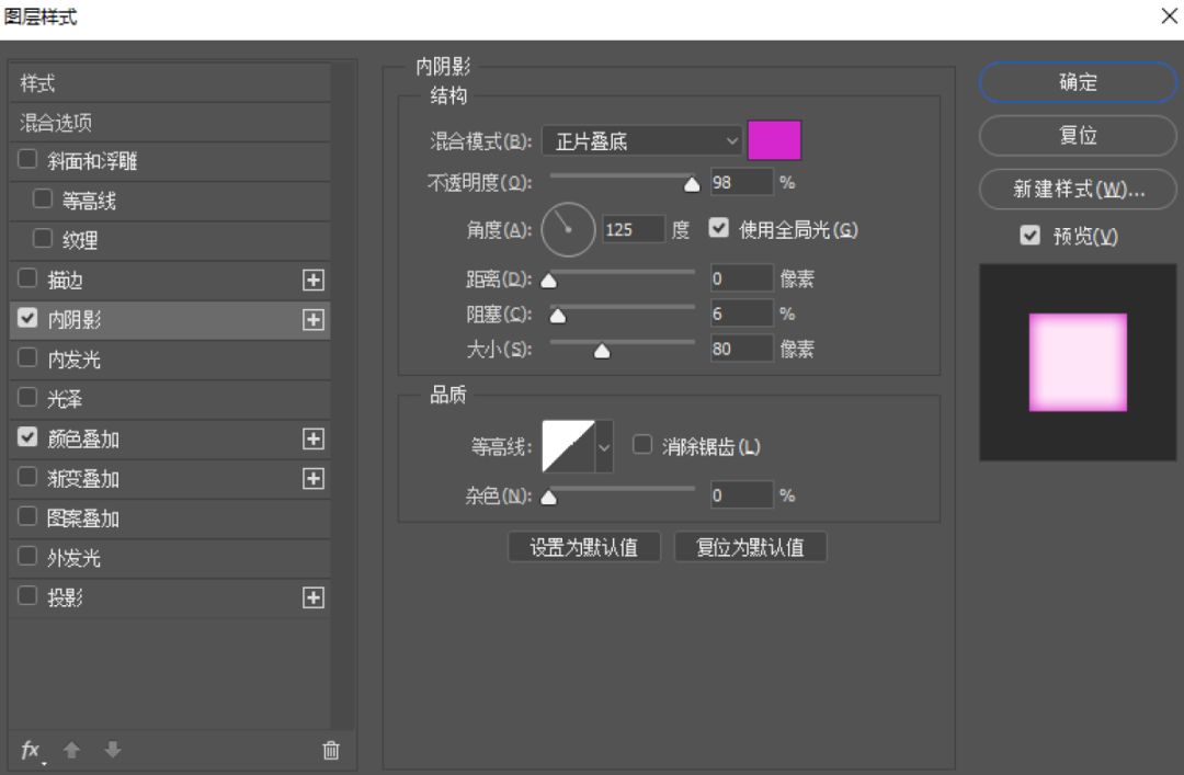
Open the PSD file, select one of the layers, click the right mouse button, select Blending Options - Color Overlay, select a bright pink, continue to select Blending Options - Inner Shadow, select a dark pink, the effect is as follows:
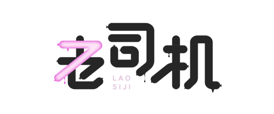
After making a stroke, hold down the ATL key and click the left mouse button, and drag the effects one by one to other layers.
Finally, add the highlight effect and you're done, isn't it very simple!

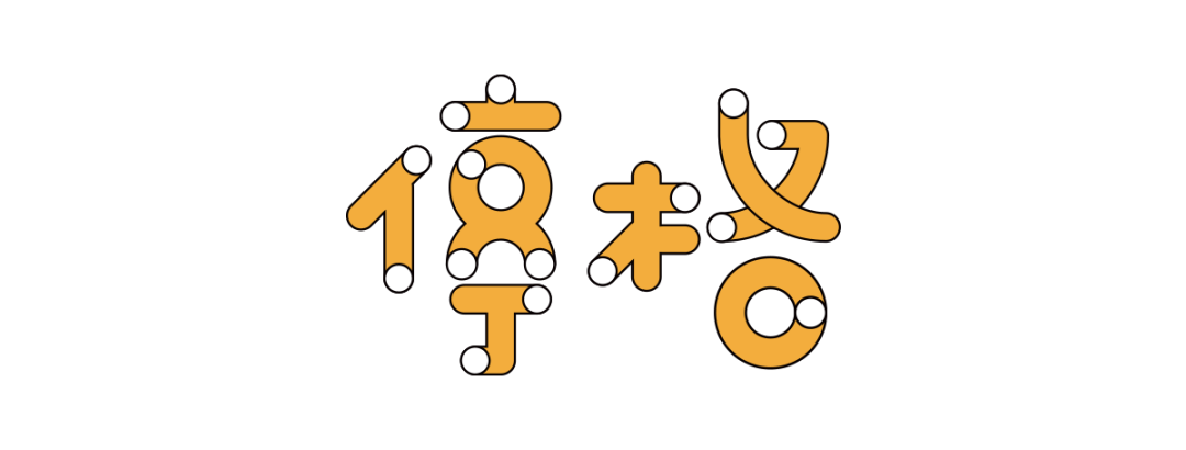
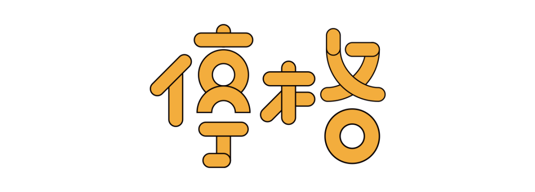
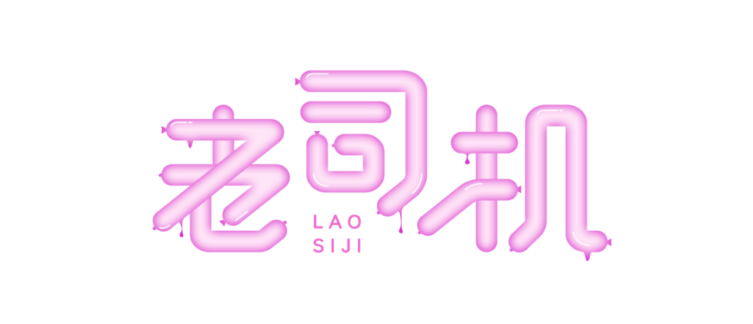
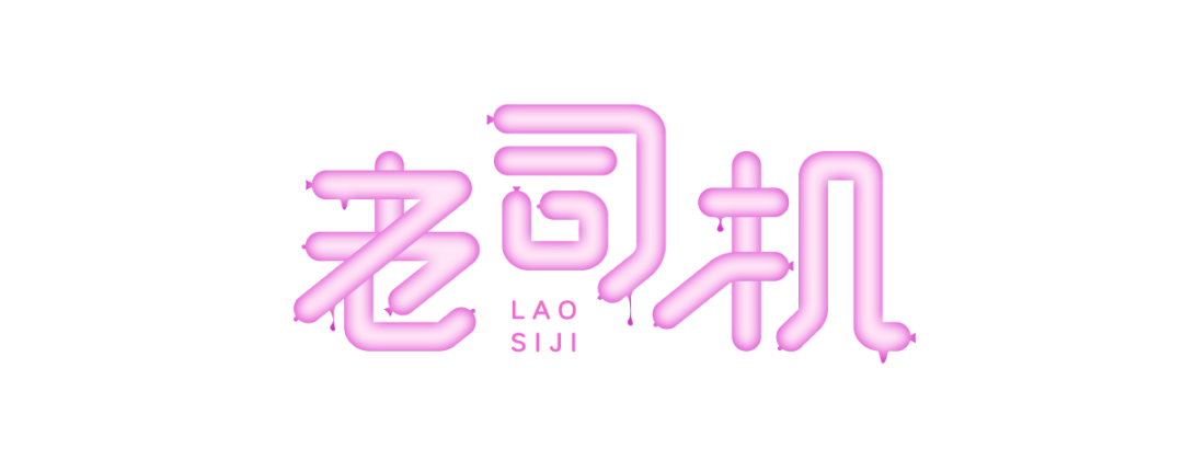
This kind of effect is also quite interesting, which means a bit contradictory space, and it is not troublesome to make. First, we use the pen to create characters to complete the outline of the font. We only need to pay attention to two details: 1, the round end point;2, rounded connection. After building the basic strokes, add a black outer stroke, the stroke should not be too thin, as shown below:
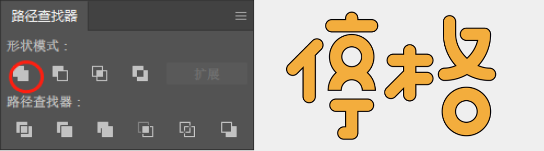
Select the pathfinder, and make a union at the place where the strokes intersect, as shown in the figure below:
Draw multiple circles with the same width as the stroke, white inside and black outside, the black stroke should be the same size as the original stroke, just cover the circle to the beginning or end of the stroke.
Well, this~~~ is really super easy, writing a tutorial is TM too simple!

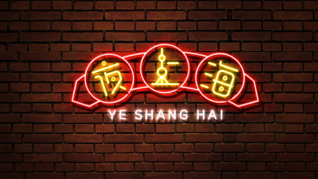
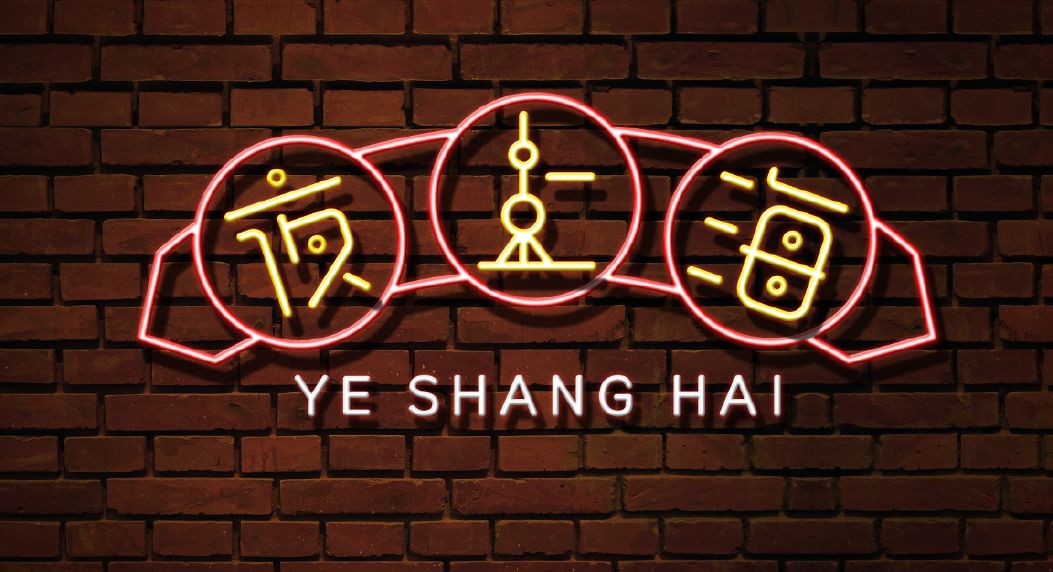
Seeing the proposition of "Night Shanghai", the scene of flashing neon lights will appear in my mind, so this group of words, I will use this effect! Let's do the basic font first, and then adjust the others:
Create an A4-sized file in PS, insert a picture of the background wall, and darken the background wall as a whole, especially the four corners. The color should be a little heavier, so that the light source can be focused in the middle:
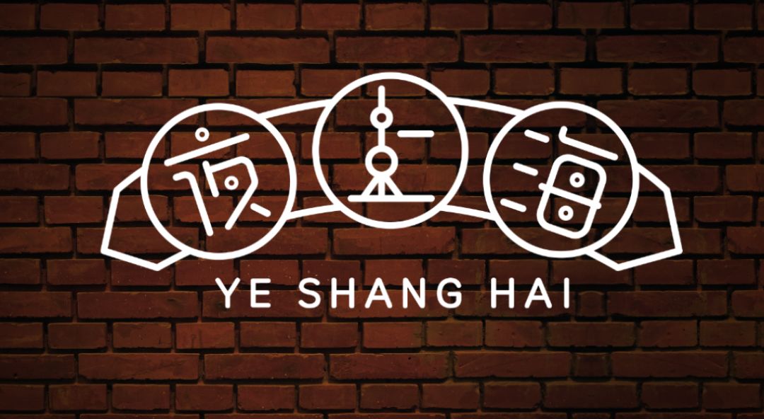
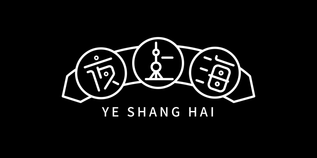
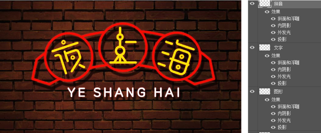
To copy the font designed in AI to PS, you need to layer the words, graphics, and letters separately, so that you can color them separately later:
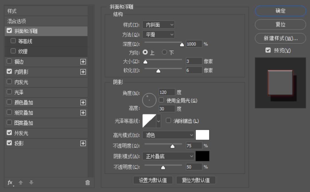
Adjust several effects in the blending options, namely Bevel and Emboss, Drop Shadow, Inner Shadow, and Outer Glow. Here I still want to emphasize the issue of attribute values. There is no fixed value, and you should follow your feelings until you achieve your favorite effect. The values in the figure below can be used as a reference:
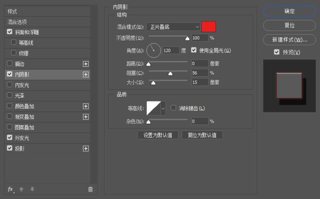
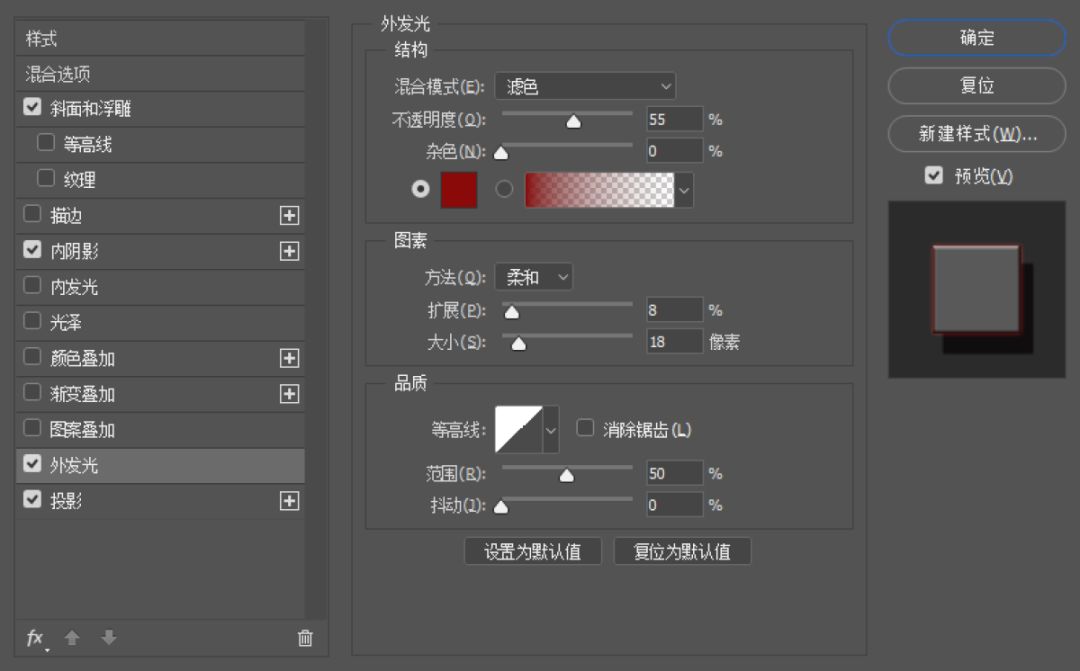
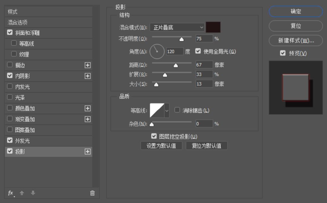
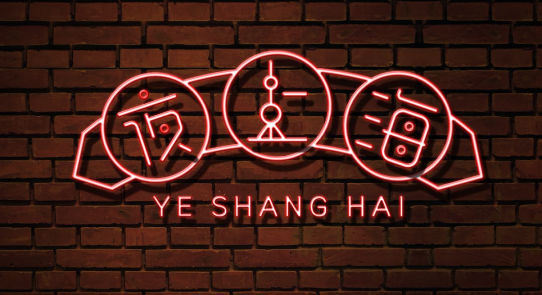
Adjust the inner shadow color of the Chinese and Pinyin layers respectively:
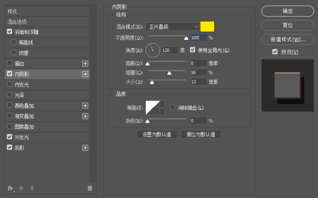
Chinese part
Pinyin part
Copy the graphics, fonts, and letters to a layer in place, turn off the layer effect, and fill them with colors:
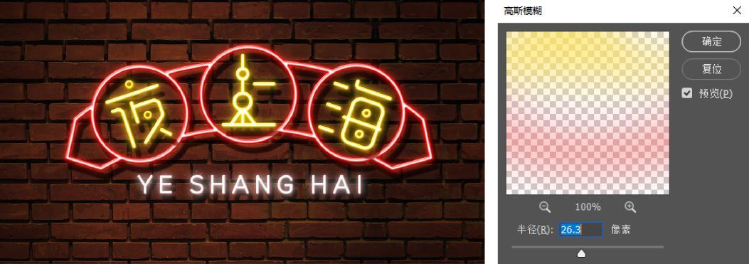
Merge the three layers just filled, click Filter-Gaussian Blur, and change the blending mode to Screen. If you think the color effect is too strong or too weak, you can copy a layer or modify the opacity to achieve it.
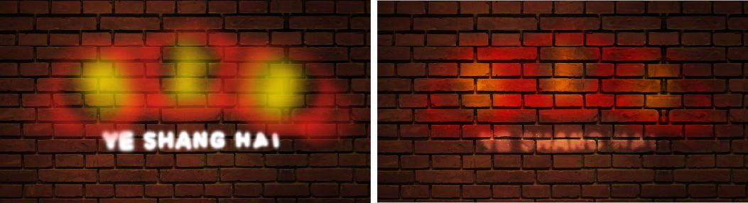
Add an ambient color, call out the brush, select a soft-edged brush, paint along the outline with the respective colors, and change the color mode to Overlay.
Finally, adjust the color as a whole to make it feel more comfortable, and you're done!


Okay, this series summarizes a total of 10 types of font design methods (tao) and method (lu). Today, the first 5 examples will be released, ok, BB is here, I hope useful to you.
Let's meet again next time!
August 5, 2019
Tutorial Li Mai & Editing: Liu Bingke
Articles are uploaded by users and are for non-commercial browsing only. Posted by: Lomu, please indicate the source: https://www.daogebangong.com/en/articles/detail/Common%20Font%20Effects%20in%20Font%20Design%20Part%201.html
 支付宝扫一扫
评论列表(196条)
测试