 When we make a large screen, in order to better distinguish the title and content and increase the sense of design hierarchy, we need to distinguish the fonts, so what kind of font is suitable for the large title? Subtitle? Content? Number?
This article will share with you some fonts suitable for large screens, and distinguish fonts based on past design experience. The acquisition method is at the end of the article~The acquisition method is at the end of the article~The acquisition method is at the end of the article~< /strong>Say important things three times.

1. Prefer the title body
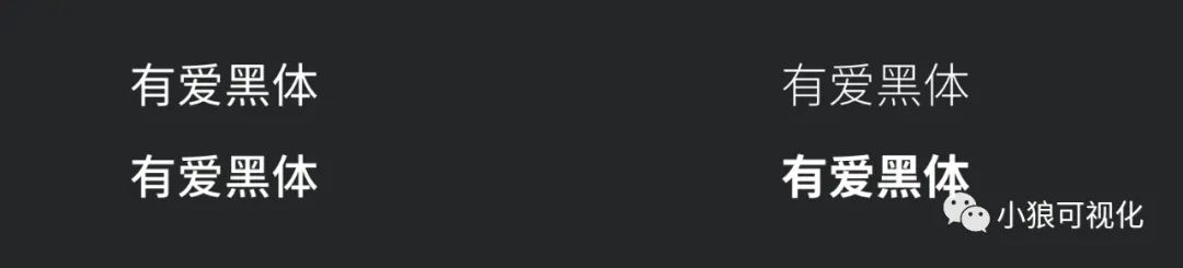
A very recommended font, the font size is usually: 40~44, because the word spacing of this font is relatively close, so you need to adjust the word spacing when using it, the recognition effect will be better Even better, some projection and lighting effects can be added according to the actual situation. Of course, this font can also be used as a secondary heading.
2. Station Kuqingke Butter BodyA relatively round font, the font aspect ratio is relatively high, so it is necessary to increase the font spacing when using it to balance the font aspect ratio. 3. The font circle is happy to crown bold
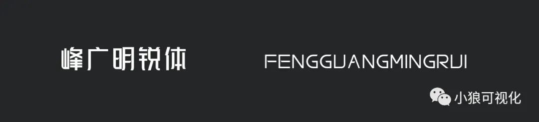
A tough font, suitable for large screen applications with technological style and mechanical style. If you add some strokes and luminous effects, it will present a better visual effect. 3. Betta Fish Chaser
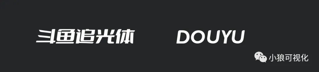
A font with personality, suitable for large medical screens. The English font display effect is also very good-looking, and it is also very suitable for decorative or digital use. 1. Pangmen Zhengdao title bodyThis font size is smaller than the normal font size, and it is a relatively square font. When using this font, the headline and content should also be as tough as this font style , so that the style will be unified, this font is also suitable for use as a headline. This typeface is more suitable for the title: Youset the title in black, one thick and one thin, and the layers are obvious. And this font can also be used with numbers. 3. Demonstrate italic boldSuitable for index title fonts, it is recommended not to use too much, or it will be heavy and more prominent. 4. Zhanku high-end black revisionIt is somewhat similar to Pangmen Zhengdao font, relatively square.
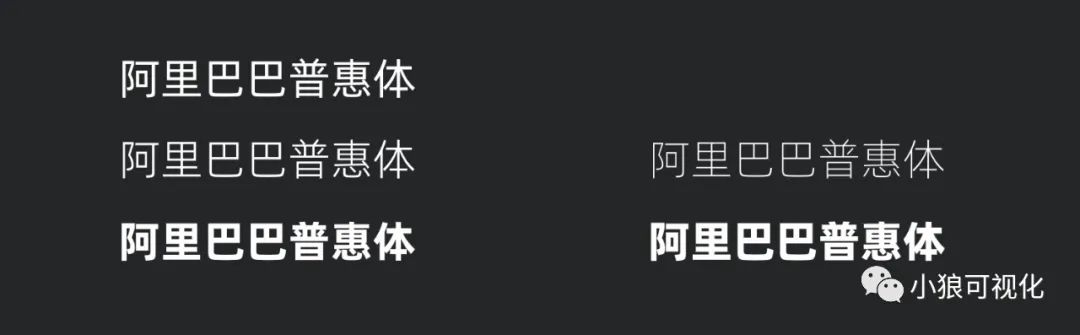
A strongly recommended font, Chinese and English effects are very good, very similar to Apple fonts, the biggest advantage is that the font file is very small, about 200k. 2. Alibaba Inclusive Body
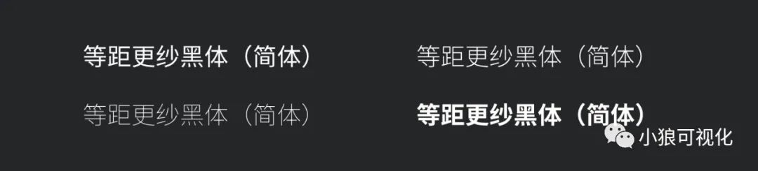
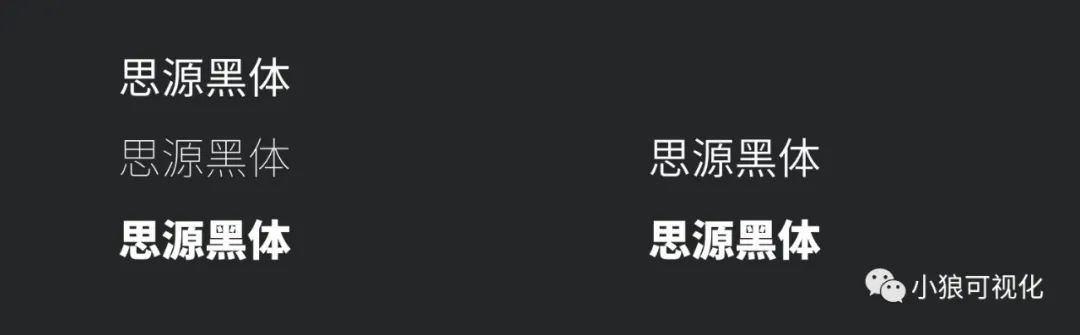
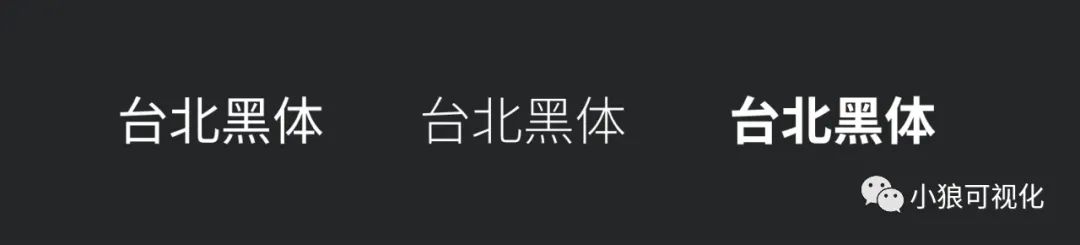
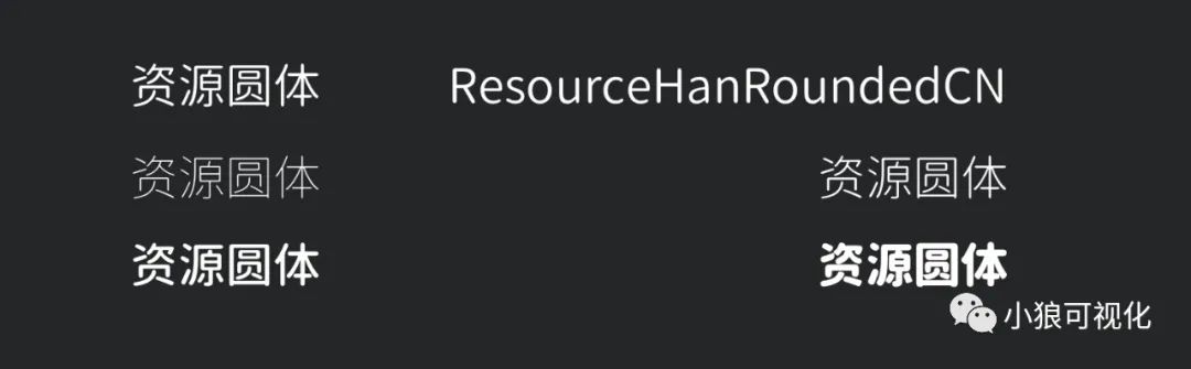
Similar to Apple fonts, but because Apple fonts are not commercially available, this font can replace Apple fonts, and the English effect is not bad, it is recommended to use. 3. Equidistant black body (simplified)< /section>Compared with the above two fonts, the font height is slightly lower, and the other changes are not particularly large, but the font file of this font is relatively large, one is about 20M , everyone chooses to install. 4. Hu Xiaobo is really handsomeAs the name suggests, it is a handsome font. Siyuan HeiTi and Alibaba Puhui Font are very similar in style, but there are Thai and Vietnamese in the Alibaba Puhui Font package (not useful), and you can use it according to your preference. A bit like a square font, the disadvantage is that the file is too large, about 20M.
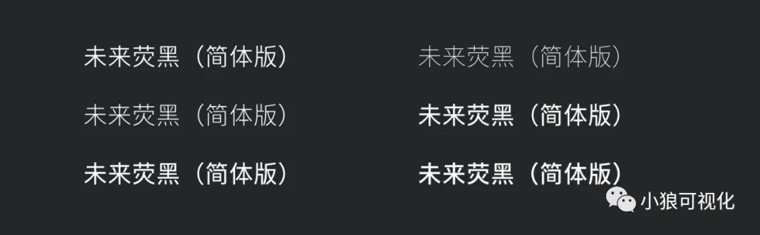
7. Future Black (Simplified)A font with a relatively complete font style, which belongs to the same category as Pingfang, Microsoft Yahei, and Siyuan Hei.
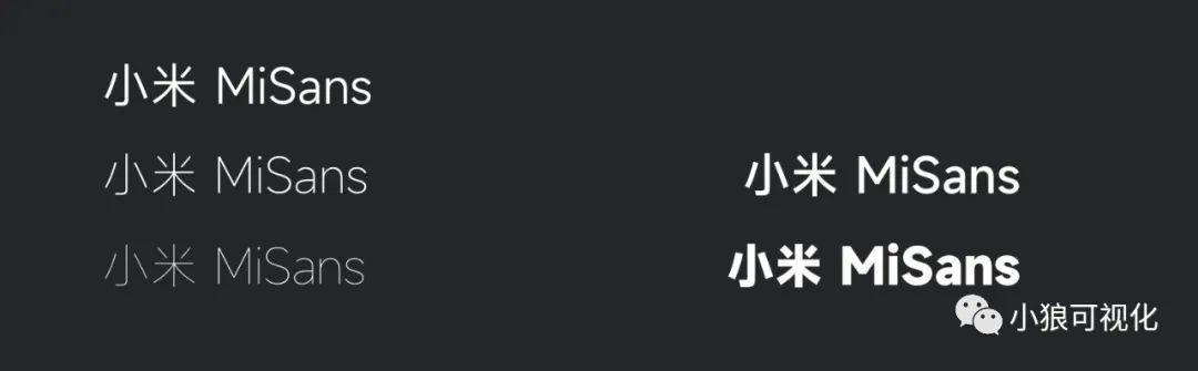
Xiaomi’s fonts are pretty good in my personal opinion. Even if the big screen is not used, it can also be used on posters.
There are three types of fonts in this font: Youai Heiti, Youai Ruifang, Youai Xinhei (simplified version), all of which are in the download file. 10. Zhanku Literature and ArtThe content font is suitable for some simple index items, and it is suitable for use in combination with Zaku high-end black body. It can be said to be a smooth version of Pingfang font. Obviously, suitable for assistive English fonts.
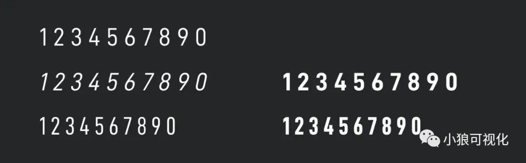
There is a DIN font, which belongs to the same category as this one, but DIN fontbody is not commercially available. It is recommended that you try to use this font for digital text< span>D-DIN. < /section>OPPO fonts belong to the same category as Xiaomi’s fonts. Both numbers and English are more suitable. Of course, the Chinese effect is similar to Siyuan Heiti, and it can also be used as content. Advantages: the file size is smaller than Xiaomi and Siyuan Heiti, Within 2M.
Summary: It is not absolute about where the font is suitable for use, but it is just a conclusion based on my own past experience analysis. It is recommended not to use too many fonts for each large screen, about 3 is enough, otherwise it will look messy. But these fonts are really good, suitable for everyone to download.
Obtaining method ~ reply: font
Obtaining method ~ reply: font
Obtaining method ~ reply: font
Articles are uploaded by users and are for non-commercial browsing only. Posted by: Lomu, please indicate the source: https://www.daogebangong.com/en/articles/detail/Commercially%20available%20fonts%20to%20share.html


 支付宝扫一扫
评论列表(196条)
测试