The popularity of commercial logo typography can be attributed to its importance in brand image and visual communication. A good business logo can convey the personality, characteristics and values of the brand through font design. Here are some tutoria


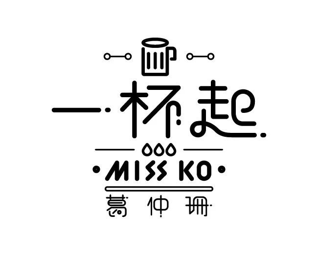
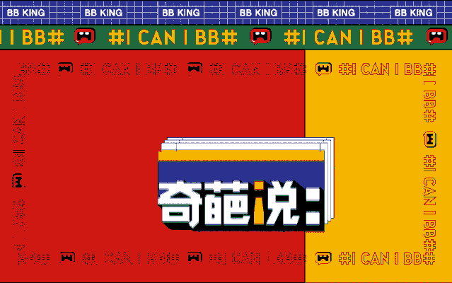
Commercial LOGO font design tutorial-There is a password at the end of the articleRecently The debate topic of "The Story of Strange Flowers" has been trending on Weibo again. It has to be said that just relying on Cai Kangyong, Li Dan, Ma Dong, and "wonderful" debaters like Ru Jing, Fan Tiantian, Fu Seoul and other "wonderful" debaters, they can attract a large number of post-80s and post-90s fans. Therefore, it is not surprising that the reading volume of Weibo topics has exceeded the 1 billion mark. This time we are not focusing on his topic, but on hiscommercial LOGO font. The LOGO of this season follows the font design and layout of the fifth season (2018), and is in A dialog window with distinct layers is added behind the text to display and transmit information to everyone. Using the colon ":" as the most direct language graphic symbol design, it can effectively convey information and express the views that every wonderful thing wants to express. In addition, the radical "讠" of the word "Shuo" is replaced with an inverted exclamation mark "!", which reflects the emotion and tone in the wonderful debate. 01. Why is the font design so popular?
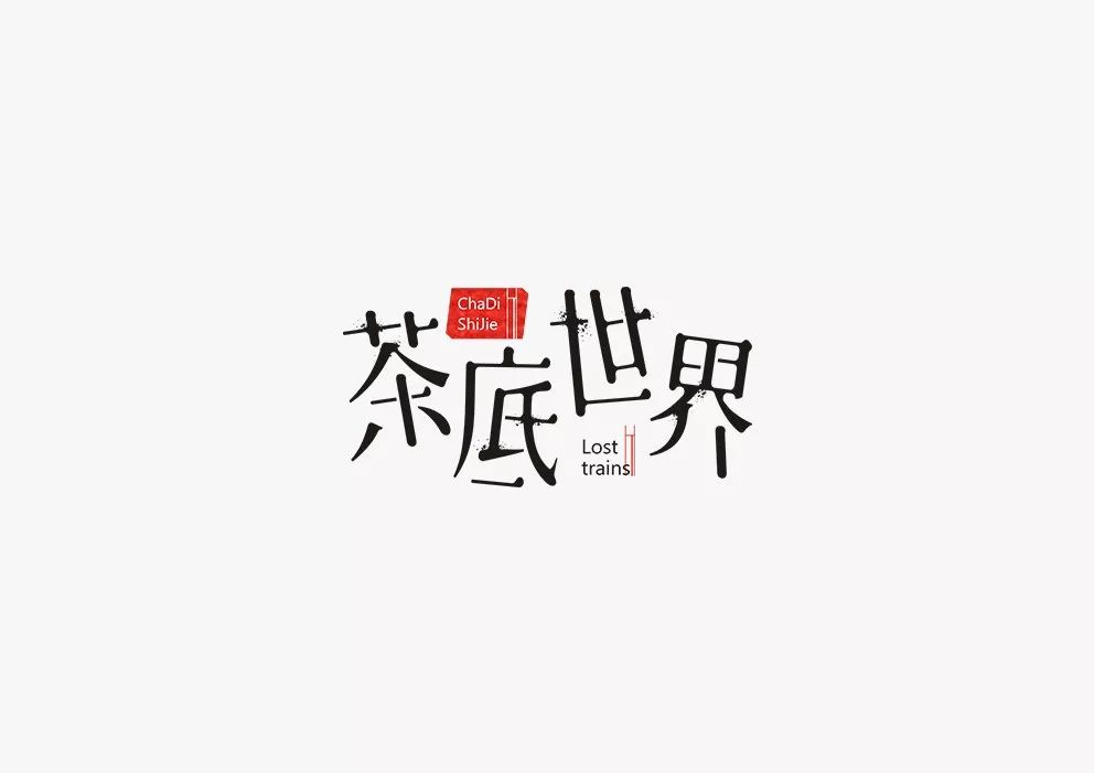
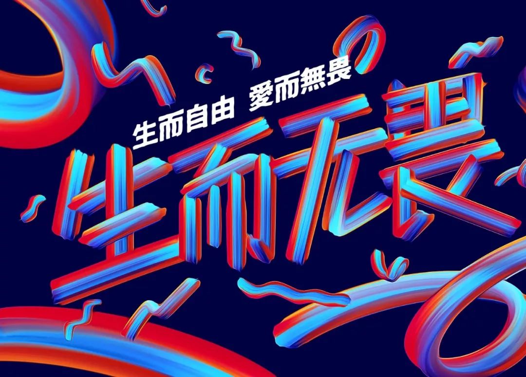
Today, people are increasingly pursuing personalization when purchasing goods or choosing brands. Something that is different and refreshing can always attract everyone's attention and spark discussions in the circle. Merchants are also enjoying creating commercial LOGOs, so we can often see many interesting cases of commercial LOGO font design. 


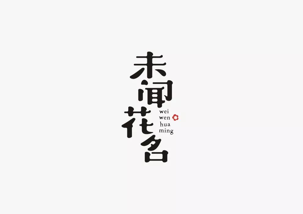

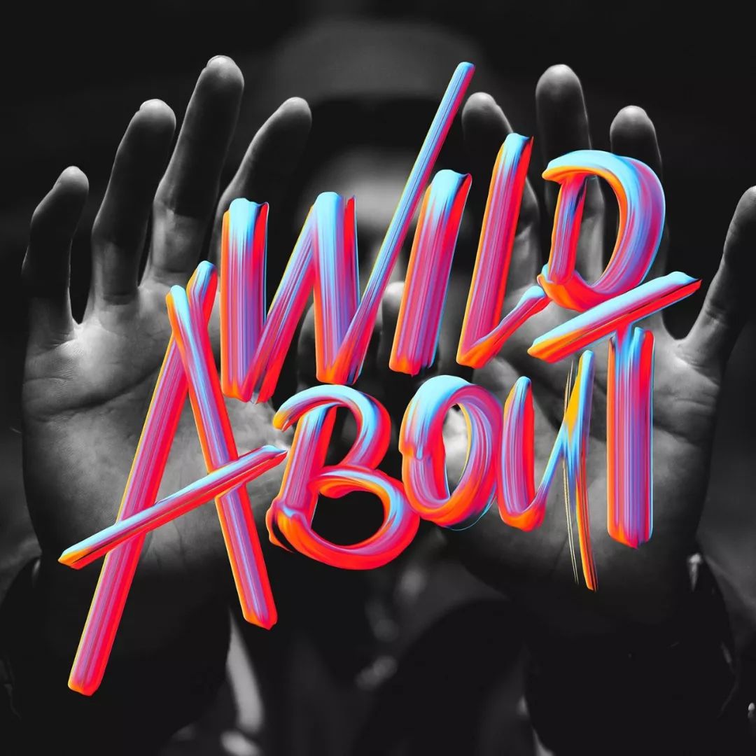
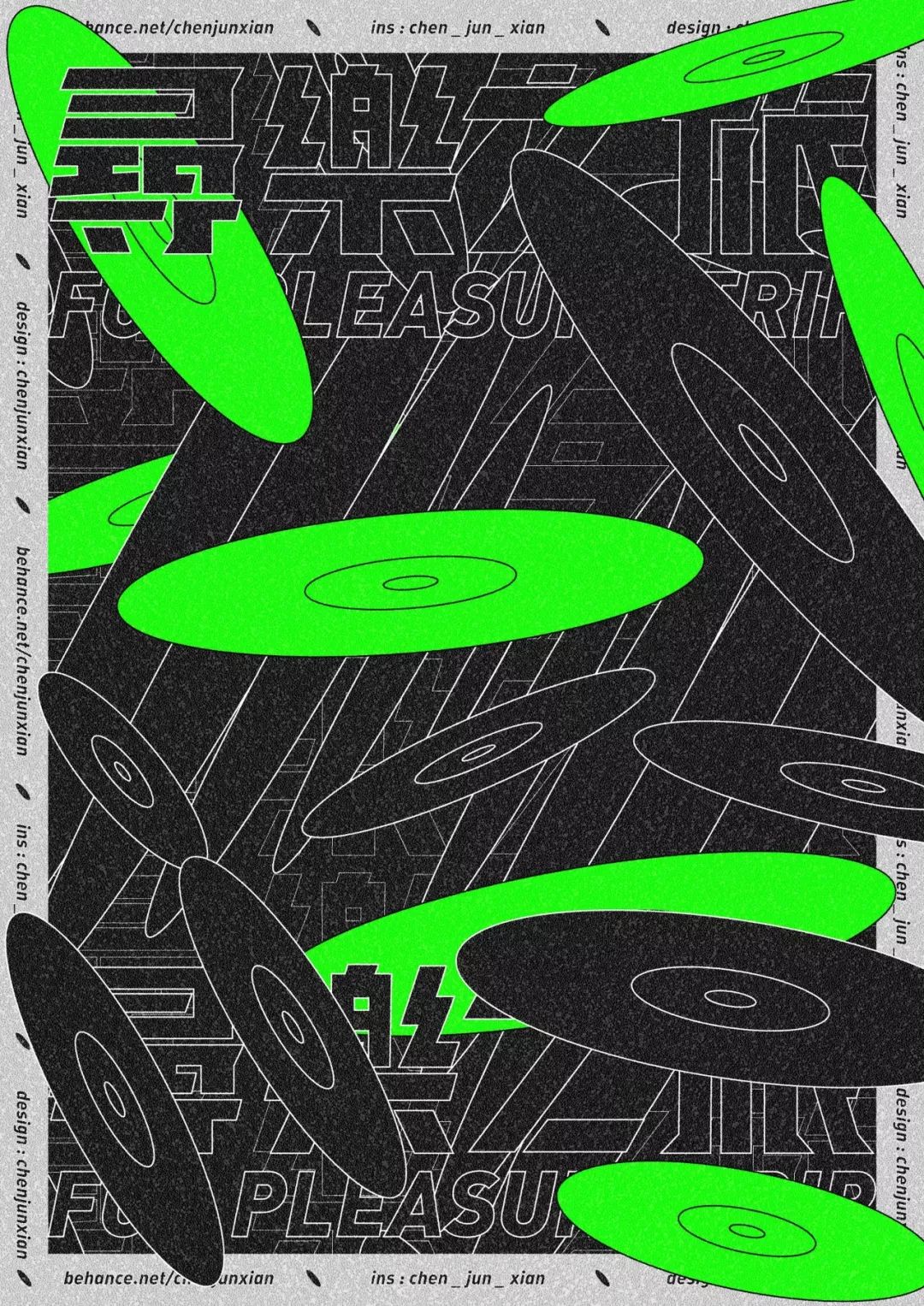
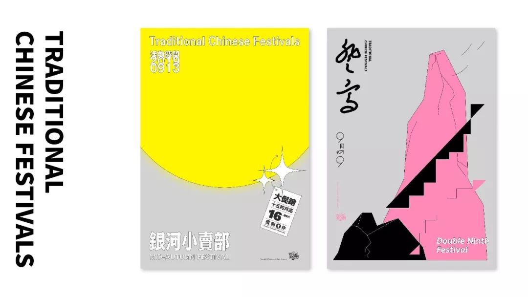
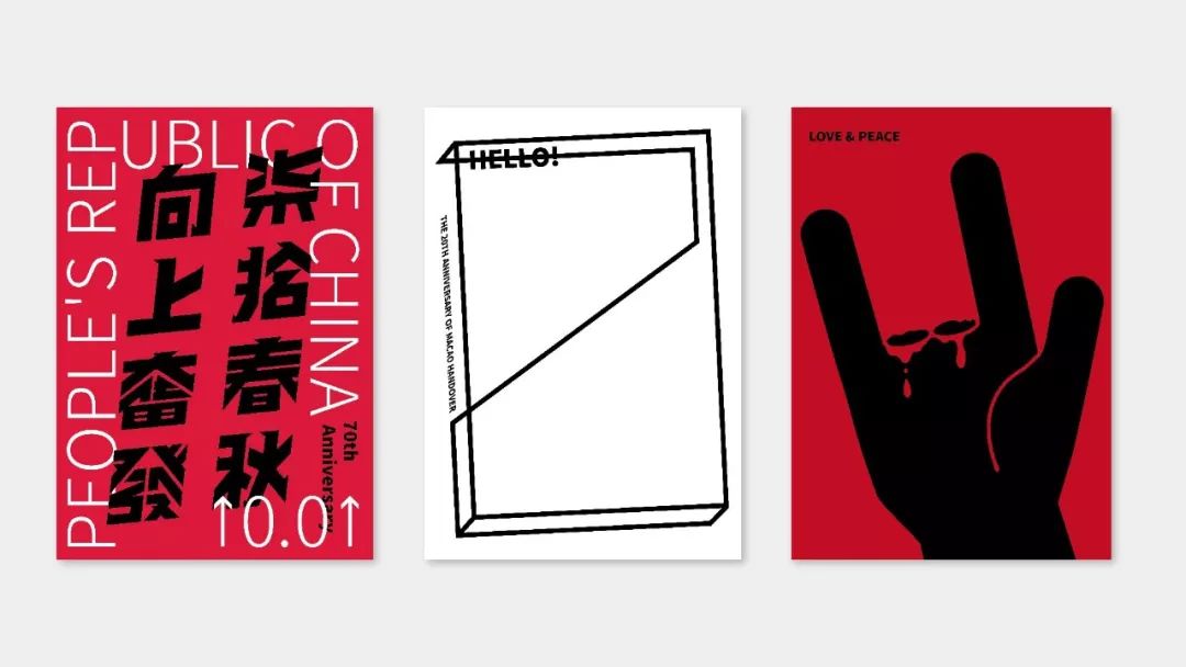
 Source of work丨Behance ID: Saury DesignIn addition, we often see some very fancy fonts Design style for event posters, advertising campaigns.
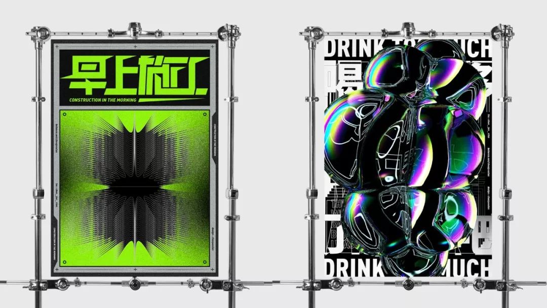
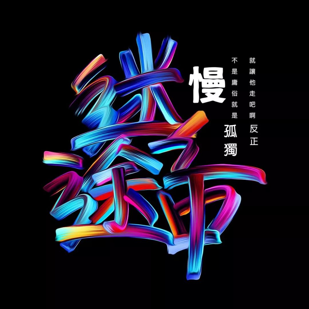
 02. Mistakes that font designers often make
Fonts The design is relatively simple compared to the logo design. Logo design is equivalent to from 0 to 1, and font design at least has an original font as a reference. Even so, it is inevitable that a font designer will overlook some problems during the design process, causing his work to look less than perfect. Such as: There is a problem with the font size ratio, different strokes and thickness, and blank space The space is uneven, the strokes are too broken, the center of gravity of the font is not uniform and so on.
03. Systematic learning font design
The above problems that font designers often have can be avoided after systematic study. Today I have prepared for youThe Great God teaches you a practical course on commercial font logo design, a total of 21G. There are benefits at the end of the article~I believe that after reading the tutorial carefully, the level of font design will definitely improve!

These resources are obtained through open and legal channels such as the Internet. The materials are only used for learning and communication, and their copyrights belong to the original author or the original publishing house. No legal responsibility for the copyright issues involved. The information is shared free of charge without any benefit. If the original author thinks it is an infringement, please contact us, we will delete the article immediately, thank you!

Scan the QR code below to reply "Font design< span >”
Get current resources in one second


Click "ReadRead the original text" directly to the Weidian!
Articles are uploaded by users and are for non-commercial browsing only. Posted by: Lomu, please indicate the source: https://www.daogebangong.com/en/articles/detail/Commercial%20LOGO%20font%20design%20so%20popular%20God%20teaches%20you%20a%20trick.html


 支付宝扫一扫
评论列表(196条)
测试