On May 8th, Coca-Cola China released a new set of brand custom fonts "Coca-Cola cares about body"
It is reported that this set of fonts was jointly developed by Coca-Cola China, the domestic professional font design organization Founder Font Library, and the Chinese character promotion organization Haozi. It took more than a year to polish and complete.

"Coca-Cola Cares" contains 7745 characters (6769 Chinese characters, 976 other characters), and is currently available for download, and is free to authorize personal non-commercial use and public welfare use.
Coca-Cola stated that over the years, Coca-Cola has operated and developed in China, and also lived and studied here. Coca-Cola feels the charm of Chinese culture and integrates with it, especially the unique "care".
It is the starting point of the relationship between people. In today's industrialized and digitalized world, this simple resonance is especially precious.

Coca-Cola's early Chinese trademark
The design inspiration of "Coca-Cola cares about the body" comes from the classic trademark font used by Coca-Cola when it returned to China.
These four characters that remain in people's memory are very kind, and each stroke contains harmony, strength, responsibility, calmness, and aggressiveness. This is the understanding and interpretation of "care".
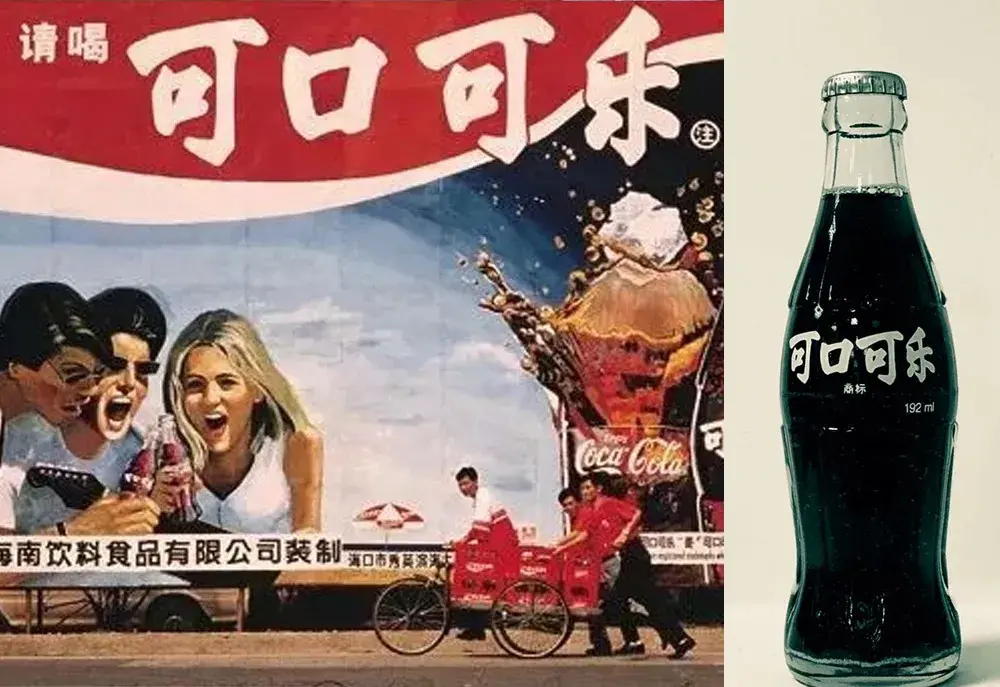
Coca-Cola's early Chinese trademark
The strokes of "Caring about the body" are fuller and thicker. The brushwork is calm and calm, with appropriate shades. Coca-Cola hopes to achieve a fusion of traditional charm and modern aesthetics.
Dots and strokes are like water droplets, full and flexible. The arc of the horizontal stroke starting and ending, and the turning point of the hook take into account the sense of roundness and strength.
The vertical painting is strong but not lost. The stretching and stretching also has a mechanical feel. The brushwork is natural and smooth, just like flowing clouds and flowing water.
This also expresses Coca-Cola's understanding of "water" as a beverage company: Calm but agile, harmonious and responsible.
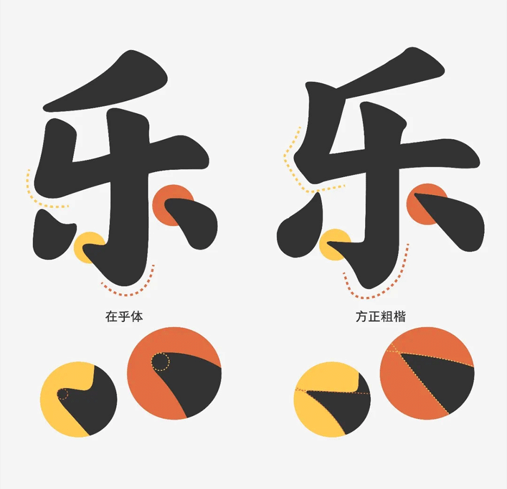

The center of gravity of the font is stable, upright, upright and powerful, and the strokes are inclined upward to the right, positively upward.
As a young soul with a rich history, Coca-Cola continues to grow positively.
This is also a font with a sense of optimism. The strokes are wide open, enough space is left in the words, and an appropriate distance is kept between the words, so that the arrangement becomes transparent, and reading is easier and more comfortable, as if breathing freely.
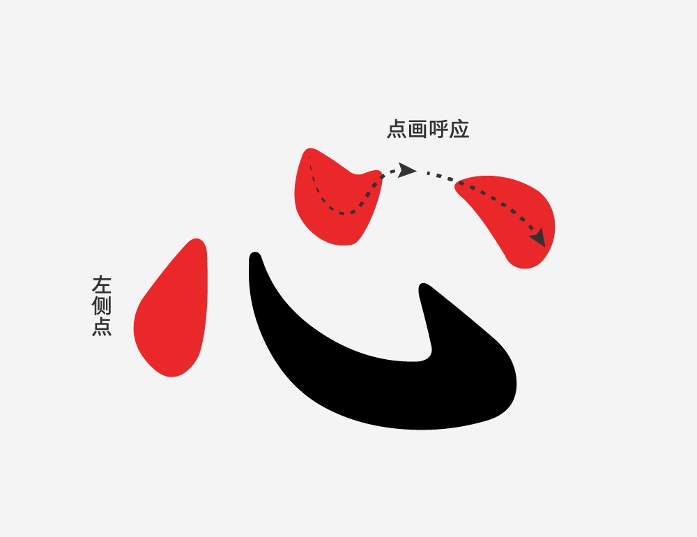
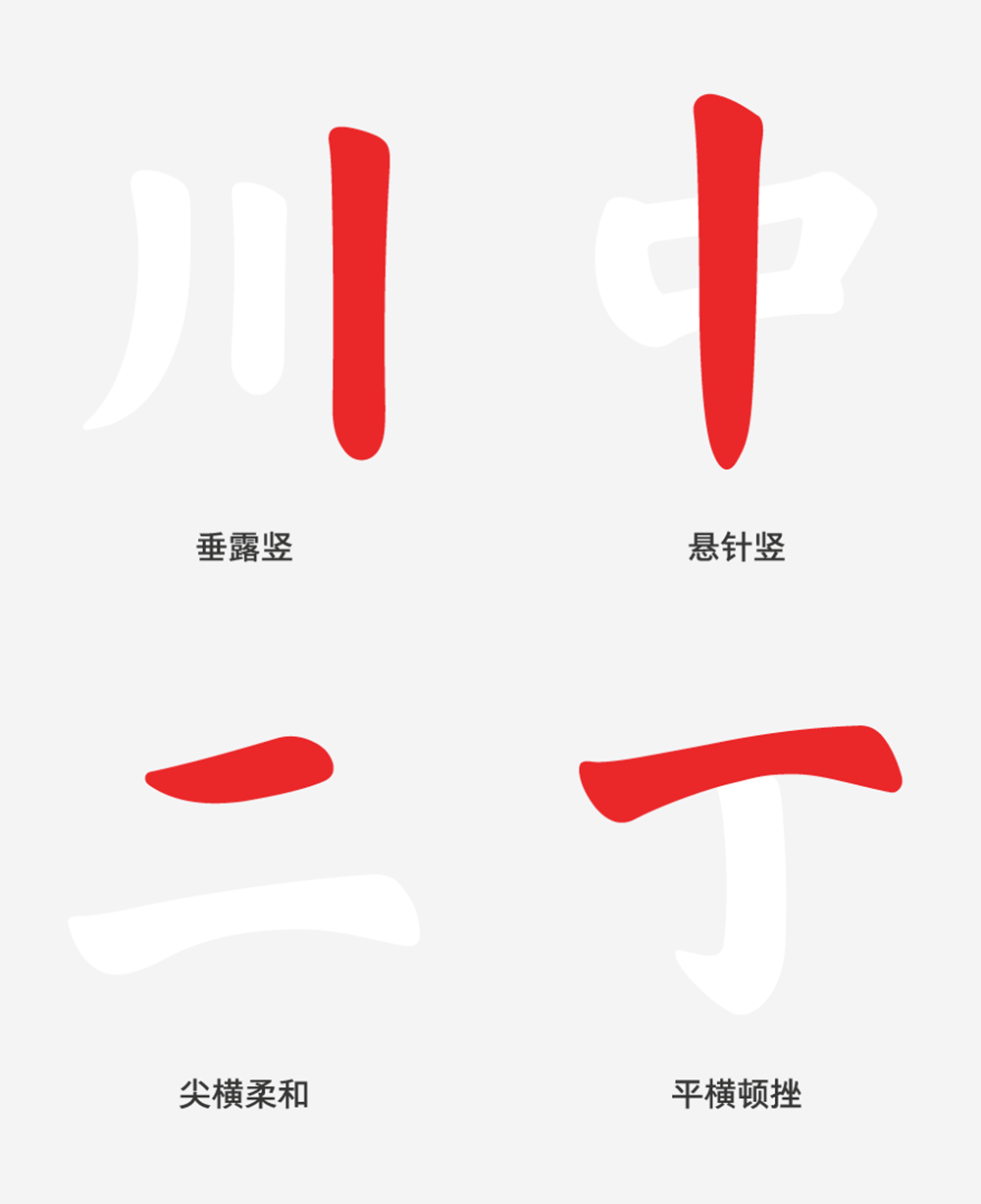
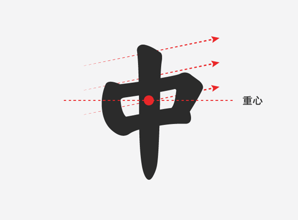
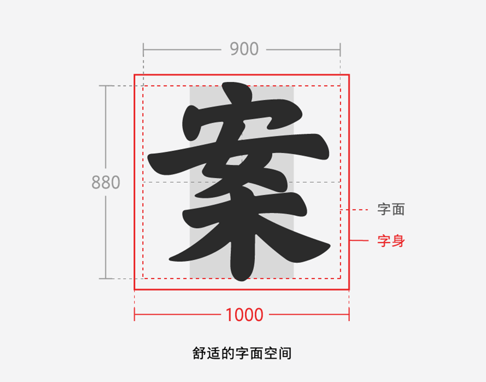
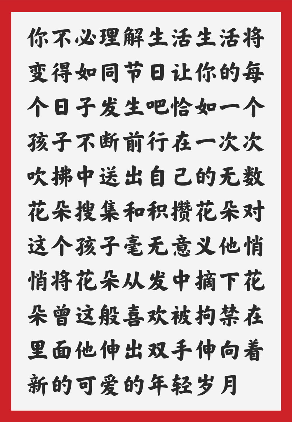
In the digital age, I hope this set of fonts will give you a humane and warm writing choice——Use the font you care about, write about the things you care about, and give it to the people you care about.

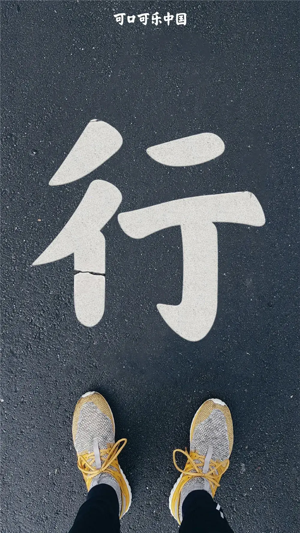
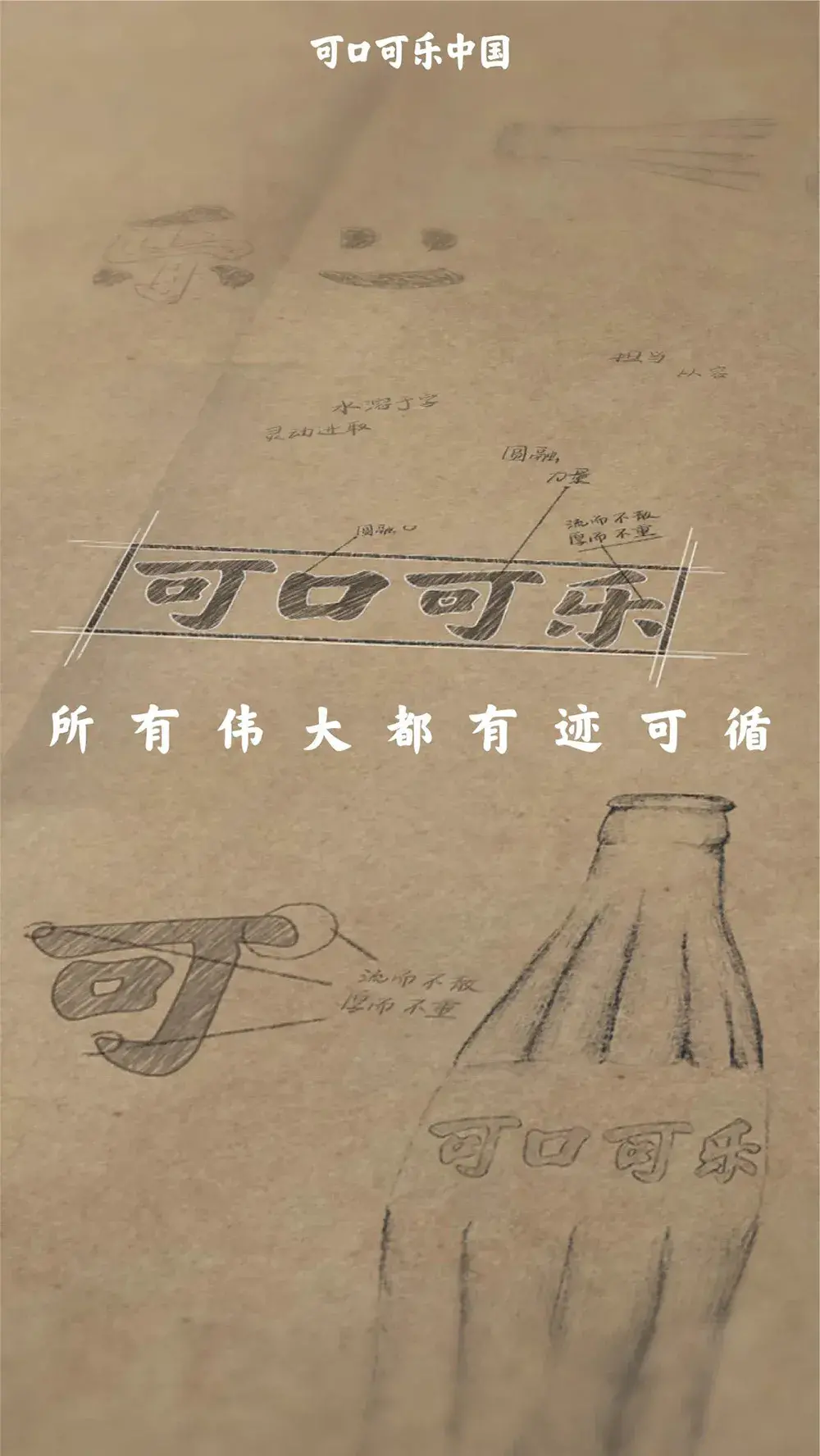
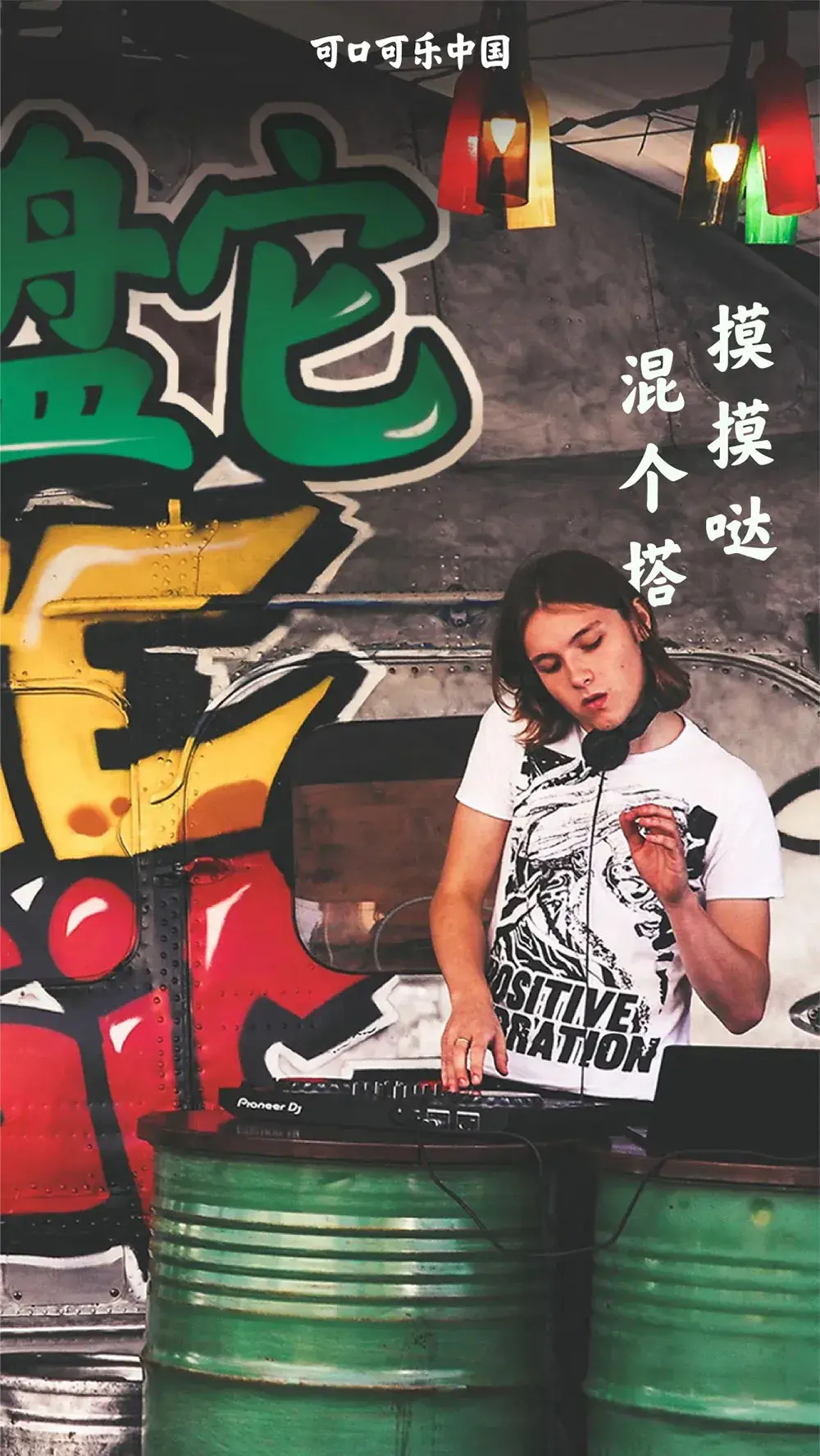
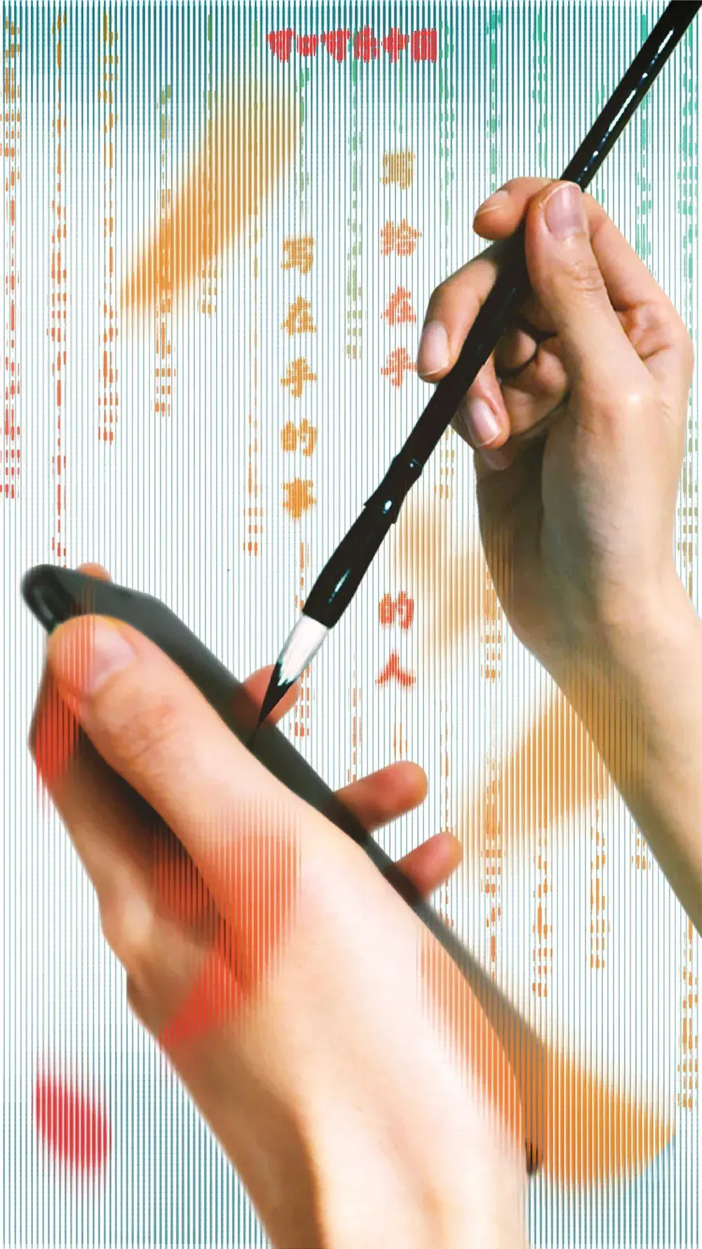
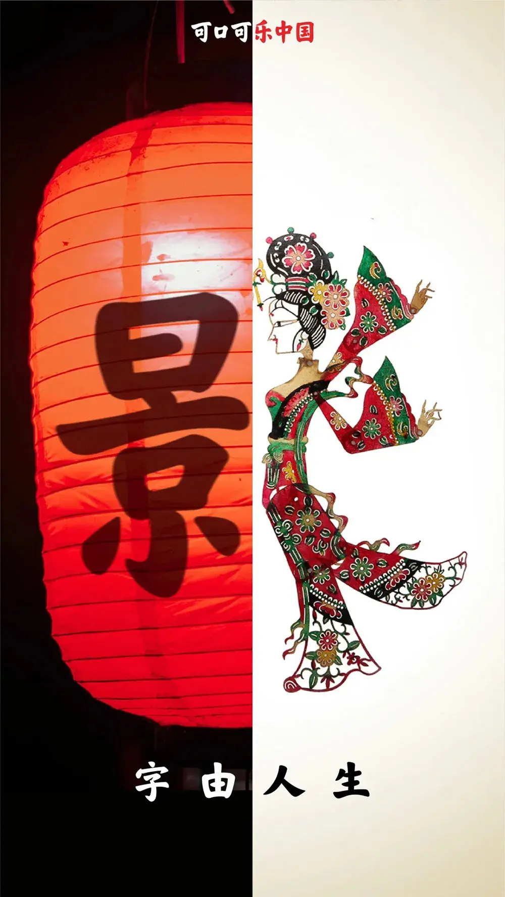
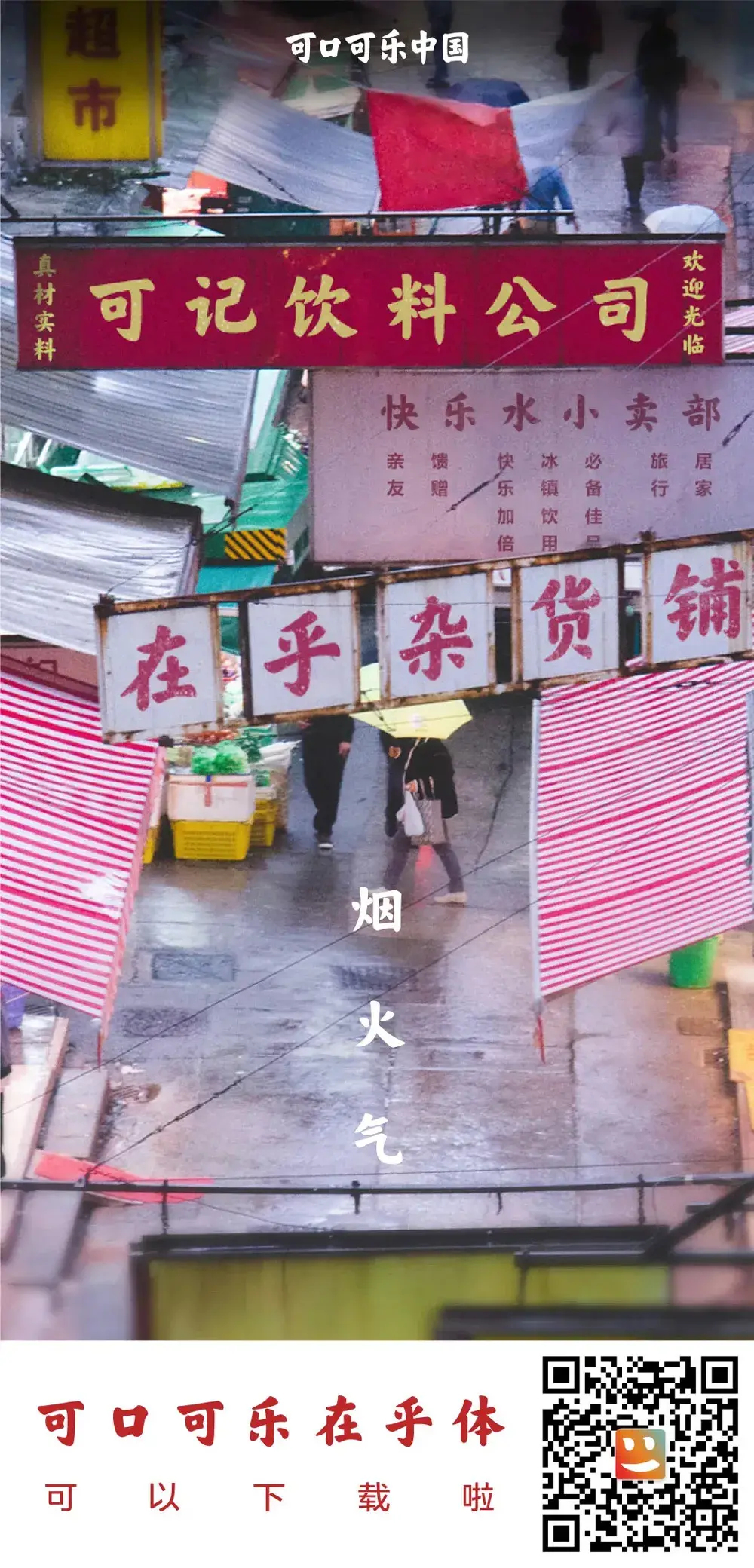
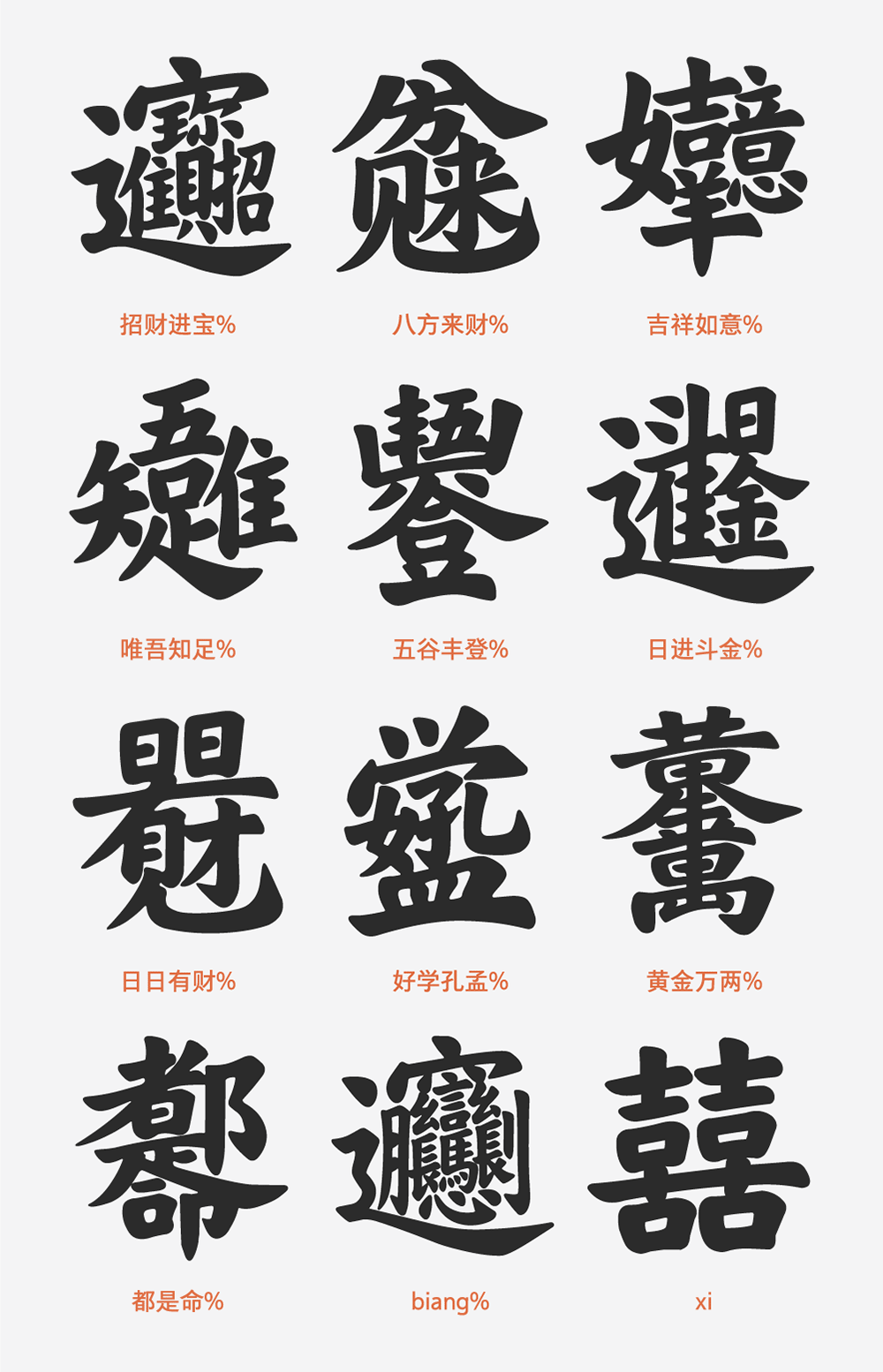
Finally , "Coca-Cola Cares" also hides some special character eggs
After installing the font, you can use it in specific software
Windows: adobe AI, adobe ID, word365, Notepad
MAC: adobe AI, adobe ID, word365, keynote
Enter the specified characters, you can type the following special Chinese characters:
Articles are uploaded by users and are for non-commercial browsing only. Posted by: Lomu, please indicate the source: https://www.daogebangong.com/en/articles/detail/CocaCola%20launched%20the%20Chinese%20brand%20font%20care%20about%20the%20body%20which%20can%20be%20used%20by%20individuals%20public%20welfare%20and%20noncommercial%20use.html

 支付宝扫一扫
评论列表(196条)
测试