
Text is the main body of the presentation, and the content and ideas to be expressed in the presentation are mainly expressed through text and accepted by the audience. In order to make the text in PPT readable, it is necessary to design the typesetting layout of the text so that the text can be as ornamental as the pictures.
The concise, minimalist, and flat style conforms to the current aesthetic standards of the public, and the PPT as an auxiliary presentation is more advocating simplicity. After clarifying the general principles of font selection, let’s see how to operate it.
Choose a sans-serif font, not a serif font
Sans-serif fonts tend to have better display effects than serif fonts due to their consistent thickness, no excessively thin strokes, and neatness, especially when viewed from a distance. Therefore, when designing PPT, sans serif fonts should be used as much as possible for both titles and texts.

sans serif font

serif font
Look for fonts that match the overall style of PPT
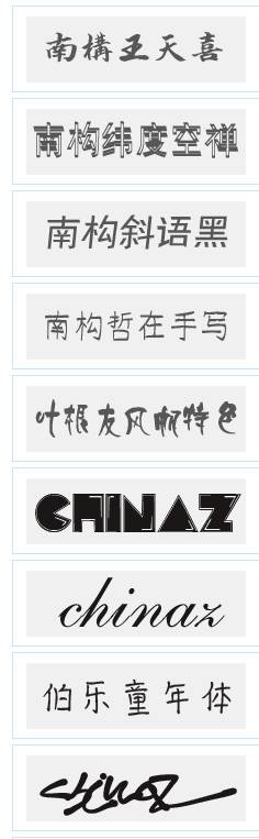
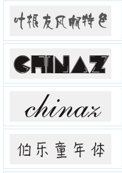
Friends who are dazzled, don’t worry, we have prepared 6 classic collocations for you, just choose according to different situations. Does the difficulty of choosing be cured all at once?
01 Microsoft Yahei (bold) + Microsoft Yahei (regular)
The Microsoft Yahei font that comes with the Windows system is simple and beautiful. As a sans-serif font, the display effect is very good.
The title is in Microsoft Yahei bold font, and the text is in Microsoft Yahei regular font.
This solution is commonly used for PPT in business occasions. In addition, it is recommended to use this solution when the time is relatively short and you don’t want to tangle with fonts.
02 Founder Coarse and Elegant Song Simplified + Founder Lanting Black Simplified
This kind of font matching scheme is clear, rigorous, and clear, which is very suitable for PPT used in more serious occasions such as government reports and public institution reports.
03 Hanyi Variety Show Brief + Microsoft Yahei
This font is suitable for use in PPTs such as academic reports, papers, teaching courseware, etc.
The title adopts Hanyi variety show style, and the text adopts Microsoft Yahei font, which is neither rigorous nor too old-fashioned, concise and clear
04 Founder Lanting Black Simplified +Arial
Arial is a good English font that comes with the Windows system. It matches with Founder Lanting Heibody, which can make PPT form a modern business style.

05 Arphic Font + Founder Lanting Black Simplified
Applicable to the PPT of the Chinese style type, the primary and secondary are clearly defined, and the cultural charm is strong.

06 Founder Fat Baby Simplified + Mini Jane Extra Thin Isoline
It is easy and interesting to match, and it is suitable for PPT in relaxed occasions such as children's education, comics, and cartoons.


Four-character formula for paragraph layout
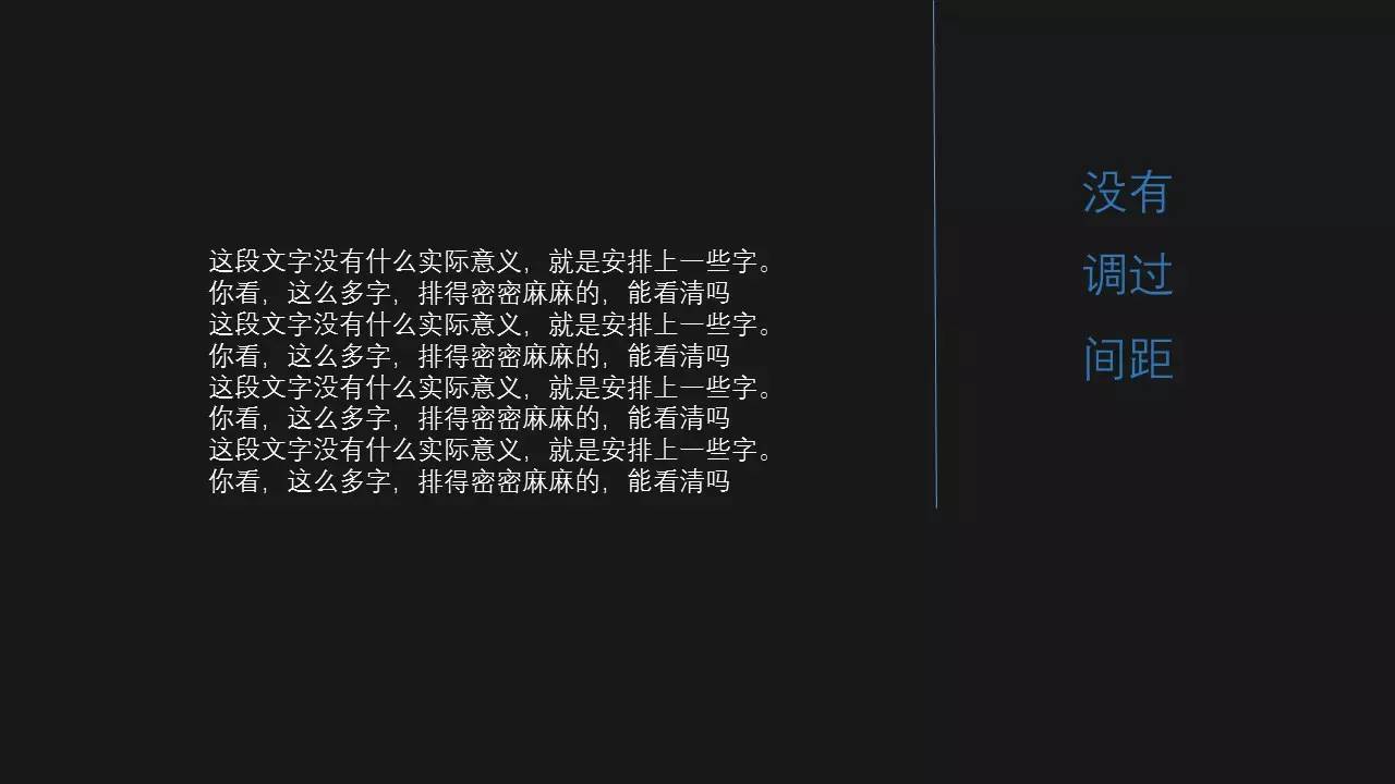
Sometimes when making PPT, it may be impossible to avoid the situation of a large paragraph of text on a certain page. In order to make such a page easy to read and look beautiful, you should pay attention to "alignment", "division", "sparse" and "scattering" when typesetting.
Qi
On the same page, the alignment method should be kept uniform. As for the alignment method within each paragraph, the alignment method should also be selected according to the mixed arrangement of pictures, texts, shapes, etc. on the entire page, so that the paragraphs are both logical and beautiful.

minutes
According to the logic of the content, decompose the content to express, separate each paragraph, and gather the content under the same meaning so that the audience can understand.
Parallel content can be automatically decomposed by bullets, and sequential content can be automatically decomposed by numbering.
Sparse
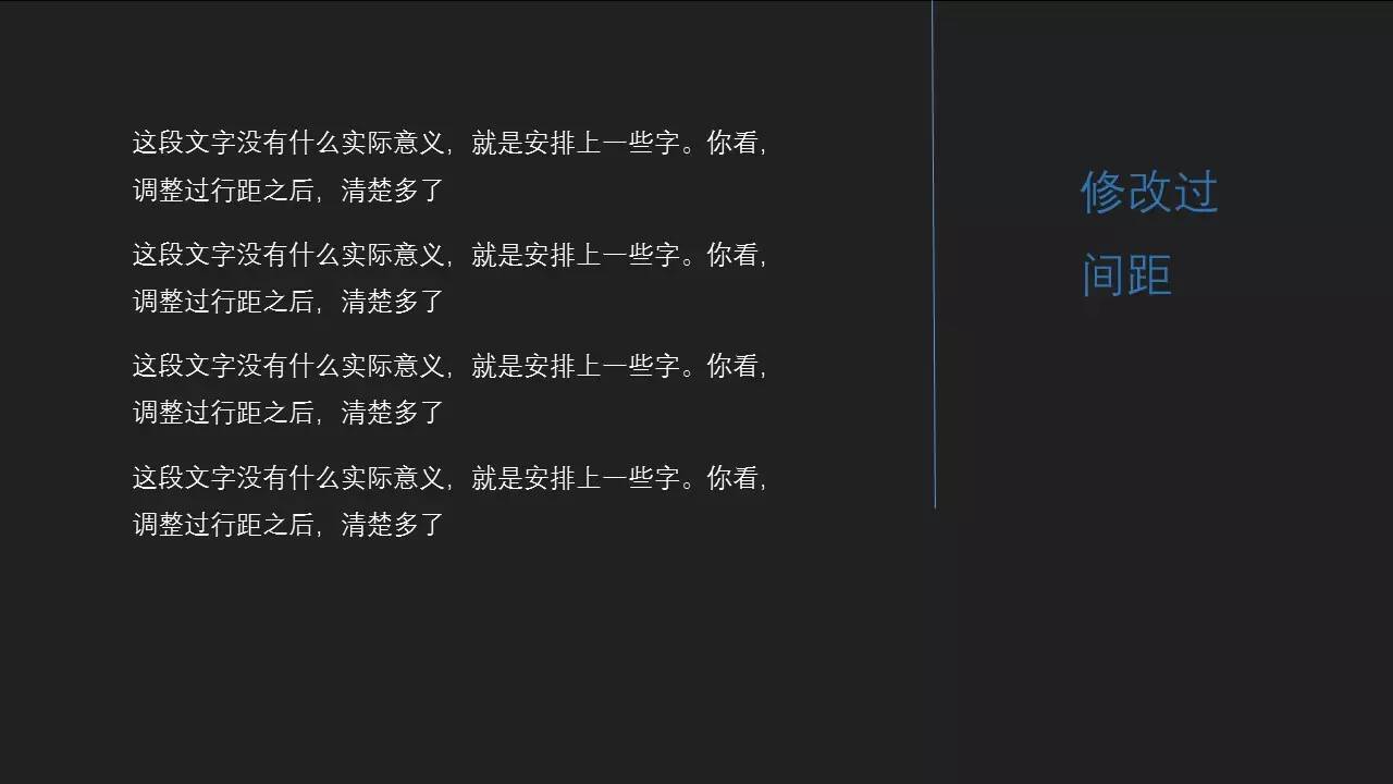
Expand the line spacing of paragraphs to create appropriate white space and avoid the oppressive feeling caused by densely packed text.
Scatter
Break up the original paragraphs, and on the basis of respecting the logic of the content, jump out of the Word thinking routine, and use design thinking to typesetting each paragraph more freely.
The modified PPT below is much easier to read than the previous one.

Articles are uploaded by users and are for non-commercial browsing only. Posted by: Lomu, please indicate the source: https://www.daogebangong.com/en/articles/detail/Choose%20the%20right%20font%20and%20your%20PPT%20will%20be%20half%20successful.html
 支付宝扫一扫
评论列表(196条)
测试